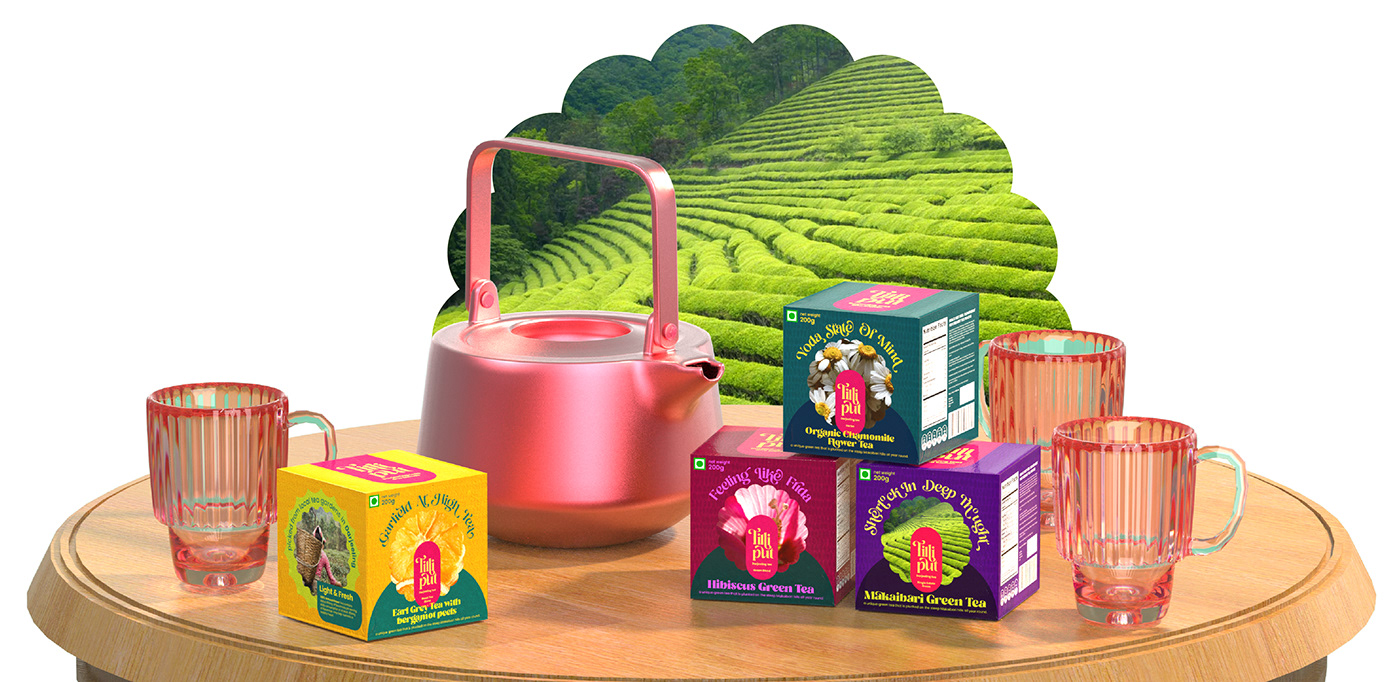
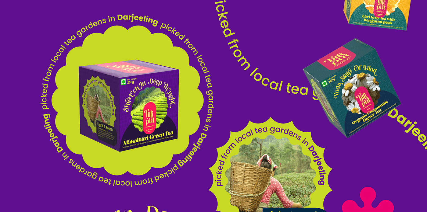
The idea was to make it look vibrant and fresh, drawing inspiration from 90s fonts but modernizing it for future design trends.
The flow of the letters is reminiscent of splashing.
I chose this style because it was on the rise and had a lot of staying power; I also tried to mix it in with the cottage core a little. which I believe came from covid and is one of the most popular subcultures in the current state