

Logo redesign for the holding company Barens.
Barens Group is a private investment and holding group with operating segments in Commodities, Real Estate and Venture Capital/Technology.
Barens Capital is a private real estate investment company, focused on generating attractive returns for our investors through deploying equity and debt capital into mainstream mixed-use 9-100-unit residential lead development projects, as well as income producing commercial real estate opportunities in Greater London and Home Counties.
barens-capital.com

The company already had a solid coat of arms logo. But the owners wanted to refresh it and make it more modern. It is also obvious that the brand needs a significant simplification since it is used mainly in the online environment - on the company's websites. When reduced, many elements merge and the symbol becomes difficult to read.
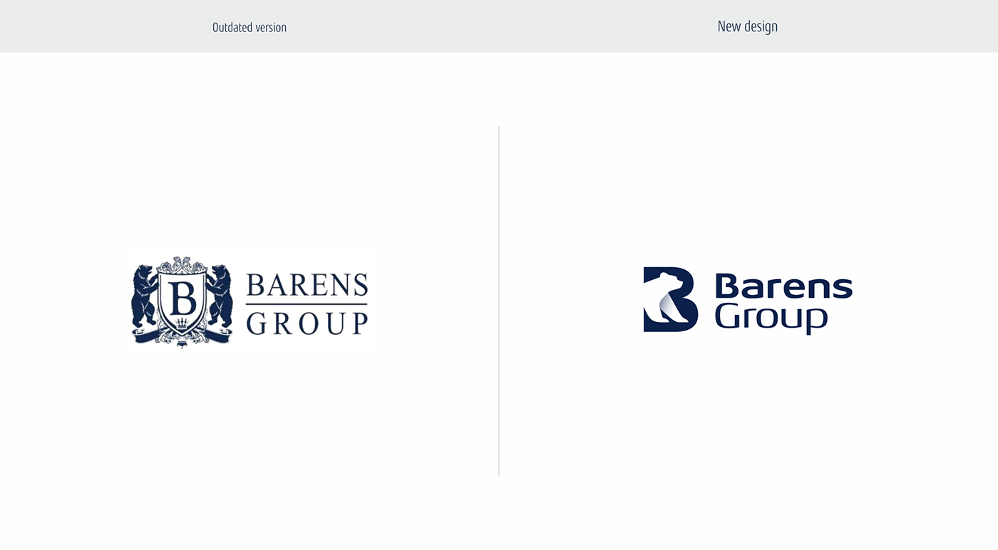
Bears are used in connection with the names of the brothers of the founders of companies. For simplification and good readability, it was decided to use one bear as a symbol of nominal and family connection.
The bear is also associated with capital, stability and development, which is well reflected in his thoughtful and confident movement with his head up.

The idea to place the bear inside the letter B was born almost immediately. The contour of the animal in the negative, instead of the gaps of the letter, gives rise to an attractive, double meaning.
However, many different bear poses were considered. I wanted to get away from aggression or brutality and find forms that reflect restraint, dignity and dynamics.

The logo looks good both on a light and dark blue corporate background, which, at the request of the customer, should have been preserved. There were no objections from my side in this regard, since the dark blue color well represents the company in a discreet, corporate style and is in harmony with the image used in the logo.

A slight shading of the left paw with a smooth gradient, quite appropriately gives some volume, looks more lively and more interesting. Do you agree?


When the brand name is scaled down, the advantage of the new shape becomes apparent. It is much more legible and readable. A corporate symbol should look good even on small offline and online media, adequately representing a company with offices in several countries around the world.


