


The Client
Atherton is a real estate development and consulting firm that proposes a better lifestyle based on detailed insight. Atherton develops various residential spaces, from high-end residences for the very few upper class, such as the Upper House, to apartment brands that present a special lifestyle to many. Atherton pursues a high-end residential culture that enhances and enriches life beyond simply creating buildings and spaces. For this, Atherton delivers a residential experience that leads the era beyond the boundaries of past methods or fields.
Furthermore, it intends to create an aesthetic space that enriches life, where you can feel closeness and share joy with people you love and where various cultures and values coexist. Based on these efforts, Atherton realizes the value of prosperity that makes life beautiful and fulfilling.

The Objective
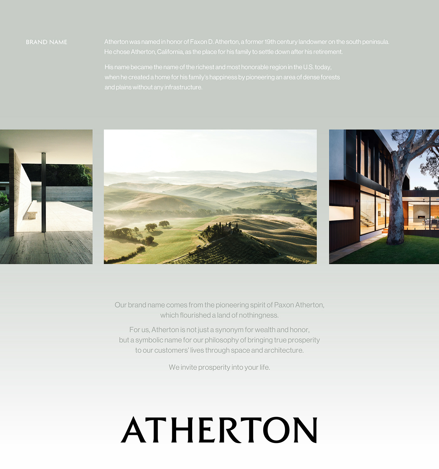
YNL developed a brand identity system that captures Atherton's differentiated brand value and an application system that can present a unique brand experience based on Atherton's new definition of high-end housing. YNL redefined the story and brand value of Atherton's brand name as follows to derive the brand concept and design direction;
Atherton provides the experience of prosperity beyond high-end housing. To Atherton, prosperity does not just mean material affluence but also encompasses emotional richness, such as serenity, harmony, balance, and satisfaction. It signifies a substantial lifestyle of enjoying life to the fullest. Atherton raises residential satisfaction and leads life to prosperity and happiness through innovative residential experiences that lead the times and careful space planning in consideration of various lifestyles.

The Solution
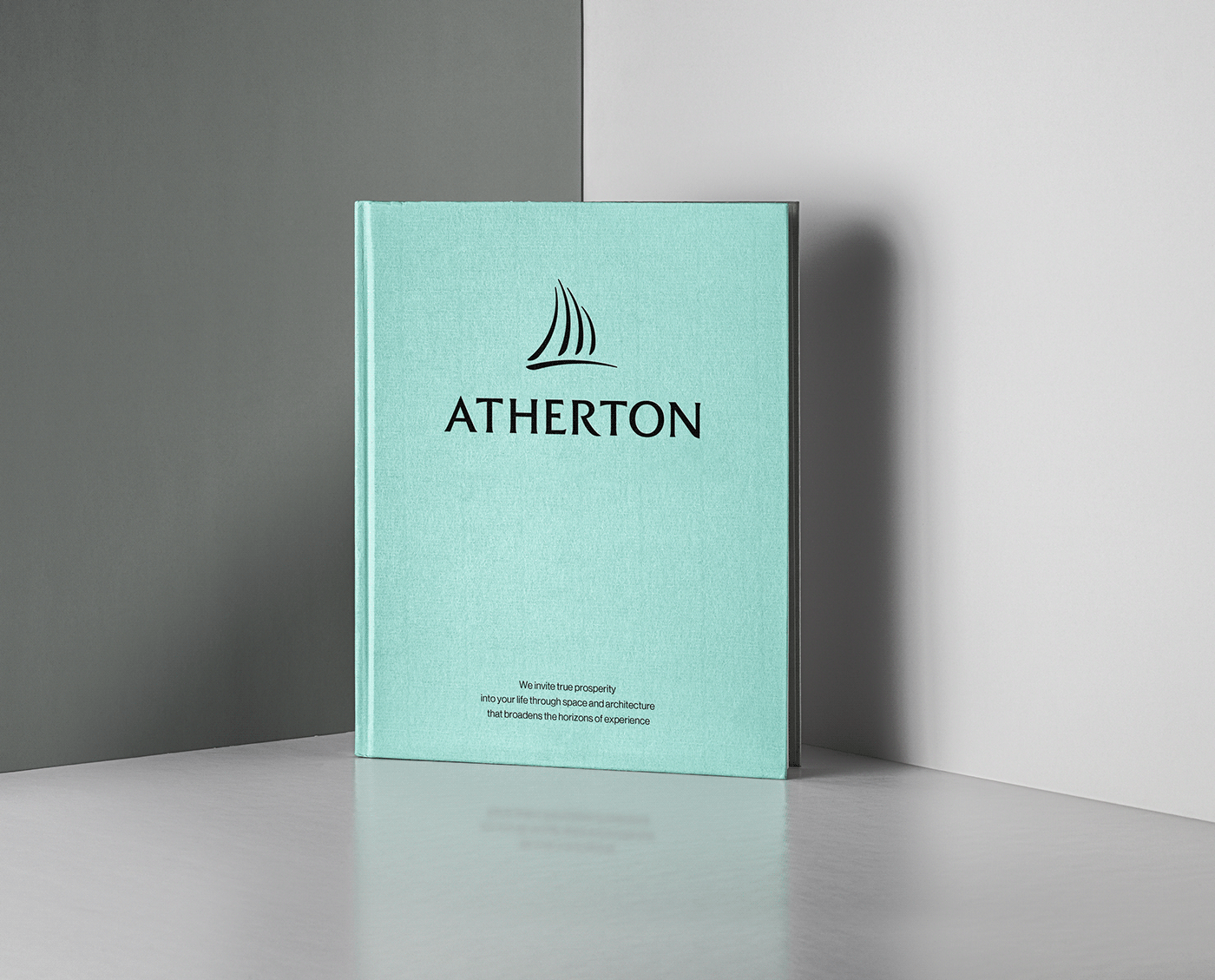
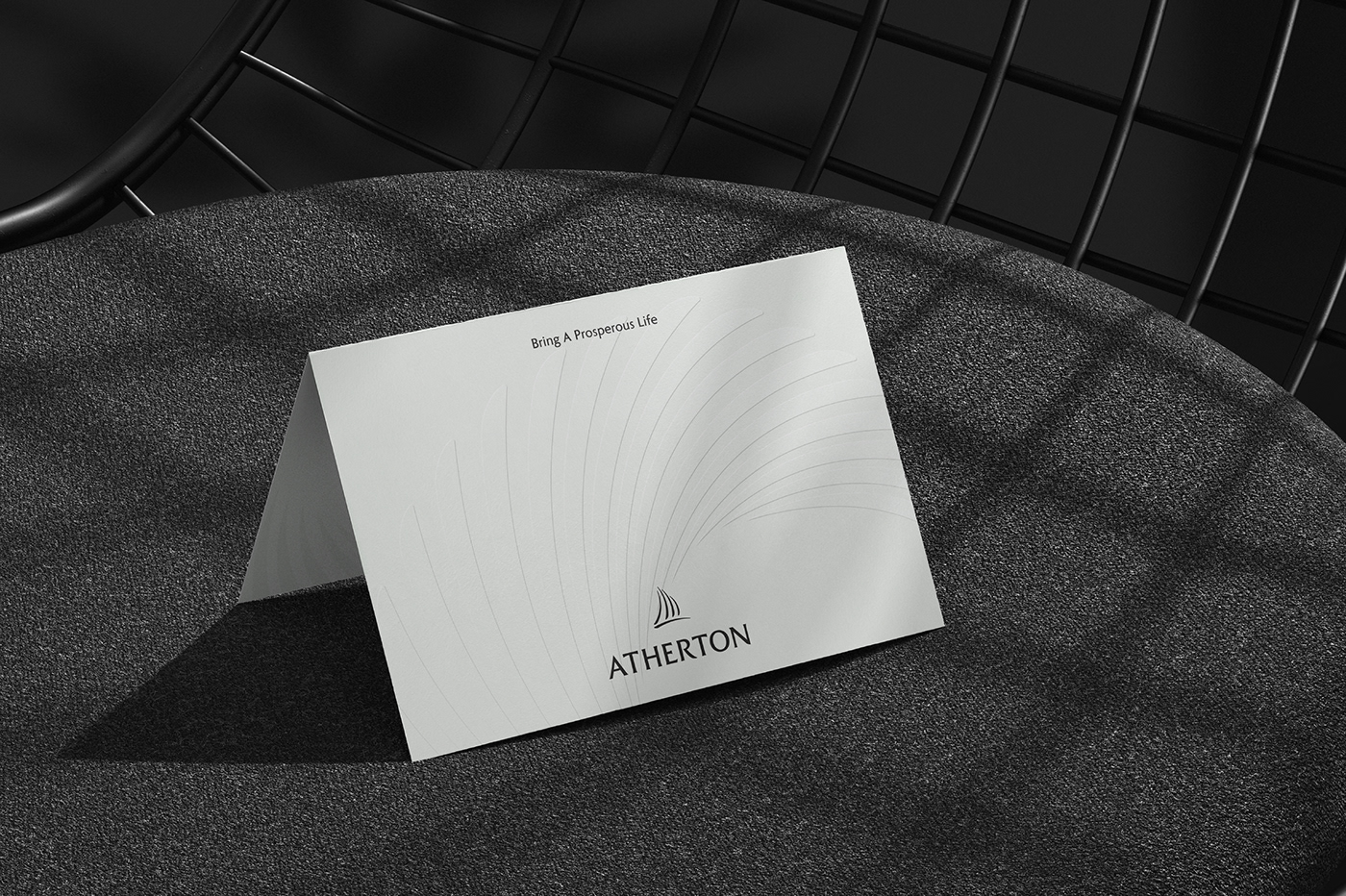
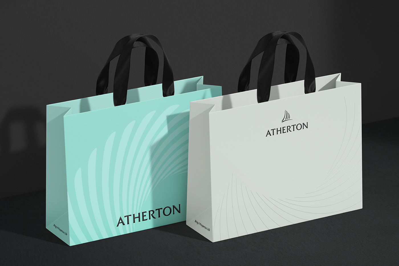
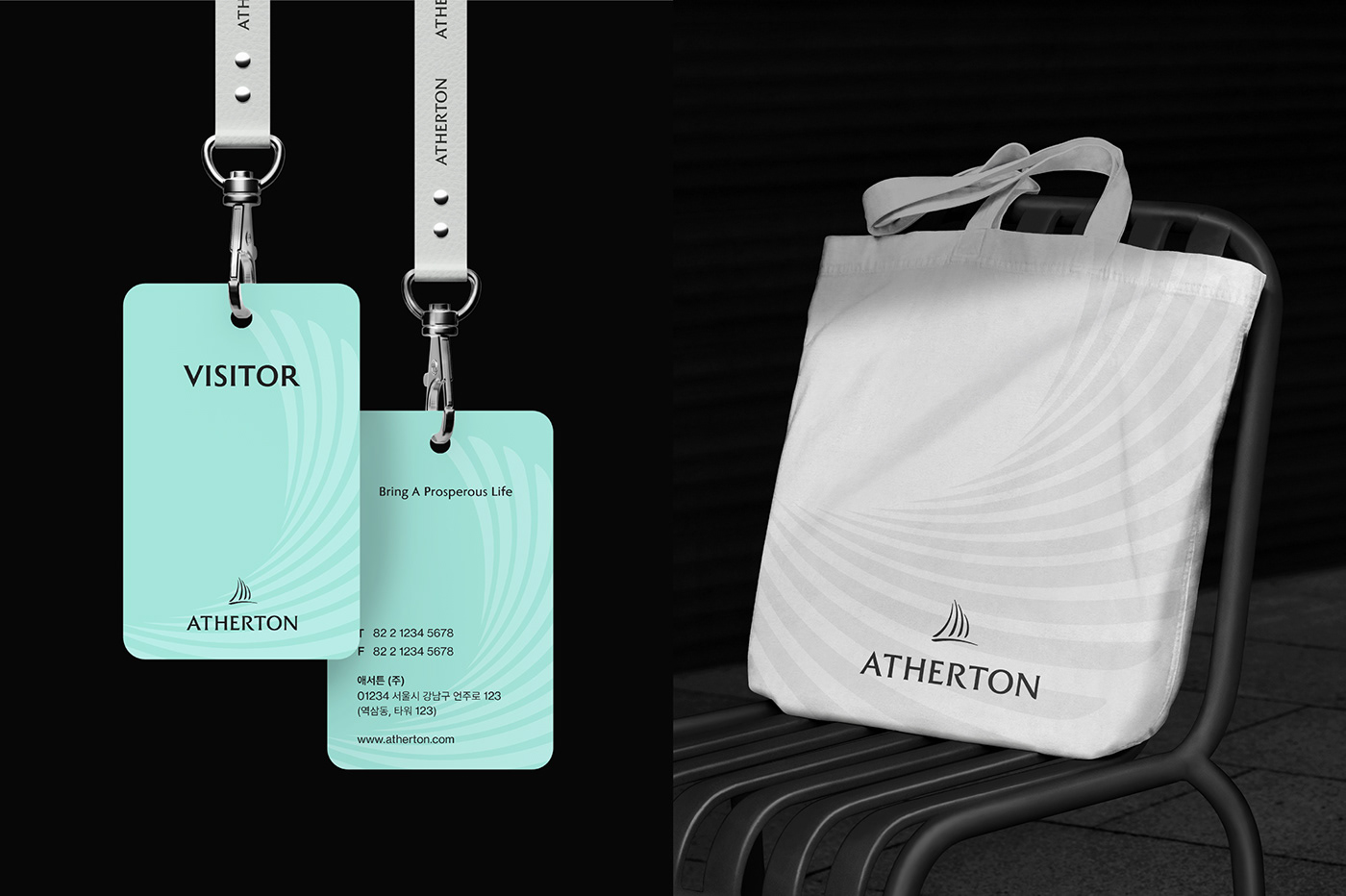
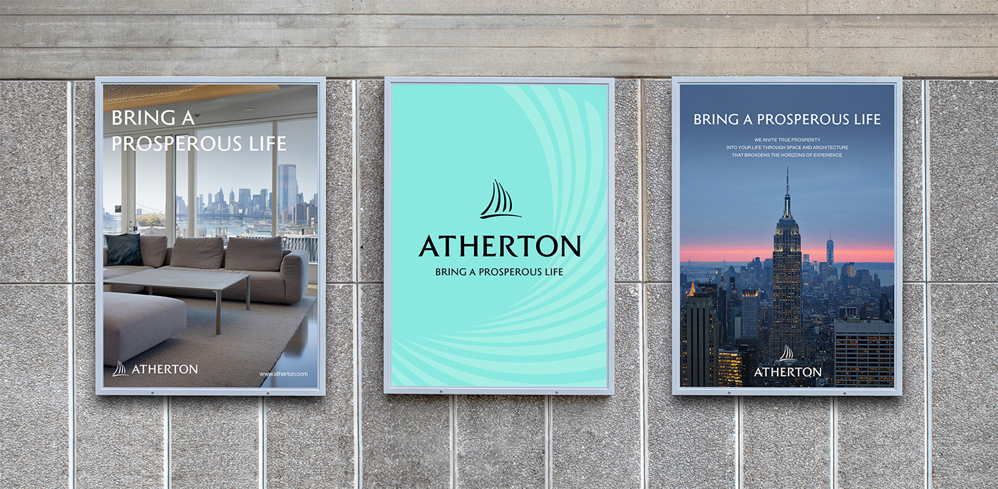
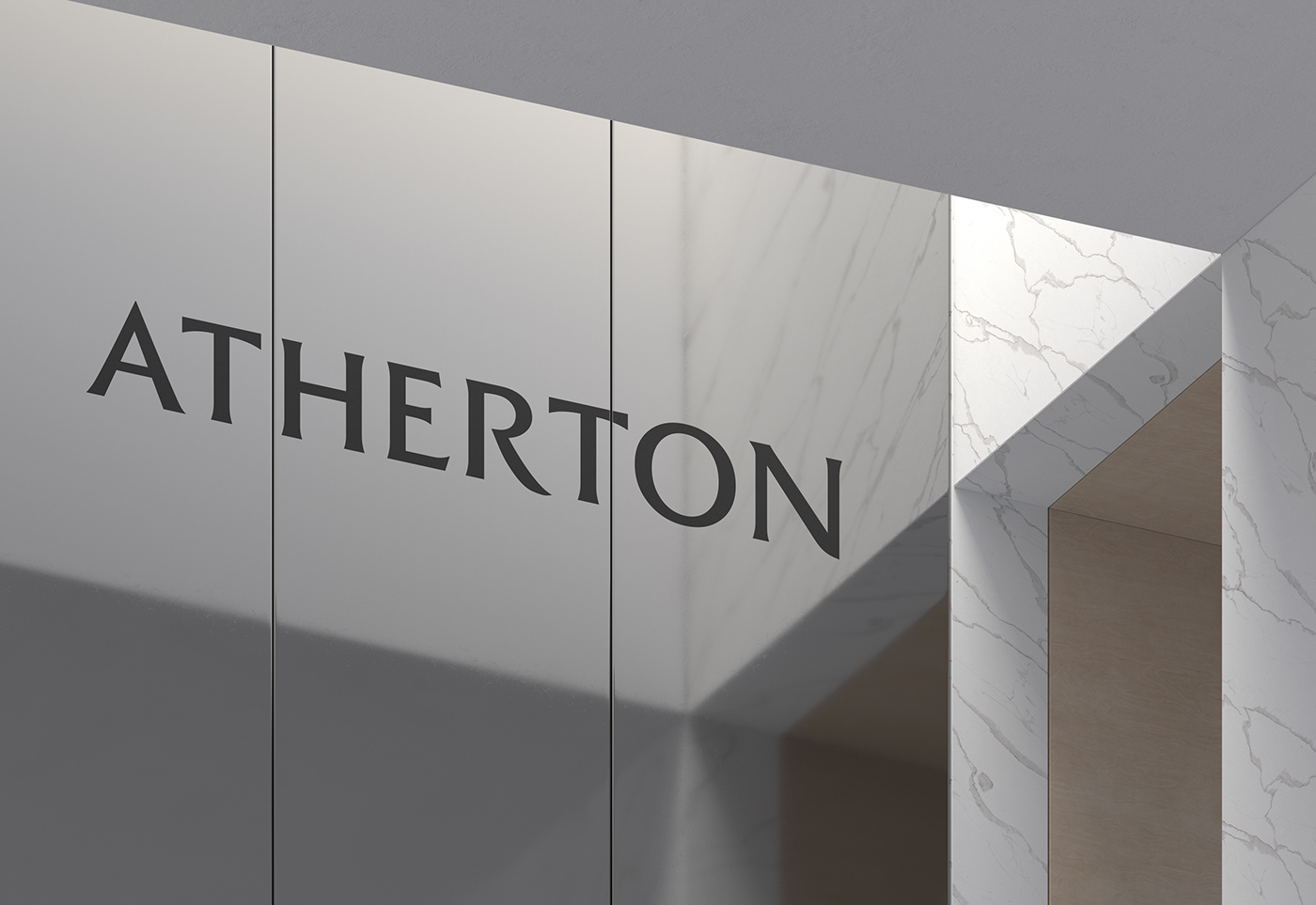
YNL defined Atherton's brand essence with the slogan BRING A PROSPEROUS LIFE. Based on this, we developed a brand identity embracing Atherton's essential values. Atherton's logotype, where the modern sensibility of refined straight lines from harmony with the comfort of curves, boldly expresses its confidence as a leading real estate development and consulting company leading residential culture.

The symbol uses gentle curves to express the affluent life offered by Atherton in a comfortable and elegant mood. The tall vertical line signifies the residential experience offered by Atherton, which creates a unique lifestyle through various architecture. The broad horizontal line means that the experience of prosperity is widely spread through Atherton's residential culture.

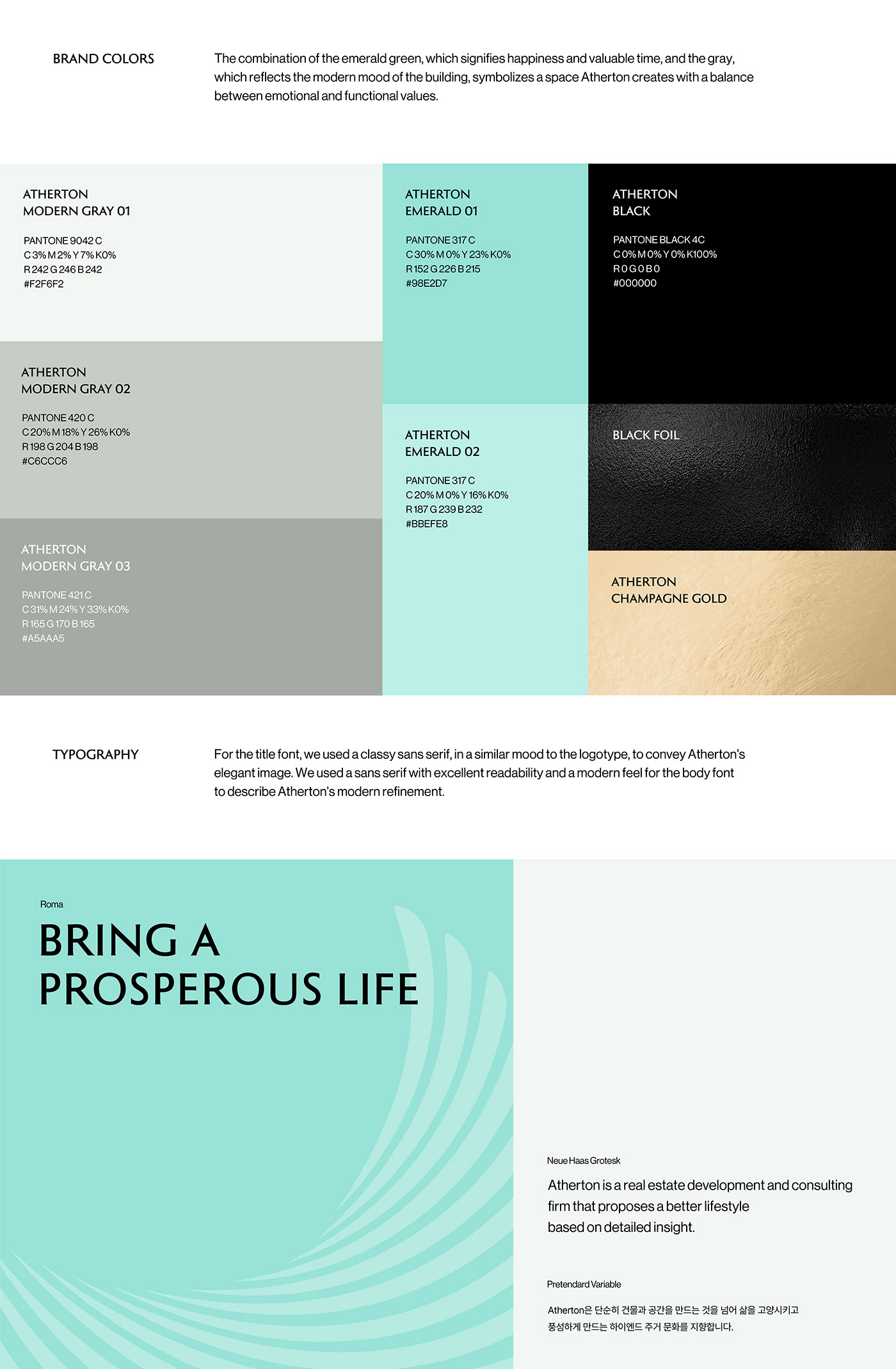
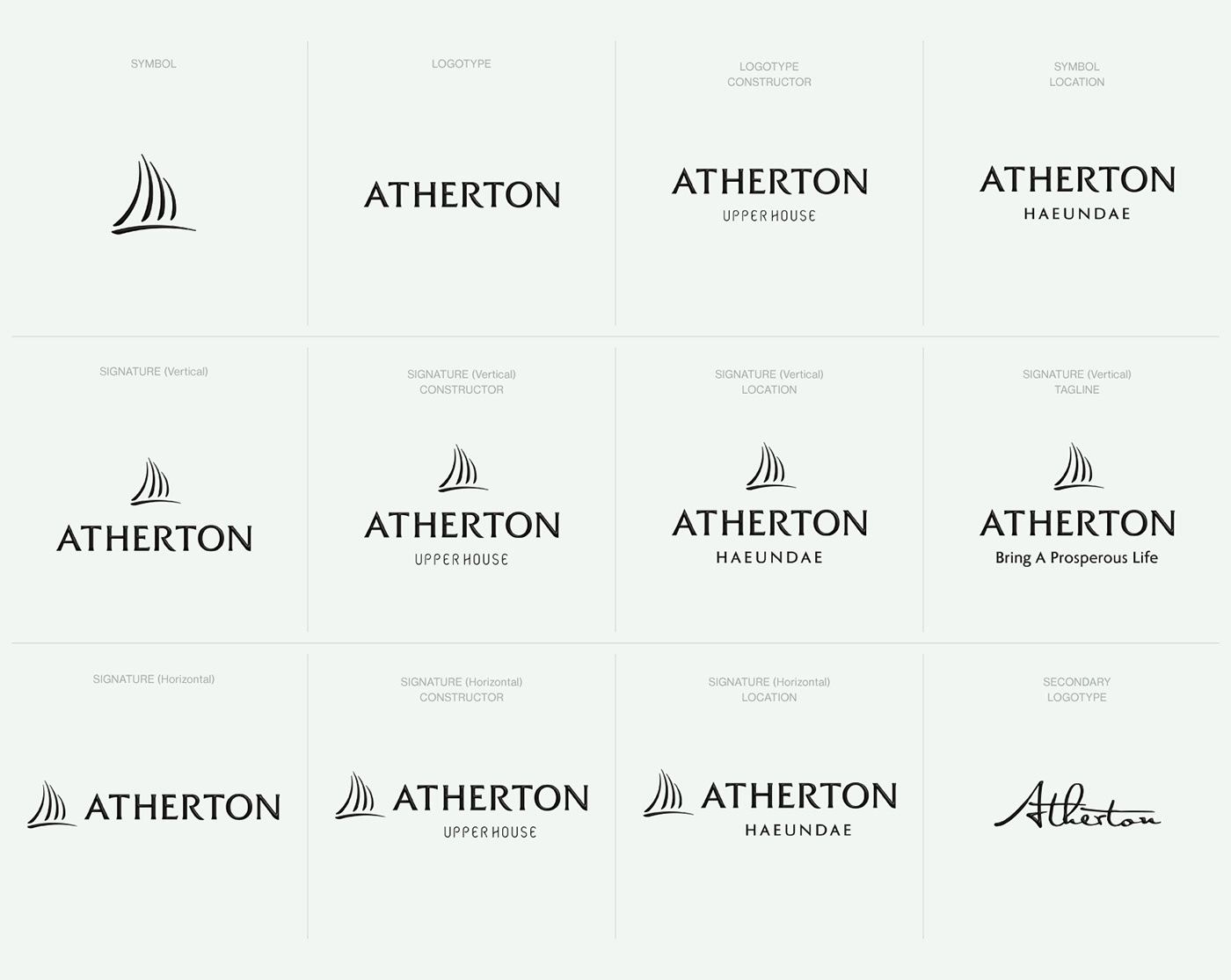
The graphic motif, developed based on Atherton’s symbol, captures the value of prosperity that extends to a higher dimension and expresses Atherton's sophisticated and affluent lifestyle. The graphic motif was developed to convey a uniform brand experience at various customer contact points, considering the scalability and applicability depending on the application template size.

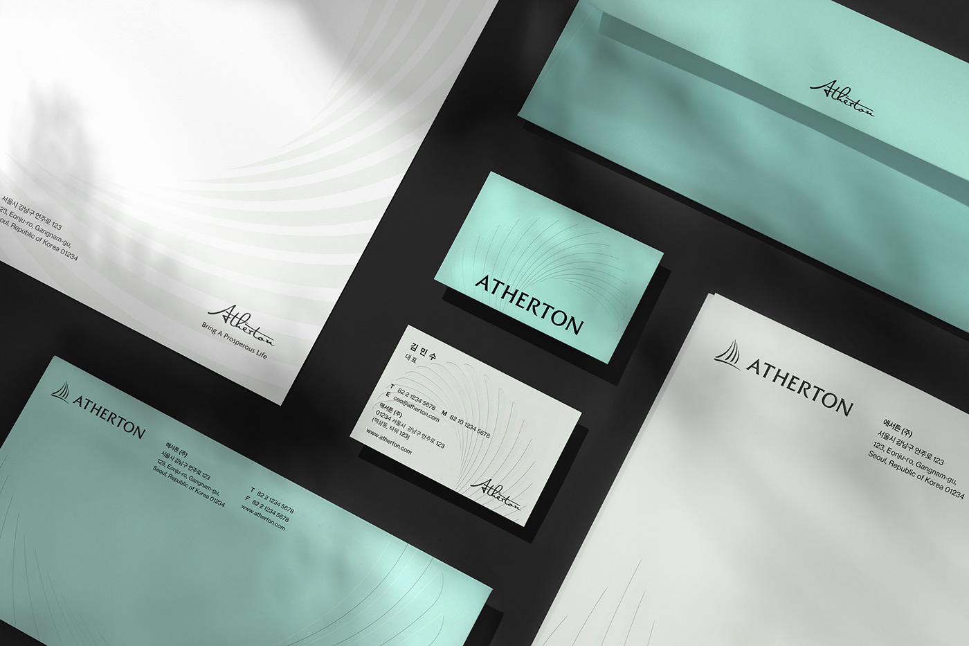

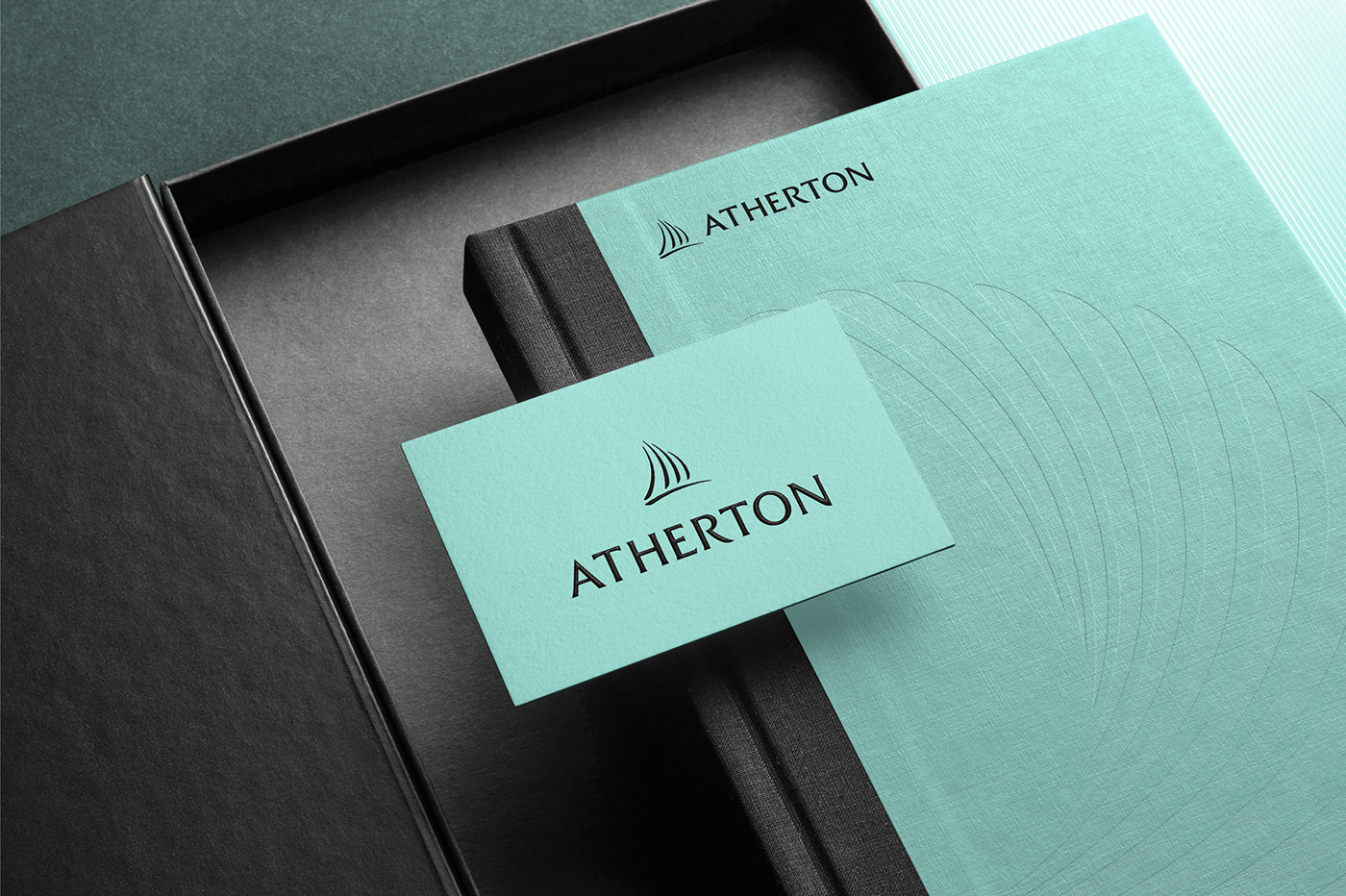


ATHERTON Corporate Identity
Corporate Identity / Brand Story / Brand Slogan / Application
Client: Goldwater Korea [(주)골드워터 코리아]
Date: May. 2022 - Jul. 2022
Project Team
Brand Design: YNL Design
YNL Design
Art Direction & Design: Liz Yoona Lee
Brand Design: Kwangsu Shin, HeeJae Choi, Soyoung Jung
© 2022 YNL Design


