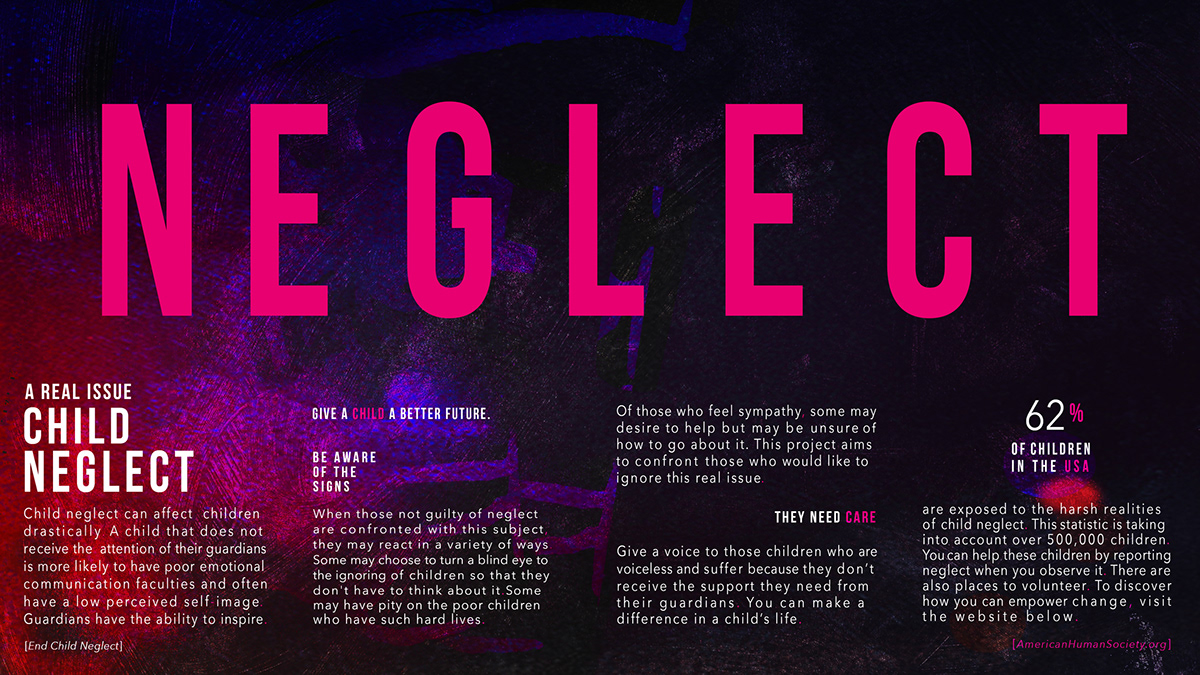
End Child Neglect
I am pleased with the outcome of this social awareness campaign. This was an arduous journey that led to a successful product.
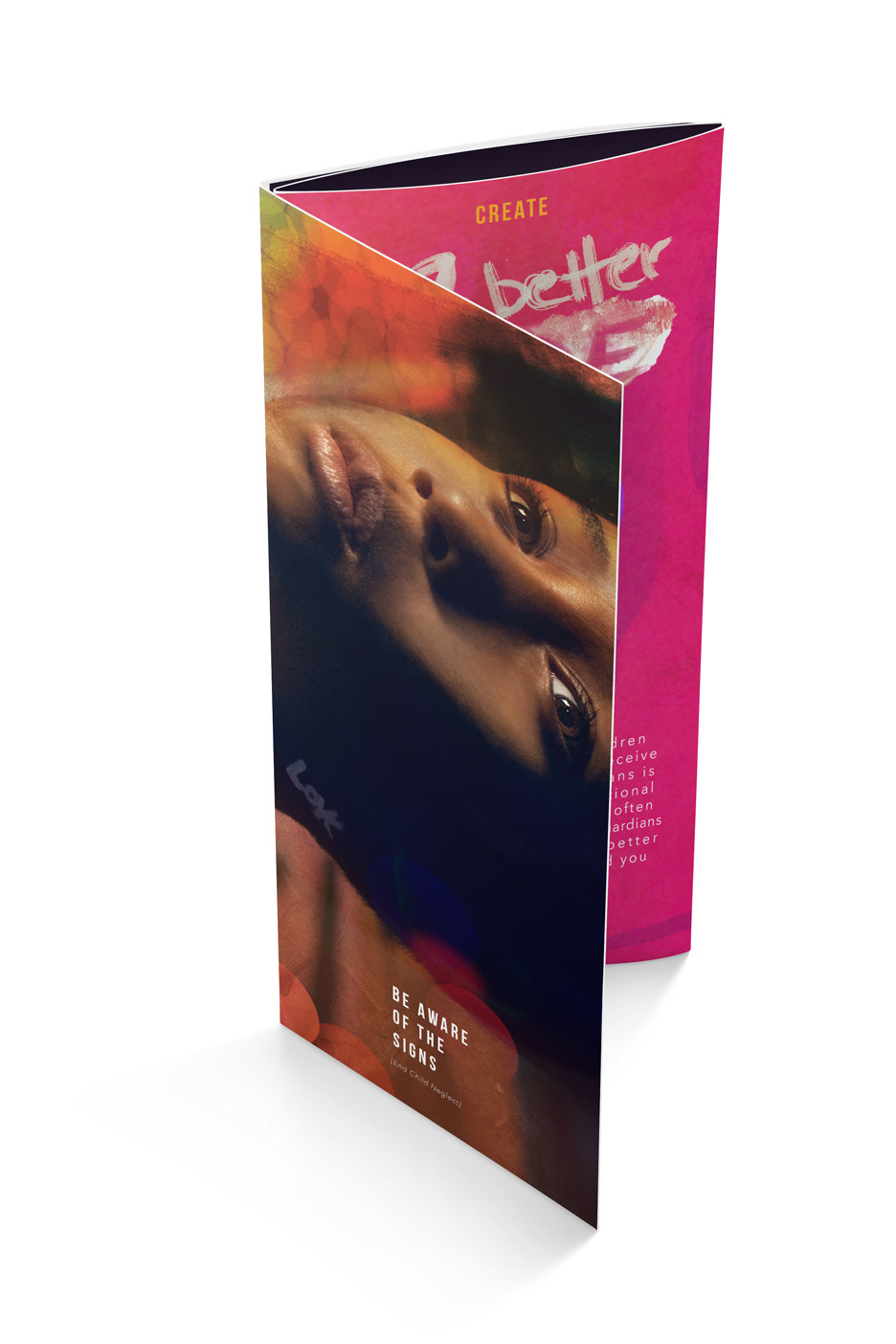
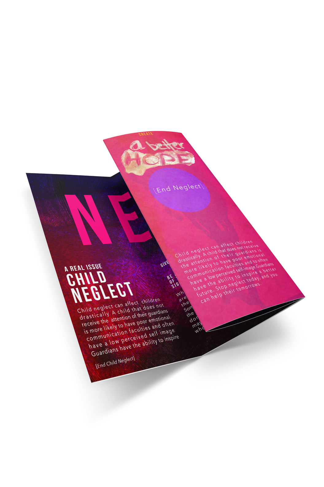
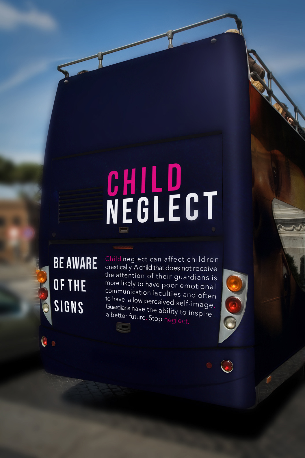
The goal of this assignment was to create materials, which had the capacity to draw the onlooker in. I didn't desire to shock the individual as they were viewing the campaign but rather encourage exploration. The use of somber colors and textures was so that the message could be the center of attention. The simple photography of the child highlights the subject matter of the campaign, and the typography exposes the message more clearly. A large majority of the colors used within this campaign are of the analogous scheme. The harmony between yellows, oranges and reds speaks to the sensitive agile structures found in organic elements. A lot of forms found in nature share an analogous color formation. These elements in nature are often malleable. Children are easily influenced by their environment, which is why the analogous hue are befitting. Since the goal wasn't to cause the viewer tension, I chose to add contrast through including the compliment of the yellows; a nice magenta. The magenta allowed me to highlight certain areas of my composition, and also enabled me to add more vibrance. The color purple typically exemplifies regality. I felt it was an appropriate color to use when talking about children because they are one of the most precious gifts people can receive. So I felt using a color that emphasizes importance are necessary.