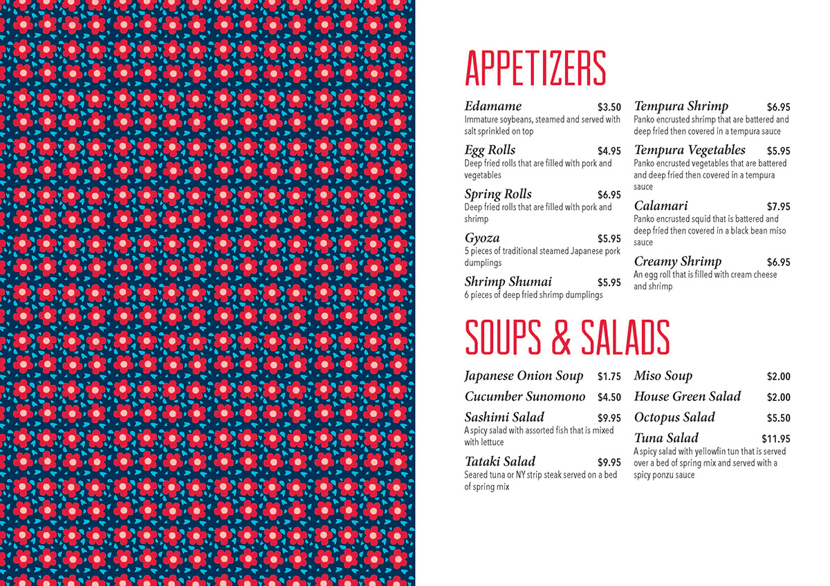
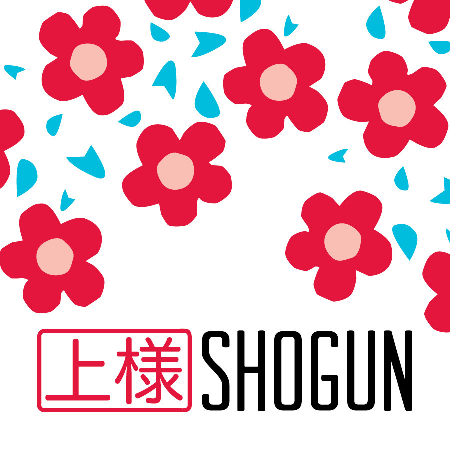
For Graphic Design IV we had to redesign a restaurant's branding. This is Shogun, a Japanese restaurant. The logo is here as well as many of the applications. You will see a blue pattern that I created that is based off of origami and used throughout the branding.

Signage

Menu


Coaster
Chopsticks

To-Go Box Tag (pattern used on back)

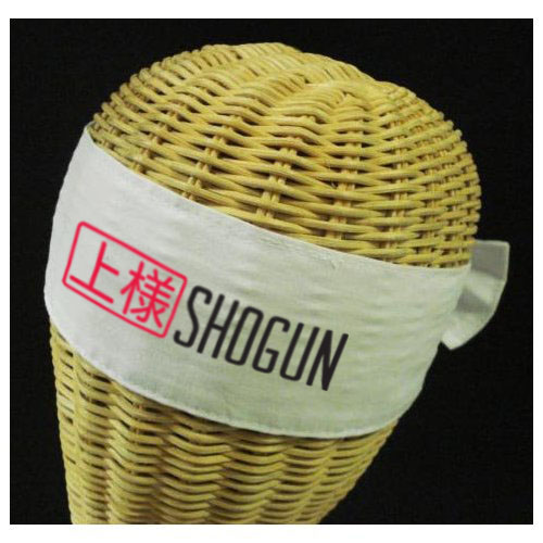
Uniform
Children's Toy: Origami Paper & Instructions


Stationary (pattern used on back of business card and letterhead)