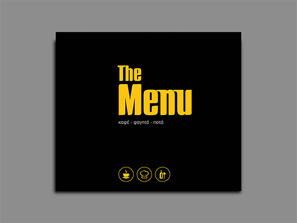
ANOTHER DRINK IN THE WALL
It all started with a 100 year old wall we discovered built in a central Larissa building. Inspired by the legendary “The wall” by the Pink Floyd, the two-tone logo uses font out of Coppola’s Godfather.
One can discern the corporate identity (from which pun and wordplay is not missing) from the external light banners, to the placemats, the menu, the toilet signs, the printing details above the dj, all the way to the chef’s uniform.
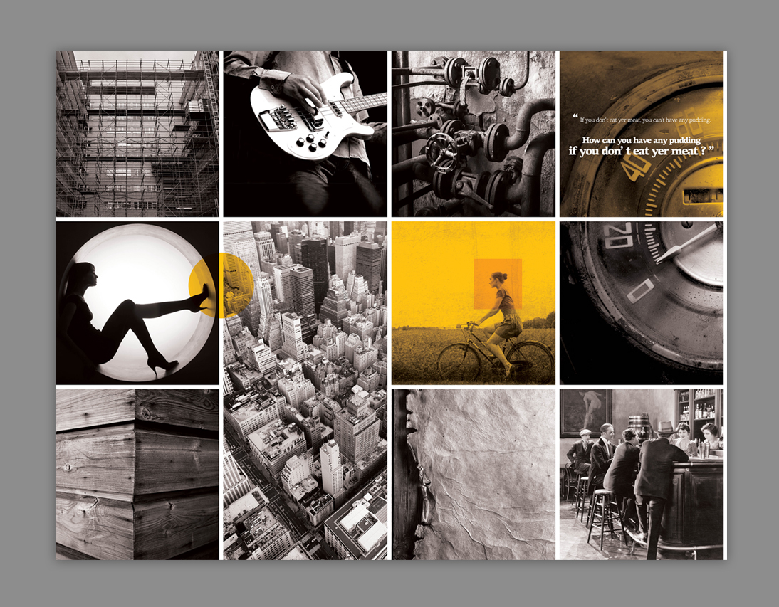
2 large photographic compositions in warm tones of gray and appropriately selected touches of colour for the necessary balance, raster-based and printed on a canvas. My aim was to combine the grey wall surfaces with the unique warm color of choice ( M25 % - Y100 % ) in order to achieve the desired balance in space.
One can discern the corporate identity (from which pun and wordplay is not missing) from the external light banners, to the placemats, the menu, the toilet signs, the printing details above the dj, all the way to the chef’s uniform.
2 large photographic compositions in warm tones of gray and appropriately selected touches of colour for the necessary balance, raster-based and printed on a canvas. My aim was to combine the grey wall surfaces with the unique warm color of choice ( M25 % - Y100 % ) in order to achieve the desired balance in space.