PROJECT DESCRIPTION
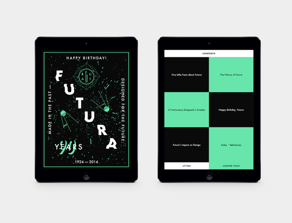
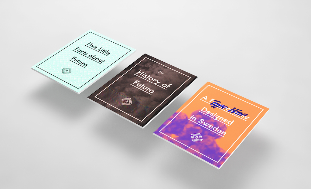
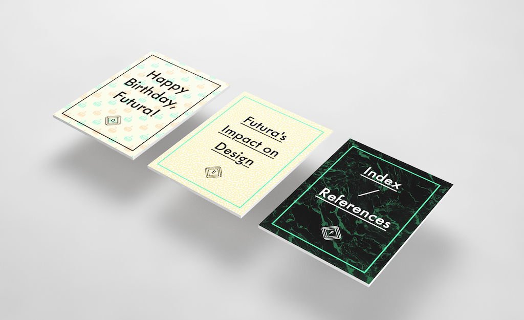
The brief for this project was to create a piece of editorial design for tablet devices that features an important aspect of typography. I chose to make mine about Futura because it is an exceptional typeface. Being one of the first sans-serif typefaces it is – quite remarkably – still used in the world of contemporary graphic design. The fact that the typeface has been around for more than 90 years also means that there are lots of interesting stories to tell.
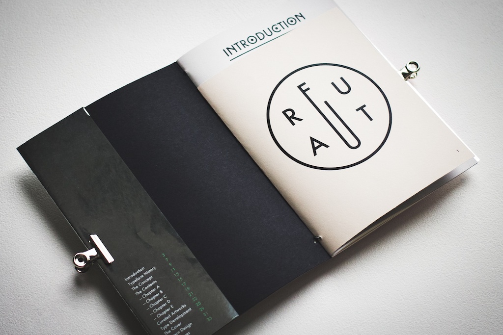
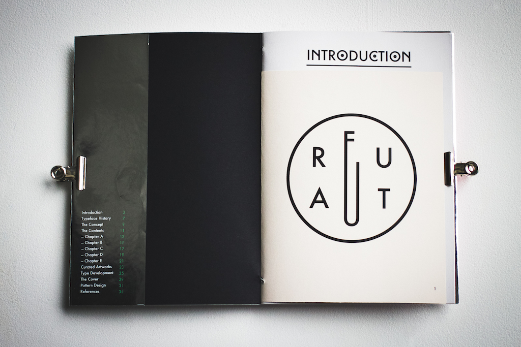
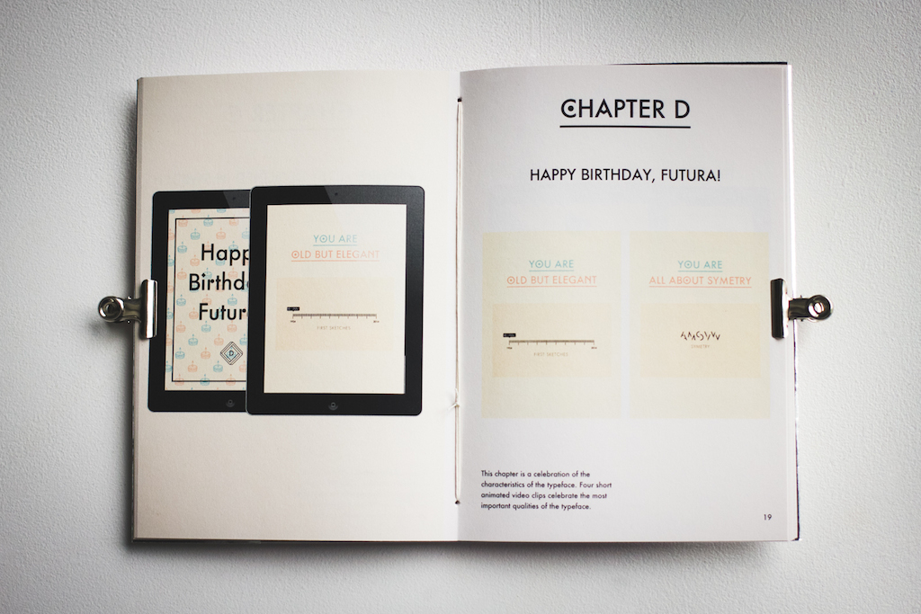
The individual chapters make use of features that would usually not be available in traditional printed publications. Various animations, slideshows and galleries provide a variety of interactions which iPad-publications are best-known for. Furthermore I created a booklet that documents the magazine itself and at the same time provides details about the creation and the contents used for the publication.
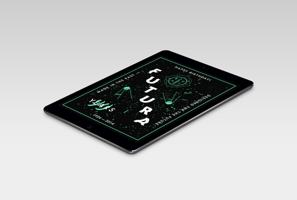
Ironically, Futura is an aged typeface that was now used for a publication for a device that hasn’t even been around for a decade. This shows that Futura truly deserves its name — it really is a typeface made in the past and designed for the future.
———
CREDITS
Designed during my 2-trimester-exchange at Plymouth University for the course “Graphic Communication with Typography” in 2014.
Designed during my 2-trimester-exchange at Plymouth University for the course “Graphic Communication with Typography” in 2014.