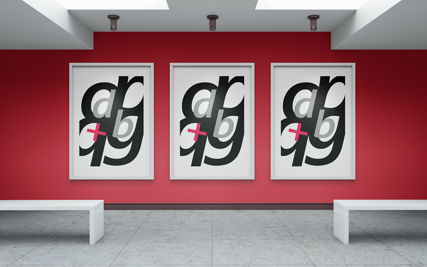
The font selected for this exercise is Segoe UI. Segoe is a typeface, or family of fonts, that is best known for its use by Microsoft. Segoe was designed by Steve Matteson during his employment at Afga Monotype. In 2004, Microsoft registered certain Segoe and Segoe Italic fonts as original font designs. The font has a clean aspect and fairly high X-height which makes the letters very easily recognizable. This was the major reason behind choosing this particular typeface for the exercise.

A variety of explorations was done to achieve a 'flow' based poster using only the form of the typeface and a limited number of colors. The final poster below is a combination of 4 letters and a symbol arranged to create a visually simulating poster.