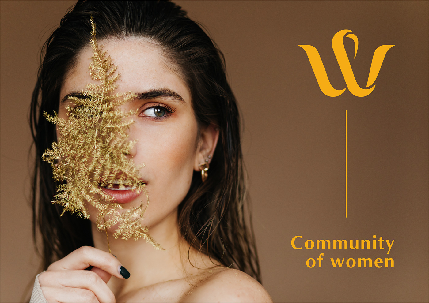
Whealthco is a women's community brought together by the curators of the brand for 5 days in the Dominican Republic for a comprehensive recovery of the whole body using the latest biohacking techniques.
The target audience - wealthy women who take care of themselves, mostly owner
The target audience - wealthy women who take care of themselves, mostly owner
o large businesses.

Symbolic part: created on the basis of a modification of the first letter of the name Whealthco. The W has been redesigned into an elegant, feminine and single line ribbon that curls to form both a letter and an image of a person with their hands up. There is a feeling that a person is supporting something. This is a direct reference to one of the most important symbols of the company - a community of like-minded people.

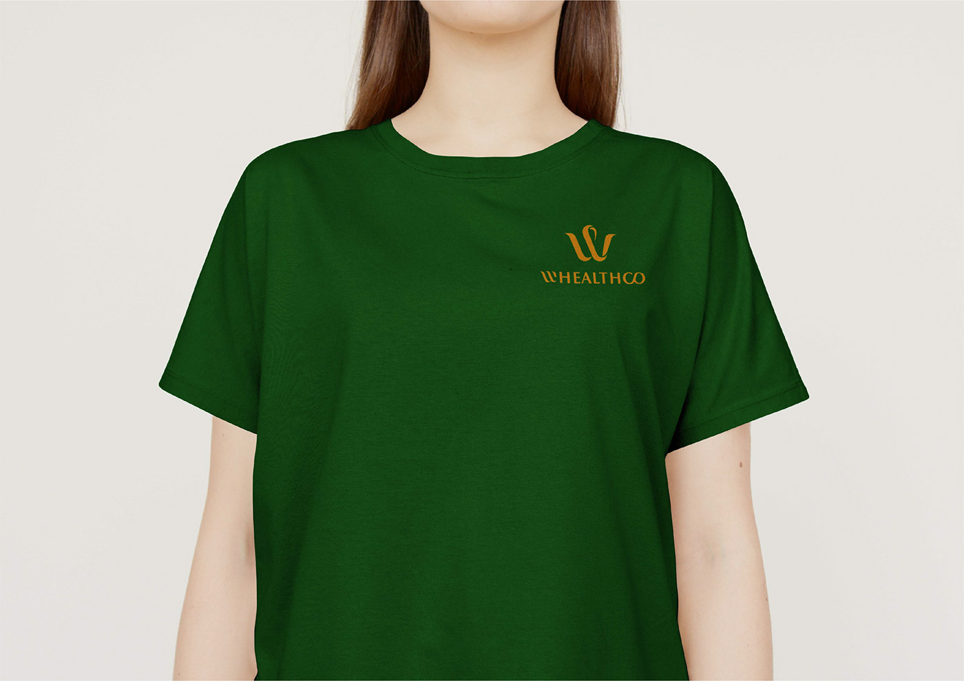
Font part: contains 3 components. W - woman, HEALTH, CO - community. To keep these 3 elements clearly visible and clearly separated, W and CO differ in style from HEALTH.


The pattern was created from an element of the iconic part of the logo.