
01 Branding & identity: Archimedes
Brief
Focused on branding and strategy development, this project aims to create a strong, cohesive, visual identity for a platform or institution. Brand strategies must be developed to guide the design process and the visual identity guide should contain the information needed for any designer that is tasked to work on the brand. For this project, an identity needed to be developed for a fictional brand that focuses on languages, language learning or culture. The brand aim is to share more information about the language or culture of choice.
Project deliverables
01 Visual identity guide
a. Digital presentation/Vertical Narrative
Please view the interactive Visual Identity Guide here: https://www.figma.com/proto/cZpgxyYfcdDxIWuIk0V2BR/4.1-CI-Guide?page-id=0%3A1&node-id=678%3A991&viewport=288%2C71%2C0.05&scaling=min-zoom&starting-point-node-id=678%3A991
Please view the interactive Visual Identity Guide here: https://www.figma.com/proto/cZpgxyYfcdDxIWuIk0V2BR/4.1-CI-Guide?page-id=0%3A1&node-id=678%3A991&viewport=288%2C71%2C0.05&scaling=min-zoom&starting-point-node-id=678%3A991
02 Visual assets
a. Logo system
b. Typography
c. Colour Palette
d. Graphics, imagery, illustration and iconography
03 Design applications
a. Business card
b. Email signature
c. Branded collateral (x2)
d. Merchandise and promotional items (x1+)
e. Signage and wayfinding (x1)
f. Website one-pager (x1)
Design strategy
Language is used to communicate narratives, relay information, and to connect with others. Keeping these core ideas in mind the identity, Archimedes, was developed. Language takes many different forms, but in our present world there is a burst in technology and a lot of people are getting lost in the vast complexity of the language that comes with it. There was a gravity of interest pulling on the edges of programming and mathematics as ‘tech’ languages (technical and or technological languages). These languages are frequently described as difficult, only reserved for nerds and used by scientists. As a way to empower everyday individuals who are exposed to a growing technological and digitally inclined society, Archimedes is created for everyone that does not speak ‘tech’.
This brand identity is inspired by Greek mathematician, physicist, engineer, astronomer, and inventor Archimedes, who is seen as one of the world’s greatest mathematicians. People tend to quickly place a limit on themselves when faced with difficult concepts in mathematics and programming but that can change when these languages are delivered and introduced to people in a different way. The brand strategy and visual identity for Archimedes is created with fun in mind. Keeping adults entertained with learning new things was a challenge enthusiastically faced and so the identity developed to boast bold colours, relatable photography and sometimes tongue in cheek language.
Process work

Creating an identity starts with a unique and memorable face. Developing a bold and versatile logo icon is essential for this brand as it will represent the endless possibilities that understanding tech languages can offer. A signature logo will also guide and inspire the unfolding visual strategy. Here is a snippet of the various logo sketches and iterations that lead to the winner winner, chicken dinner.


Developing a simple yet powerful logotype a core feature to a brand. Here is a snippet of the various iterations of type crafting that typed a way to the brand's heart.


The visual strategy had dug many tunnels before striking gold. Here is a snapshot of the visual directions that didn't make the cut.

A snapshot of logo and visual asset development

Colour for your language
Our colours are bright and lively to catch a user's interest and hold it. Here is the primary hierarchy in which they are used:
1. Dark Violet is the core colour of our brand. This is the hue that is associated with Archimedes as a brand.
2. Sea Green Crayola and Red Crayola are our secondary colours that can be used independently or in combination with the other colours
3. Cultured and Dark Purple are our ‘neutral’ colours that can be used for background and typographic applications


Logo
Archimede’s logo icon is unique and memorable. By displaying the logo icon by itself, it can be useful in third party applications, where the logo icon recognizability would aid in brand awareness.

Logo Signature
The Archimedes logo consists of the logo icon and the logotype in a horizontal lockup. Our typographic element uses customized letterforms inspired by the curves and shapes of our logo icon and crafted through the use of the Sora font (Bold).
The logo can be used in 5 different colors: Sea Green Crayola. Cultured, Dark Purple, Red Crayola, Dark Violet

Portrait Lockup
Our logo icon is recognizable and thus the larger size and prominent placement helps us stand out among other apps and brands. Use this stacked version when supplying logos to third parties, and when the usage is within a square or elongated space.

Logo clear space
In order for our logo icon to catch users’ attention, placing any objects such as visual graphics or text in the clear space shown is not permitted.


Typography

Signature type

Illustrations
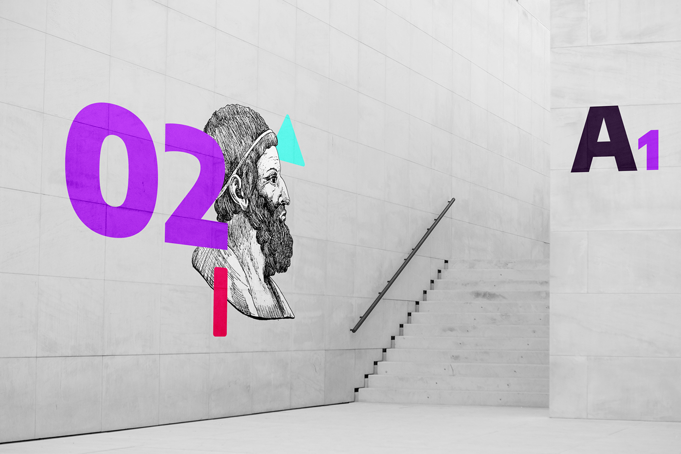
Archimedes takes the traditional and renews it, such as the way technical languages are taught and introduced to people. Our interesting and playful Illustrations combine the traditional style of ink pen on fabriano and the digital vector style of our logo icon to create visually pleasing illustrations.

Photography
Photography plays a role in relative human interaction and we use a collage approach for or photography. Combining illustrative drawings with our photography keeps the playful and intruiging atmosphere alive.

Patterns


Our brand is simplistic but vibrant and eye-catching and so our patterns are as well. The patterning we use is derived from our logo icon through the use of the shapes in combination or as individual shapes.
The shape patterning can be placed on all our colours: Dark Purple, Cultured, Dark Violet, Sea Green Crayola, Red Crayola
The shape patterning can be placed on all our colours: Dark Purple, Cultured, Dark Violet, Sea Green Crayola, Red Crayola


Business Card

Business card: Our employee business card is creative and interactive. The round shape ties in with the rounded nature of the brand visuals and has a logo icon cutout.
E-mail signature


Branded Collateral
Printed Collateral: Poster Design

Social Collateral: Instagram Carousel
To interact with the instagram infographic, please visit this link: https://www.figma.com/proto/s0T6wK74QSQxOJayPX7vgC/Instagram-carousel?page-id=0%3A1&node-id=23%3A1752&viewport=-1875%2C-7937%2C0.51&scaling=scale-down


Merchandise and promotional items
Branded T-shirts


Event lanyards

Entrance signage

Wayfinding
App icon & Favicon


