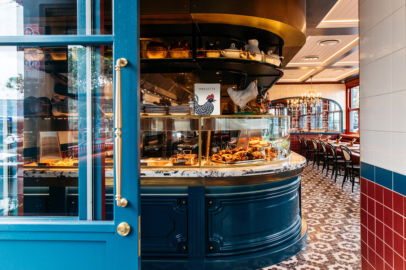
Poulette (pou· lette | (ˈ)pü¦let) means chicken in French and was the perfect choice for a casual take-away and dining restaurant from New South Wales/Australia. The restaurant's branding and color palette were inspired by the aesthetics of old French restaurant signs and facades, while incorporating a modern twist.
The chicken illustration created for the brand can stand alone as a representation of the restaurant's identity, without the need for any accompanying text. The playful nature of the icon is balanced by the use of simple typography, which lends a modern and timeless quality to the logo.
Consistency is achieved throughout the branding and packaging through the use of a rhombus pattern, which is featured on take-away boxes, papers, and sauce label details. This approach ties all of the elements together and reinforces the brand's visual identity.
pouletterotisserie.com // @pouletterotisserie