

P R O J E C T
Coaching – Yoga – Ayurveda
Brand Identity for "Lulu's Yoga" by Louise Paul
Y E A R
2022
Logo Story
The logo represents the three provided services by Louise. It combines elements like leaves for Ayurveda, continuous water drops for coaching and Yin&Yang for yoga. The resulting intertwined circle stands for the sense of community Louise is installing though her sessions and represents the conscious circle of life.


Brand Values
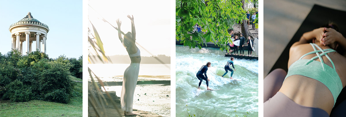
Louise has a deep connection to nature and holds lots of her yoga classes outside in the local parks of Munich. She hopes to help her clients to feel not only physically but also mentally healthy. Therefore she has built a brand that supports her clients on three different topics: coaching, yoga and Ayurveda.
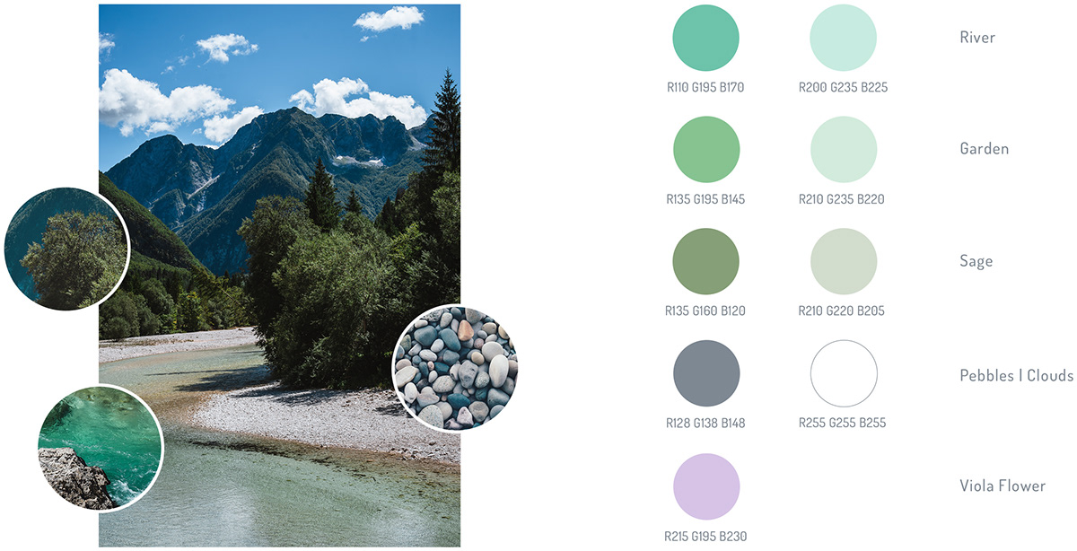
Colour Palette
Built on these brand values, the colours were picked from Mother Nature herself. The primary colour (river) emphasises the refreshment of body and soul.
Typography
The stylistic features of the Dosis font with its rounded letter shapes not only fits well to the round logo but also supports the brand message by picking up the topic of mental and physical balance.

Brand Identity


Designed by Rebecca Luisa Taub
© All Rights Reserved. 2022


