The task in this challenge was to create a redesign for an app of our choice. We should focus on UI aspects and recreate at least 3 screens and incorporate micro interactions to our prototype. This was a solo project that was done in 3 days in the UX/UI Ironhack Bootcamp.
Below you can see side by side the current app and the screens I redesigned, from the screen #1 to screen #4, I will describe and explain my decisions for each screen, taking into account the Heuristic Analysis.
But first, I would like to remark that my decision about the colors could not be limited to conveying the brand’s message and values. They are also great allies of UX Design. This is something I've been learning and practicing in all my projects: UI solutions are also user centered solution. In this sense, a well-defined color scheme helps with the contrast and readability of an interface and stimulate actions intuitively.
With all this in mind, and after performing some contrast and shading tests, I defined the color palette and typography to be used in the redesign.

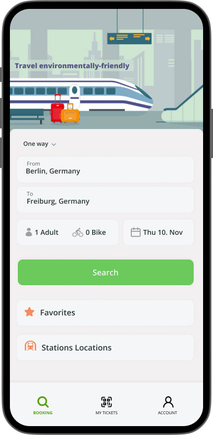
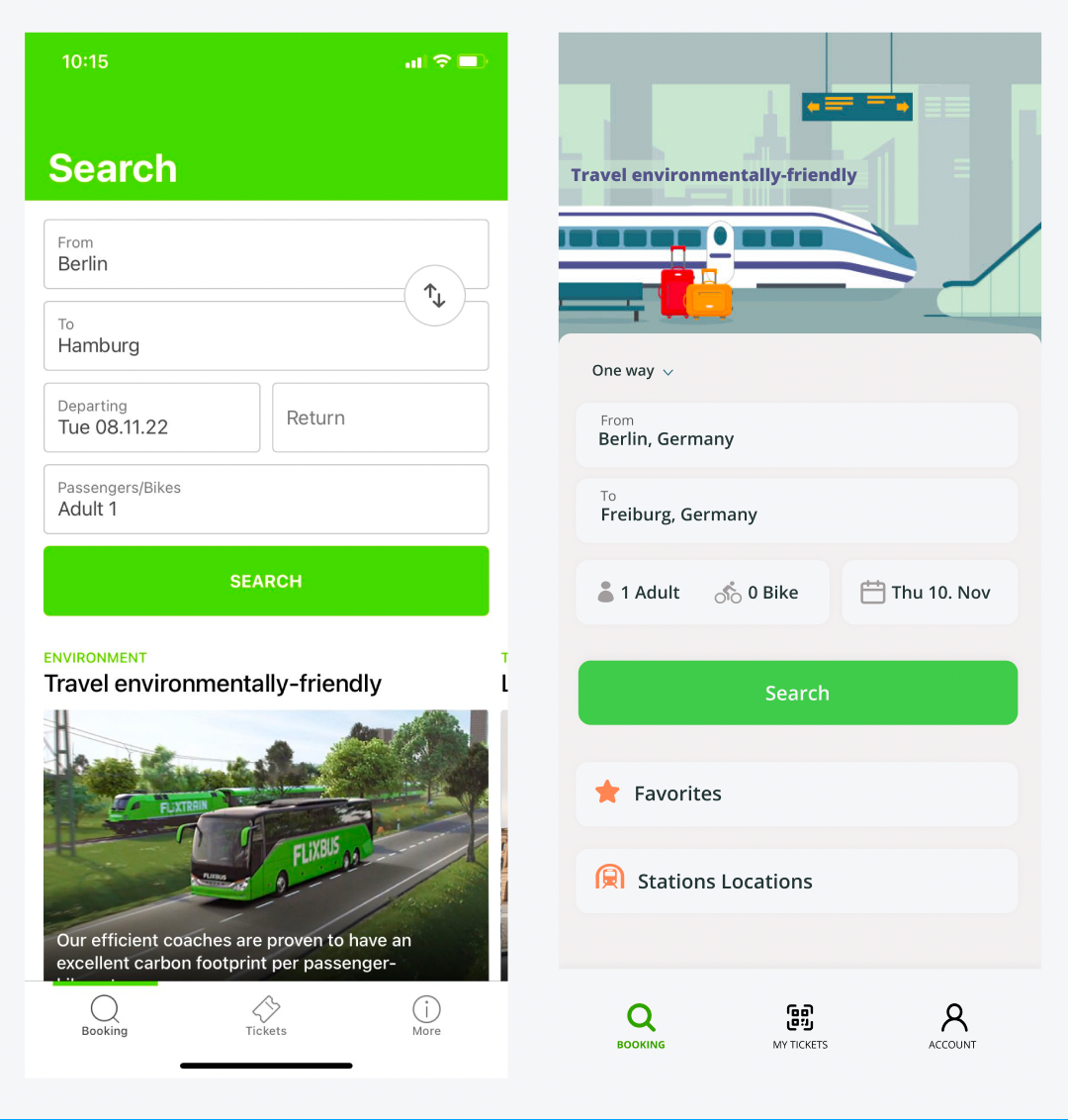
Screen #1: I started by replacing the big bright green on the top with an illustration. The green top is distracting and uncomfortable, and also I realised, from the competitive analysis, that a good practice is to use an illustration related to the theme on top of searching screen. It's much more fun and comfortable in terms of colors. The pictures of buses with sustainability related sentences in a scroll bar is unnecessary. I incorporated the sustainability message to the illustration and removed the pictures from that screen.
Instead of having a blank space for adding a return date that might be not used, I incorporated the one way/round trip choice as the first step to be filled up on the search. I also considered important to have a designated space for selecting a bike and for accessing favorites in case the user is a recurring passenger. In my redesign, the search button change the color while pressed — it helps with the visibility of system status.
I also did some changes on the navigation bar: 1- in my version the icons referring the current screen is highlighted with a different color (green); 2- the tickets icon was replaced by a QR code so that it's clear that it's possible to use the digital version and not only a printed one; 3- the icon "more" is uninformative, so I decided to create an icon for the information related to account settings and I created a direct access on the main screen for the "station locations" — since this information is relevant to be easily accessible.
Screen #2 Here is used the transition animation that already helps to visualise the system status transition to practice my new animations skills. It's a good point of the current design that they have this animation between the search and options screen. But the current animation is excessive and distracting.
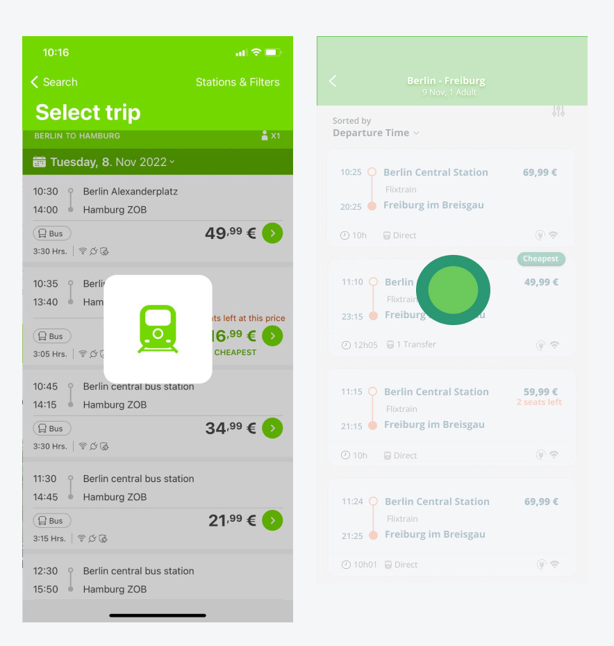
Screen #3 This one was the most challenging and rewarding screen to redesign. I started by putting all the informations about the selection on the top center. The top green become cleaner and pleasant. I also changed the information "filter" to an icon and added the information "sorted by", so that the use know under what criteria he options will be displayed.
The current app present the options in a way that can be confusing in terms of hierarchy: there's a line on the middle of the card and the price is bellow in a huge font compared to other informations. I changed the hierarchy of the information such as the price size, destination and origin size and created a a much smaller dividing line for further information (travel duration and number of transfers).
I also created bigger cards with rounded corners, with very subtil shadows, because that makes the visual information lighter. I considered the green button go forward distracting and unnecessary. It is common practice to click on the card to select an option. And last but not least, I replaced fastest and cheapest information on the top right of cards, using a rounded dark green label with shadows, that makes that options much easier to identify.

Screen #4 On the payment screen I started by redesigning the text boxes for entering passenger detail to keep them all the same size — all of them have the same importance and creating a different hierarchy here can confuse the user. At this point I added the option to create an account (disclosure button), if the user want to save the information for next bookings. This is not mandatory or required when the user opens the app. That's why I decided to include this option only on the last screen.
Moving forward, I identified again some information hierarchy issues on this screen. The most relevant one was the summary of the selection displayed below the payment, when the payment is normally the very last step. In my solution, this information with the details about the selection can be easily accessed by clicking a disclosure button that also have a QR code icon. I also decided to put all the extras that can be added to the purchase in a disclosure button, so that the user doesn't need to keep scrolling to see informations that might be not relevant to them.In the Heuristic Analysis I considered important to have the steps of the process indicated by numbers. But again the size and the bright green is distracting. I decided to keep the title of the steps, but to remove the distracting green square, since I considerably reduced the scroll on this screen. On the redesign the users will need to scroll less if they decide to go direct to payment and then the purchase could be completed smoother and quicker

Click below if you would like to access the prototype for this project! :)
