WILLFU CO., LTD.
Branding, Art Direction, Graphic Design
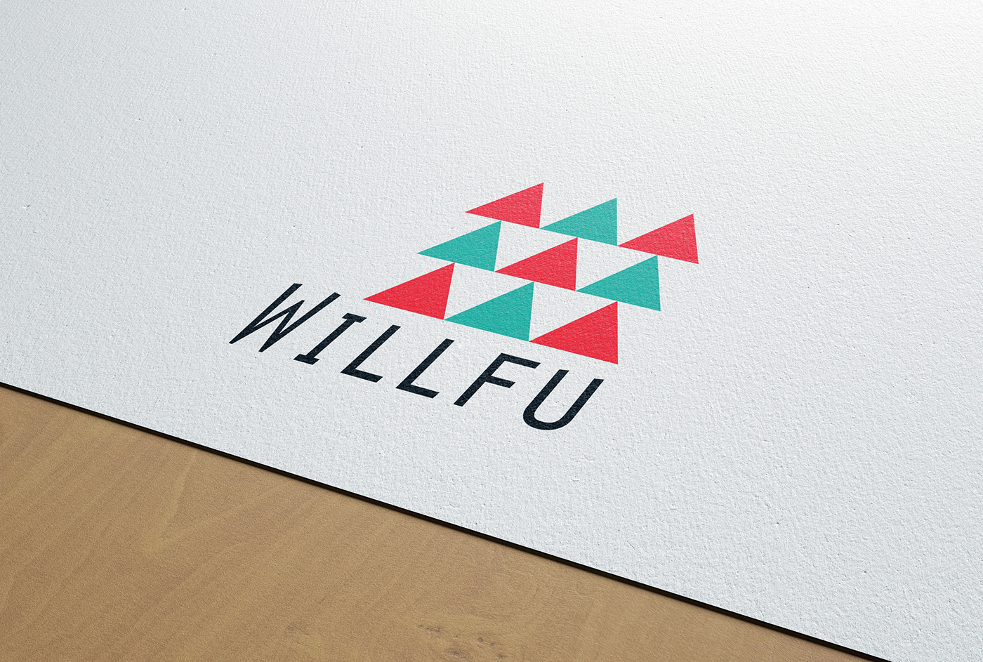
WILLFU is the business school for the university student who have the "WILL" to be an entrepreneur.
WILLFU believes that if their "WILL" get together, there will be bigger "WILL", and the bigger "WILL" create our "FUture".
"WILLFU" means "WILL create our FUture".
The triangles in logo means one's "WILL". If three triangles line up, you can see W among the three.(▲▲▲) The W means "bigger WILL".
The color of triangles means diversity. Red means energetic "WILL" and green means down to earth "WILL".
Awards
2014 4th Hiiibrand International Awards 2013 [Nomination]
2016 Flexibility - International Brand Design Awards 2015 [Excellence Award]