


Logo design | Brand identity | Packaging
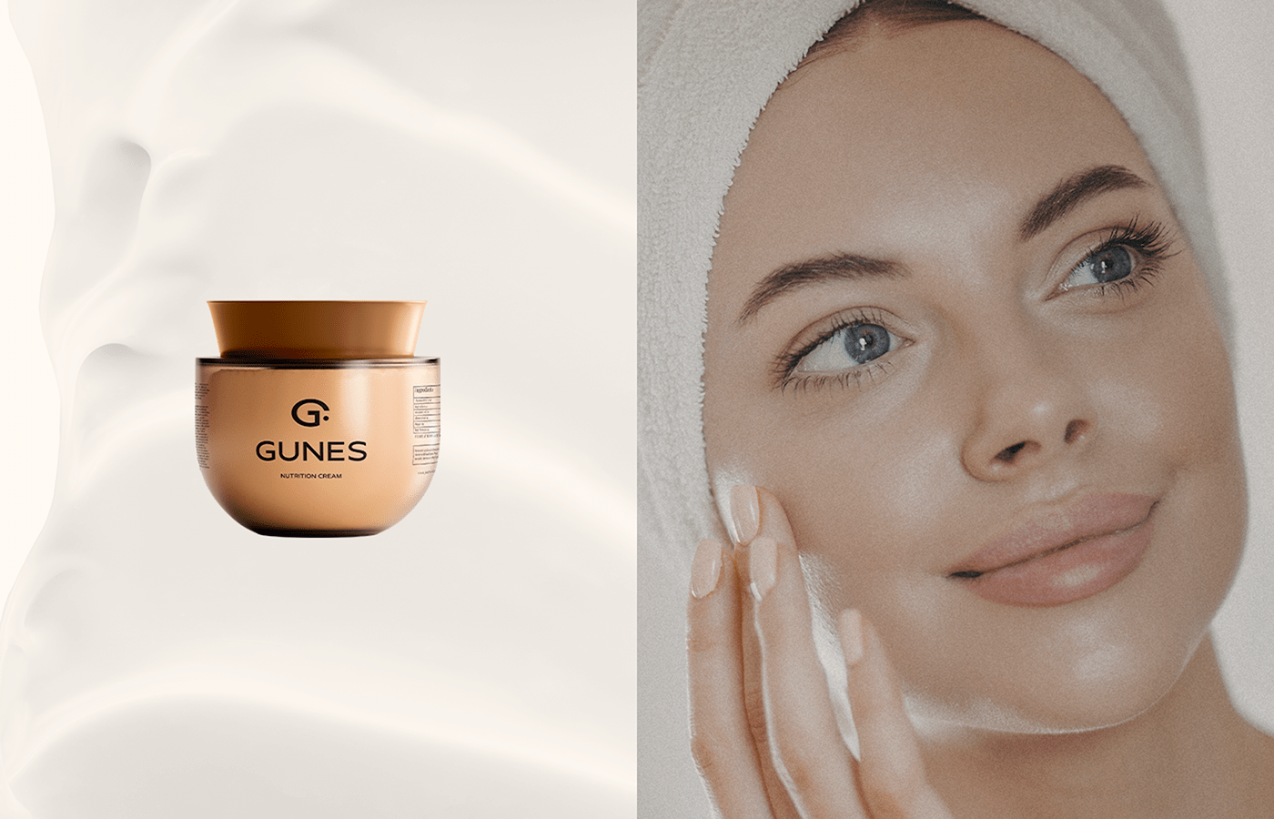
GUNES
GUNES effective nutrition cream for your face skin. GUNES was founded on the philosophy that your skin always must shine like sun, always must be bright and light.
GUNES means Sunshine in Turkish.
When I created the sign, I used an ellipse as the symbol for the sun, which comes from the letter G.
Logo GUNES is easy to read and approachable. Defined clear space help to make it as instantly recognizable as possible.
The resulting brand identity is clean, warm, sun, with the "Face skin" element conveyed through the use of women faces.


Thank you for watching!
You can contact me for branding, identity and logo design.
Work in a short time with a clear deadline and a bright result!
Work in a short time with a clear deadline and a bright result!
Designer: Tatiana Gorbenko


