


Una nuova identità visiva per promuovere il metodo scientifico
A new visual identity to promote the scientific method
Progettazione di una nuova brand identity per il CICAP, il Comitato Italiano per il Controllo delle Affermazioni sulle Pseudoscienze fondato nel 1989 da Piero Angela e un gruppo di scienziati italiani. La nuova identità visiva, progettata dagli studenti del corso di Graphic Design IED Milano, è studiata per veicolare al meglio le attività e i valori dell’associazione, rafforzando il suo attuale ruolo di voce rispettata e autorevole nel dibattito su pseudoscienze e disinformazione in Italia.
A new brand identity design for CICAP, the Italian Committee for the Control of Claims on Pseudosciences founded in 1989 by Piero Angela and a group of Italian scientists. The new visual identity, designed by the students of the IED Milano Graphic Design course, is designed to best convey the activities and values of the association, reinforcing its current role as a respected and authoritative voice in the debate on pseudoscience and disinformation in Italy.


Il progetto prevede l’evoluzione grafica dello storico marchio del CICAP, al fine di creare un nuovo linguaggio, semplice ma iconico, che incrementi fluidità e immediatezza comunicativa. I quadrati diventano cubi/frecce che puntano in direzioni differenti, per simboleggiare il dinamismo e la voglia di ogni socio del Comitato di approfondire i fatti con gli strumenti della scienza e a 360 gradi.
The project involves the graphic evolution of the historic CICAP brand, in order to create a new language, simple but iconic, which increases communicative fluidity and immediacy. The squares become cubes/arrows pointing in different directions, to symbolize the dynamism and the desire of each member of the Committee to investigate the facts with the tools of science and with an all-round view.


Dai colori ufficiali a un vessillo per per il pensiero razionale
From official colors to a flag for rational thinking
Il progetto di brand ha visto un'evoluzione dello storico colore blu del CICAP in una palette multi-cromatica dal forte significato iconografico, sociale e etico denominata THINK DEEP.
The brand project has seen an evolution of the historic blue color of CICAP into a multi-chromatic palette with a strong iconographic, social and ethical meaning called THINK DEEP.
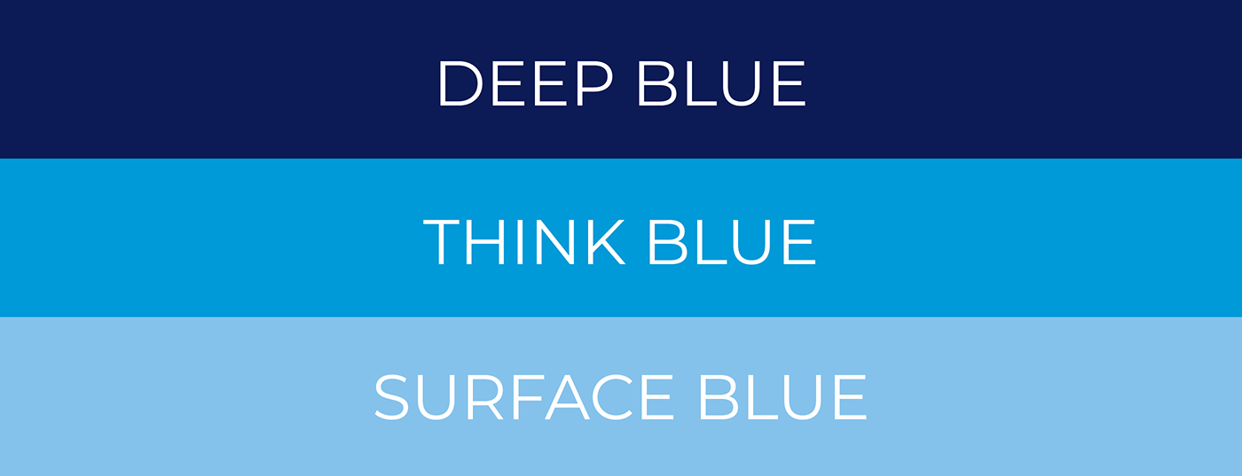
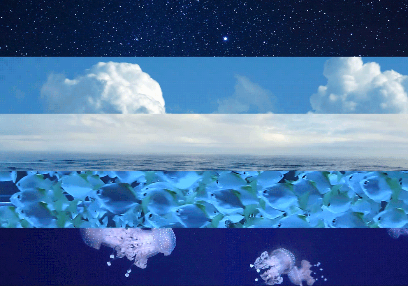
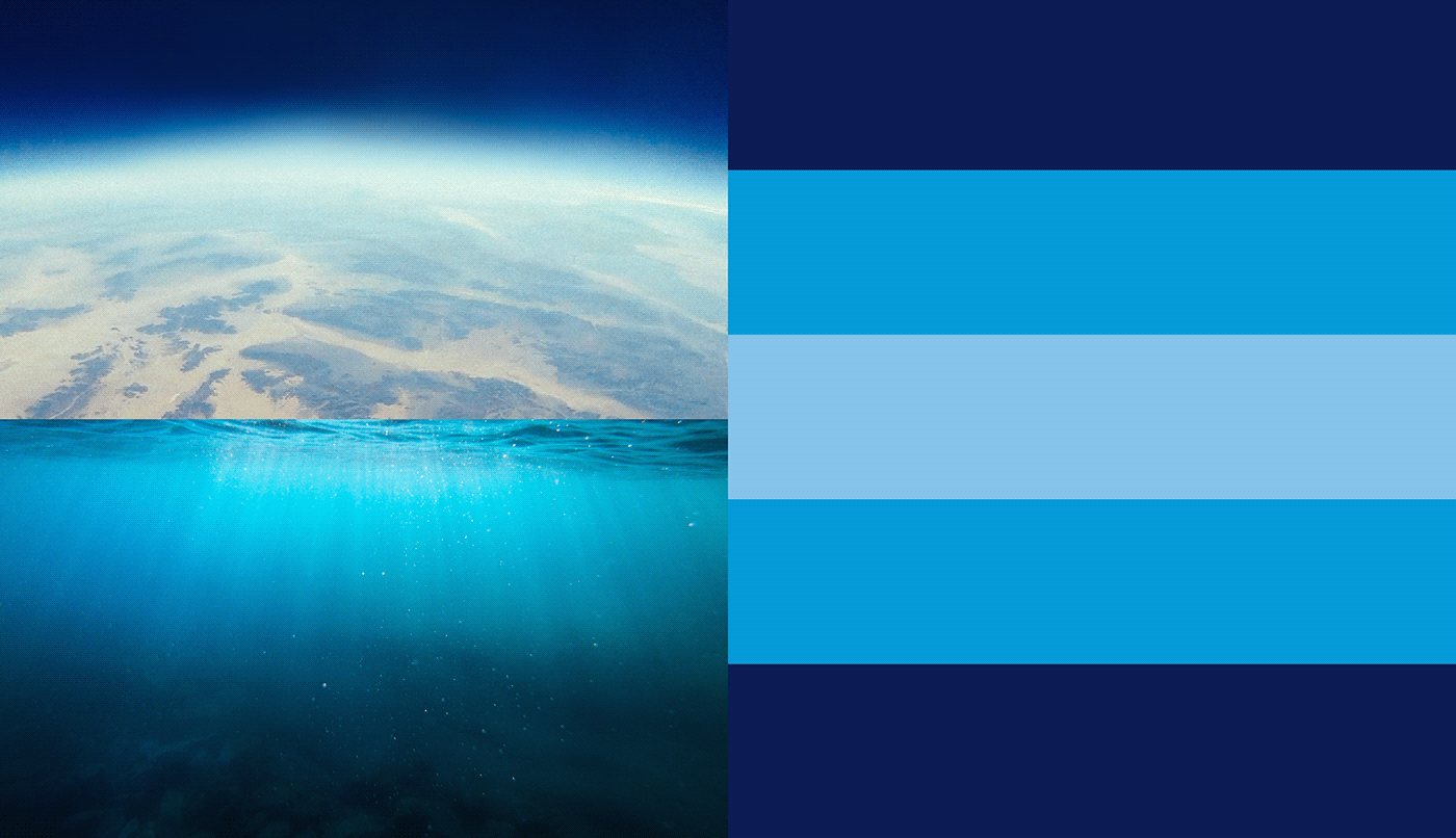
I blu del CICAP acquisiscono un significato che rappresenta il passaggio dalla superficialità alla profondità con le tinte SURFACE BLUE, THINK BLUE, e DEEP BLUE. Una sequenza cromatica che parte dall’azzurro delle superfici, come mare o cielo, e si dipana in altro e in basso verso tonalità più scure, che rappresenta il bisogno di andare a fondo ed esplorare luoghi oscuri che ci spaventano come l’universo o gli abissi. Così come accade per il pensiero critico e scientifico, non ci si può accontentare di ciò che c’è in superficie: occorre indagare in differenti direzioni per comprendere il mondo.
The CICAP blues acquire a meaning that represents the transition from superficiality to depth with the SURFACE BLUE, THINK BLUE, and DEEP BLUE shades. A chromatic sequence that starts from the blue of the surfaces, such as the sea or the sky, and unfolds upwards and downwards towards darker shades, which represents the need to go deeper and explore dark places that scare us like the universe or the abyss. As with critical and scientific thinking, we cannot be satisfied with what is on the surface: we need to ignvestiate in different directions to understand the world.


THINK DEEP non è solo una palette cromatica dedicata alla comunicazione del brand CICAP, ma è stata trasformata in una bandiera, un simbolo per tutti coloro che vorranno dire al mondo di supportare, in qualsiasi ambito, il metodo scientifico e il pensiero razionale.
Come bandiera, la THINK DEEP, potrà essere utilizzata sia nella sua pura essenza cromatica sia apponendo su di essa simboli o frasi specifiche, atte a facilitare l’identificazione della comunità scientifica globale.
La nuova identità di brand del CICAP gravita quindi intorno a due elementi distinti e unici: il nuovo marchio, dalla forma altamente iconica, e la presenza della palette cromatica THINK DEEP. Tutto ciò agevolerà la concretezza dell’identità CICAP su ogni genere di utilizzo o materiale che nel tempo il Comitato deciderà di produrre.
THINK DEEP is not merely a color palette devoted to the communication of the CICAP brand, but it has been transformed into a flag, a symbol for all those who want to tell the world that they support the scientific method and rational thinking in any field.
As a flag, THINK DEEP can be used both in its pure chromatic essence and by placing specific symbols or phrases on it, to facilitate the identification of the global scientific community.
The new CICAP brand identity therefore gravitates around two distinct and unique elements: the new logo, with a highly iconic shape, and the presence of the THINK DEEP color palette. All this will facilitate the practical use of the CICAP identity on any kind of material that the Committee will decide to produce over time.


Pur rispettando la storia del CICAP, agganciandosi alla precedente identità visiva, il progetto ha regolato e normato ogni elemento grafico per assicurare coerenza e riconoscibilità immediata. Il nuovo marchio dà vita a un sistema flessibile e scalabile con il quale è possibile progettare icone, layout e sotto-marchi dedicati a gruppi regionali o aree tematiche come il CICAP-FEST, RADIO CICAP e qualsiasi altra attività nascerà in futuro tra le fila del Comitato.
While respecting the history of CICAP through a link to the previous visual identity, the project has regulated and standardized each graphic element to ensure consistency and immediate recognition. The new logo gives life to a flexible and scalable system with which it is possible to design icons, layouts and sub-brands dedicated to regional groups or thematic areas such as the CICAP-FEST, RADIO CICAP and any other activity that the committee will undertake in the future.


UN "PROFONDO" GRAZIE A TUTTI
A "DEEP" THANK YOU TO ALL
Art direction
BOB Liuzzo
Design team
Gaia De Tata
Lucrezia Mattioli
Alessia Panzeri
Paola Pinto
Davide Tartari
Giulia Gravina
CICAP team
Rodolfo Rolando
Kevin Zanni


