
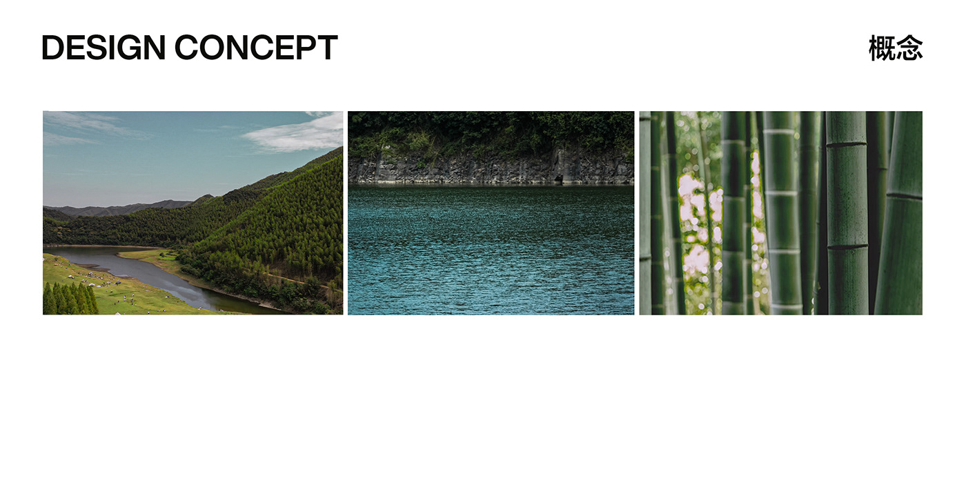
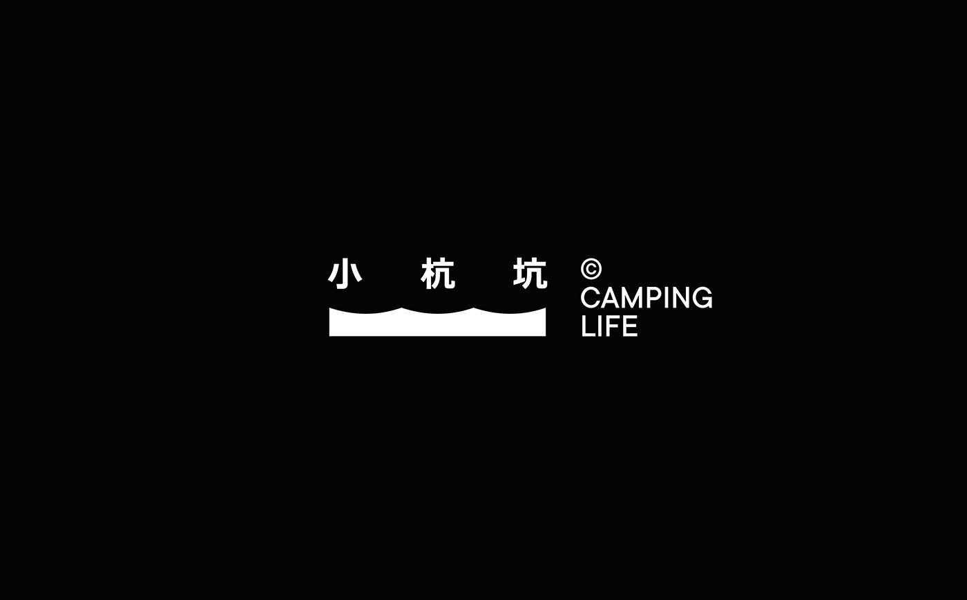
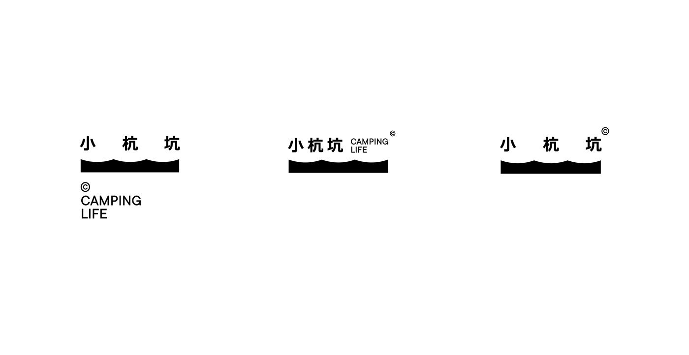
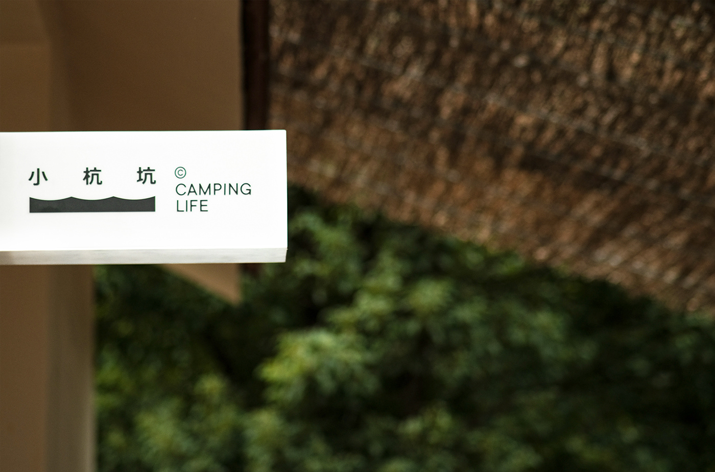
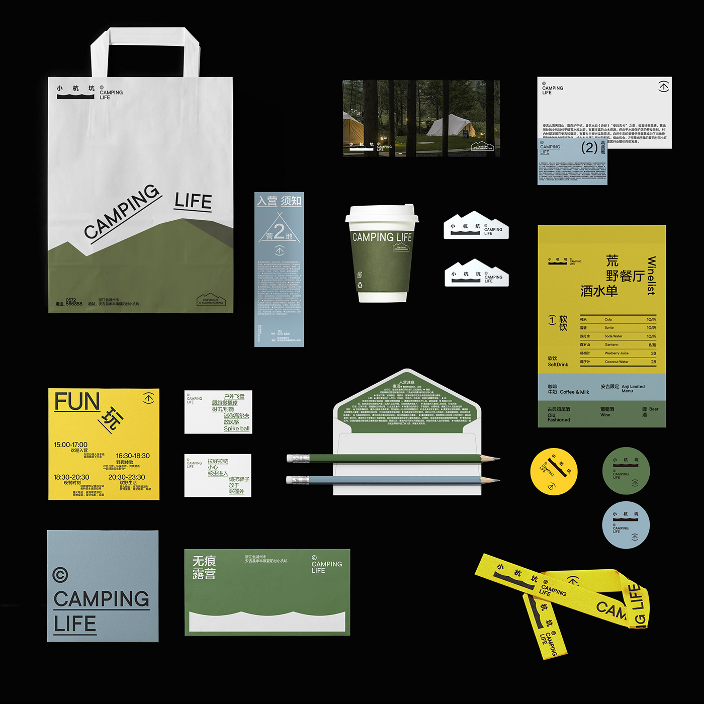
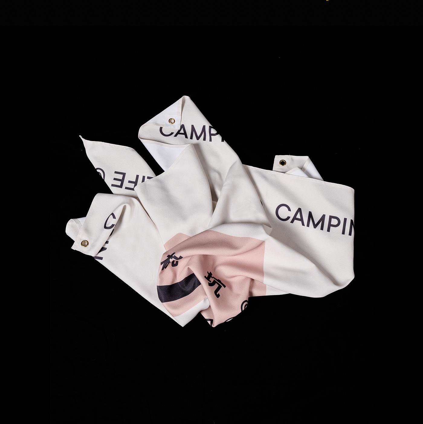
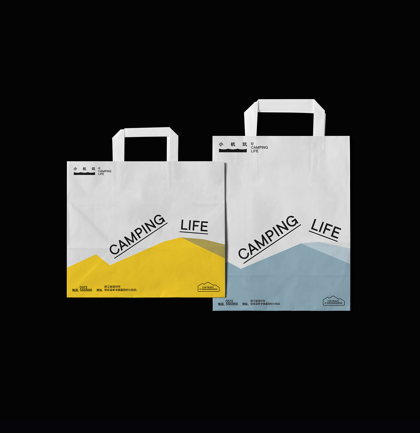
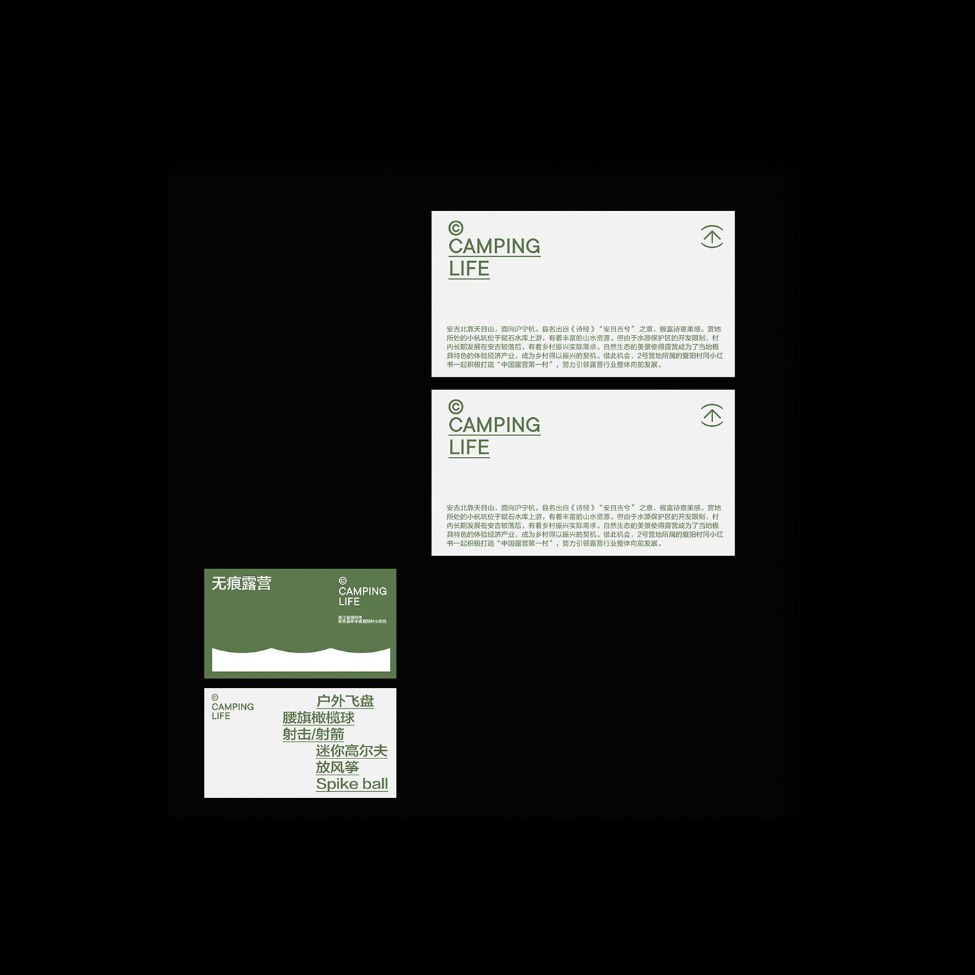
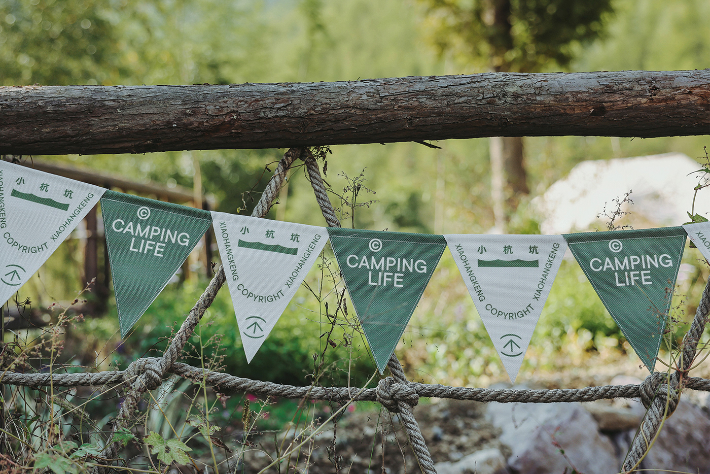
小杭坑是小红书打造的首个以公益方式助推乡村振兴的露营地项目,位于绿水青山的浙江安吉,安吉也是中国四大竹海之一。 品牌中围绕着“自然、质感”展开,标识主体源自营地环境中代表性的“山、水、竹”元素,我们将三者以抽象的手法融合其中,造型似山似水似竹,动中有静,静中有动,传递一种自然生活的意象。同时提取了营地山峦起伏的自然形态,应用于品牌的视觉系统中,将自然的意象视觉化,表达对自然的向往。
Xiaohangkeng is the first nonprofit campsite project created by Xiaohongshu to promote rural revitalization. Xiaohangkeng locates in Anji, Zhejiang, which has one of the four bamboo seas in China. The core of the brand is 'nature' and 'texture'. The body of the logo is derived from the mountain, water, and bamboo, which are representative elements of the campsite. In order to combine dynamic with static and to convey the image of living in nature, we integrate the three in an abstract way so that the logo looks like a mountain, water, and bamboo at the same time. Meanwhile, the natural form of the undulating hills in Anji is extracted and applied to the VI system of the brand, visualizing the image of nature and reflecting the yearning for it.







Credits 制作人员
Art Director 美术指导:Dora、哈特
Graphic Design 平面设计:厨子
Photography 摄影:卡尔(REDstudio)、 黄冕、王妍 特别感谢:达达、和叶

