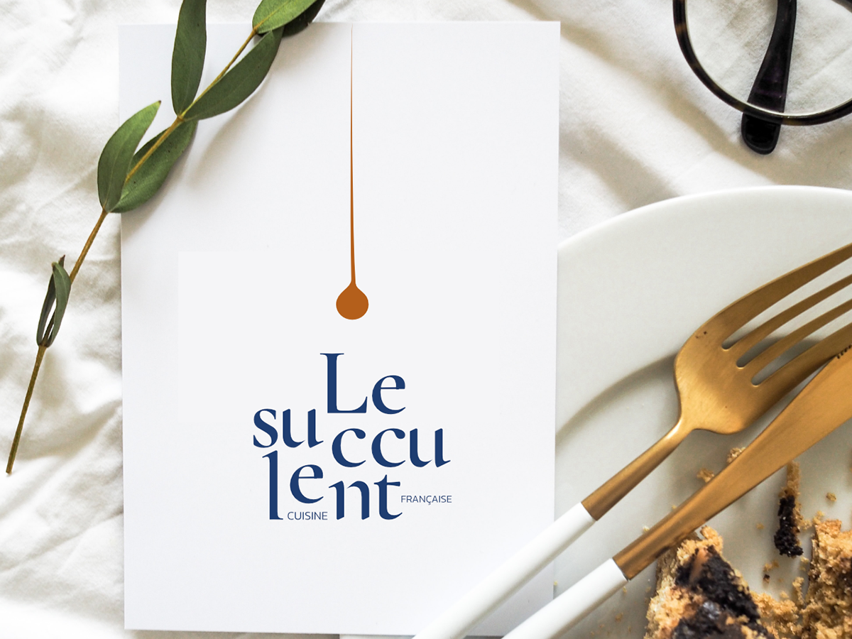
Le succulent is a French restaurant based in the UK*. They offer gourmet and exquisite french dishes with ingredients from local farmers and recipes designed by a Michelin starred chef. This restaurant was designed for curious and gourmet taste buds in search of a fine cuisine experience.
This brand identity was meant to embody fine cuisine as well as generous servings. The serif font Cormorant was perfect for this project: round shapes to convey the generosity and custom pointy ends representing the French fine cuisine. The logo was meant to transmit a high-end ambiance, while still being audacious. As for the color choice, it represents the gourmet restaurant universe: timeless expertise, fine dishes with delicious sauce served in fine china.
*Please note that this is a passion project with a brief that I created to experiment and have fun with design.