
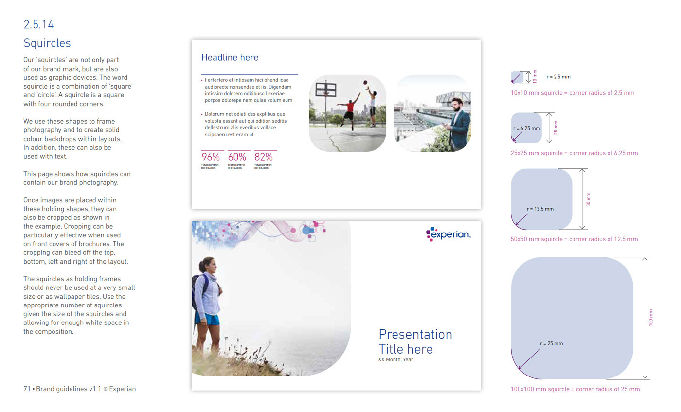
Squircle: Experian's internal agency
When Experian launched its own internal creative solutions agency I was asked to develop a logo for it. The internal agency would develop meaningful customized marketing assets for use with the white label version of the product. These are intended to engage end users of the product through their corporate clients such as banks.
The various names were narrowed down to three:
1. Walter
2. Studio 475
3: Squircle

I felt that whatever I developed should tie into the existing Experian logo.


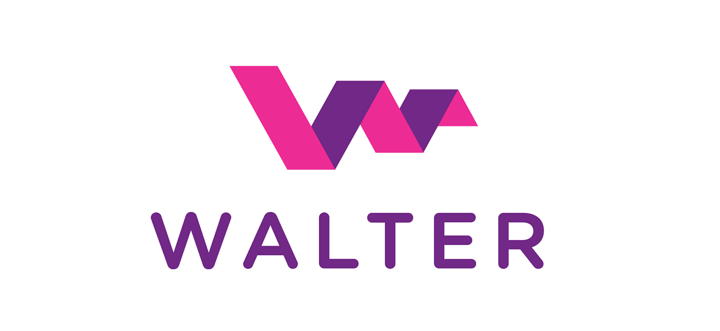
Concept 1: Walter
The name 'Walter' was chosen to seem more personable such as 'just let Walter do it for you'. I looked at cool logos for inspiration before sketching.


Concept 2: Studio 475
The name Studio 475 is based off their office address. As before, I looked at interesting logos with numbers for inspiration before sketching.


Concept 3: Squircle (Chosen)
The name 'squircle' comes from the shape's name (part square part circle) and is a fundamental part of the Experian brand language. Of the many name options presented this one and the concept of using the Q made from squircles was seen as clearly on brand. In all other aspects the identity mirrors assumptions made for the main experian logo such as the lower case font throughout and coloring.


...and this logo also won an international design award.


