


ESP-
Neonspace – Brief corto de la marca
Acerca de:
Neonspace es un estudio creativo dedicado a proveer a clientes identidades empresariales memorables además de campañas publicitarias que vayan mas allá de lo común, creando proyectos únicos con personalidad y llamativos mas allá de un simple icono.
El problema:
La marca necesitaba algo que la hiciera resaltar y ser lo suficientemente llamativa como para captar la atención de la clientela a primera vista, que además de ser fácil de recordar sea versátil para poder ser usada en medios publicitarios y en papeleria de manera atractiva y al mismo tiempo efectiva.
La solución:
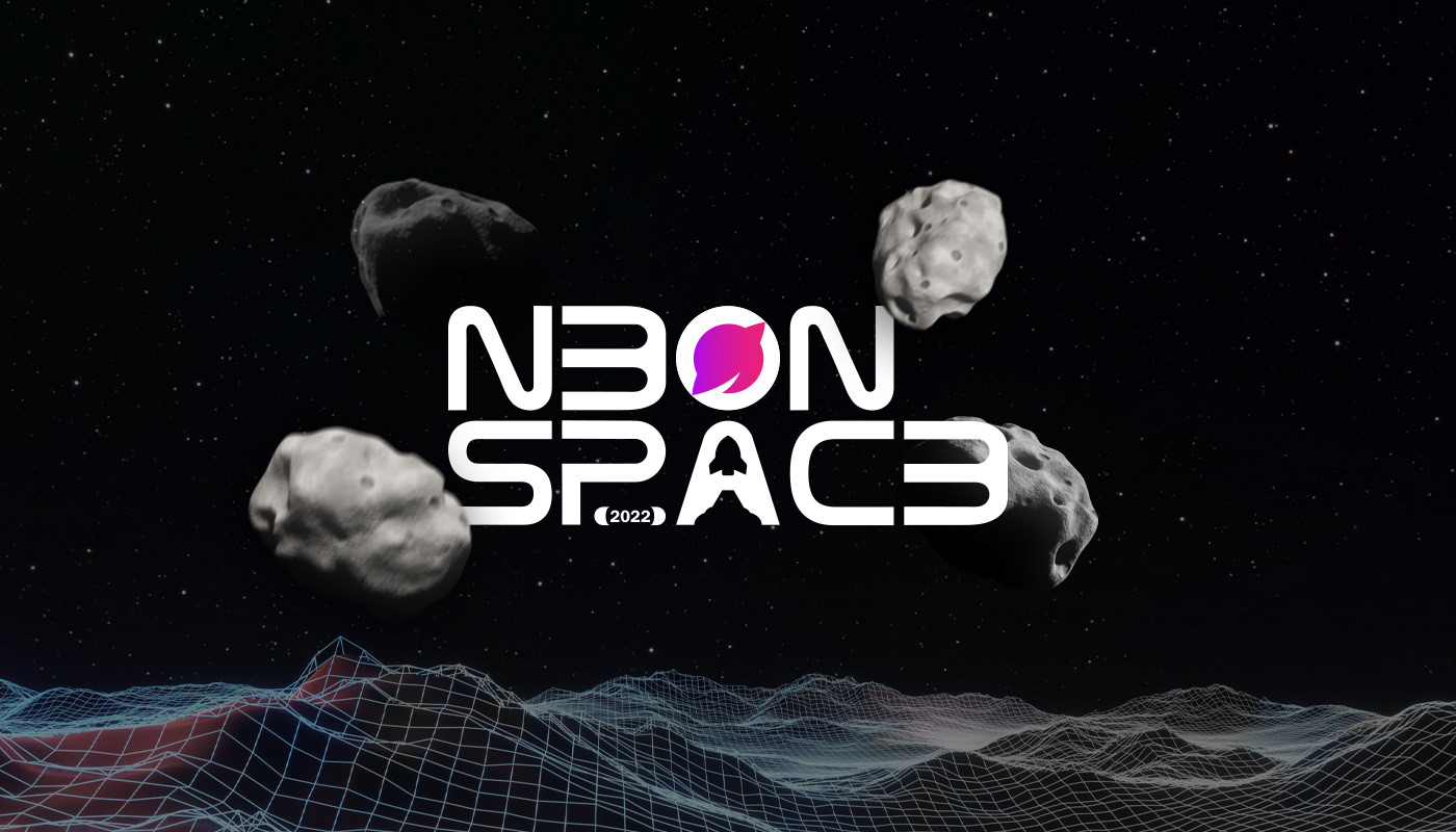
Basada en el espacio, se creo una marca con colores muy llamativos y ostentosos, y un diseño muy memorable creando en el mismo imagotipo referencias de viajes al espacio y de planetas de neón lo cual se volvió el icono por separado del nombre de la marca, un icono que además de ser muy llamativo tiene el equilibrio perfecto entre espacios vacíos y puntos de atención interesantes.
Eng-
Neonspace – Short brief of the brand
About:
Neonspace is a creative studio dedicated to provide clients with memorable business identities as well as advertising campaigns that go beyond the ordinary, crrafting unique projects with personality and eye-catching, beyond a simple icon.
Neonspace is a creative studio dedicated to provide clients with memorable business identities as well as advertising campaigns that go beyond the ordinary, crrafting unique projects with personality and eye-catching, beyond a simple icon.
The problem:
The brand needed something that would make it stand out and be striking enough to capture the attention of customers at first sight, that in addition to being easy to remember, be versatile to be used in advertising media and stationery in an attractive way and at the same time effective.
The brand needed something that would make it stand out and be striking enough to capture the attention of customers at first sight, that in addition to being easy to remember, be versatile to be used in advertising media and stationery in an attractive way and at the same time effective.
The solution:
Based on space, the brand was created with very striking and ostentatious colors a very memorable design, creating references to space travel and neon planets in the same imagotype, which became the icon separately from the brand name, an icon that in addition to being very striking, has the perfect balance between empty spaces and interesting points of attention.
Based on space, the brand was created with very striking and ostentatious colors a very memorable design, creating references to space travel and neon planets in the same imagotype, which became the icon separately from the brand name, an icon that in addition to being very striking, has the perfect balance between empty spaces and interesting points of attention.


ESP-
Color y tipografía:
Los colores de la marca asemejan mucho a la referencia popular que tenemos del espacio, juntos crean degradados sumamente llamativos para el entorno publicitario además de cumplir con uno de los objetivos del briefing que era crear esa percepción de neon a primera vista.
Las tipografías elegidas para este proyecto fueron excon como fuente principal y ranade como secundaria, excon funciona muy bien como fuente de cabeceras y títulos en sus versiones media y bold, en cambio la fuente ranade se usa mas que nada como acompañante al ser una fuente sin serifa al igual que la principal y ser las 2 tipografías geométricas se complementan muy bien una con la otra.
ENG-
Color and typography:
The colors of the brand are very similar to the popular reference that we have of the space, together they create extremely striking gradients for the advertising environment in addition to fulfilling one of the objectives of the briefing, which was to create that perception of neon at first sight.
The fonts chosen for this project were excon as the main font and ranade as secondary, excon works very well as a font for headers and titles in its medium and bold versions, on the other hand the ranade font is used more than anything as a companion since it is a font without serif like the main one and being the 2 geometric typefaces complement each other very well.


