
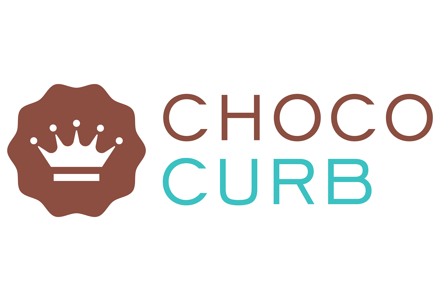
Chococurb
This is a redesign I proposed of the Chococurb logo. The original has a crown as an allusion to the premium chocolate used in this subscription service. The following was designed on an 11 hour flight from San Francisco to Shanghai.

As usual I started sketching ideas in my notebook.

I streamlined the crown and seal then substituted a clip art crown and tiara.


Next I devised the light hearted splash of liquid chocolate for a crown.


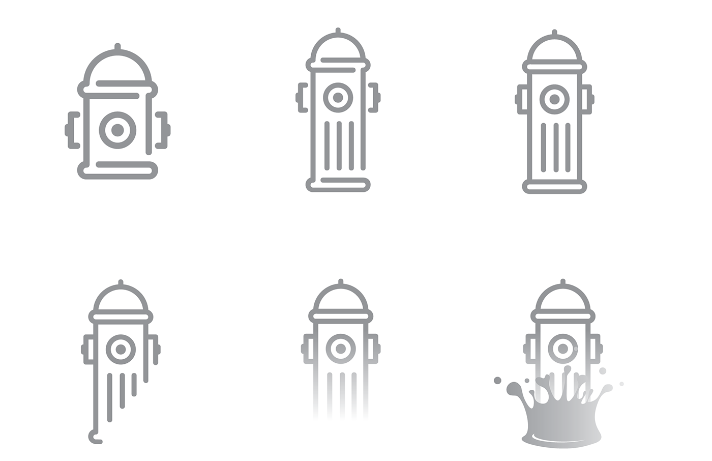
When thinking of 'curbs' I tried fire hydrants...

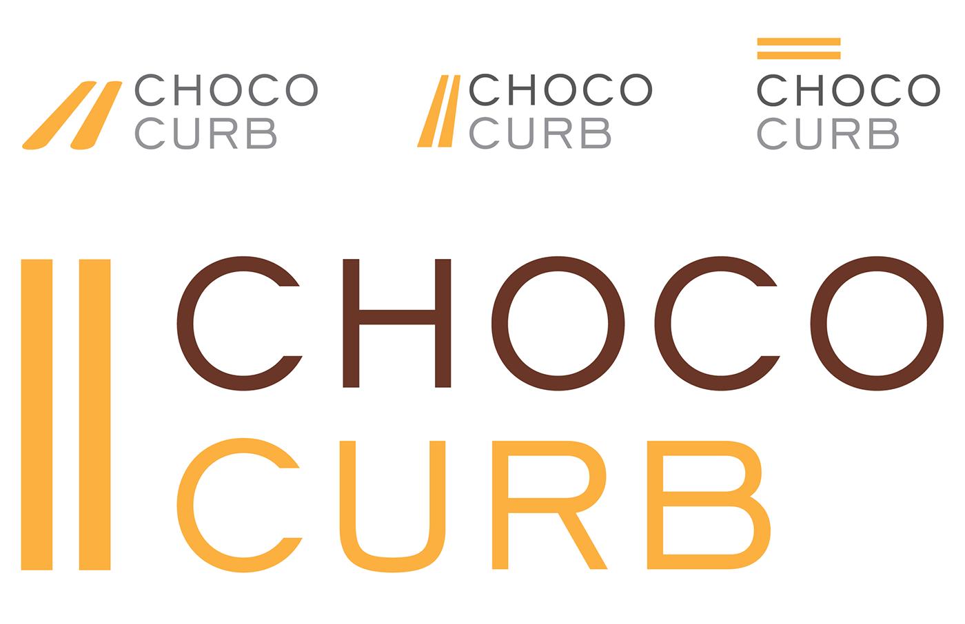
'Curb' also inspired this version with a road's double yellow lines.
I took some clip art to create a few more ideas.


I call this the Coco Chanel concept route.

I used a cocoa bean as a heart for the love of chocolate.

I used a stork as a metaphor for the delivery of the bespoke boxes.


Thinking I needed to do a version with chocolate I did a study of browns.


