
Chefio is a leading household appliance brand in Vietnam, coming to Tree when the brand was still struggling with reaching its consumers. Having "put on" a complete identity that seemed to bring good results, Chefio did not receive the expected results. An unworthy identity has "buried" the brand " in the commercial arena. Therefore, when sharing with Tree, Chefio wishes to restructure the brand identity to suit the aesthetic and oriented position of the brand name.

Challenges
Chefio will return with a look that suits the brand's visions and values and comes out as a brand that strives for timeless, sustainable quality that meets most consumer needs. At the same time, the logo appearing on the product must be flexible, always in a position with a good viewpoint.

Solutions
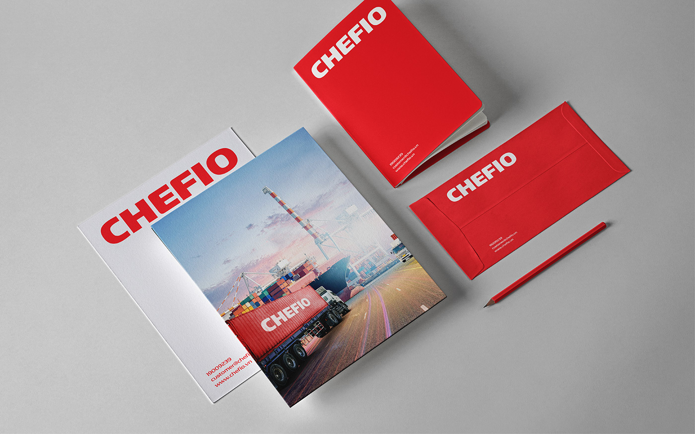
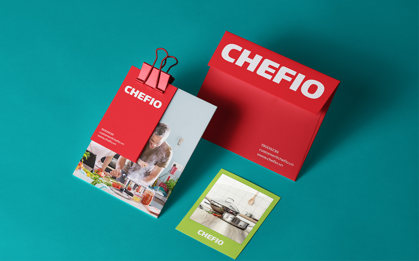
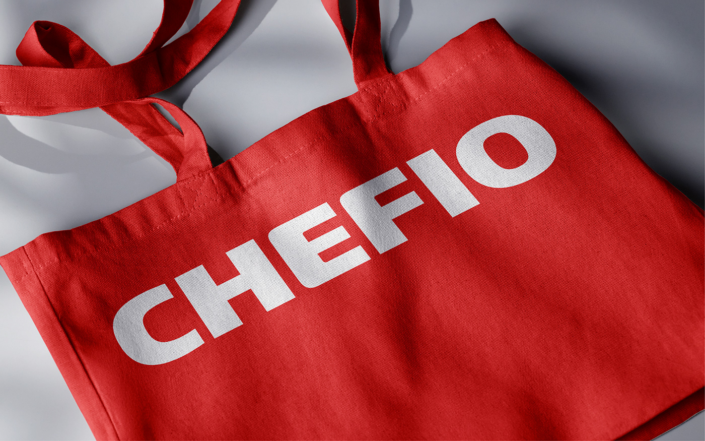
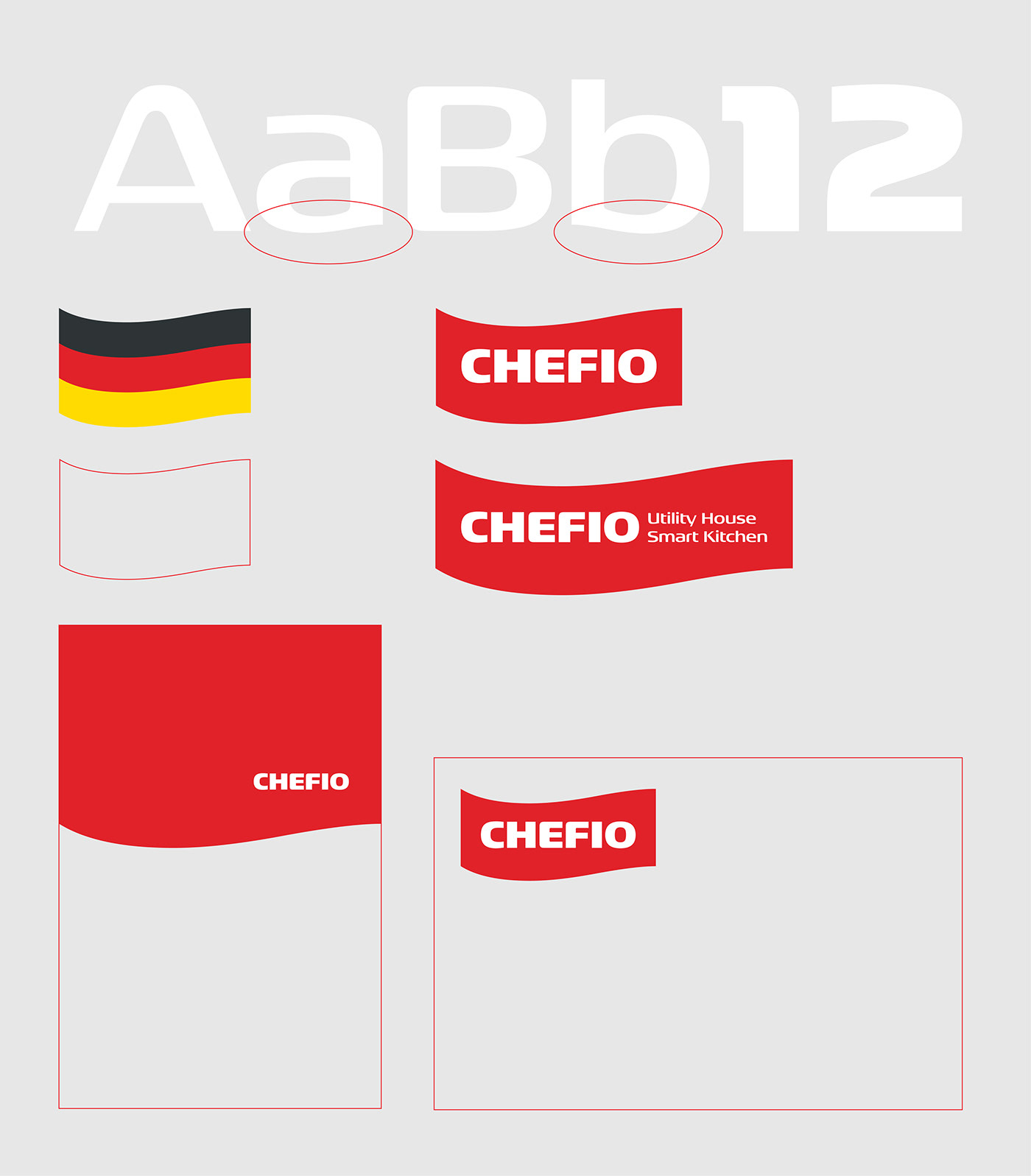
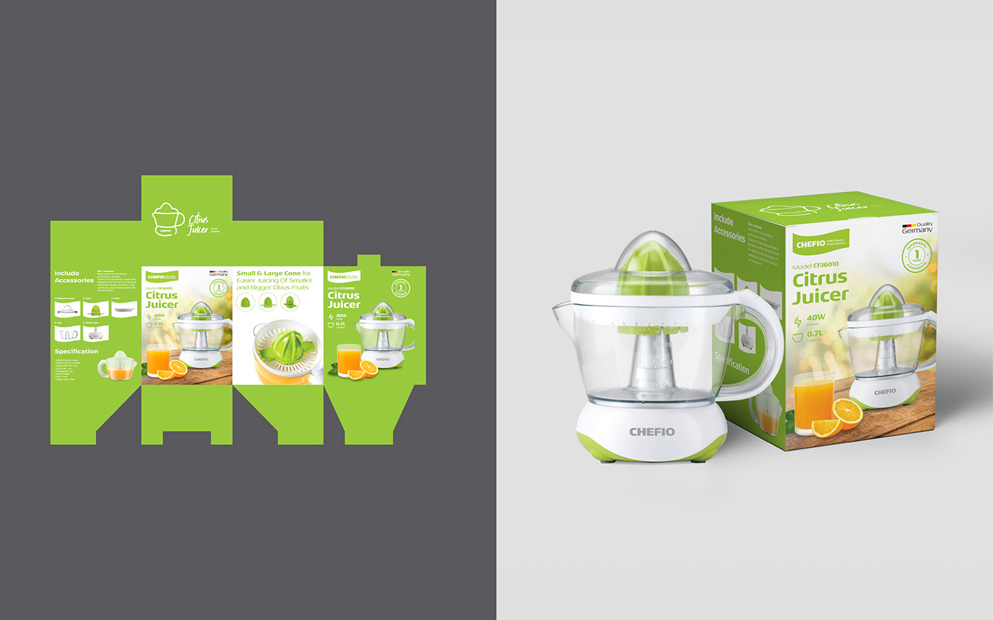
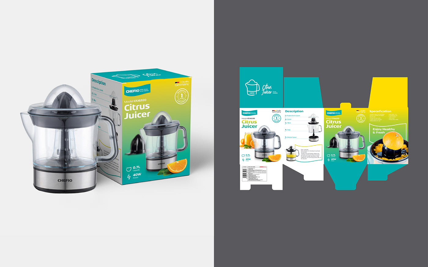
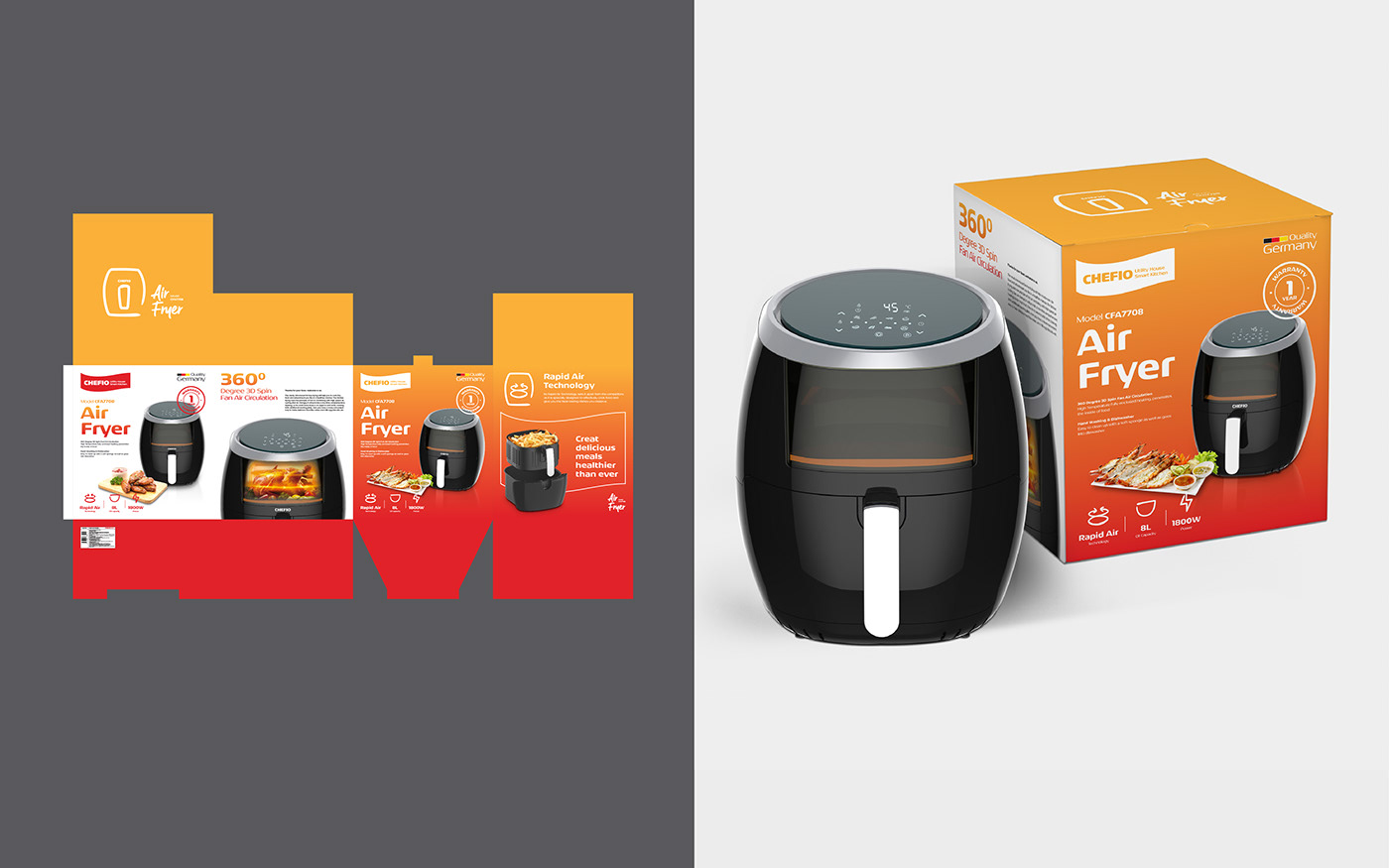
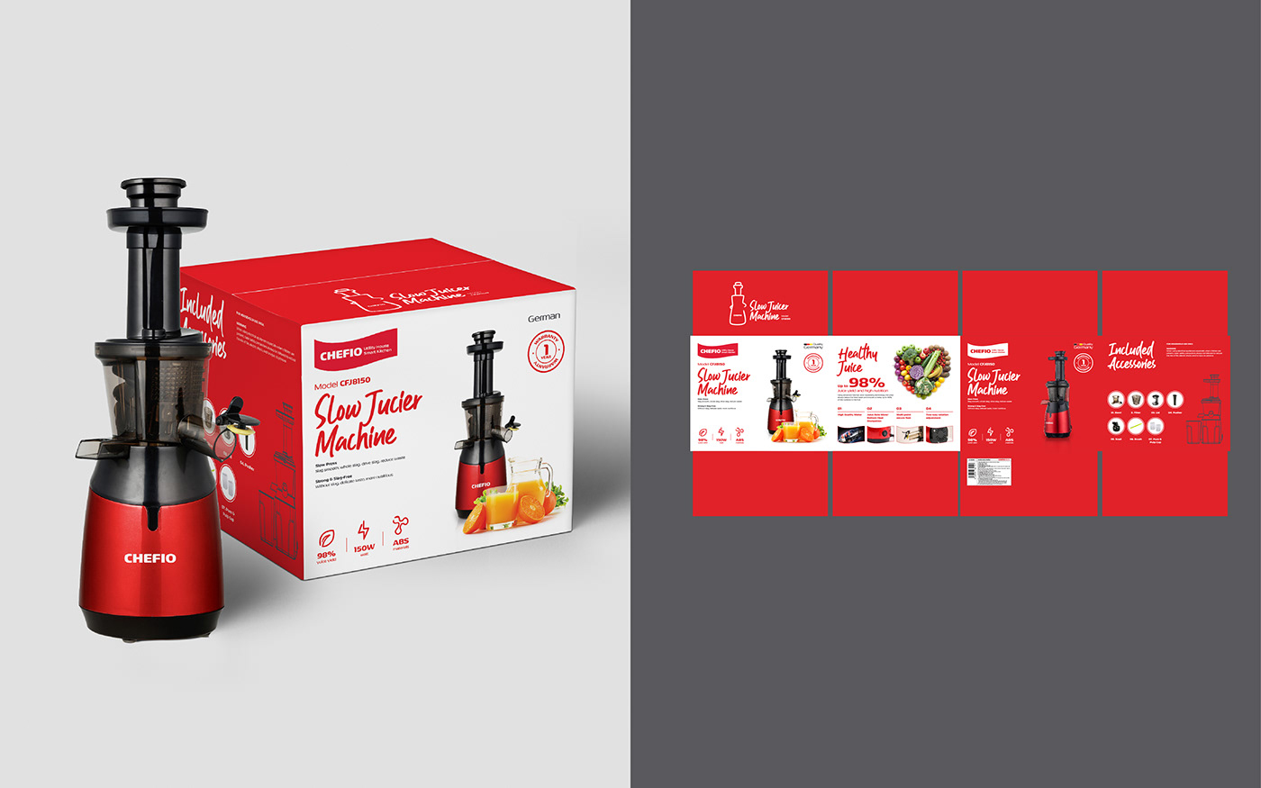
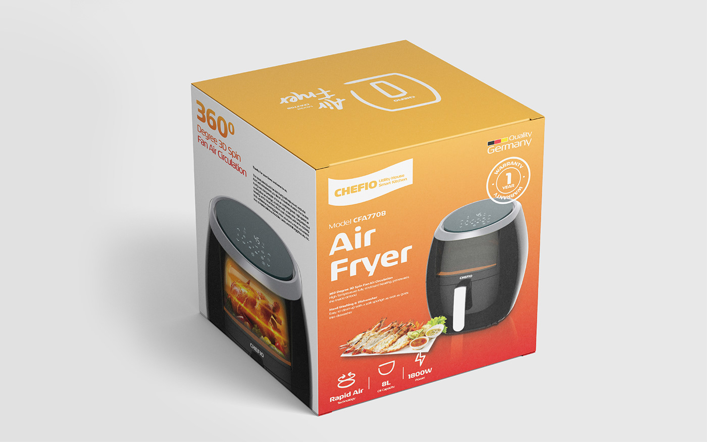
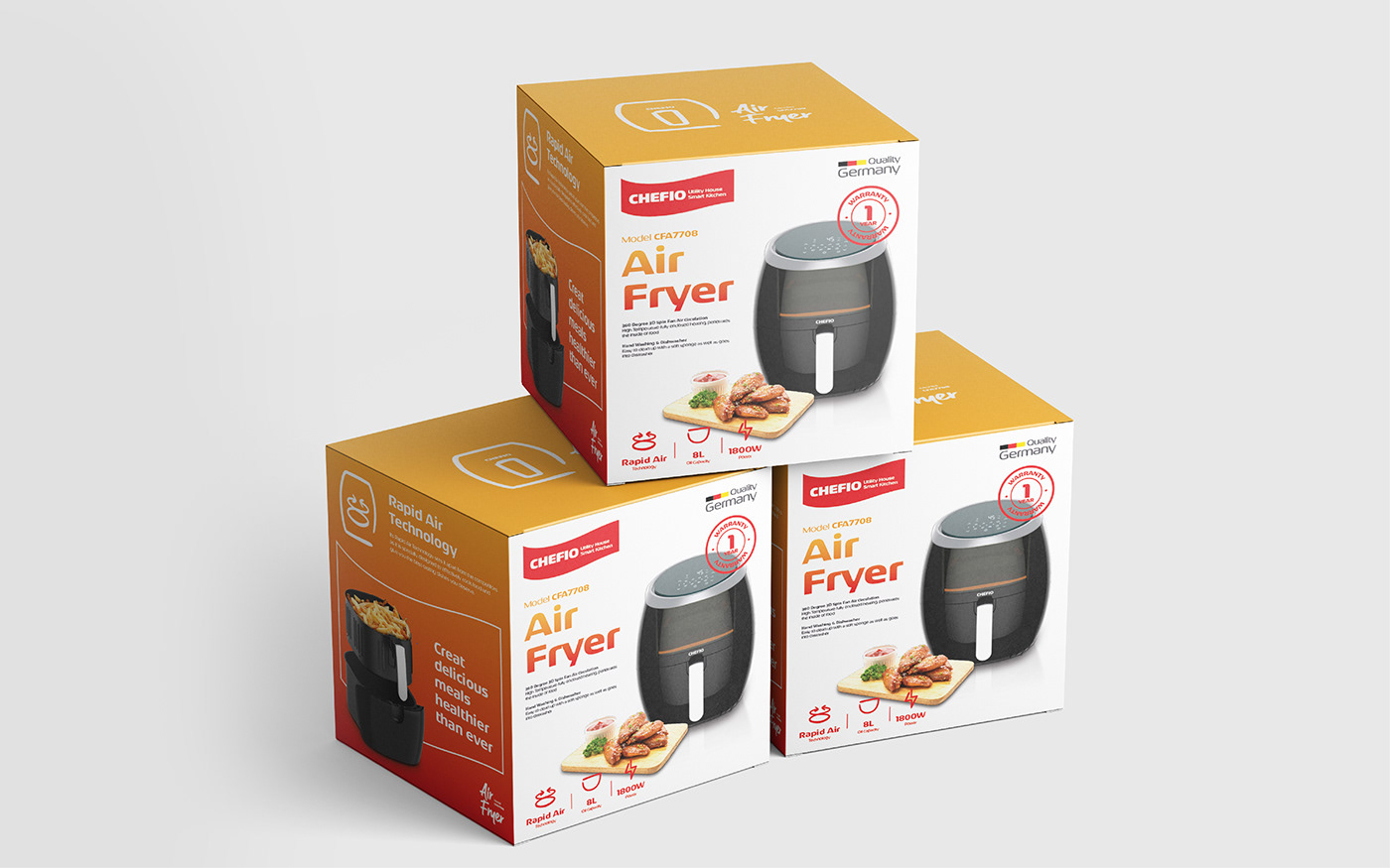
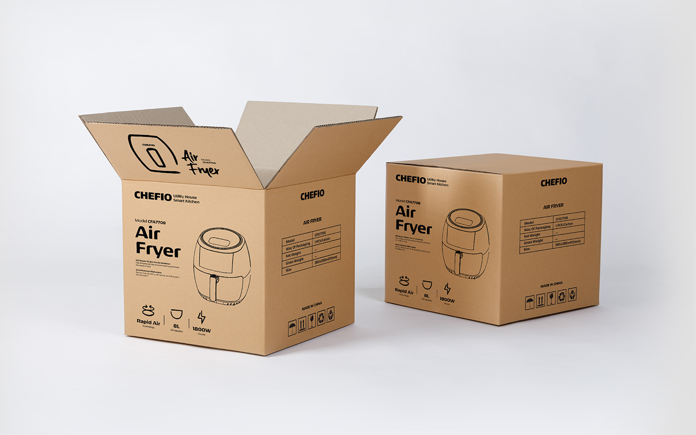
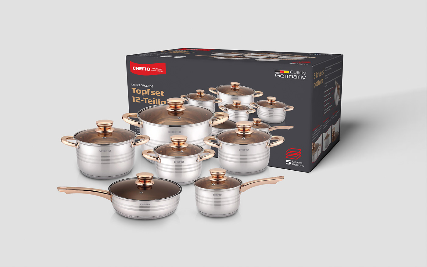
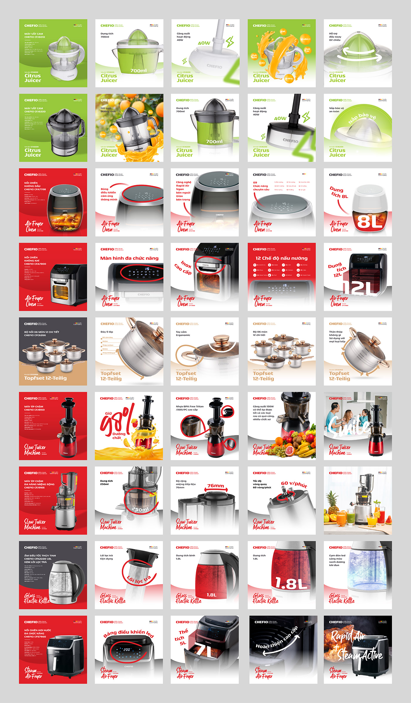
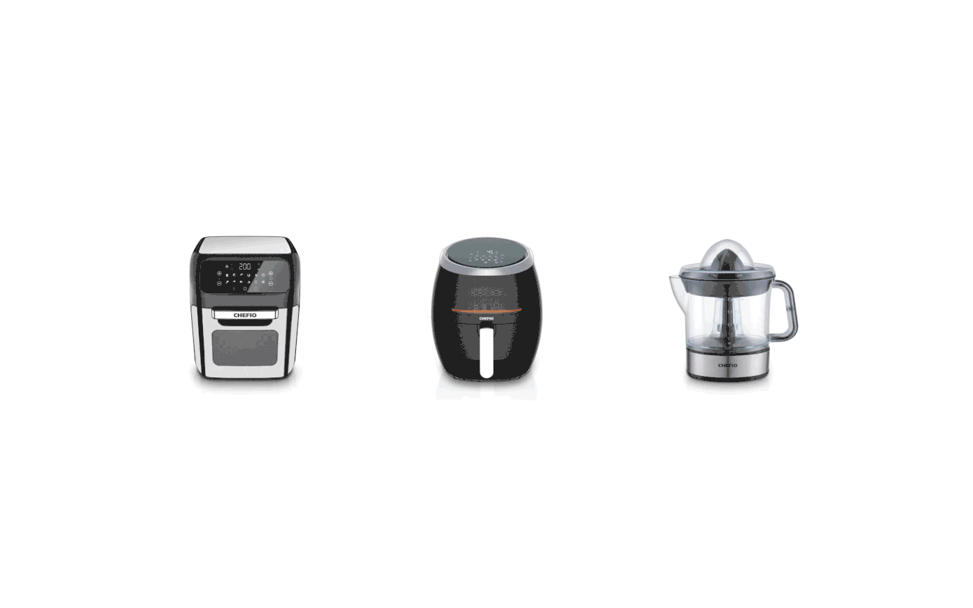
The Chefio identity is created from a large and bold font system with curves and circles to create familiar images with the unique identity of the home appliances field.
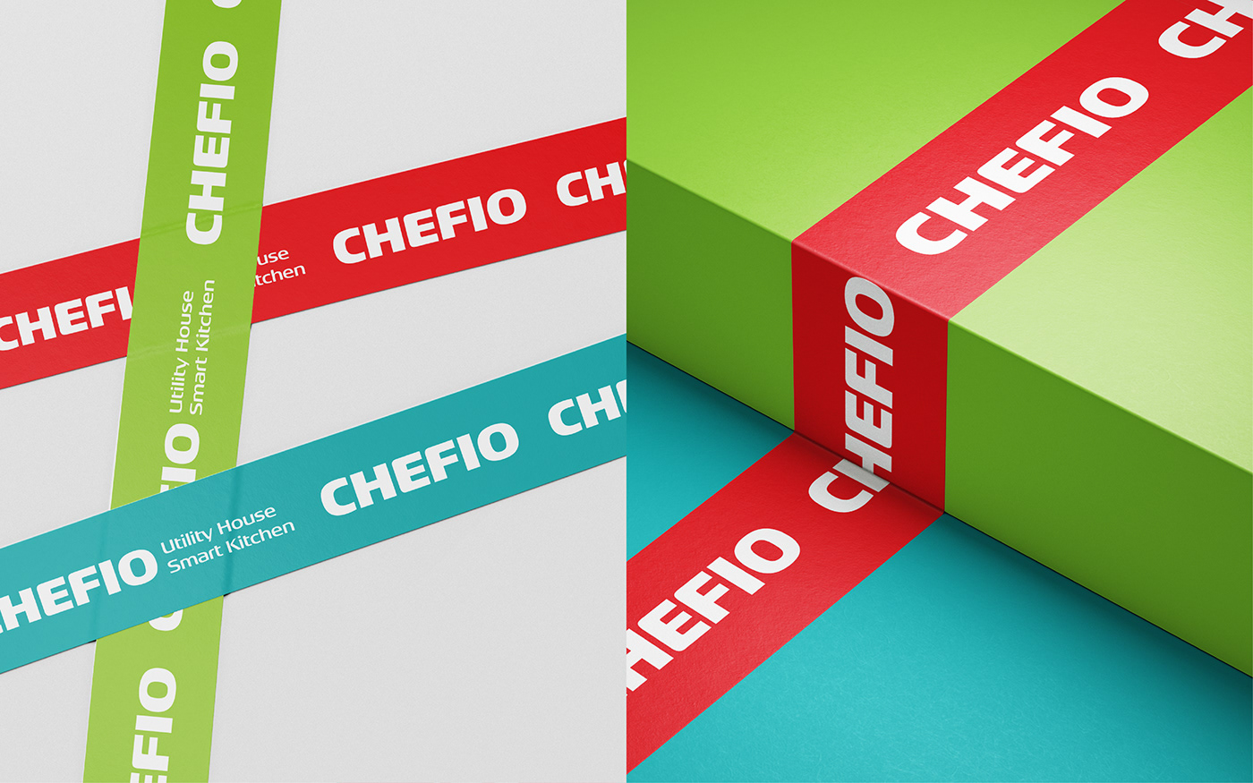
Tree chose a simple letterform logo formed from thick and bold handwriting to create solidity for the brand while showing a commitment to the durability and quality of the product. The logo symbol in letters, while not sophisticated, its delicacy creates a feeling of luxury when applied to products. A unique identity for the household industry.
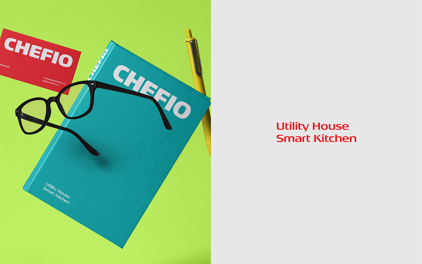
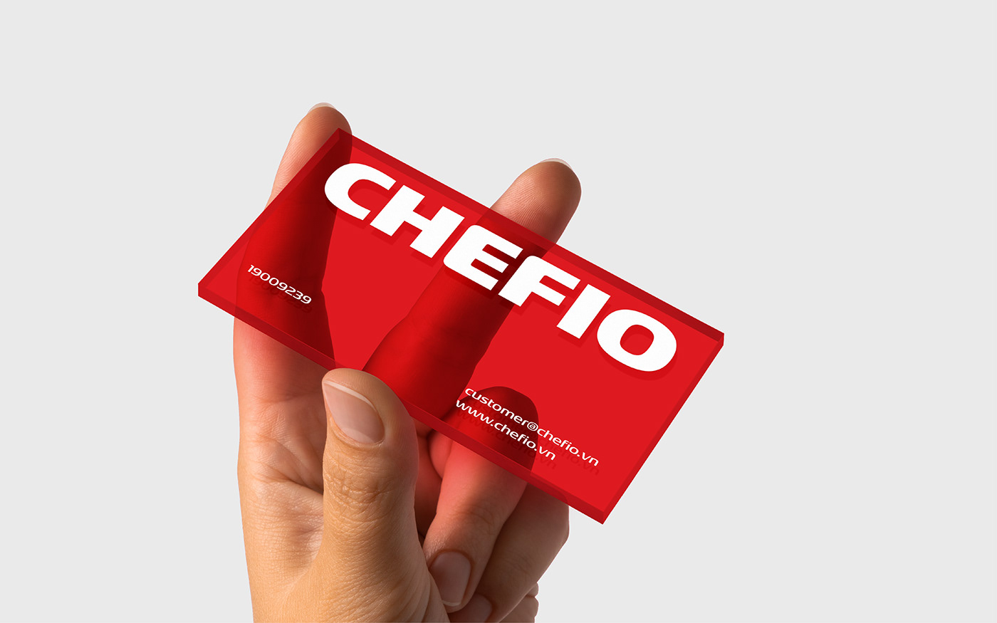
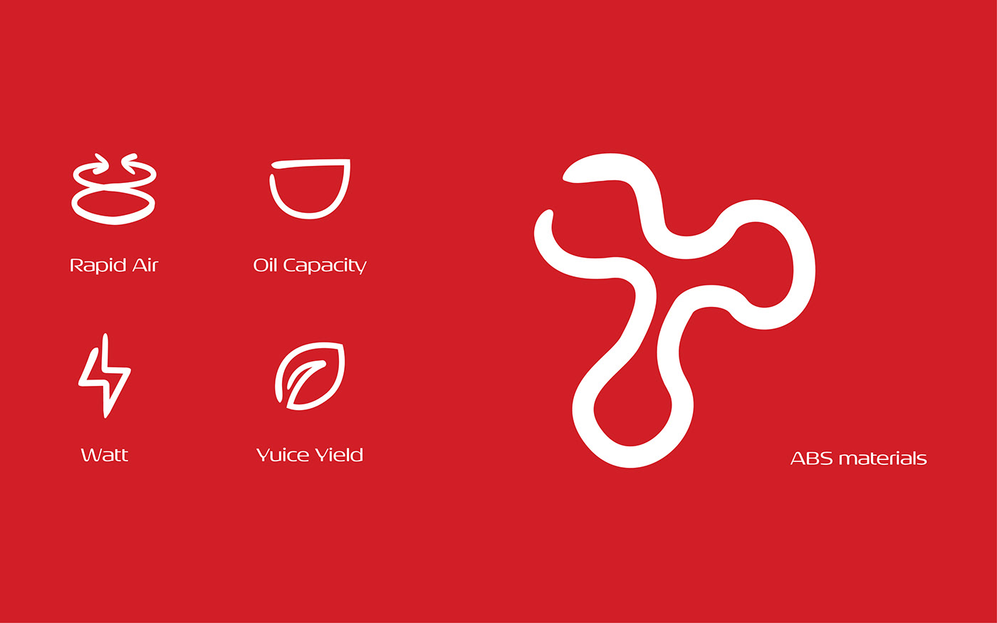
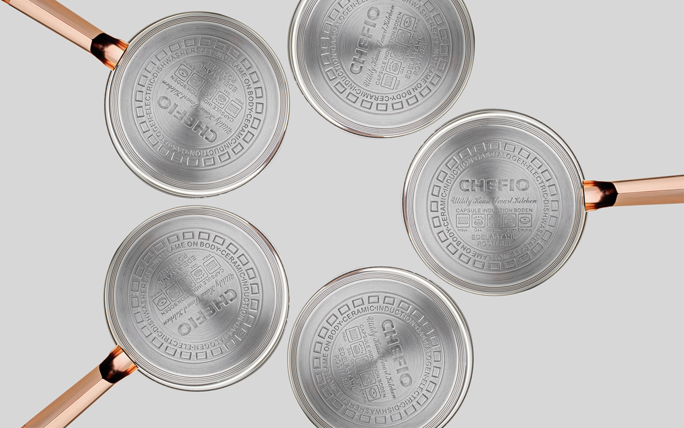
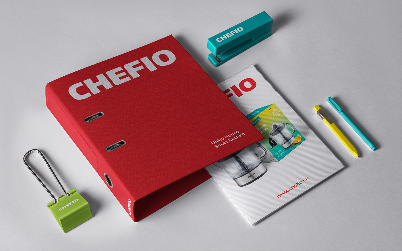
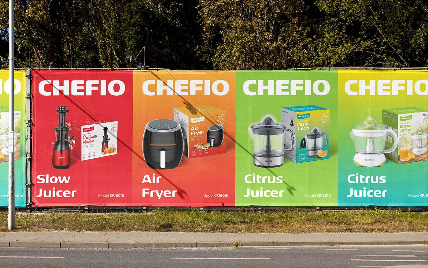
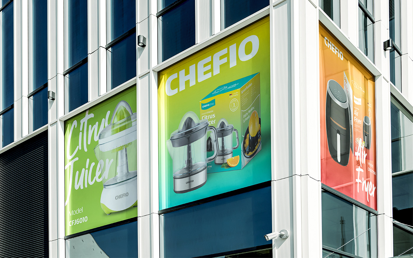
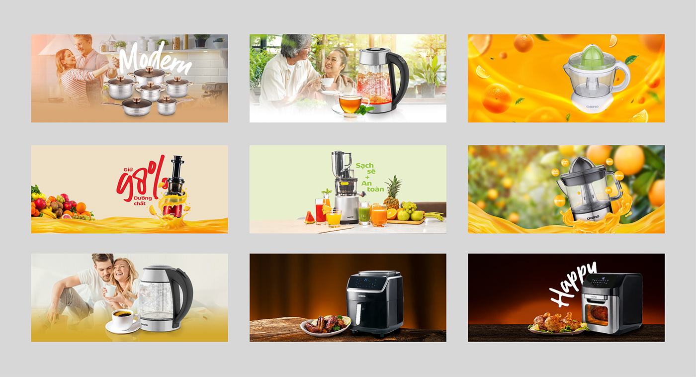
From the font system created by bold curves and round strokes, Tree develops a unique set of Icons that identify Chefio's products printed on the brand's packaging or publications, creating a series of distinctive images as an introduction to consumers.


Results
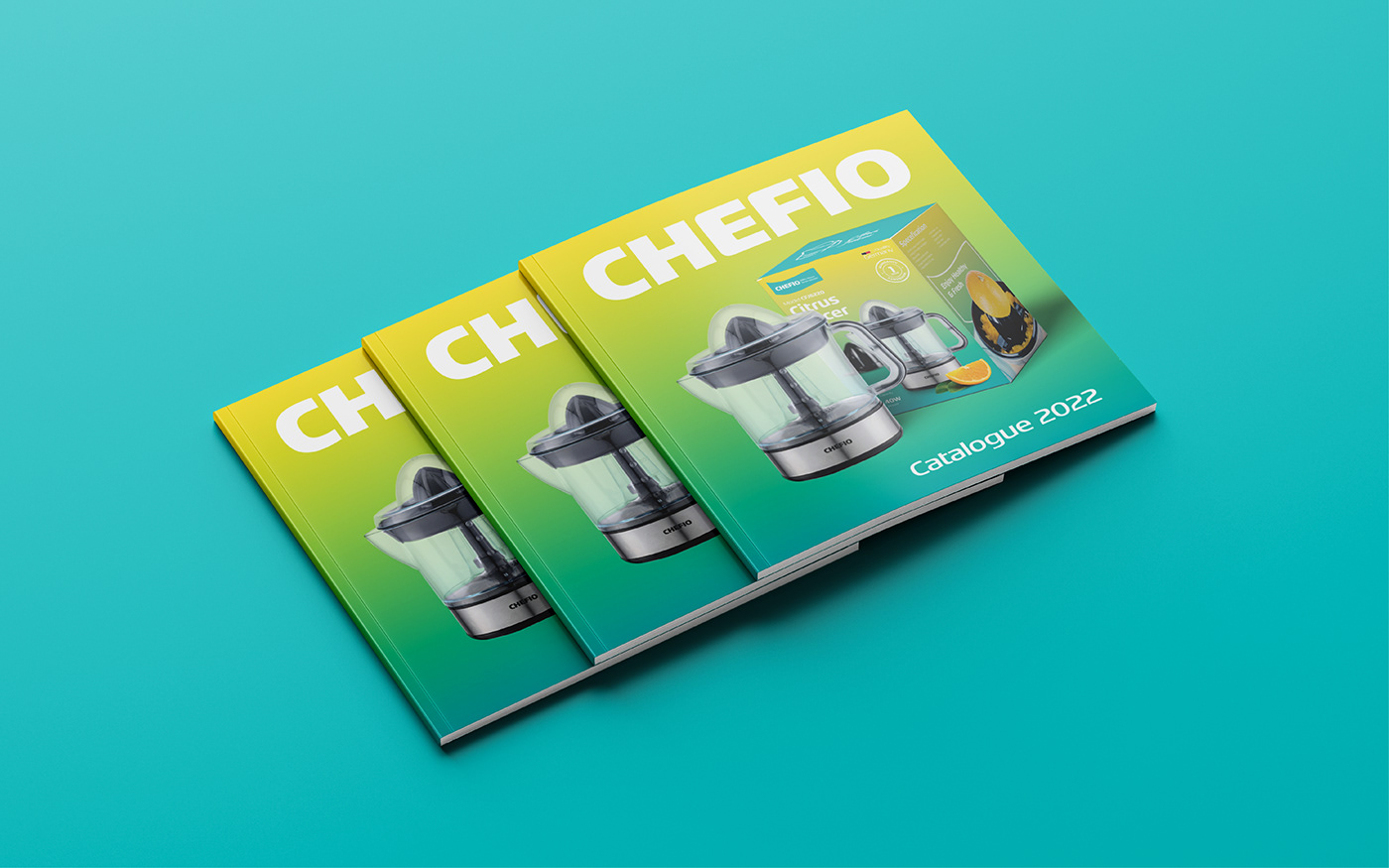
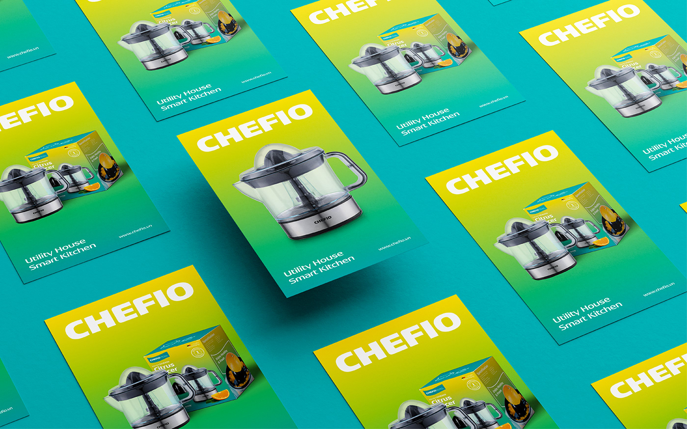
With only a simple font system, Tree has successfully built a distinctive and outstanding brand image in the market, delivering a worthy brand identity to the brand’s values of visions of a leading brand in Vietnam.