


Case study:
Bull
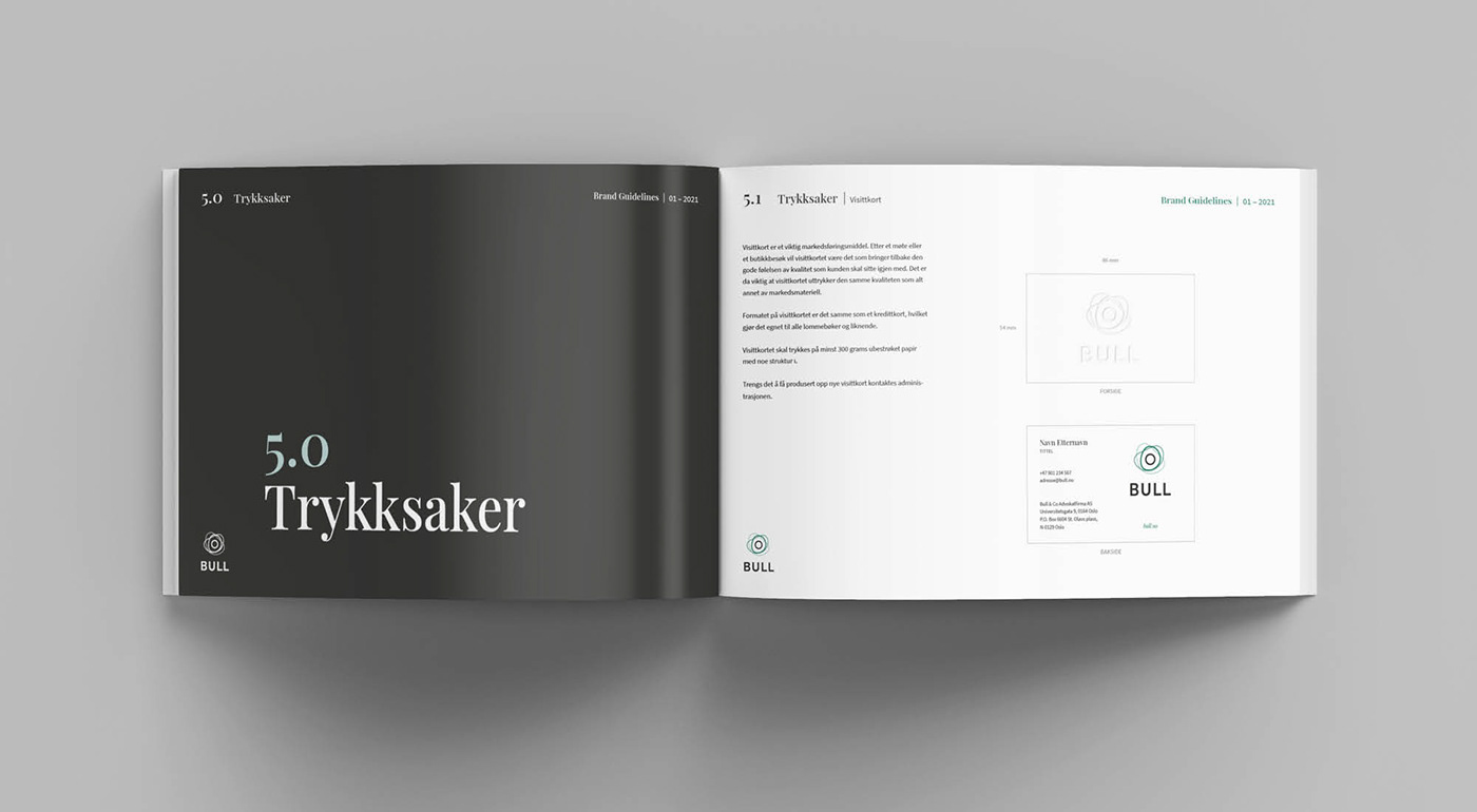
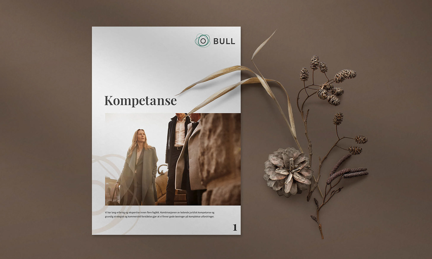
DELIVERABLES: Logo and profile development, profile manual, website UI/UX
Our process
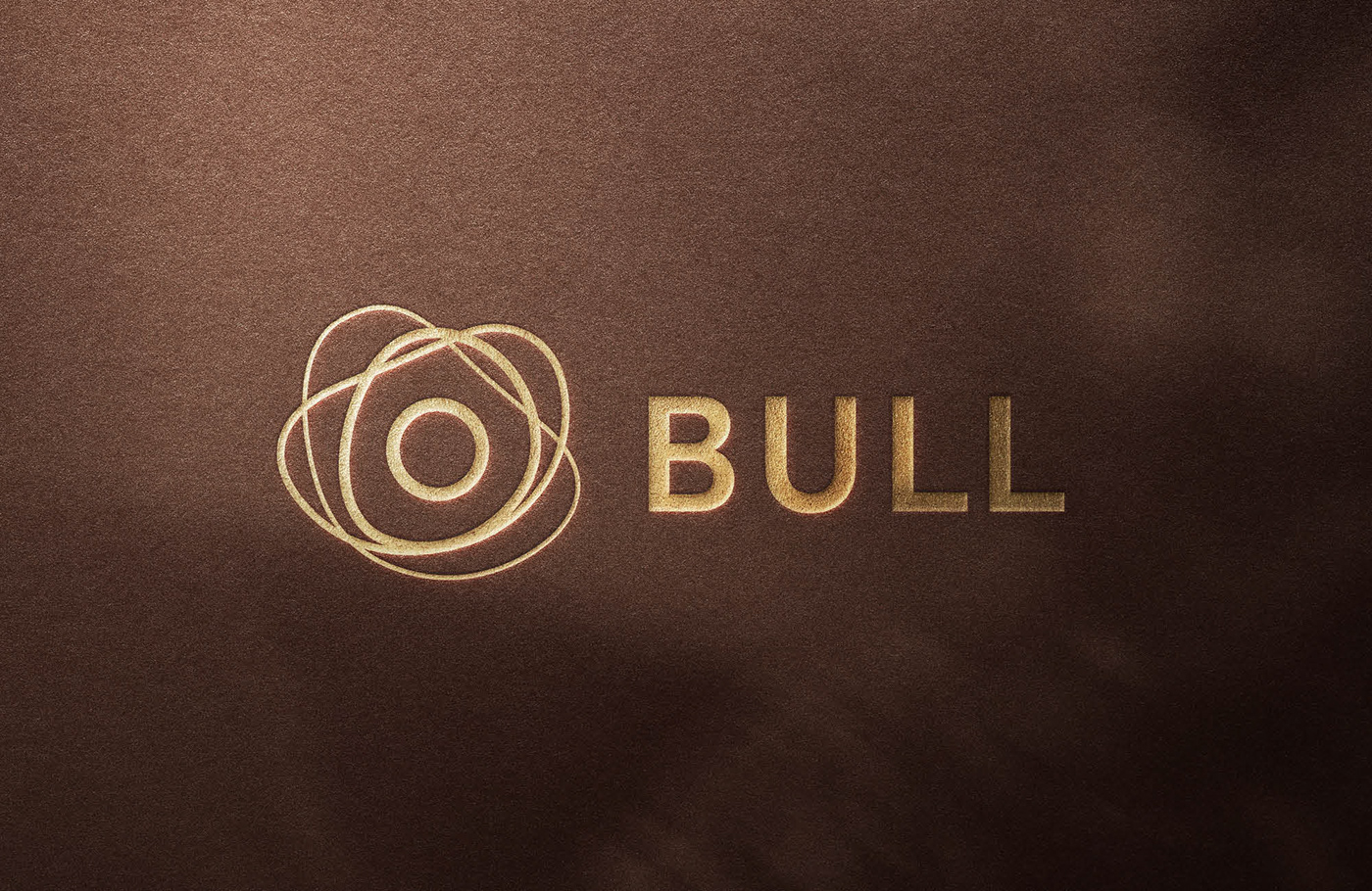
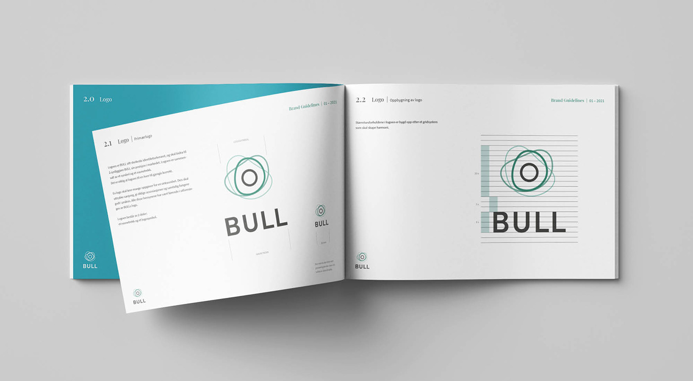
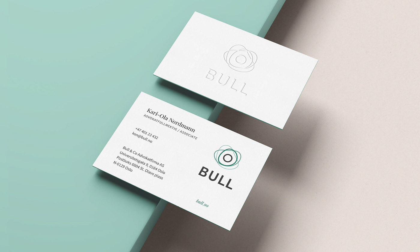
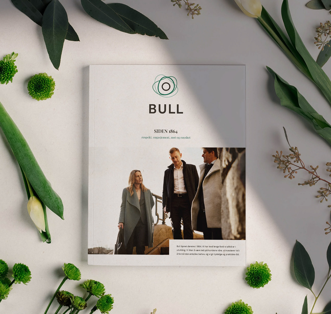
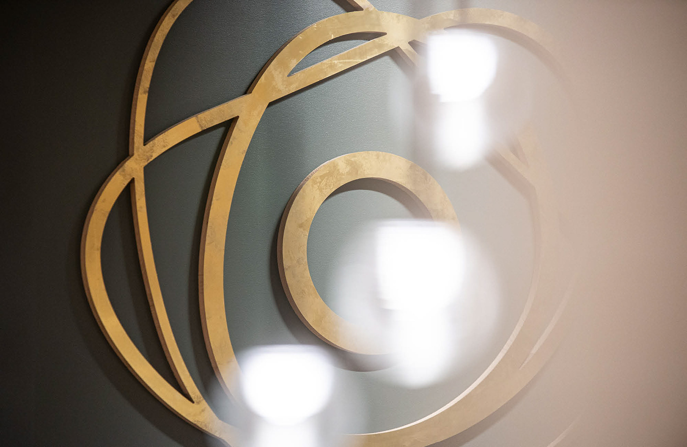
The idea that ended up as the final solution was born at a very early stage – a perfect circle, a shape without beginning and end that could represent BULL – solid and safe in the middle of elements that are in motion and in constant change. Although the world around us is characterized by changing directions, different opinions, customers with different needs and constantly evolving laws and regulations, BULL stands safely in the center.
We presented various different logo directions, incorporated into different mood boards, to a specialist committee, the board and partners. After a thorough process the choice fell on the original concept, which was a nice confirmation that intuition, creativity and understanding of the customer's brief was where it needed to be.

What the logo symbolizes
The logo's four circles are based on several different meanings:
BULL's values
1. Commitment
2. Courage
3. Respect
4. Generosity
1. Commitment
2. Courage
3. Respect
4. Generosity
The four pillars of legislation
1. Accountability
2. Fair laws
3. Transparent authorities
4. Accessible justice
1. Accountability
2. Fair laws
3. Transparent authorities
4. Accessible justice
1. BULL
2. A world and society in constant change
3. Customers with different missions and needs
4. Pieces of legislation in constant change that must be known and followed
2. A world and society in constant change
3. Customers with different missions and needs
4. Pieces of legislation in constant change that must be known and followed


– Henning developed a new visual identity and new logo that really captured the essence of who Bull is and who Bull wants to be going forward. He helped us with how the final identity should look both digitally and in print, and also developed the design on Bull's new website. Henning's combination of creativity, clear advice and flexible form of collaboration is worth its weight in gold in such processes.
Tine Engstrøm Wærsten
CEO, Bull
The client brief
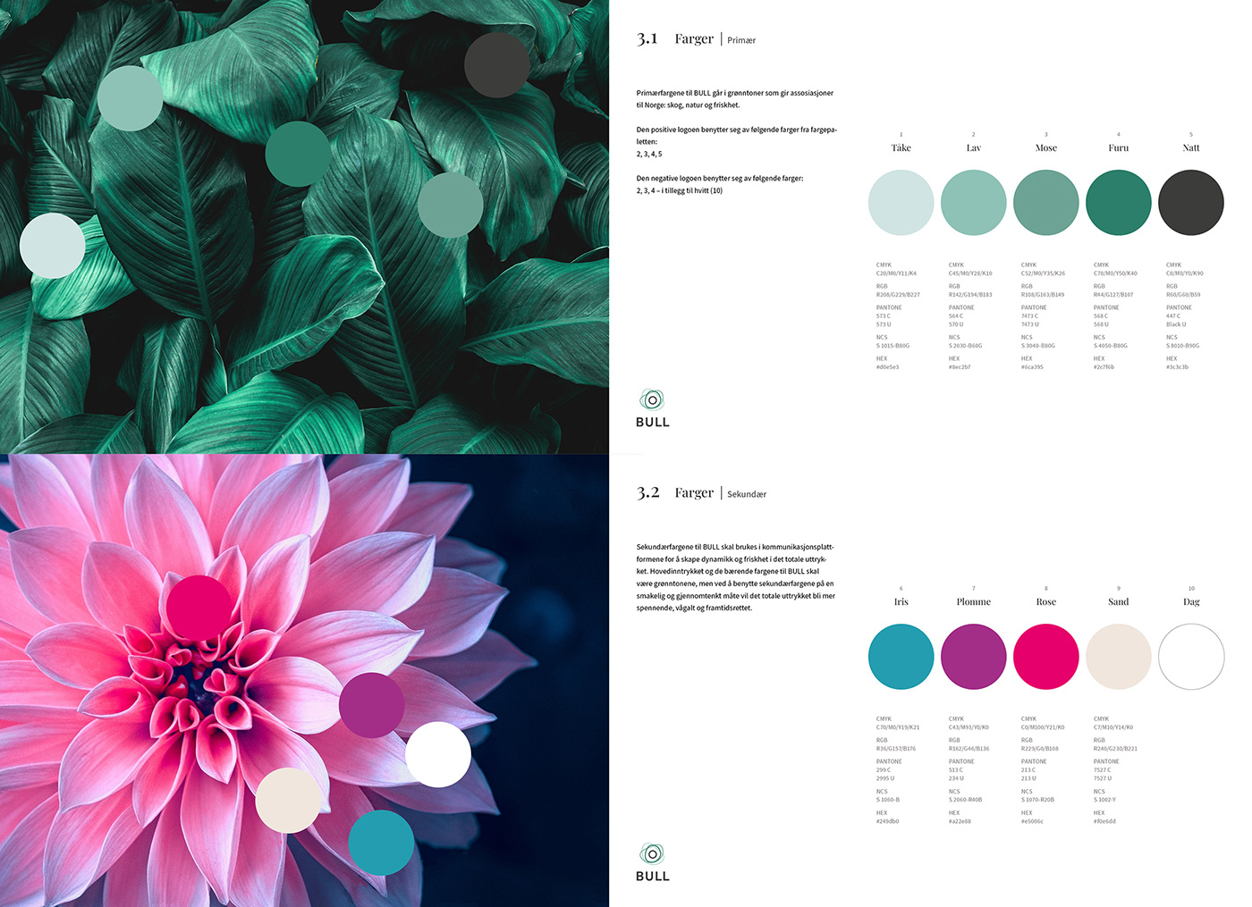
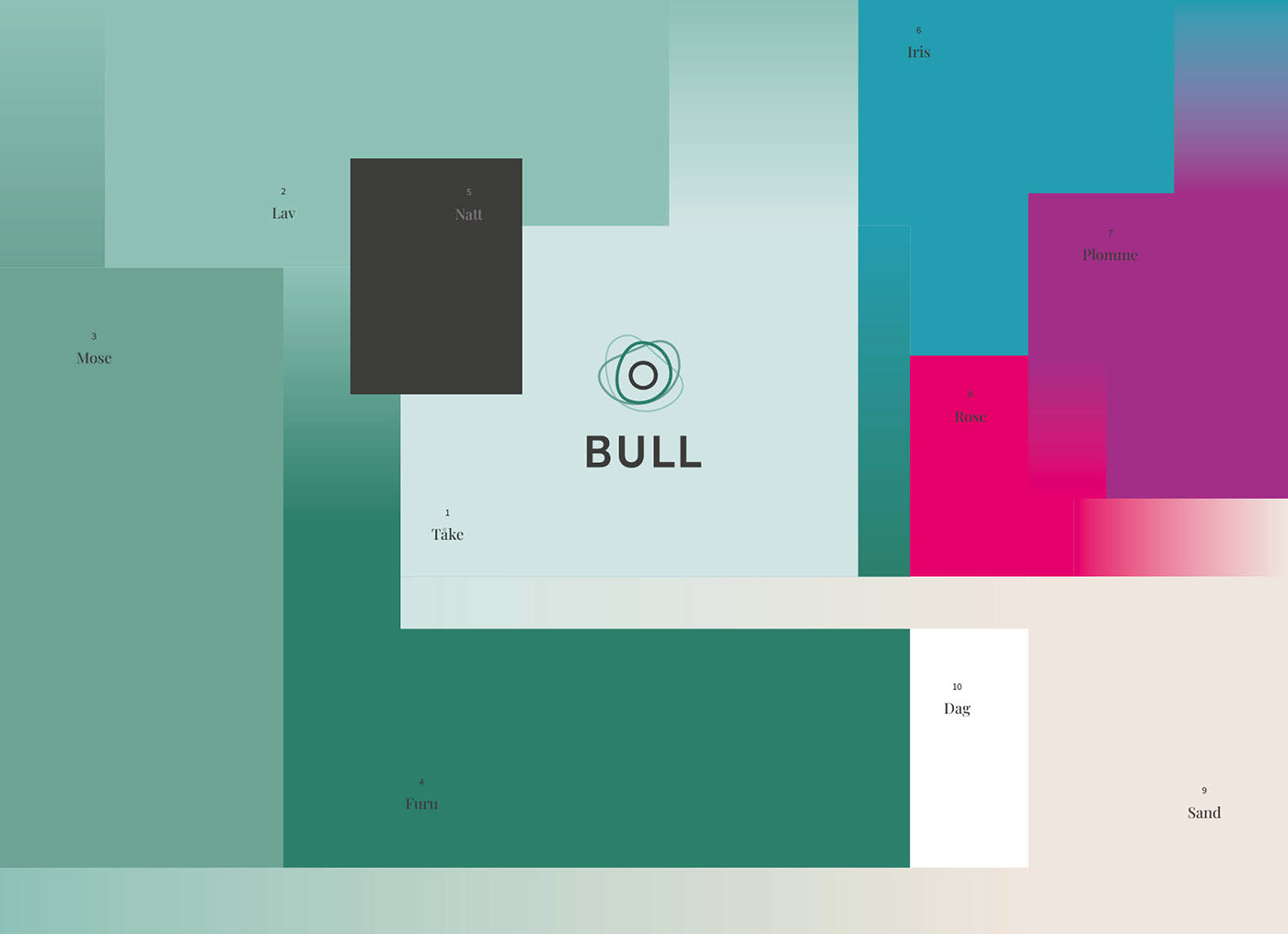
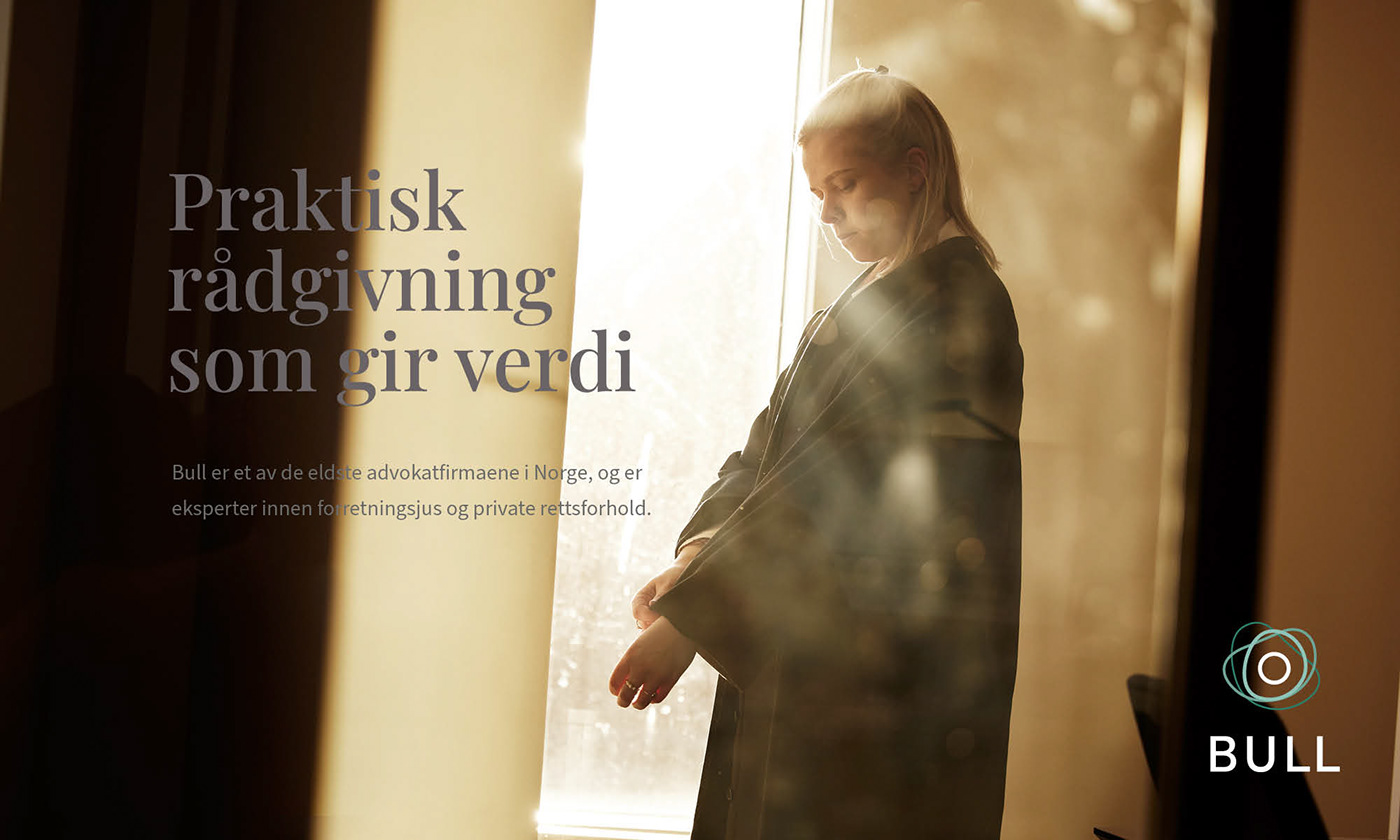
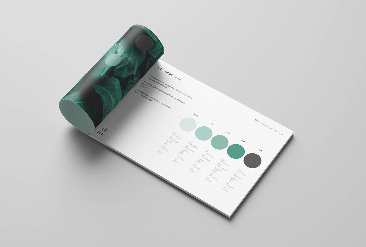
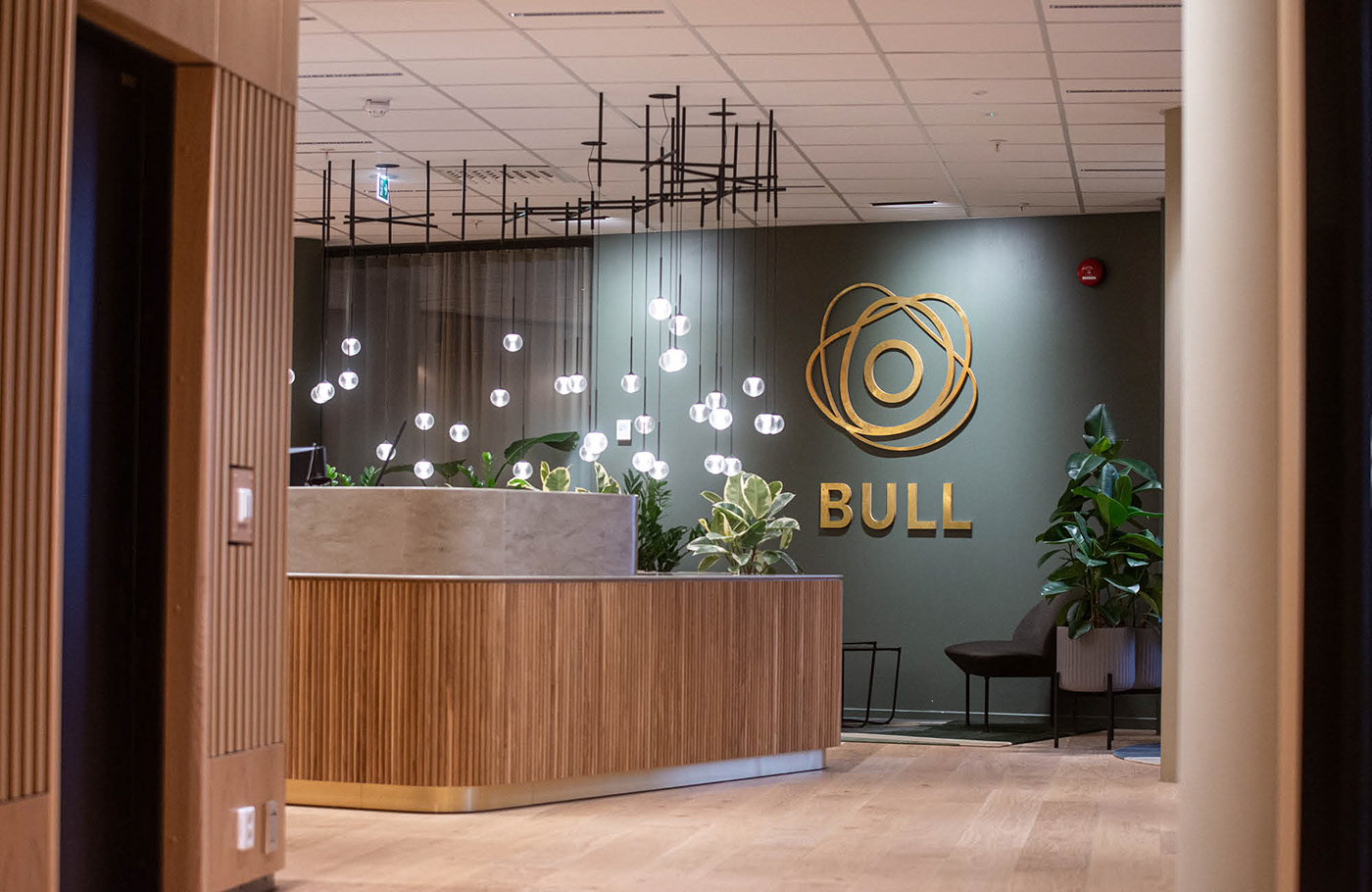
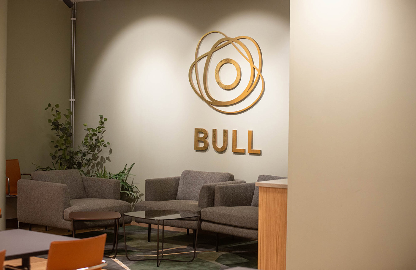
Bull is Norways second oldest lawyer firm, located in the capital Oslo. Having tried several different visual expression over the years, they now felt it was time to get a new and updated look that better could represent the direction they had developed as a company. The new profile was to have a Nordic expression, something that could represent the industry they are in, while at the same time they wanted something that made them stand out from the competition. The general expression of the visual profile had to match with the colors and choice of materials in their brand new office building: green tones, wood, beige and gold – warm and earthy colours. This means the opposite of cold and impersonal glass, steel and reinforcement often being used for branding large lawyer companies. The strong focus on human relations also set clear premises for the final direction.
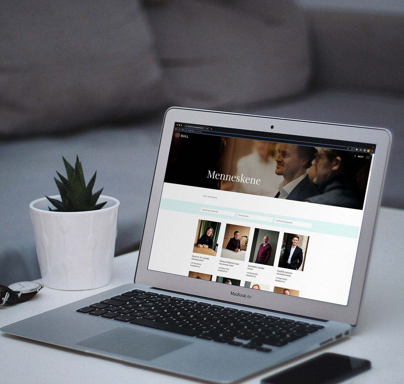
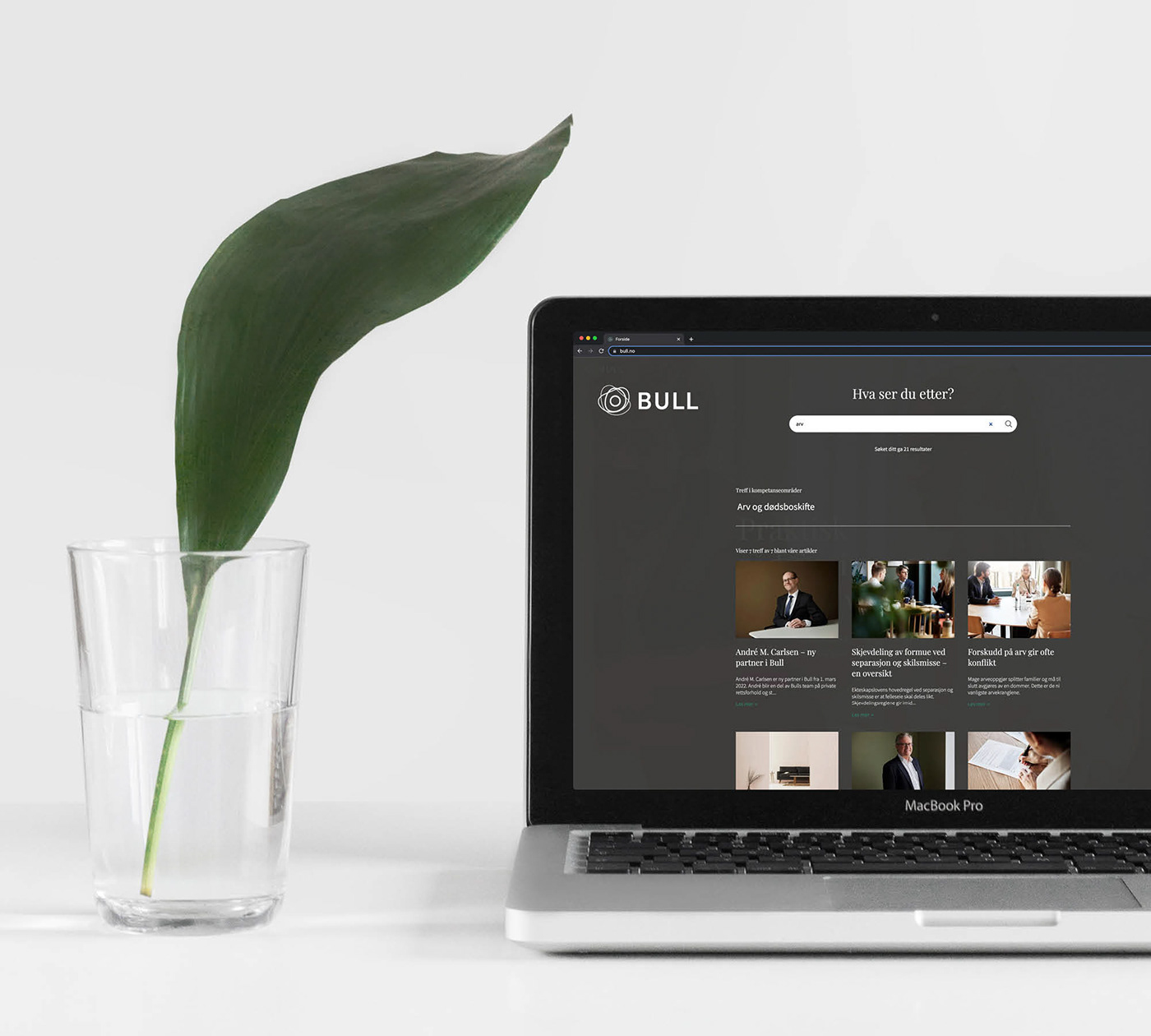
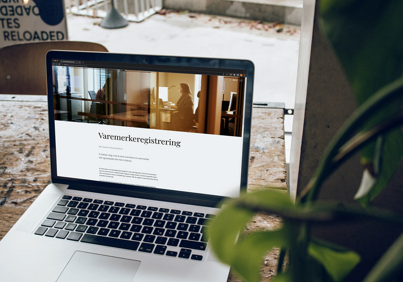
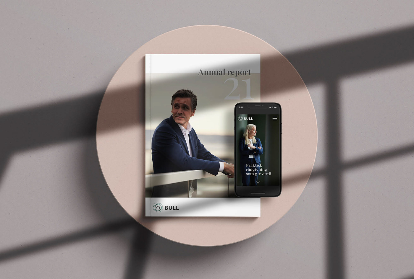

Visit the website here: bull.no
Thanks for watching <3
If you enjoyed this you can find more case studies on my website: filet.no
Collaborators:
Web development: Supersymmetric
Content production: Vild
Photo: Lars Petter Pettersen
Content production: Vild
Photo: Lars Petter Pettersen


