APERTA
OVERVIEW
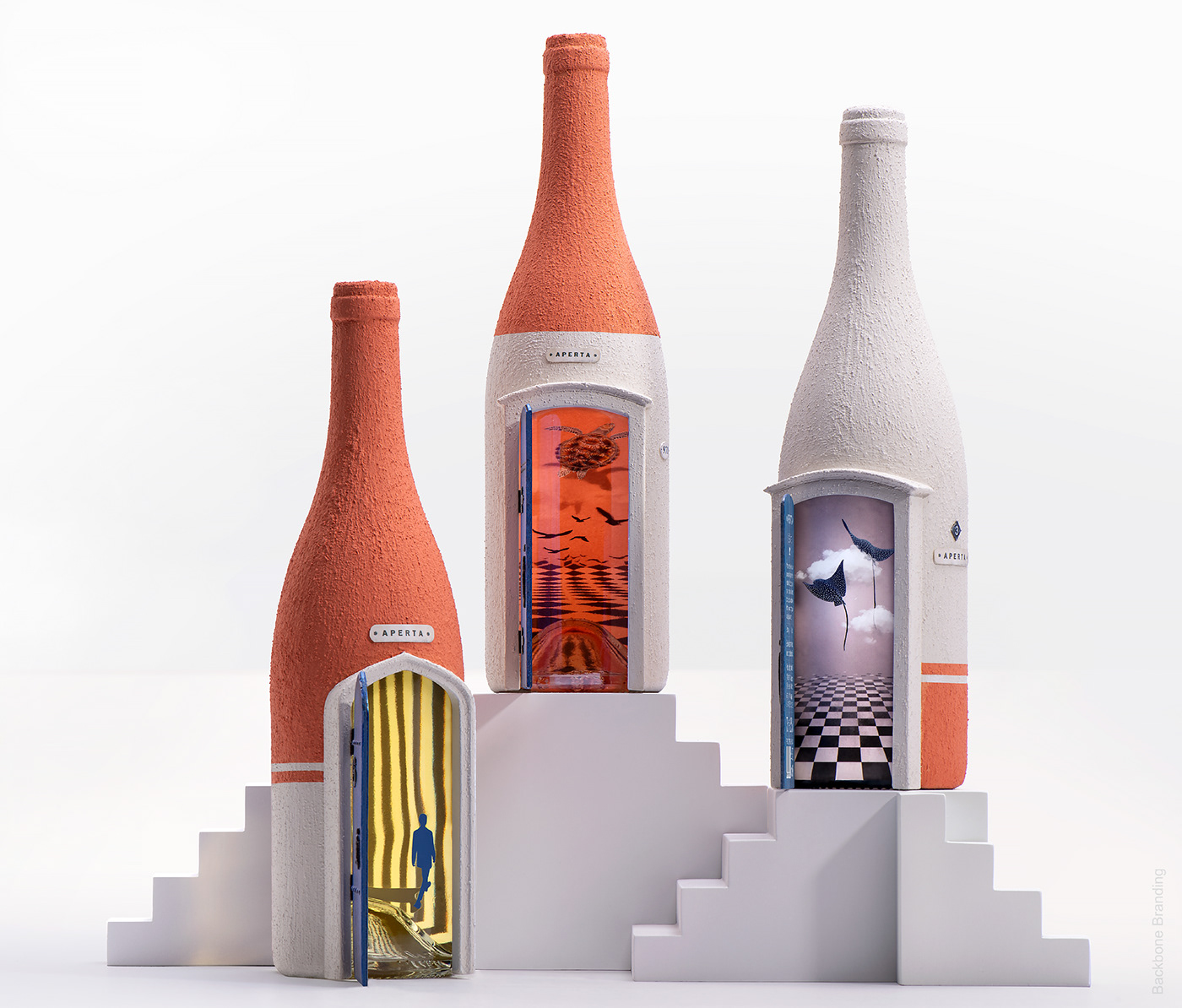
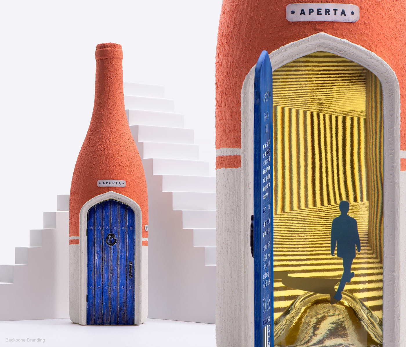
We have embodied a philosophy of the paths of human life in a unique concept design for a new wine.
CHALLENGE
We were given the freedom to create without limits and designed a wine bottle and packaging portraying the unique history and flavor of low-intervention wine.
SOLUTION
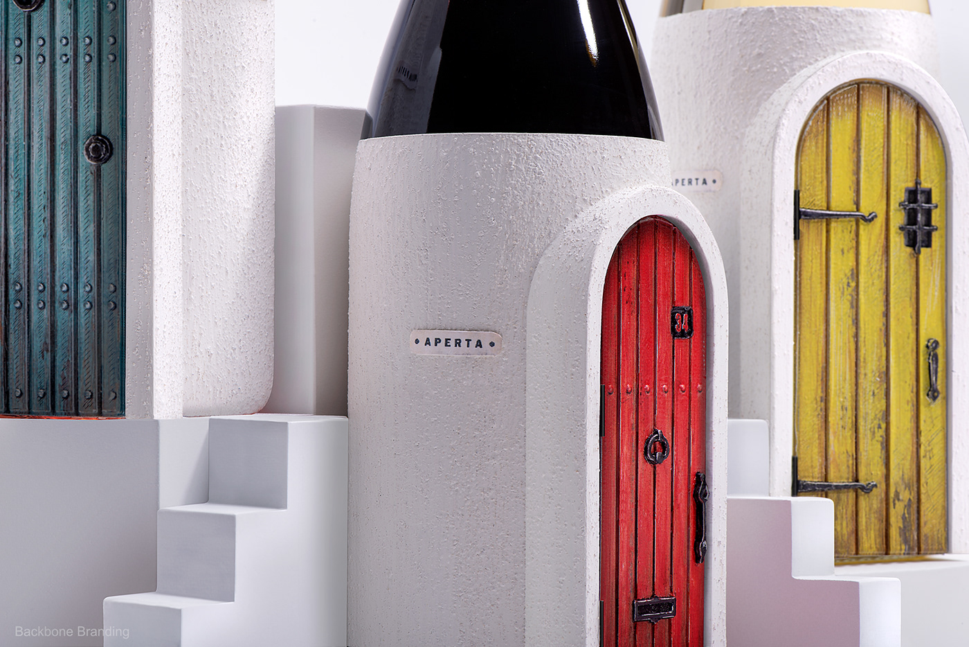
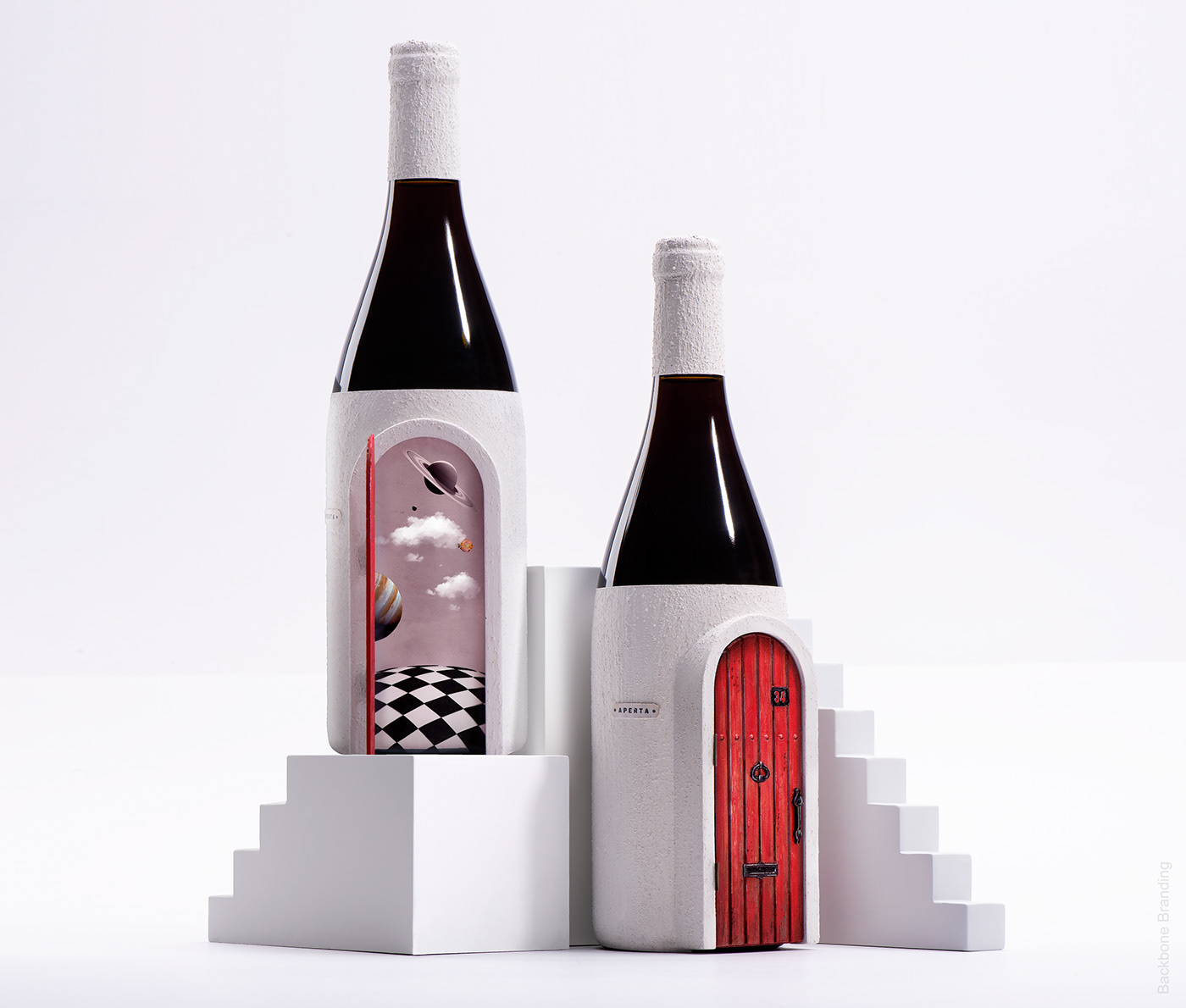
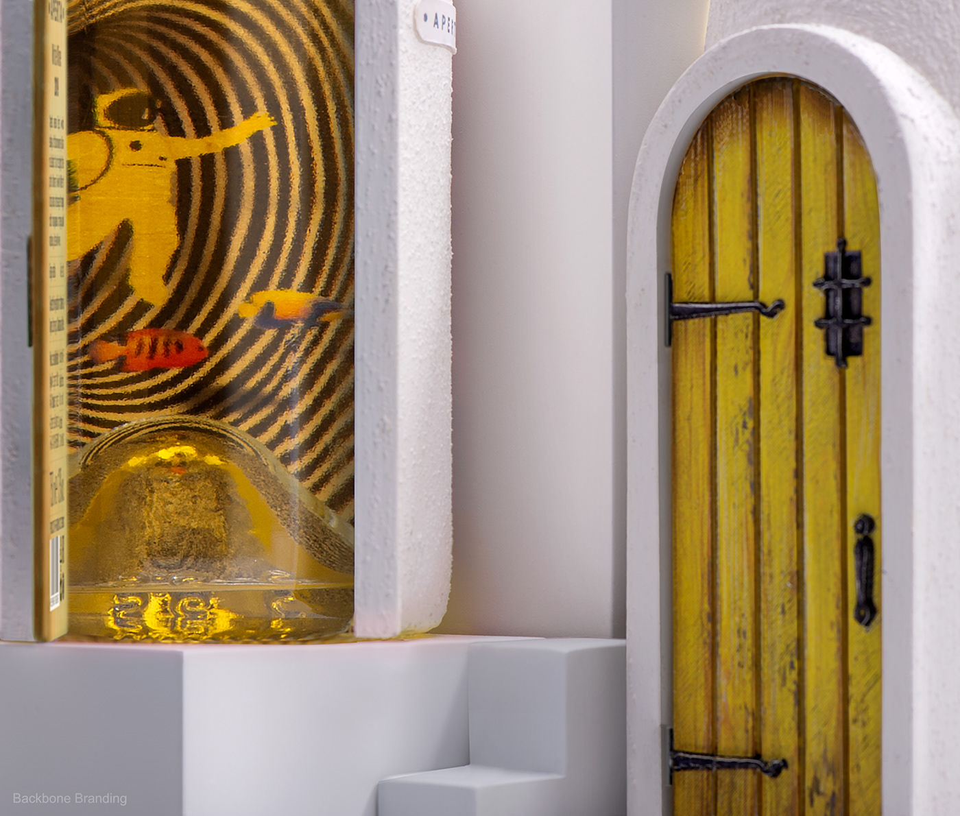
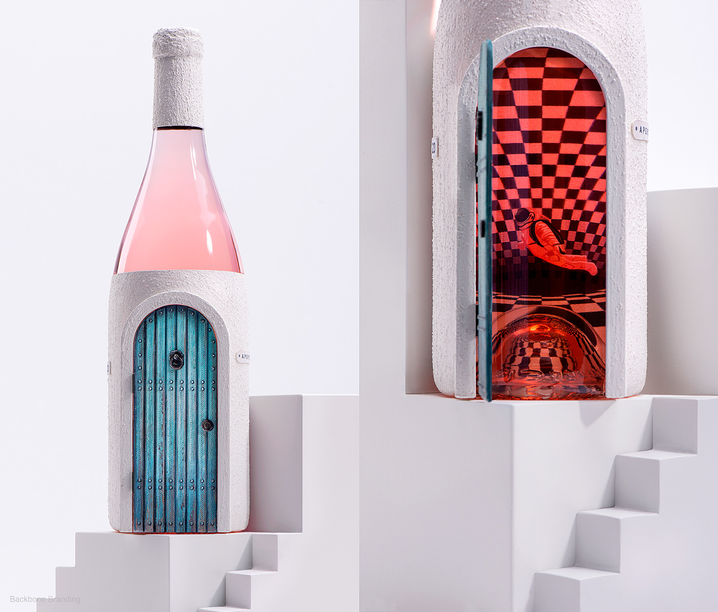
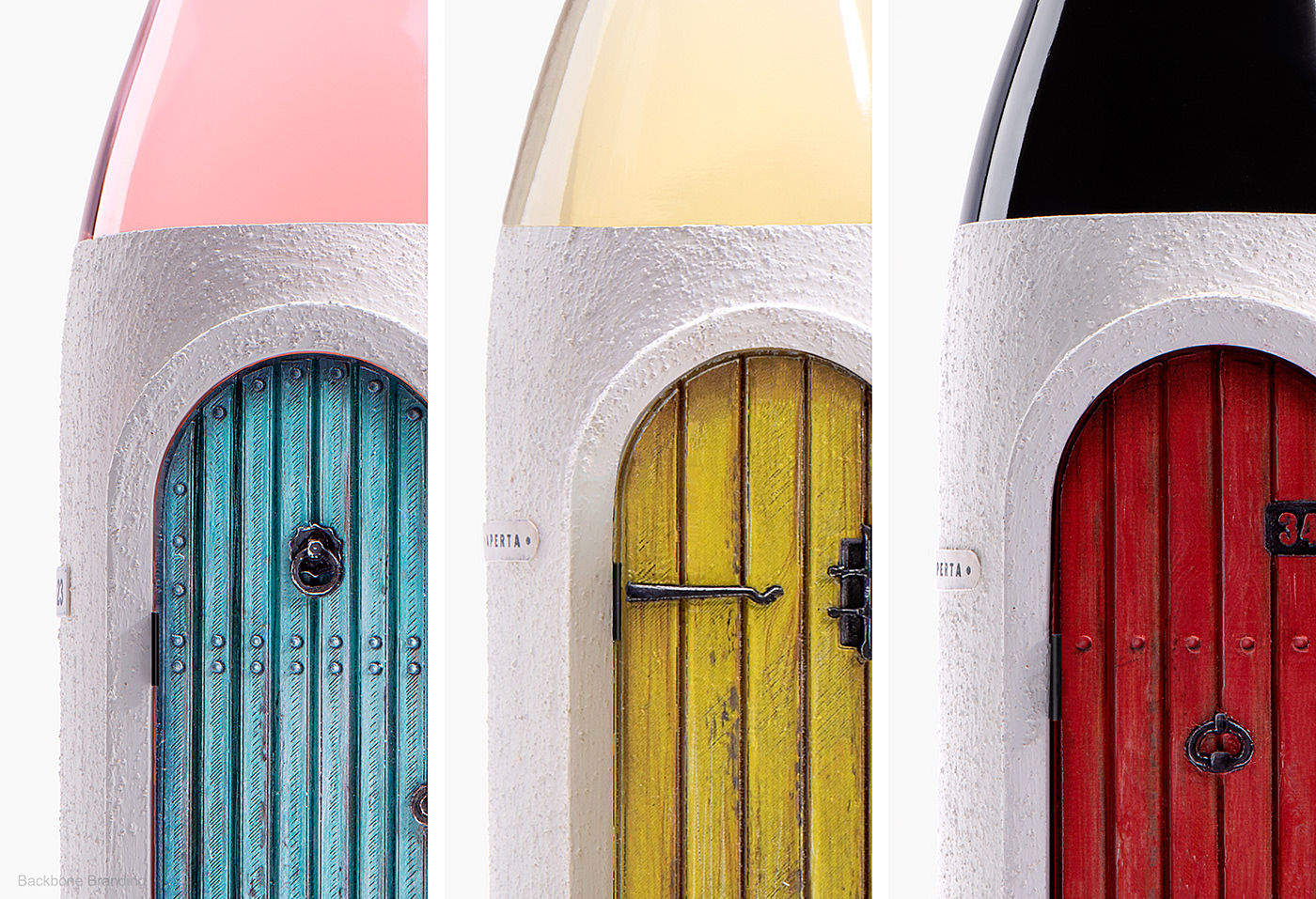
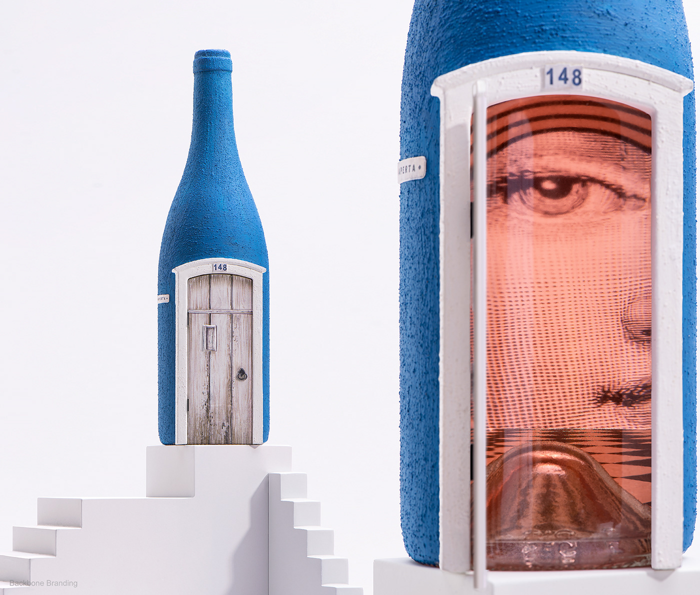
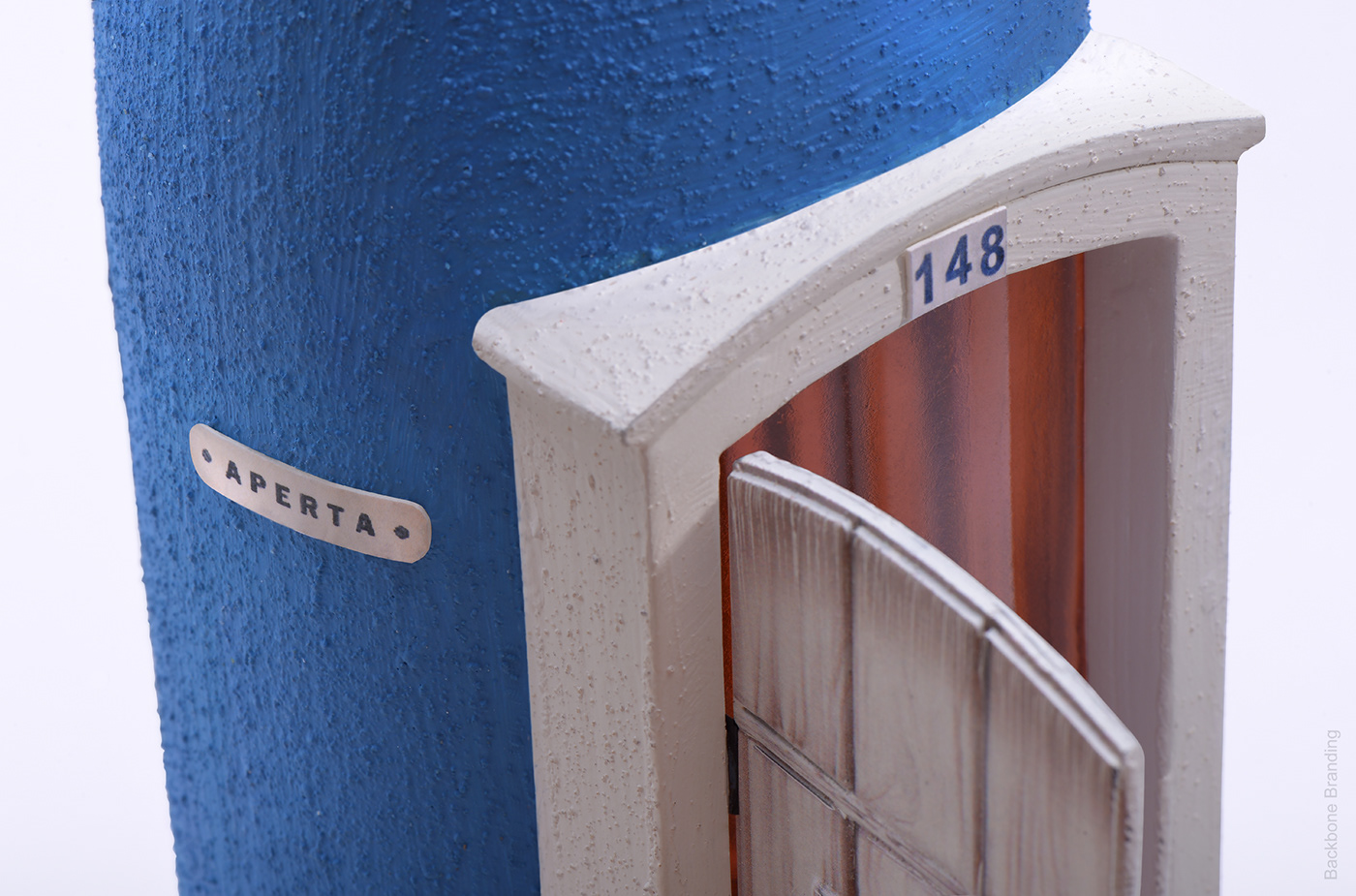
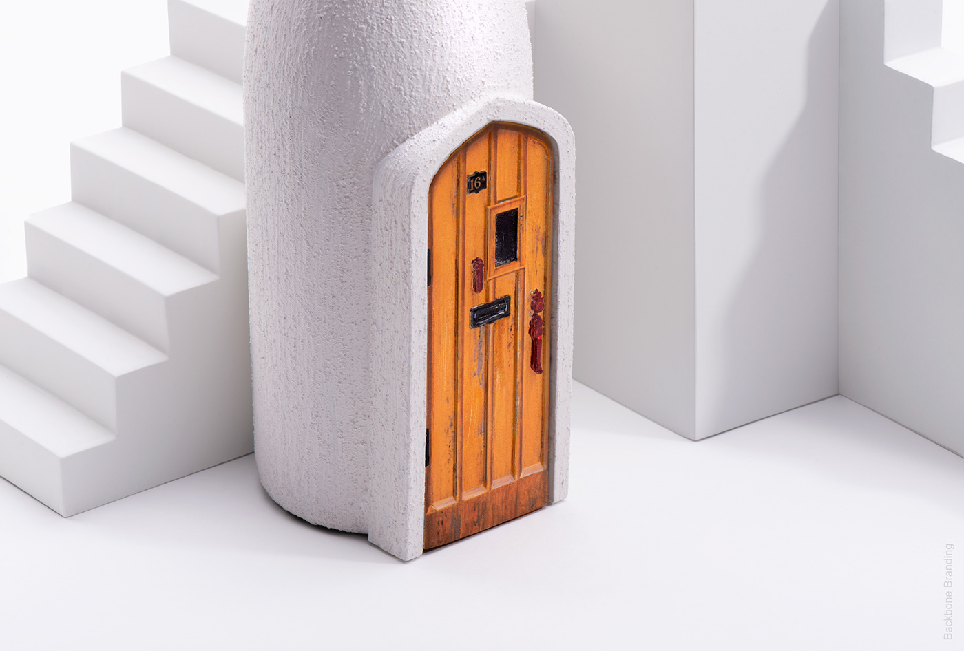
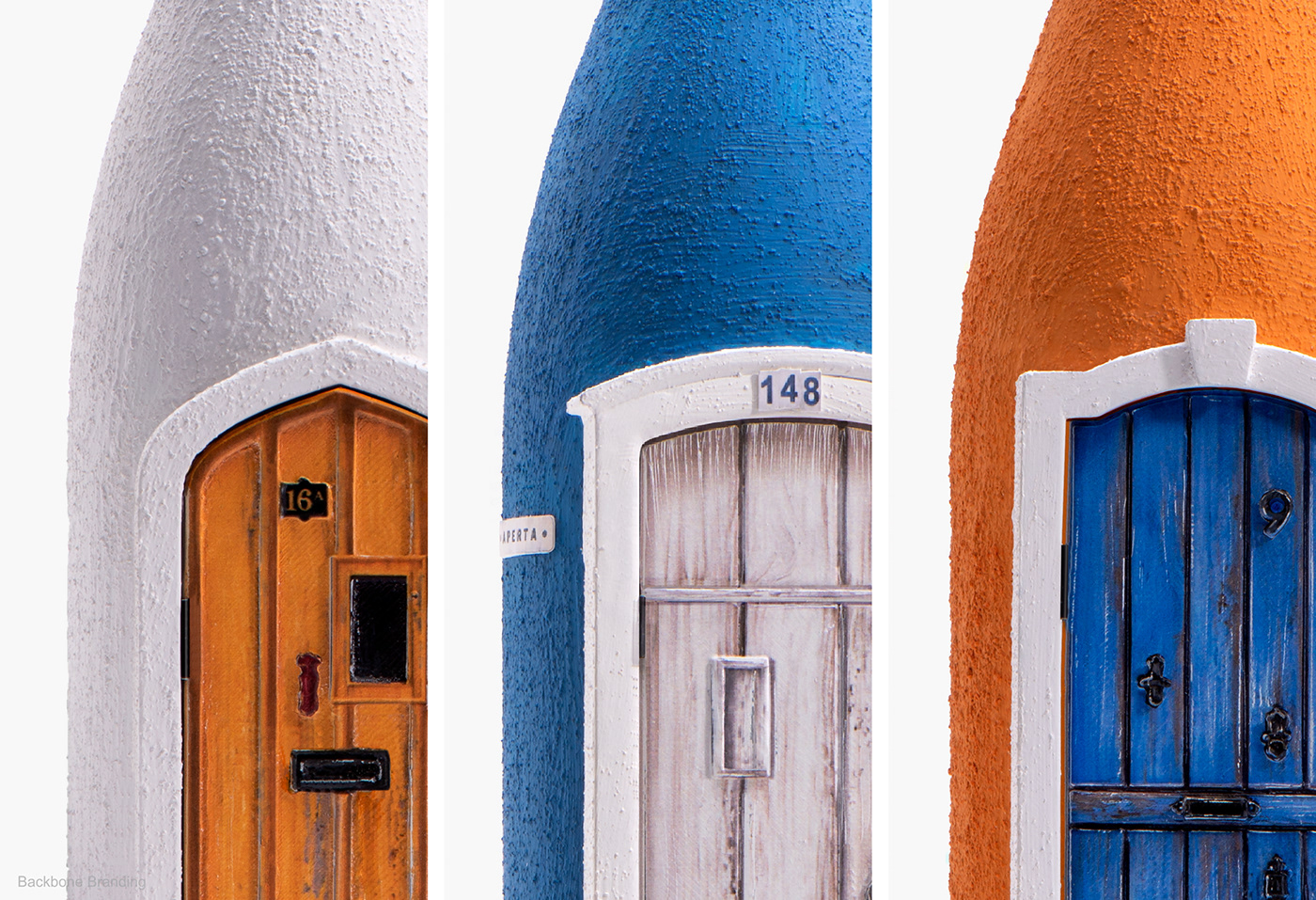
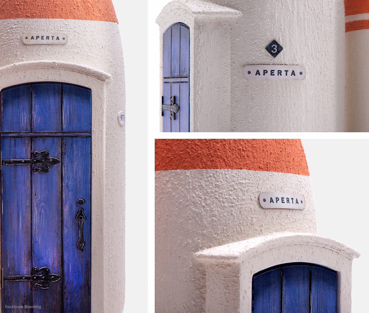
We called it “aperta”, meaning “open”, using doors on each bottle to lead you into each of their stories. We divided the wines by age - young, middle-aged, and old - each one presented in the three different types, namely rose, white and red wine.
The overall design is a visualization of a philosophy of the paths of human life with different doors, stairs, and passages through which man passes, changes, and matures, just as with wine․
The illustrations and colors vary between the three age categories, depicting developing life journeys and different experiences and tendencies from age to age.
Brand Strategist: Lusie Grigoryan
Creative Director: Stepan Azaryan
Art Director& Illustrator: Marieta Arzumanyan
Junior Designers: Lilit Hovhannisyan Liana Mazmanyan
Creative Director: Stepan Azaryan
Art Director& Illustrator: Marieta Arzumanyan
Junior Designers: Lilit Hovhannisyan Liana Mazmanyan