
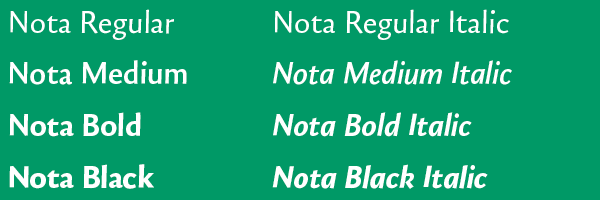
Nota is what handwriting could look like as a typeface. The influence of the pen comes through in the oval and half oval letterforms where the northeast and/or southwest sides of “b”, “o”, and “q” are thickest. Like many sans serifs or block letters, Nota is a low-contrast typeface because the difference between the stroke widths is minimal. Its unusual traits also make it legible and readable: ascenders, compared to handwriting, are not capped by sharply angled tips, they flair slightly to the left and bulge gently at the top; the descenders of “p” and “q” are straight, but appear to be tilted because Djurek has slanted all upright letterforms by two degrees. The left stems of “m”, “n”, and “p” are slightly pinched at the top to keep the branches legible at text sizes and the hook of Nota’s “r” is a nondescript, nearly horizontal projection.
Though a bit rigid, Nota’s Italics are authentic: “g” and “a” become cursive single-storey forms, “f” gains a lively descender, and all remaining lowercase forms are based on the looping flow of a sharply angled, fast-moving pen. Nota Italic’s ovals and curves are tighter, the counters are smaller, and the letterforms are condensed. The tops of ascenders slope more, though not as much as they would if they were handwritten. Djurek’s decision to cut the bottoms of the stems at contrasting angles makes Nota Italic distinctive. The bottom left stem of “h”, for example, is trimmed at a steeper angle compared to the one on the right. The typeface works very well at text and display sizes because it is chiseled and rhythmic, elegant because it is neither too loud nor too soft-spoken. It is innovative because Djurek has managed to settle the friction between tradition and novelty.


Nota supports following languages:
Latin: Afrikaans, Azeri (Latin), Basque, Bosnian, Breton, Catalan, Croatian, Czech, Danish, Dutch, English, Esperanto, Estonian, Faroese, Finnish, French, Friulian, German, Greenlandic, Hawaiian, Hungarian, Icelandic, Indonesian, Interlingua, Irish Gaelic, Italian, Kurdish (Latin), Latvian, Lithuanian, Luxemburgish, Malay, Maltese, Māori, Norwegian (Bokmål, Nynorsk), Polish, Portuguese, Rhaeto-Romanic, Romani, Romanian, Sámi (Inari, Lule, Nrthern, Southern), Serbian (Latin), Slovak, Slovene, Sorbian, Spanish, Swahili, Swedish, Turkish and Welsh.
Latin: Afrikaans, Azeri (Latin), Basque, Bosnian, Breton, Catalan, Croatian, Czech, Danish, Dutch, English, Esperanto, Estonian, Faroese, Finnish, French, Friulian, German, Greenlandic, Hawaiian, Hungarian, Icelandic, Indonesian, Interlingua, Irish Gaelic, Italian, Kurdish (Latin), Latvian, Lithuanian, Luxemburgish, Malay, Maltese, Māori, Norwegian (Bokmål, Nynorsk), Polish, Portuguese, Rhaeto-Romanic, Romani, Romanian, Sámi (Inari, Lule, Nrthern, Southern), Serbian (Latin), Slovak, Slovene, Sorbian, Spanish, Swahili, Swedish, Turkish and Welsh.
Cyrilic: Abaza, Adyghe, Aghul, Avar, Belarusian, Bulgarian, Chechen, Dargin, Ingush, Kabardian, Karakalpak, Kumyk, Lak, Lezgian, Macedonian, Mordvin (Erzya), Mordvin (Moksha), Nogai, Russian, Rutul, Serbian (Cyrillic), Ukrainian, Uzbek.


