Macross 82-99
A MILLION MILES AWAY
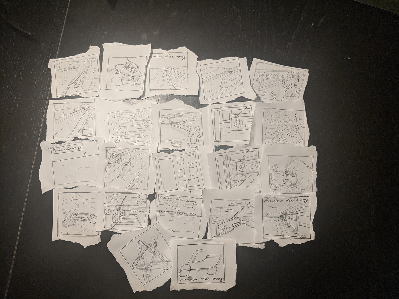
Thumbnail sketches

During my thumbnail sketches, I considered what mediums I would use to create them. Mostly, I wanted to create the cover art through digital illustration using Adobe Fresco. This is because the "future funk" genre is often associated with anime and Japanese culture, so I wanted to create artwork in that style. I wanted to create something that conveyed the feeling of "A Million Miles Away" in beach paradise, the feeling I get when listening to the music. The album includes both high energy, exciting tracks, as well as laid back, slower tempo songs, to convey a range of emotions you'd feel at a beach holiday.
Version 1

The first idea that appealed to me was a collage style collection of digital illustrations, similar to the album's existing cover. The radio is the main focus of the image, to reflect Macross 82-99's music, who often include sounds such as radio static or announcer voices in their tracks. Additionally, tying this to the image of the sea behind it creates the desired atmosphere of a laid back and peaceful environment. When listening to their music, I envision myself laying on a beach, listening to it through this radio.
This idea I still think could have done well, but it just came down to preferring version 3 over it (coming up). I wanted to convey that peaceful beach atmosphere more, which I think worked better in version 3.
Version 2

My second idea takes the concept of "A Million Miles Away" more literally, placing a train in the distance of the vast ocean landscape. This brings out the feeling that man is not so important in the grand scheme of things, and instead makes you focus on the large, tranquil rest of the illustration. Even a giant vehicle like a train looks small in comparison. The way the train drives on water is a nod to the anime "spirited away", keeping in line with the Japanese influence. Floating on the water, creating gentle ripples, creates a relaxing, fantastical atmosphere, and conveys to me the feeling of riding a long train trip to another, far away place.
My problem with this design was that - by design - the train was going to be hard to see, which I was hoping would make you want to look closer at the cover, but I think in the end, just feels lost. Additionally, I wasn't happy with the overall composition when trying to add text on top of it as well, as it only increased the visibility problem of the train. I instead wanted to try going for a simpler design, and honed in on that for version 3.
Version 3

For version 3, I wanted to keep it simple, and stick to this ideallistic, fantastical representation of water. Again, this is drawn similar to the Japanese anime style, to stick with the theme of the music and future funk genre. Additionally, representing the water in this cartoon style makes it feel more foreign: "A Million Miles Away", yet, the perfect ripples and bubbles of water still feel familiar. The perspective of the artwork draws you in, and is used to emphasize the text placed on top of it afterwards in Photoshop.
This was the design I chose to elaborate on further.


Additional filters were added in Photoshop to further enhance the piece, as well as the text box at the top. The Japanese characters are the main focus, to reinforce that foreign feeling of "A Million Miles Away" (to a western listener).
Overall, I am happy with the final design, and glad I chose this one to continue with for the rest of the project. The illustration itself is not complicated, but with the filters added on top creates detail that you may not notice on first inspection. The grainy filter and blur enhance that distant feeling, like a dream, or memory. I can envision myself splashing in the sunny, shallow waters, enjoying my paradise in "A Million Miles Away".

