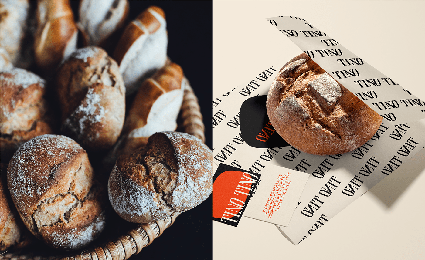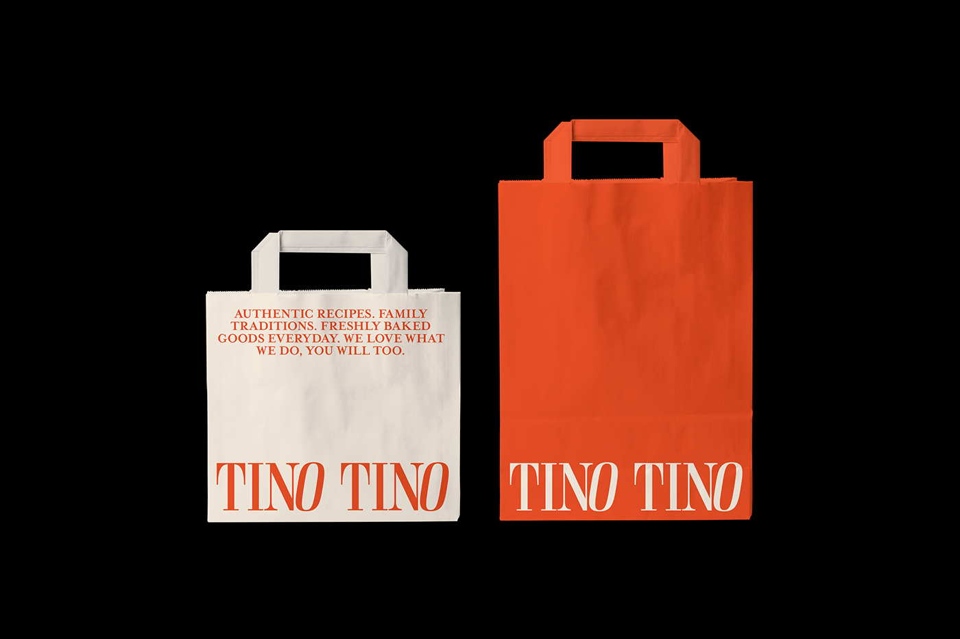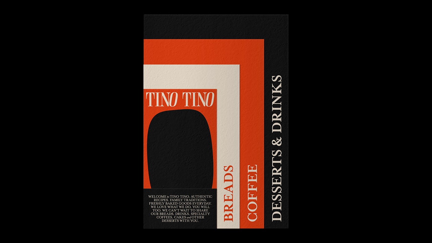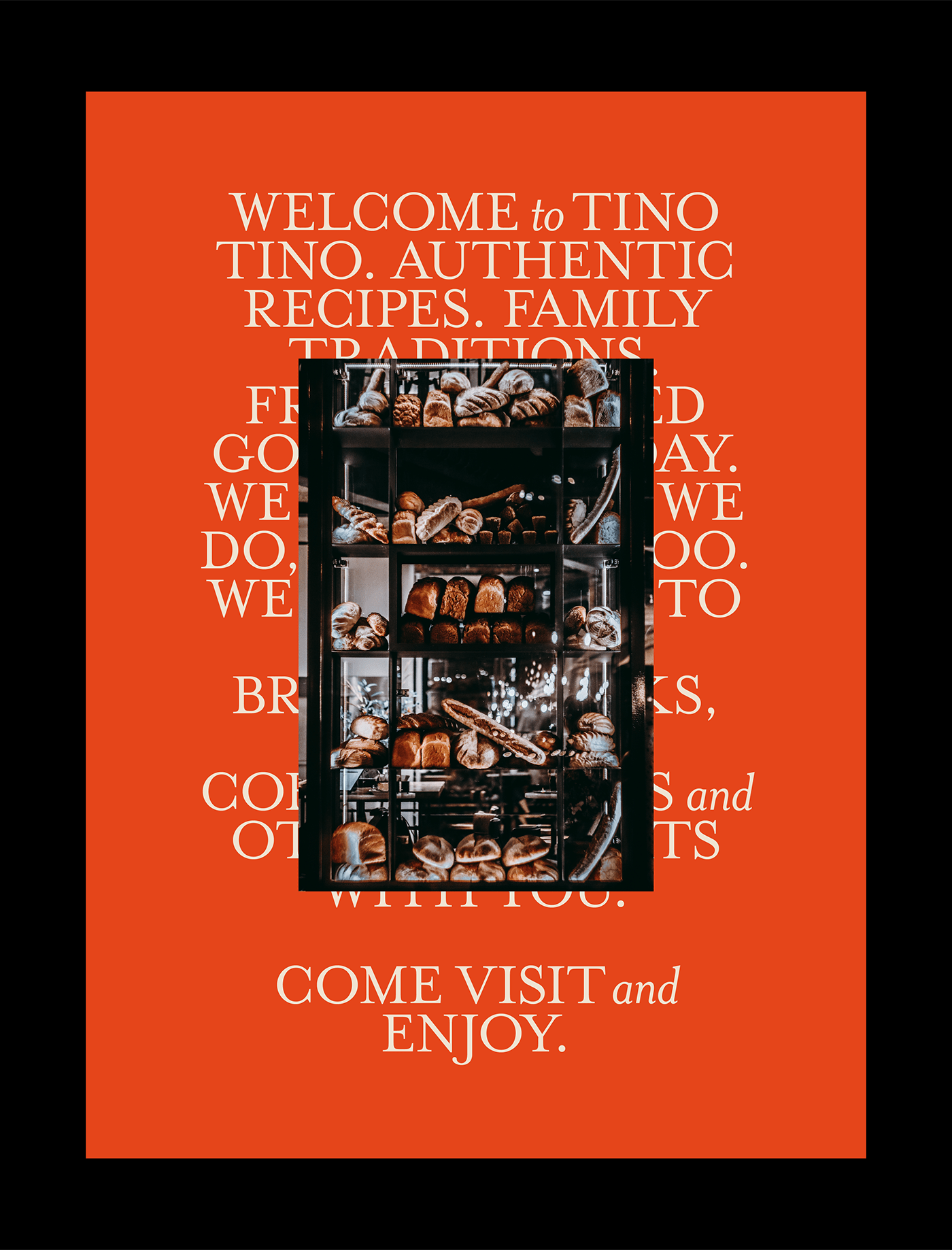
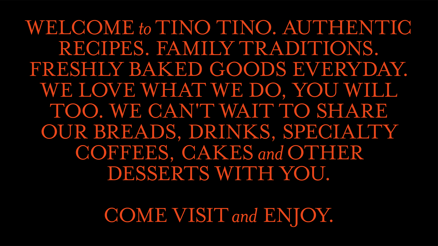
"Authentic Recipes. Family traditions. Freshly baked goods everyday. We love what we do, you will too."
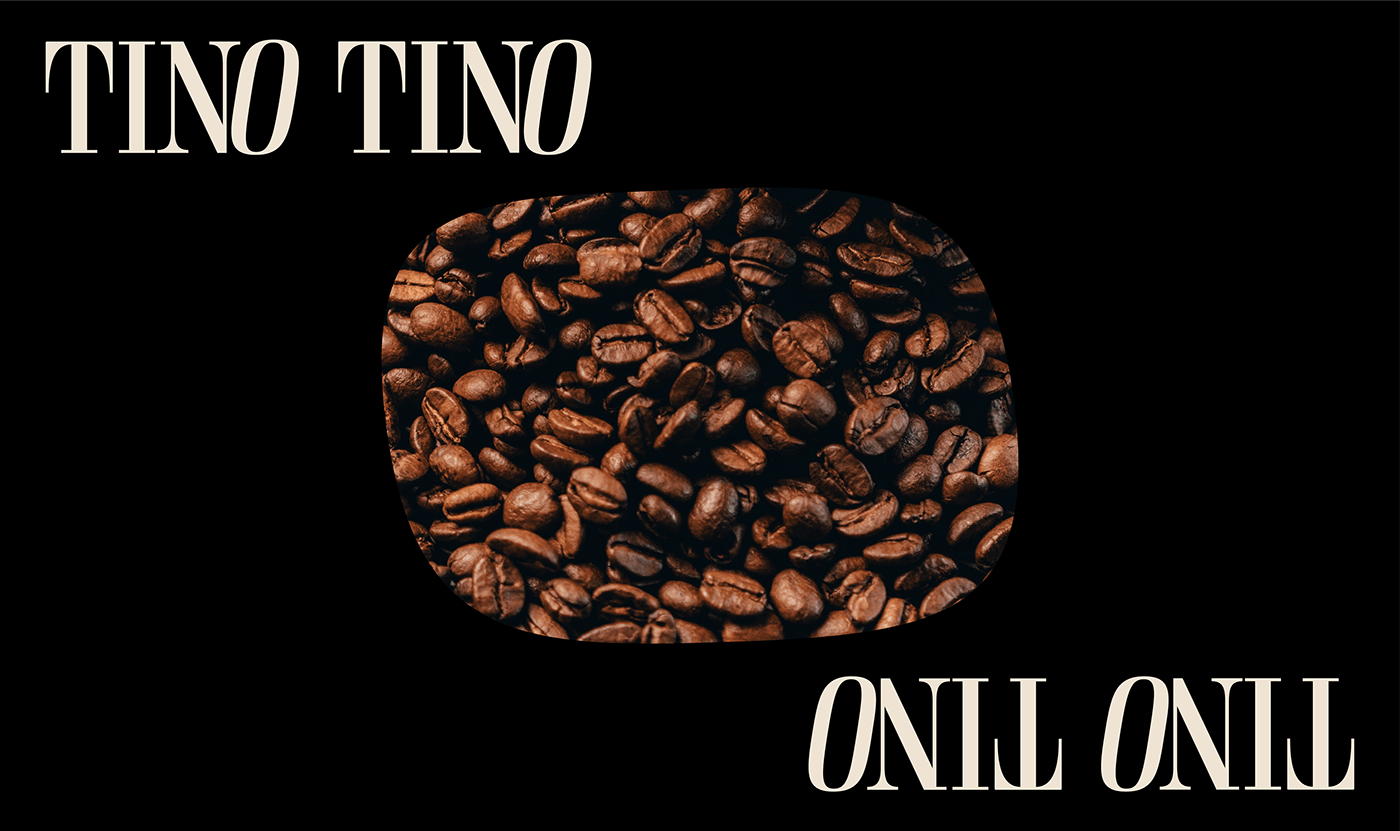
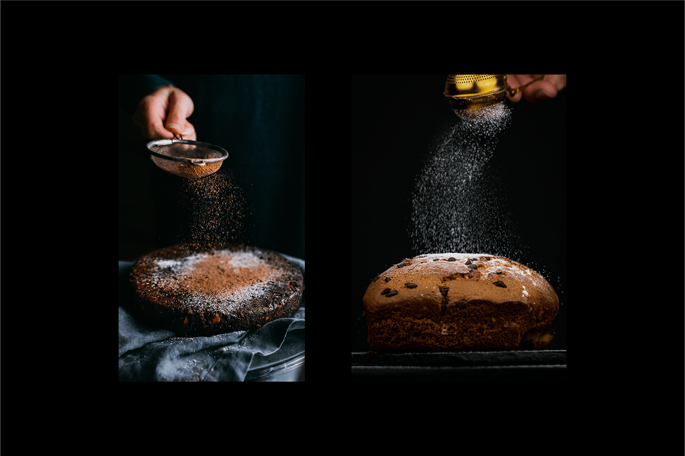
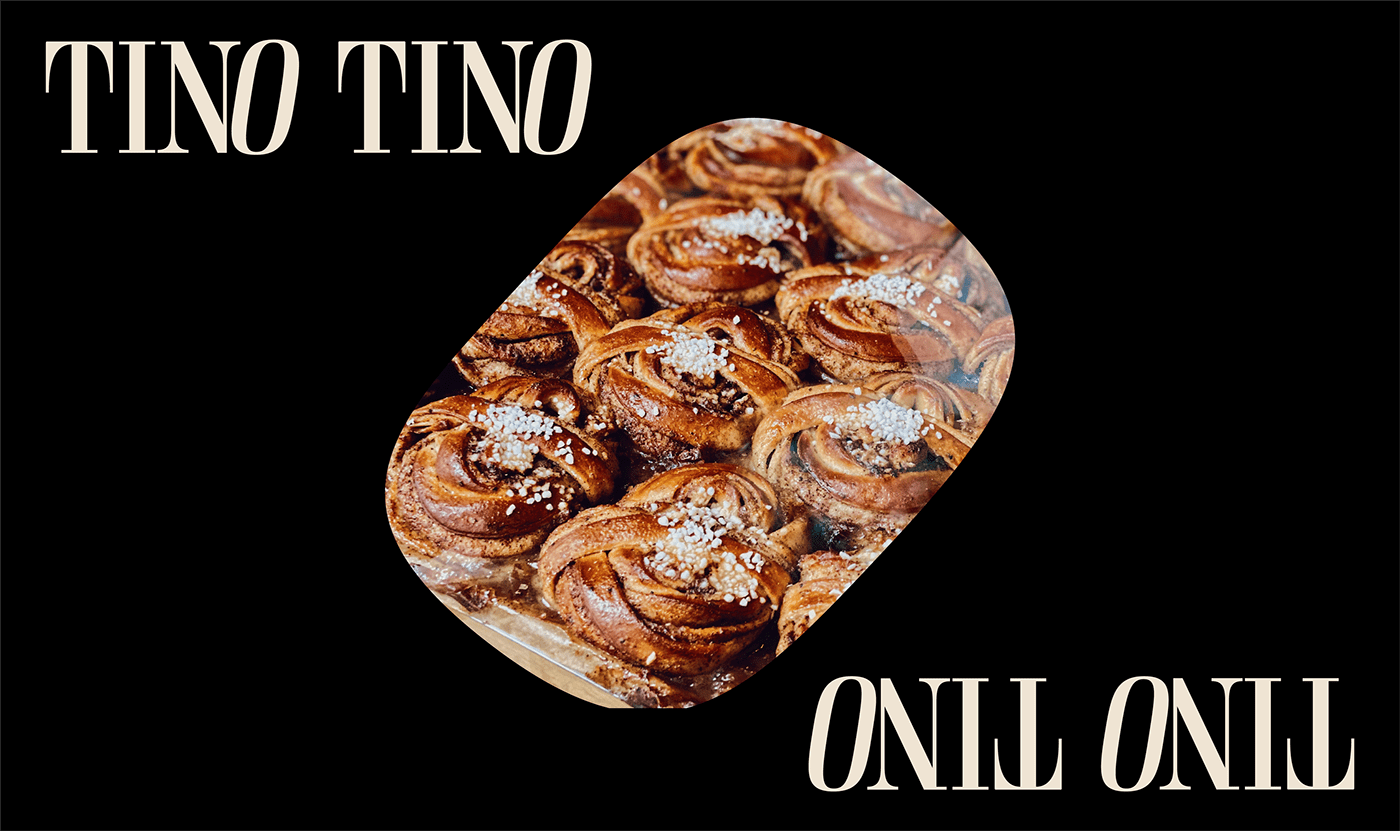
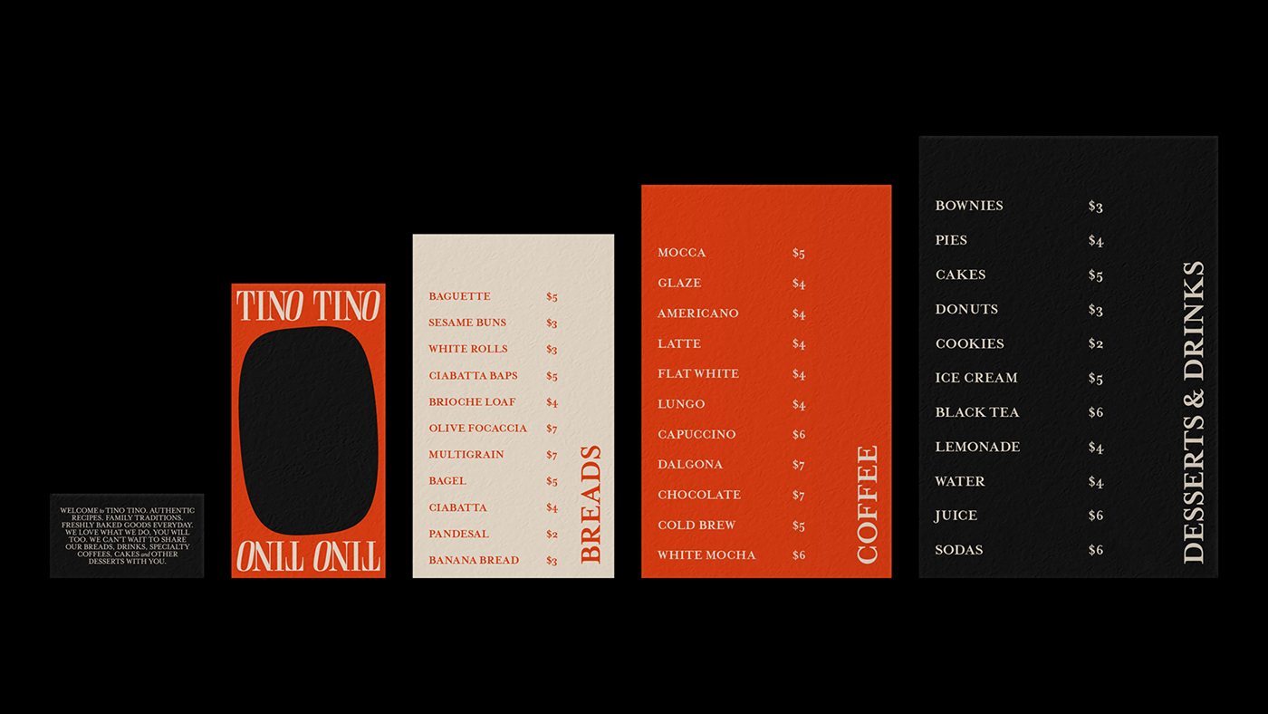
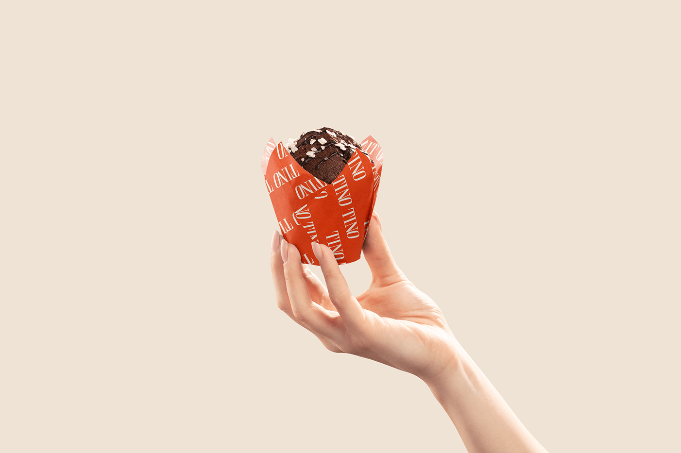
Tino Tino serves fresh breads, specialty coffees, desserts and non-alcoholic beverages to customers in its stores. They guarantee that these products are fresh, with careful and selected ingredients. The store maintains a relaxed and open atmosphere, an interesting detail is that it seeks to attract attention with the aroma of fresh baked goods and coffee.
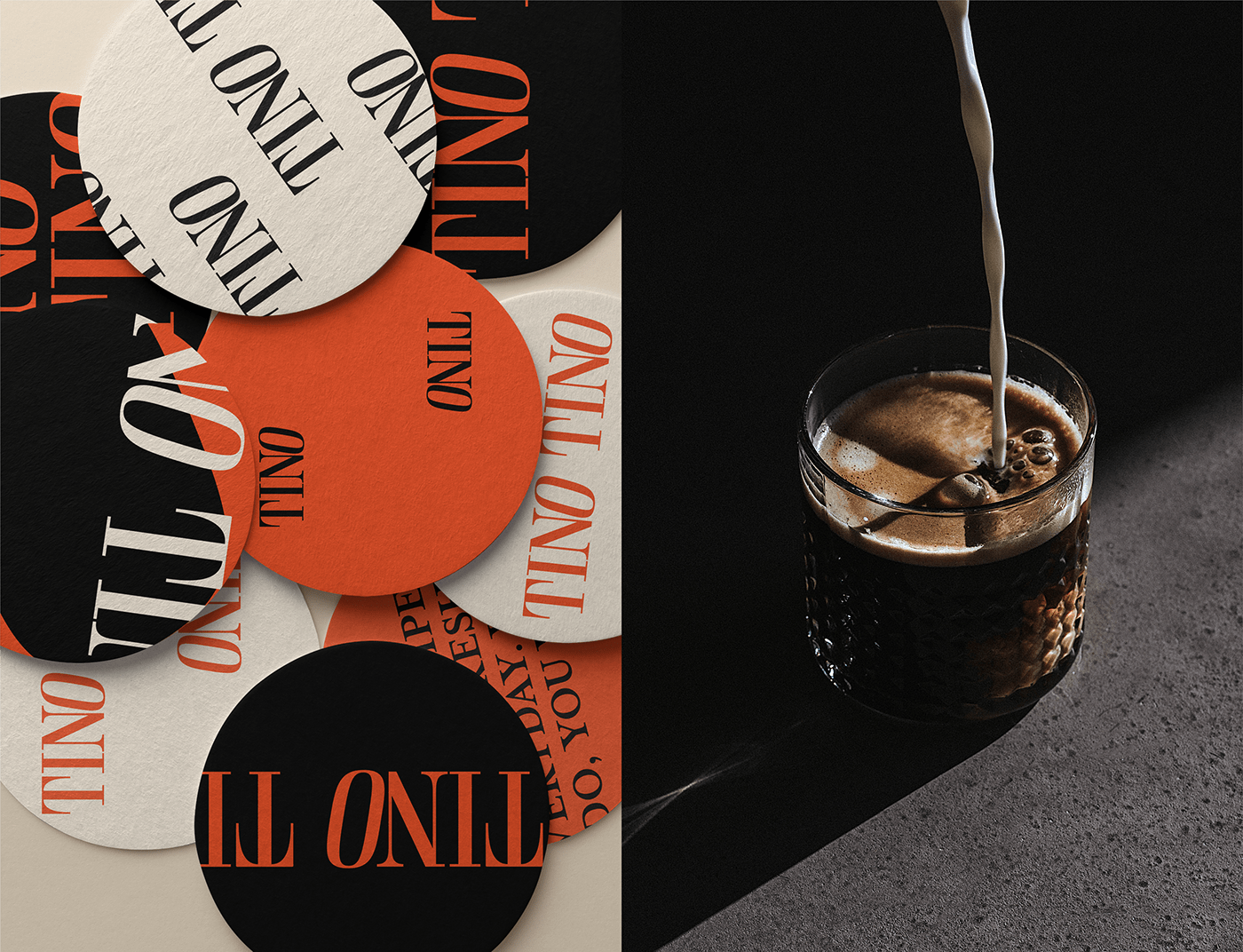
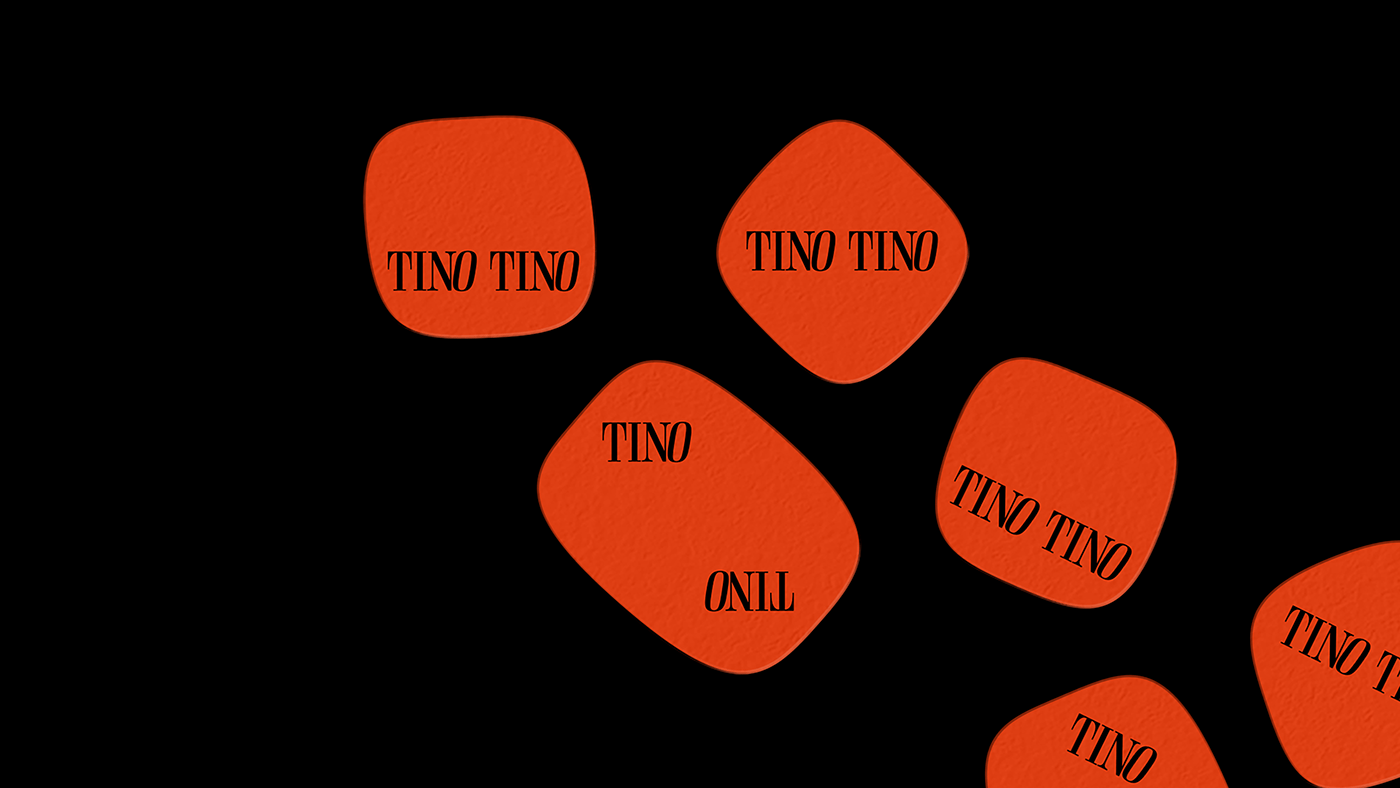
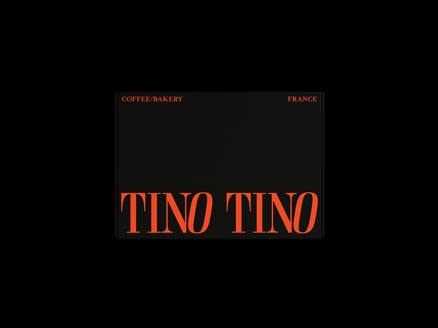
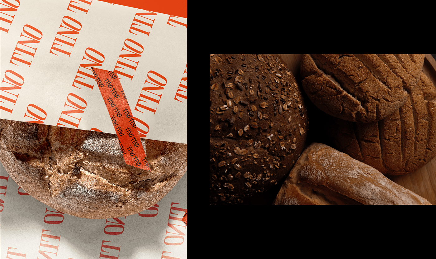
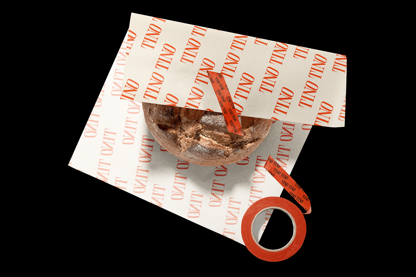
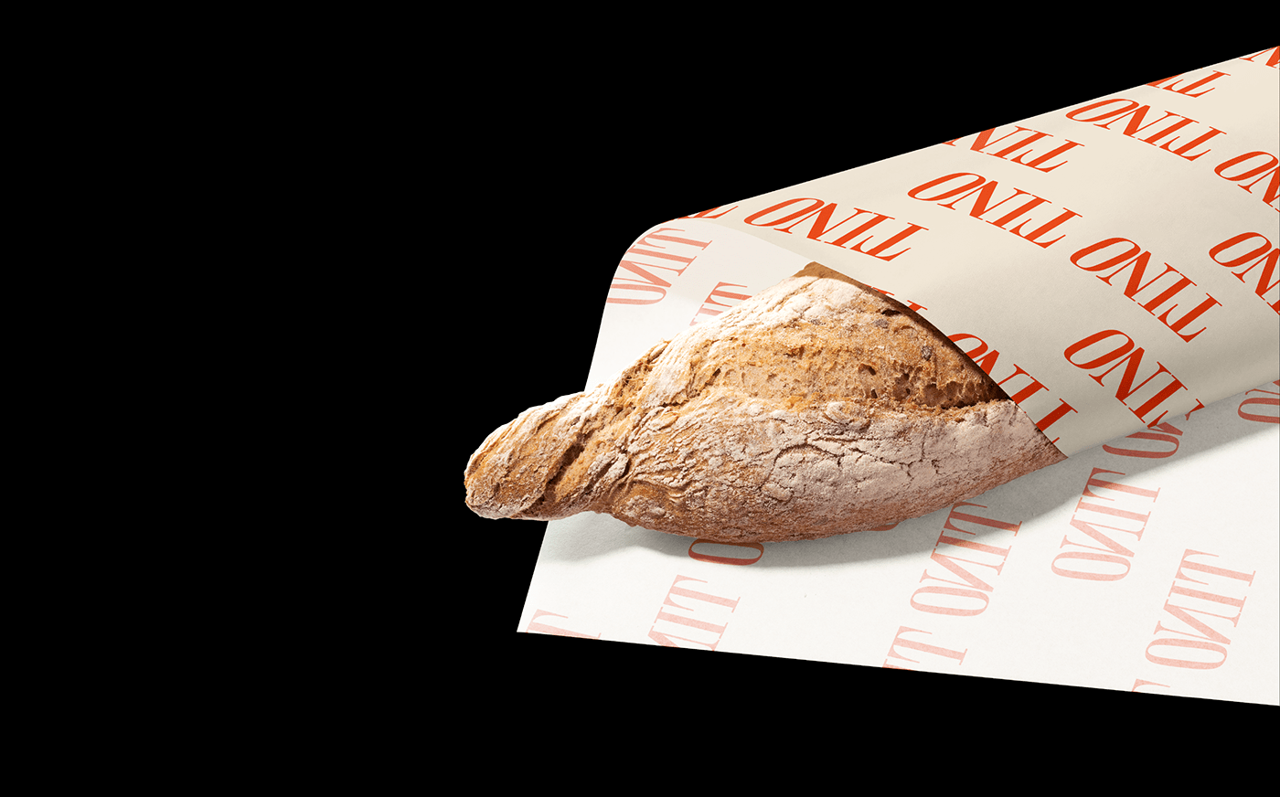
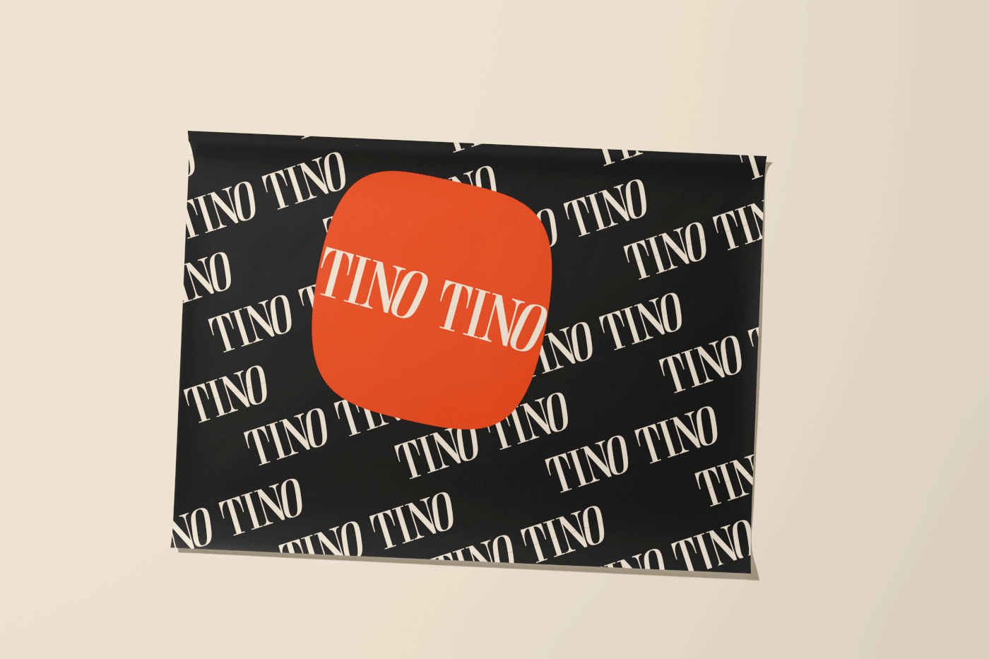
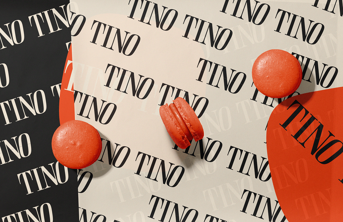
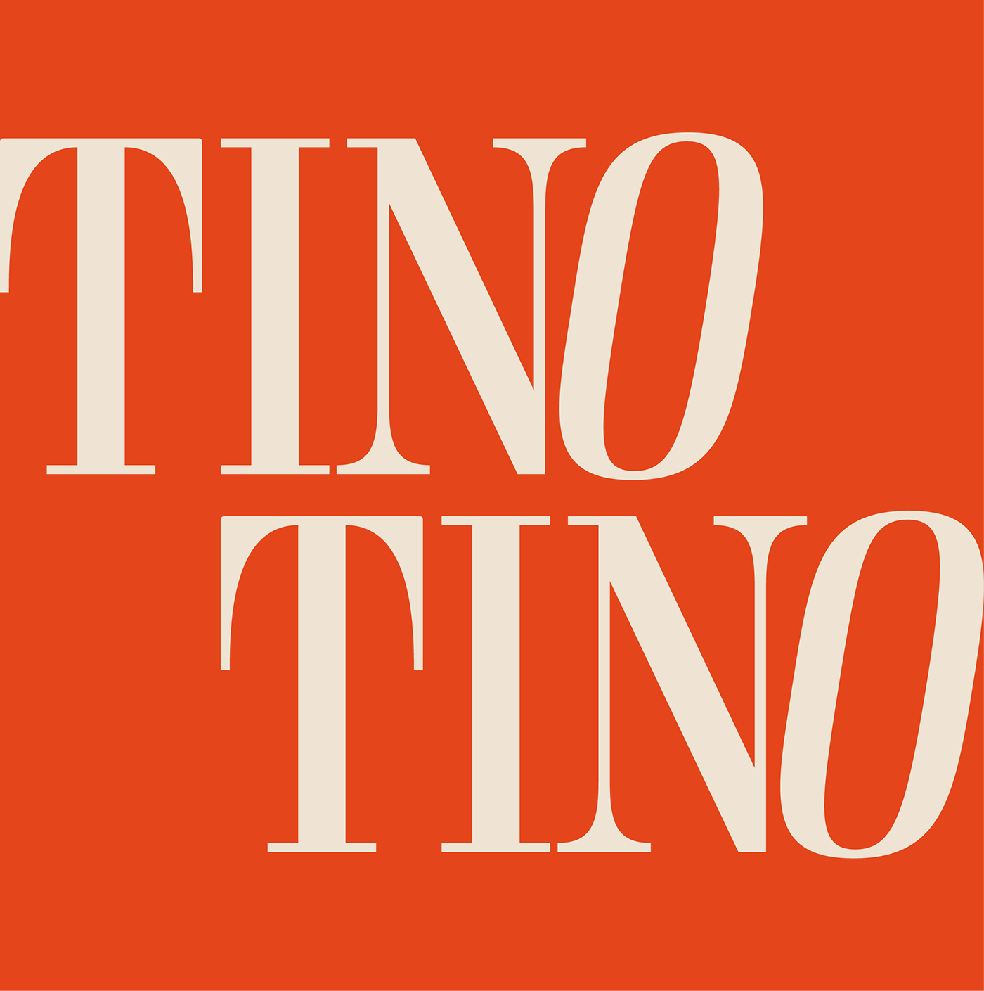
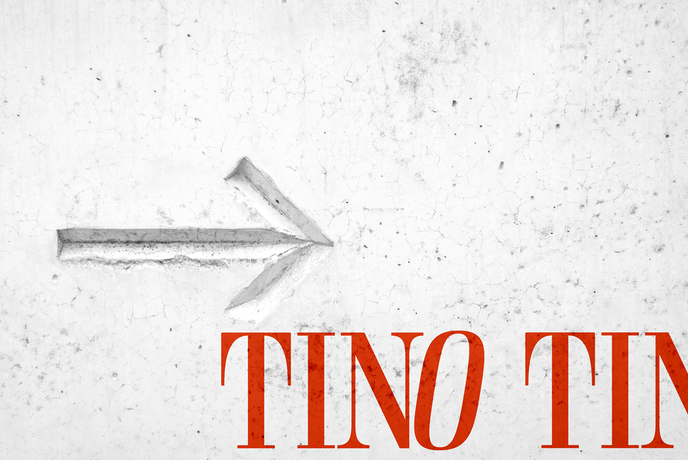
In the first phase, we carried out research, defined the basis and goals of the project and created a new logo that reflected the brand values. The logo was designed to be clean and simple, while also preserving its historic/traditional character, as requested and discovered in the early stages of the project.
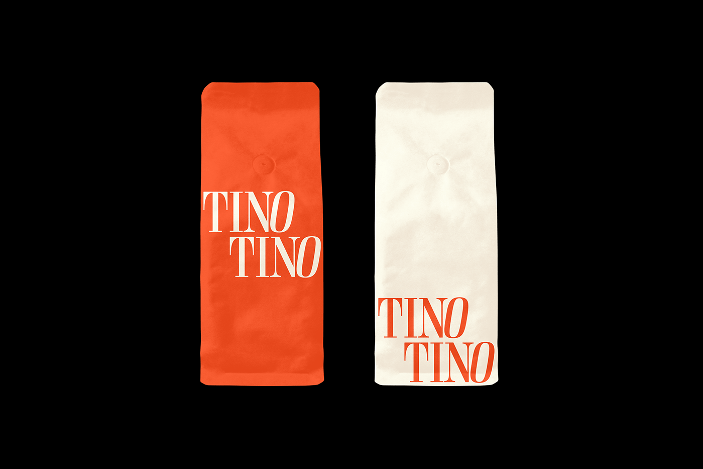
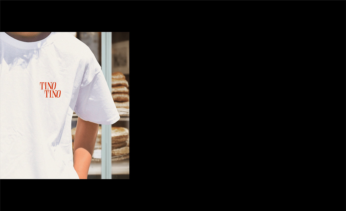
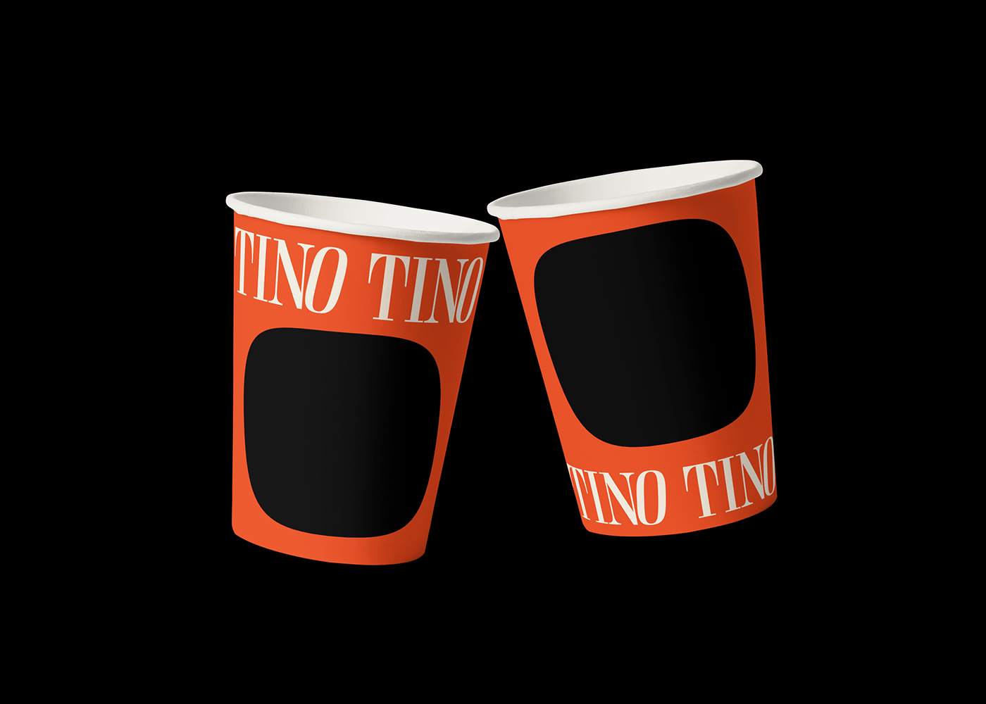
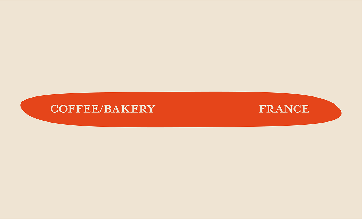
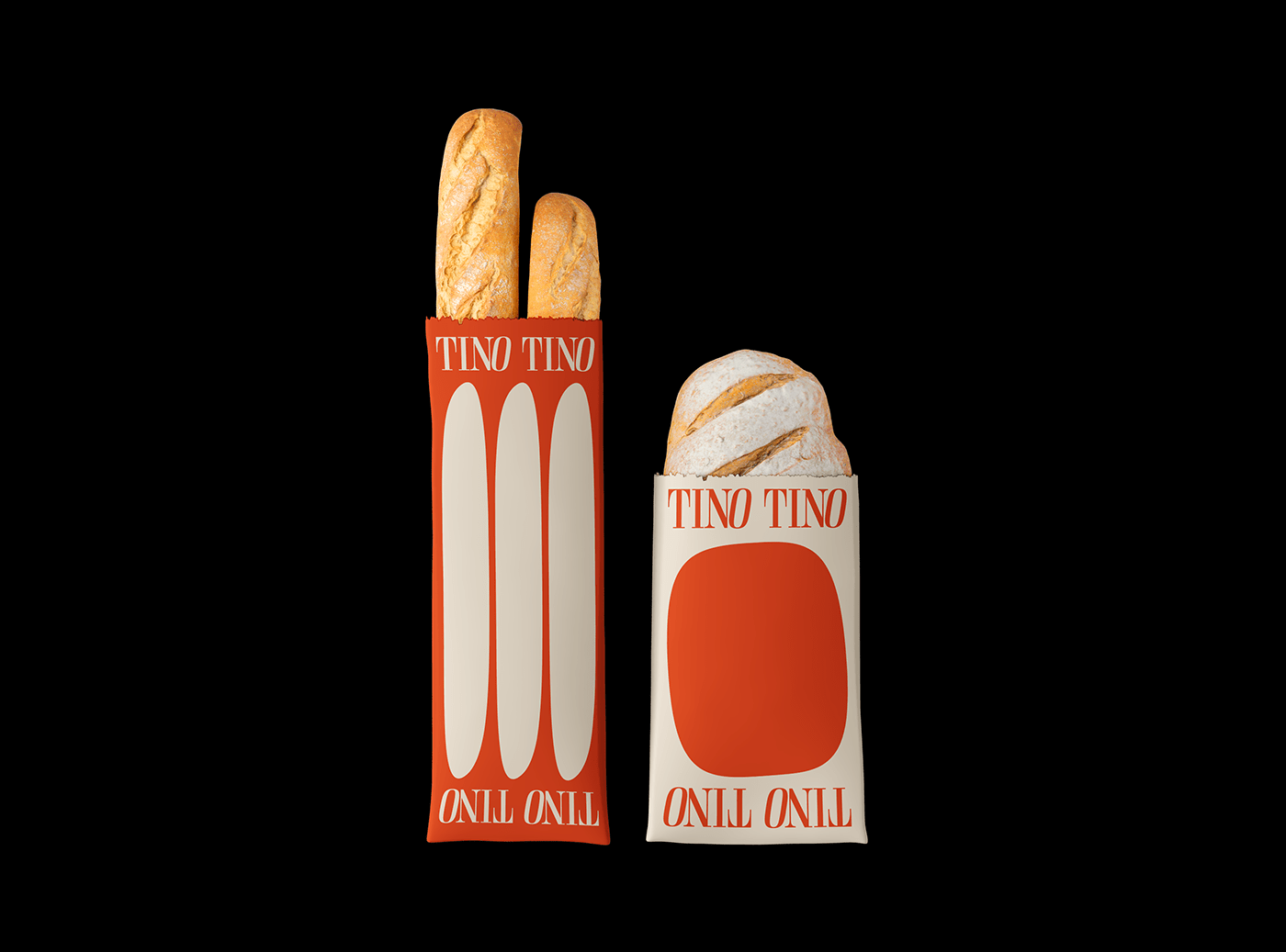
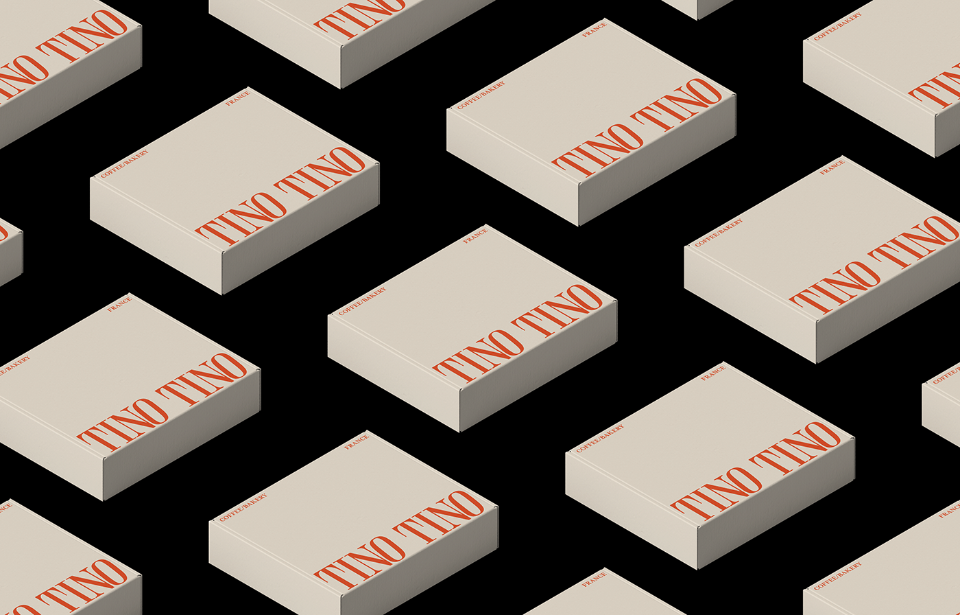
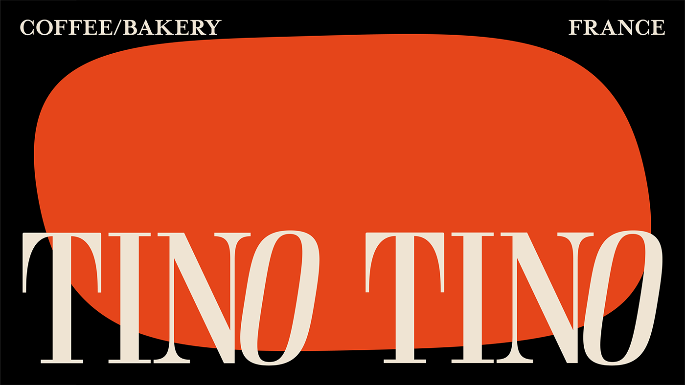
As it is a bakery and cafeteria in a shopping center where values are higher, we wanted to keep originality, sophistication and tradition together, walking side by side. We arrived at this vibrant result, with an elegant touch and simple communication of a strong visual identity.
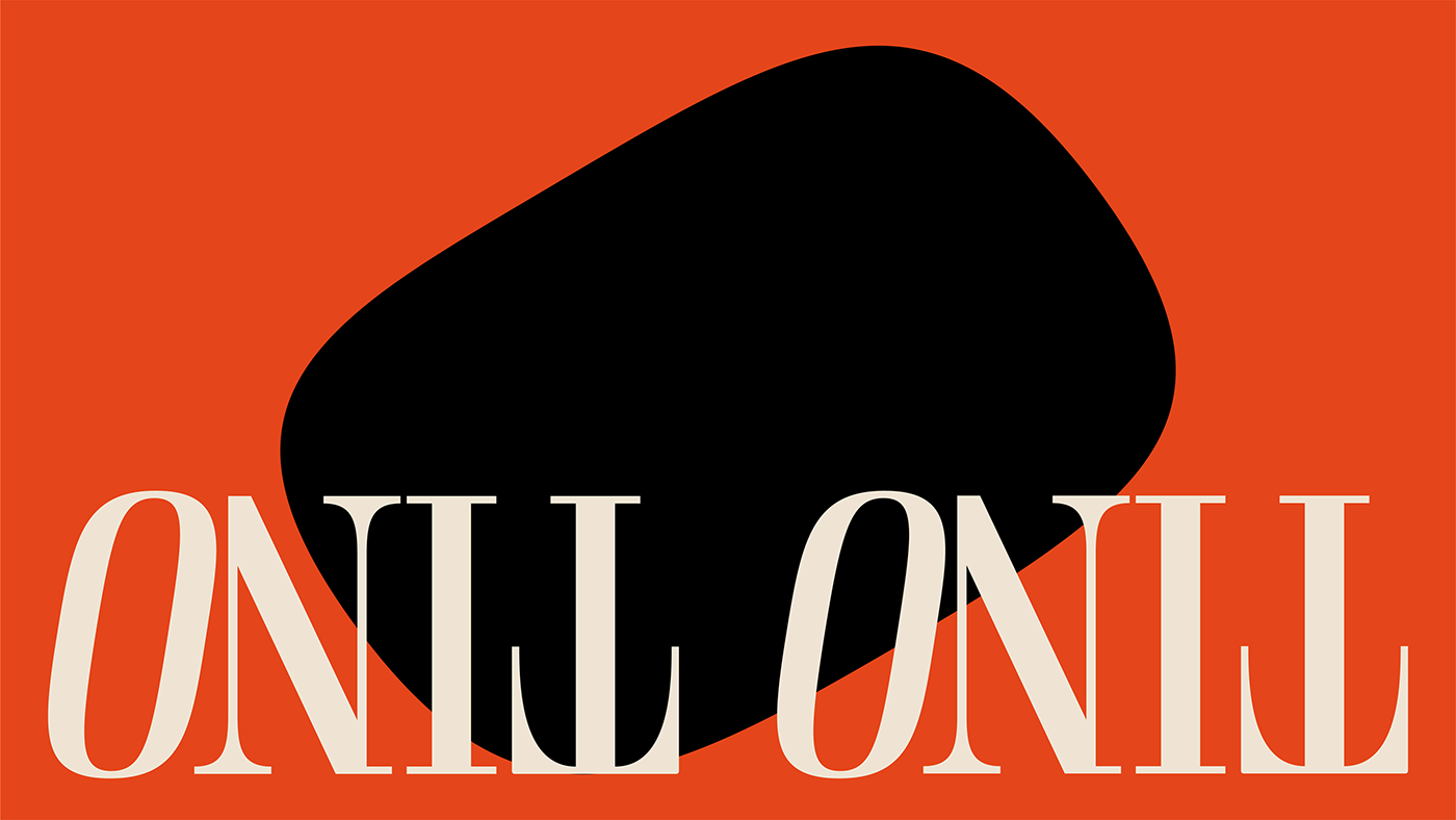
The logo and supporting typography were chosen for their elegance and the color palette was chosen for their warmth, we wanted a vibrant brand that shows itself to offer a premium product. I believe we have achieved a good balance and a good look that not only looks good, but also works.
Tino Tino serves fresh breads, specialty coffees, desserts and non-alcoholic beverages to customers in its stores. They guarantee that these products are fresh, with careful and selected ingredients. The store maintains a relaxed and open atmosphere, an interesting detail is that it seeks to attract attention with the aroma of fresh baked goods and coffee.
In the first phase, we carried out research, defined the basis and goals of the project and created a new logo that reflected the brand values. The logo was designed to be clean and simple, while also preserving its historic/traditional character, as requested and discovered in the early stages of the project.
As it is a bakery and cafeteria in a shopping center where values are higher, we wanted to keep originality, sophistication and tradition together, walking side by side. We arrived at this vibrant result, with an elegant touch and simple communication of a strong visual identity.
The logo and supporting typography were chosen for their elegance and the color palette was chosen for their warmth, we wanted a vibrant brand that shows itself to offer a premium product. I believe we have achieved a good balance and a good look that not only looks good, but also works.