
“Unexpected logic” is NotCo's motto, a company born in Chile, but already taking over the world with its plant-based food technology. When NotCo reached out to us looking for a custom typeface, we were thrilled with the possibility of giving shape to such a bold strategy.
Until that point, NotCo used Neutraface as the brand's typeface. An excellent choice, but failing to follow the brand's continuous changes. Looking for just the right amount of unexpected, we went after both past and future.
Until that point, NotCo used Neutraface as the brand's typeface. An excellent choice, but failing to follow the brand's continuous changes. Looking for just the right amount of unexpected, we went after both past and future.
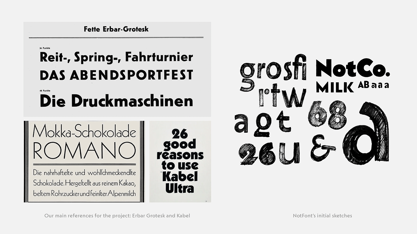
We looked for typefaces such as Kabel, a twentieth century classic that manages to create strong personality while being a geometric face. It was also important, however, to translate the brand's technological feel, which made us look for more futuristic references. NotFont is a mix of these two seemingly clashing ideas.
NotFont has unexpected logic, but is not disruptive. It functions like one of the companies’ core values: "make it bitesize". Which means being transformative in small steps.
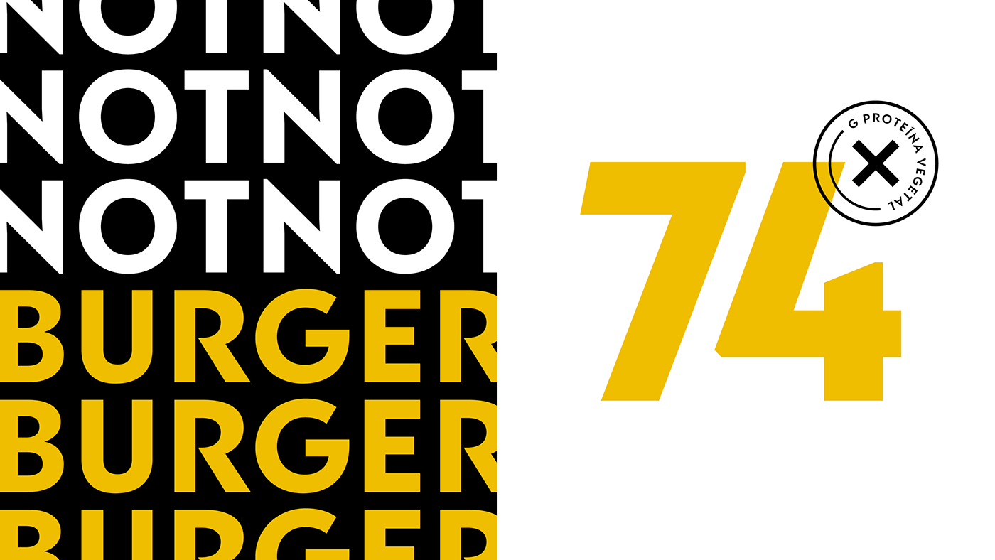
Display's uppercase letters were developed with packaging in mind. Problematic pairs such as RJ or VA were individually refined and are ready for big, bold presence on product's packages. There are also many characters worthy of attention, like /G and /a. Diagonal terminals were the perfect excuse for making pairs that fit into one another.
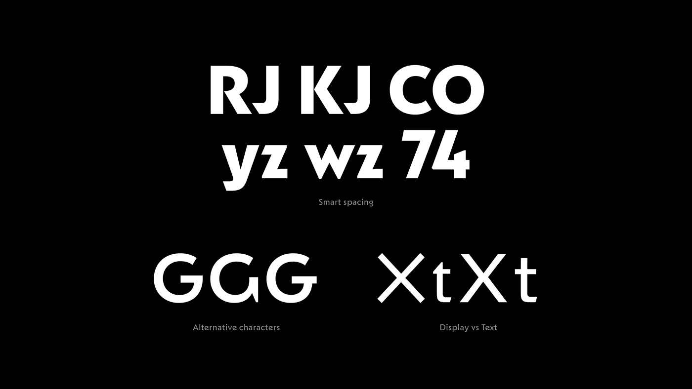
An “unexpected” tool we used for the design was having mathematically perfect shapes, like the /X and /O, which do not have optical adjustments, contrary to what would be expected. This gives and odd, but cutting edge look to the letterforms.
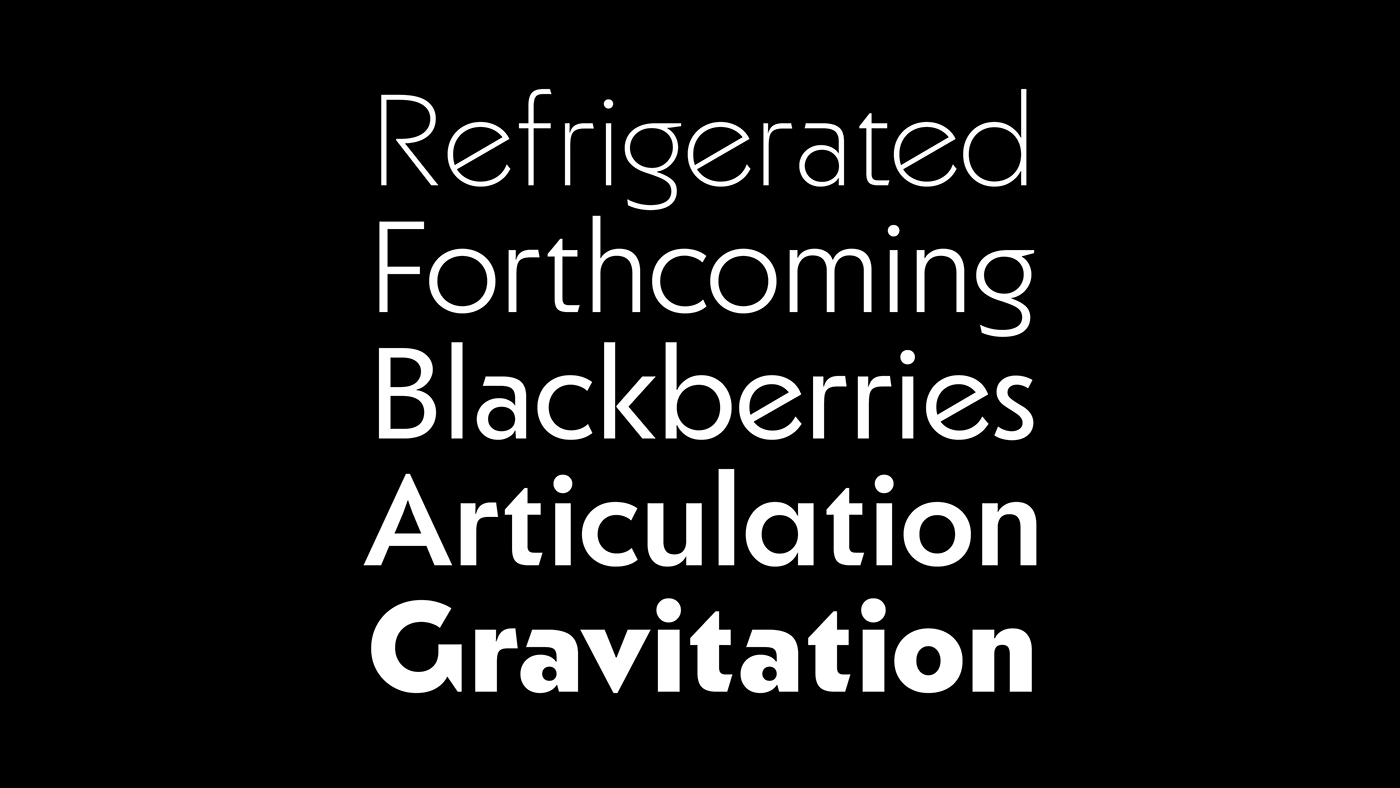
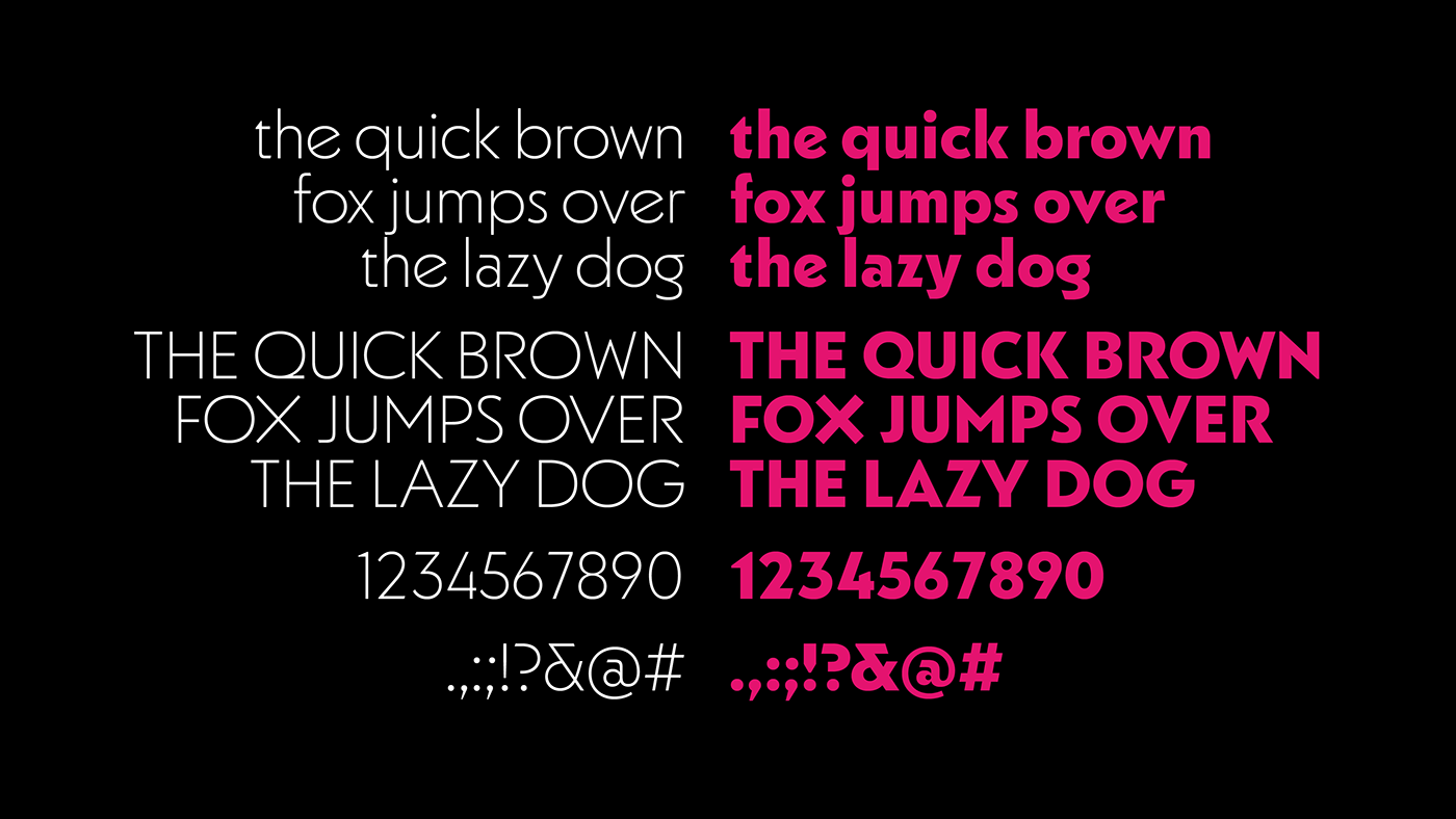
NotFont has both display and text versions. Forms like the crossed /X are only there for the display one, just like several other details that were toned down for legibility. Spacing is looser and the details simplest for NotFont Text.

Display's uppercase letters were developed with packaging in mind. Problematic pairs such as RJ or VA were individually refined and are ready for big, bold presence on product's packages. There are also many characters worthy of attention, like /G and /a. Diagonal terminals were the perfect excuse for making pairs that fit into one another.


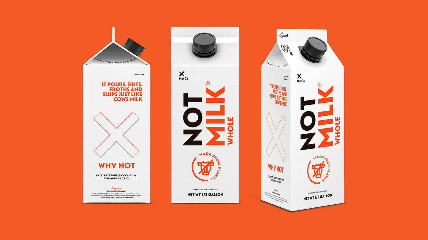


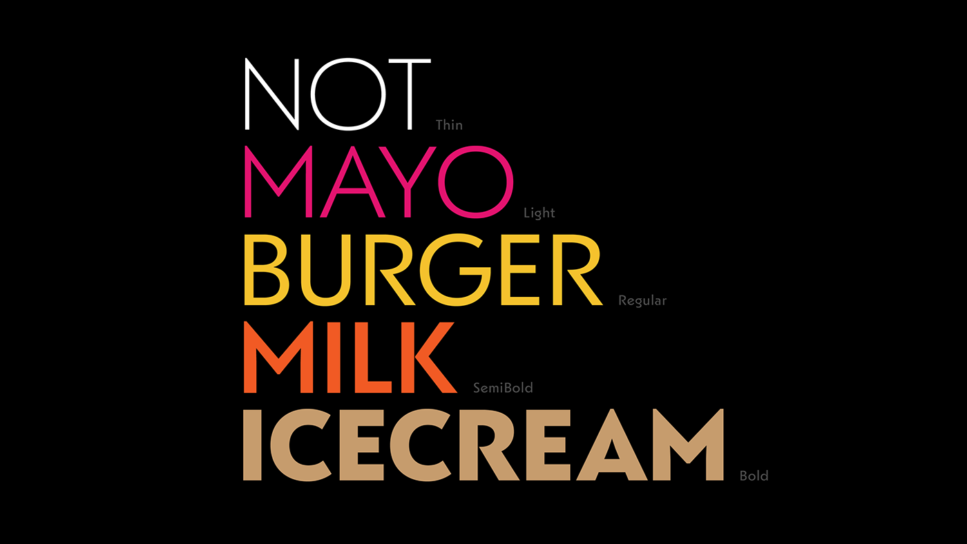
NotFont is now part of a big of products and assets, always named with the word “Not”: NotMilk, NotBurger, NotMayo. There's a great explanation for this: NotCo claims their products are just like animal products, but NOT.


Project Credits:
Branding and Visual Identity: Make – Mariona Ortiz & Kenzo Mayama Kramarz
Type Design: Plau – Rodrigo Saiani & Carlos Mignot


