
VHS effect was chosen for the posters and logo of the Composition exhibition. This seemed a logical decision considering Cunningham’s previous work with the format and his ‘alternative’ style.
Both artists also have a history of creating dark, mysterious work so I chose to try and reveal as little as possible about the exhibition itself apart from the necessary details and some small clues to what the exhibition is about.
The poster is printed in colour and a number of distortions have been added in order to emphasise the VHS effect. While this could not be replicated completely on the logo due to colour constraints, I believe the impression still comes across.
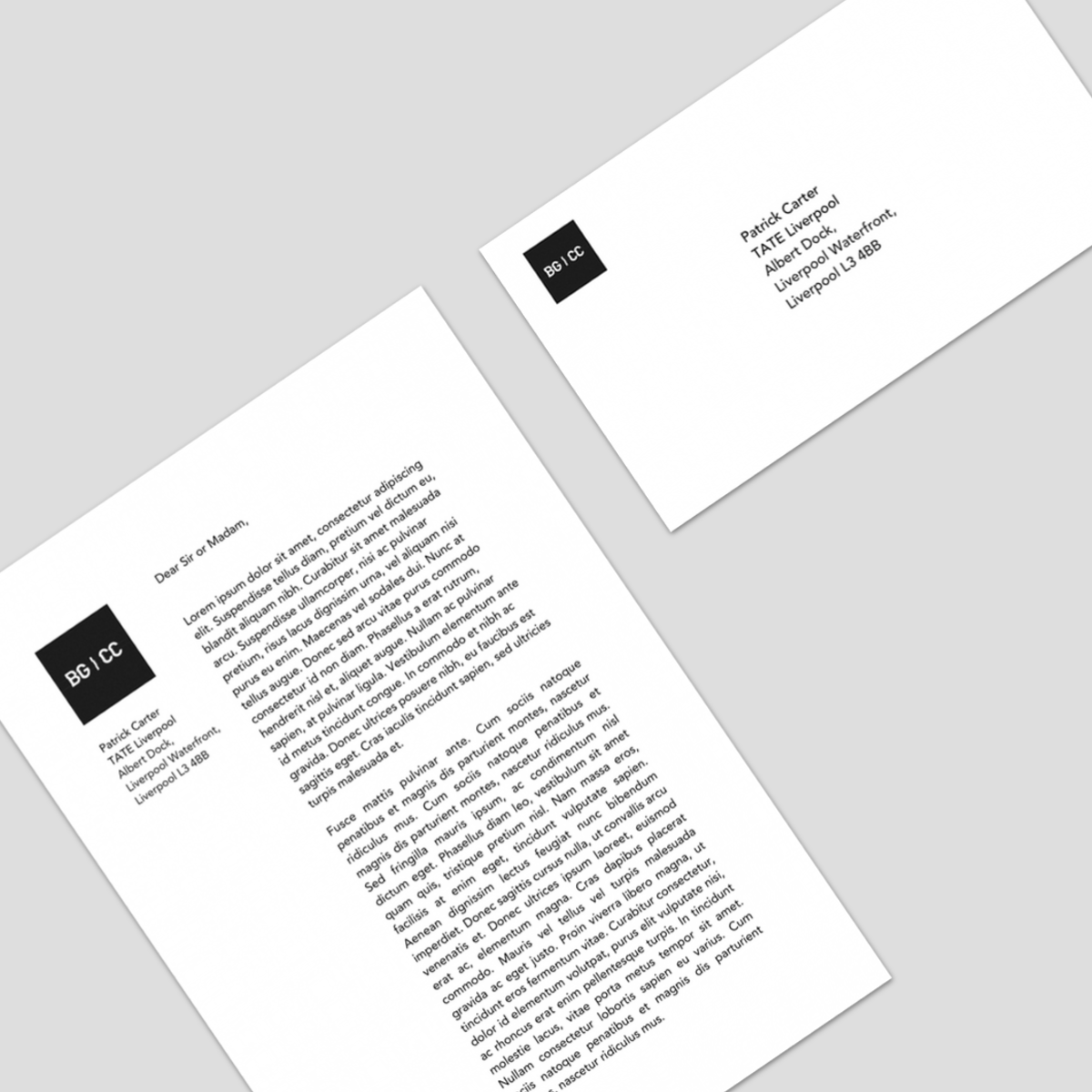
The logo is shown as a letterhead and on an envelope. These would be used when inviting special guests and for any official business relating to the exhibition.


The same aesthetic was continued onto the TATE Liverpool microsite for the exhibition. The visual distortion effect was continued on these pages as shown in the pictures to the left. Had the website actually been created these effects would have been animated, with moving horizontal scan-lines and specific flaws, characteristic of the VHS technology. A preexisting image of Björk was used for the front page of the site, however it was edited to resemble the characters featured in her last collaboration with Chris Cunningham, All is Full of Love.

To accompany the exhibition, a DVD featuring the work and a special edition VHS were created to be used as promotional items.


