

Naming, branding and web design proyect .for company based in Zamudio, Basque country.
This has been my first full project (Logo + Web + Extras) and if so has acted as the guinea pig for my first steps in the huge world of design.
The goal was to make a brand of sportswear outdated into something modern and current.
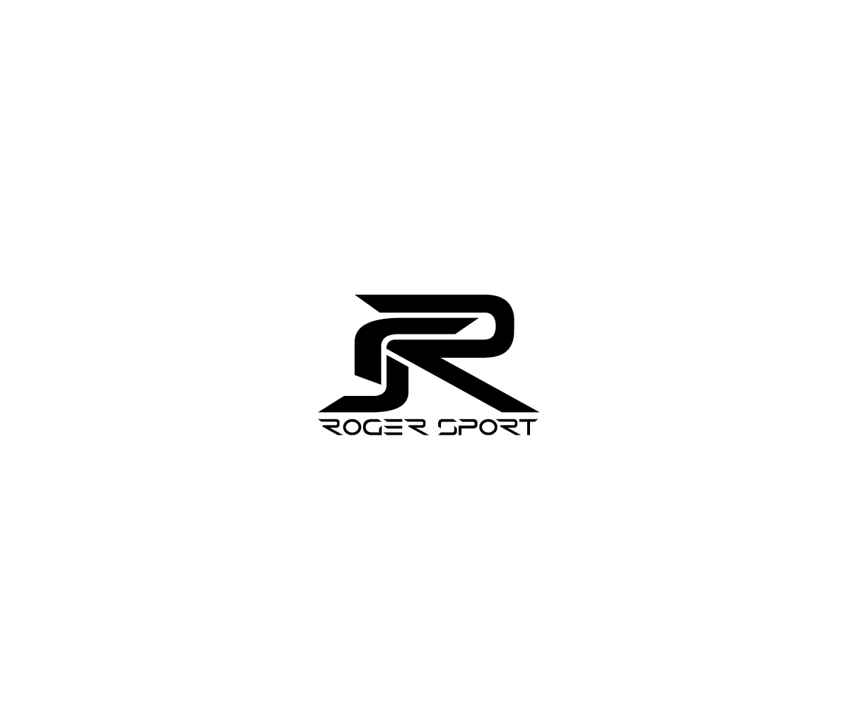
The company wanted a symbol slightly aggressive and elegant at the same time, in which the letter R had a great presence and well-functioning single color(the brand colors are black, white and red). Business is specialized in the creation of cycling clothing, from there to the letter S appears (very abstract) a silhouette of a cyclist.
The website is not finished yet and is missing many things to improve, however the base and structure are definitive

The starting font was Tele-Marines and the logo is also inspired on this font , mainly style of the "R" and "S"


The maillots are also designed by me , though I still have much to learn about patrons and "fashion" world
To see more visit http://www.roger-sport.com/views/ciclismocatalogo.html


Business cards had to be 3 colors (red and white black) but finally added an extra layer of varnish effect 3D to the front face

Any suggestion is welcome, we are here to learn
THANKS FOR WATCHING


