


LES CÉRÉALES BRANDING & VISUAL IDENTITY DEVELOPMENT / PACKAGE DESIGN
LES CEREALES is a naturalistic luxury skin care brand which was born to refine the identity of LKHSS on their solid foundation of the miracle grain beauty knowledge and to step forward worthily to healthy beauty.
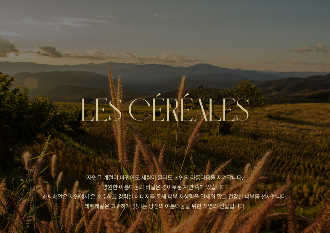
HEAZ developed and established LES CEREALES’ logo, symbol, mood and color system. Grain, the key ingredient, has been successfully visualized into its logo and the brand identity. The deep green with gold color pair conveys eco-friendly and high-end mood.
LES CEREALES aims to devote pure energy of grain to consumer. They have focused on raising the strengthen of skin itself with an ideal grain combination revitalizing your skin, and have been studying incessantly to present an eternal skin beauty.
Client_ LKH Skin Science
Year_ 2022
Brand Location_ South Korea
Art Director_ Sangchul Won
Designer_ Haeseul Joo, Haneul Kim
Photographer_ Junghun Yeom / Jina Kim, Jeongseon Kim


