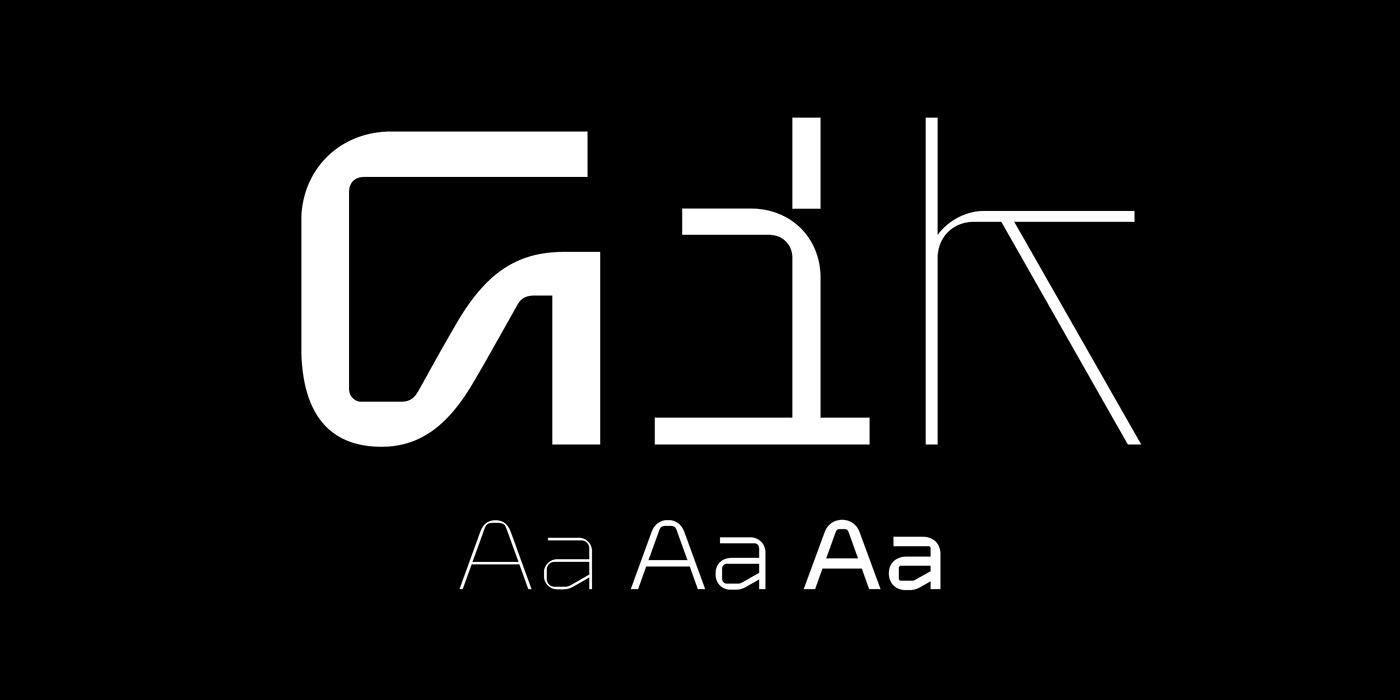

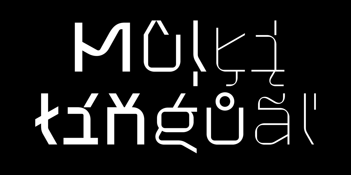


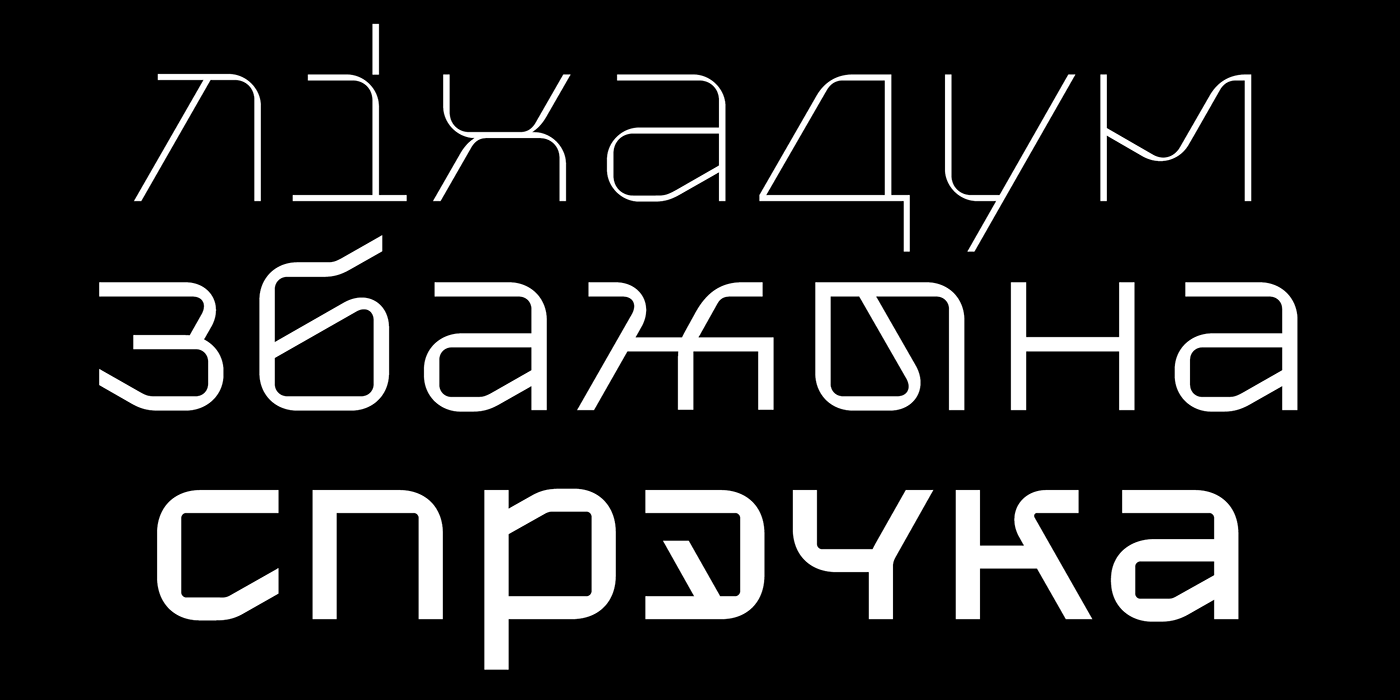
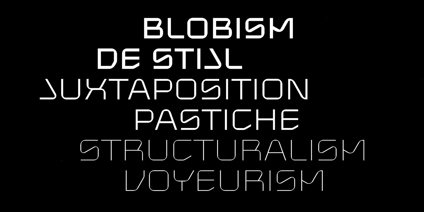

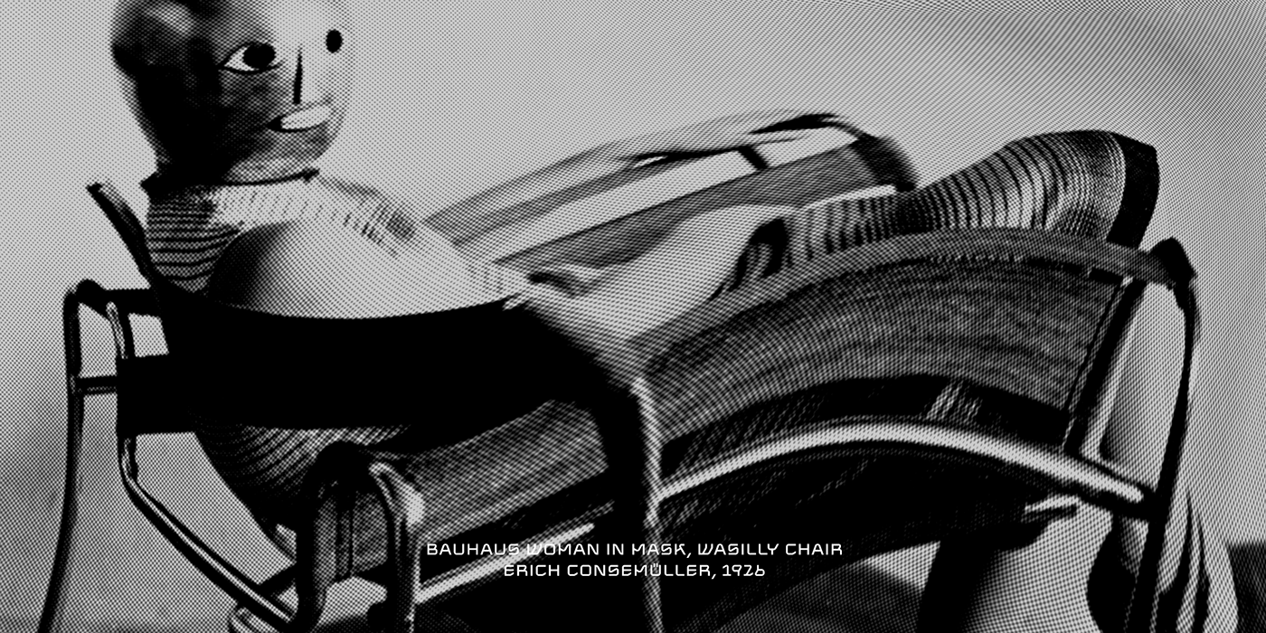

Gik is a three styles modular sans serif font family. Gik's compositional and plastic solution combines echoes of (de)constructivism, brutalism, de Stijl, ... and other manifestations of antiquity of the 20th century, with techniques characteristic of italics. This does not make the font look old-fashioned — on the contrary, it helps to understand how to use it.
Gik is a product of the metamodernism era — it is on the edge between modernist enthusiasm and postmodernist mockery, between simplicity and awareness, wholeness and cleavage, clarity and ambiguity — a kind of conceptual oxymoron.
Looking at Gik, you could imagine it at Fashion Week, if there was one for typography. In Gik embedded a message for both the designer and the gazer, it stimulates the imagination, it is the anthology of all fonts of the Future.
Available from $40
www.serebryakov.com (more types of licenses and just preferable to me)
or MyFonts.com


