Some key words for the Design Brief
• Name : "George R." named after the famous bootlegger
• 1920's / Whiskey / Bootlegging / Bars
• Sketchy or frayed
• Typeface: 1920's feel font
• Typeface logo : also be recognisable without the mark
• Grayscale
• 1920's / Whiskey / Bootlegging / Bars
• Sketchy or frayed
• Typeface: 1920's feel font
• Typeface logo : also be recognisable without the mark
• Grayscale


After the initial sketches and ideas
• Keen on the hat idea
• Wanted "classic" feel logo with the spirit of 2013
• Bottle / Boot / Barrow would be too obvious ( + not "modern" enough)
• Needs to be more abstract
• Wanted "A clear font + stamped look image"
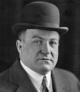
• Wanted to develop from portrait image
• Wanted "classic" feel logo with the spirit of 2013
• Bottle / Boot / Barrow would be too obvious ( + not "modern" enough)
• Needs to be more abstract
• Wanted "A clear font + stamped look image"
• Wanted to develop from portrait image
...We have decided to go further from portrait image idea


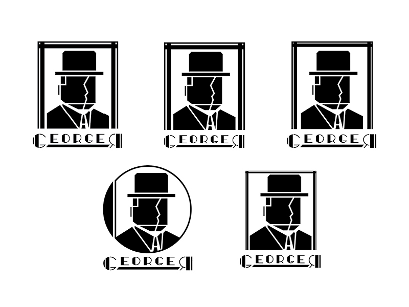
Variations of frame ideas
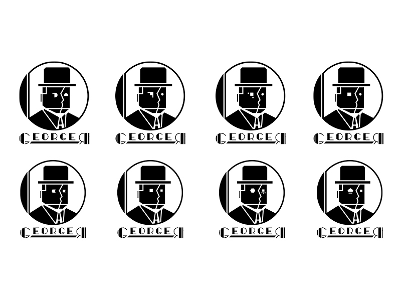
Variations with eyes on the portrait
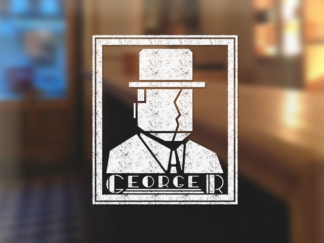
Final Solution with Refined Mark and Typeface Logo

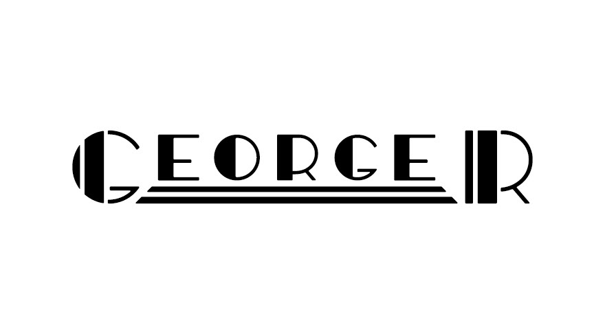
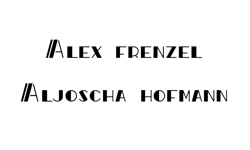
Type Logo for Founders names

Frayed version