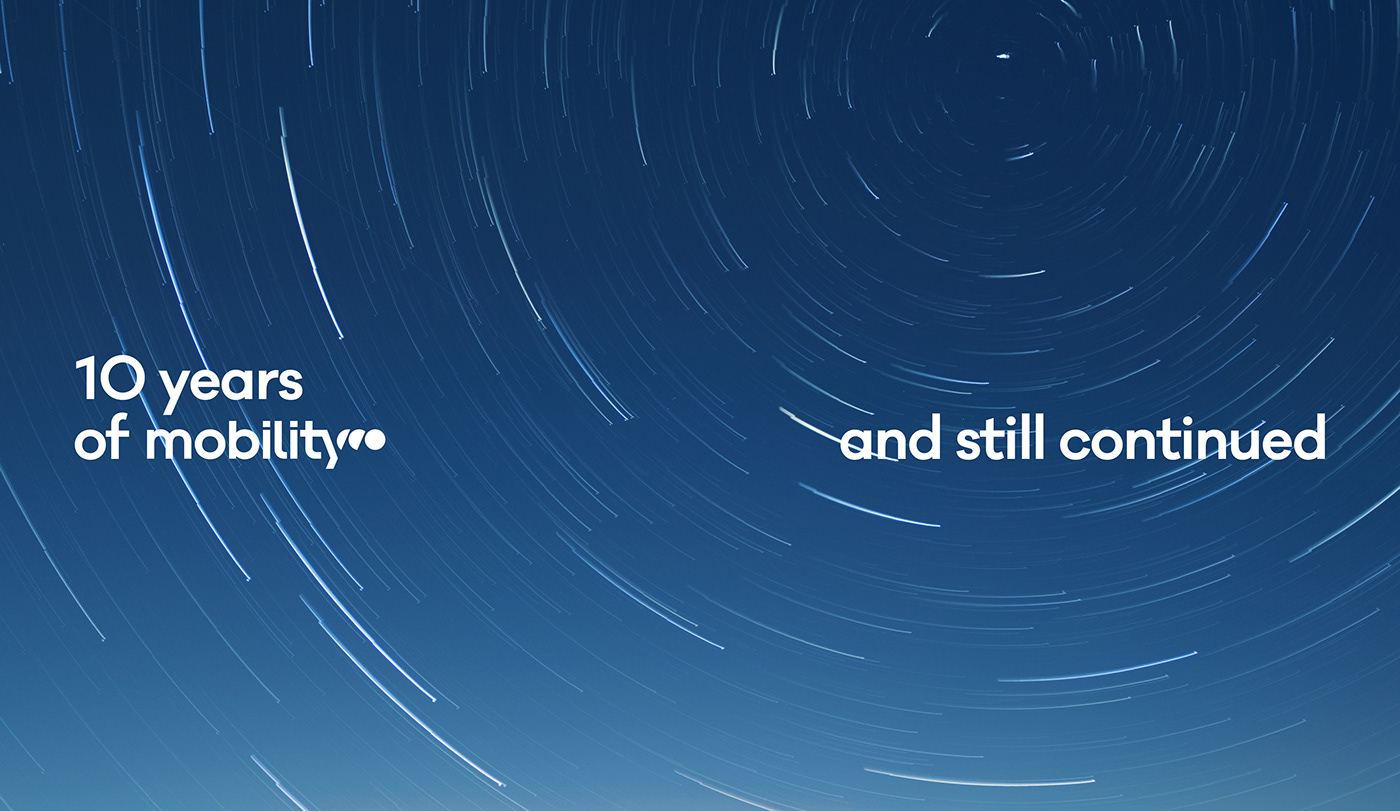
Mobility, Enjoy the way - Brand identity
A new starting point, a new visual identity
A new starting point, a new visual identity
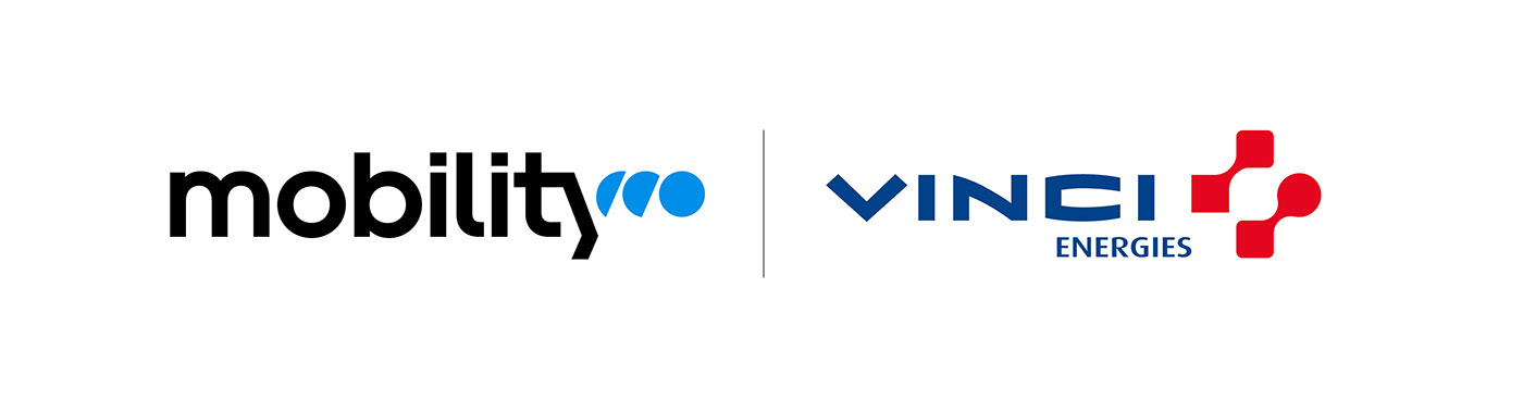
In a constantly changing world, Mobility is involved in the design and implementation of road, rail and urban transport infrastructures. Mobility, founded in 1913 under the name Cegelec, is present in some thirty countries and employs around 25,000 people worldwide. This subsidiary of Vinci Energies imagines cities that are ever more fluid, accessible, breathable, civic-minded and inclusive.
Graphéine redesigned Mobility's visual identity in order to provide the teams with a graphic guidelines with codes that complement their new logotype. A global visual system was created to better integrate the identities of each solution and to unite the teams around a common brand.
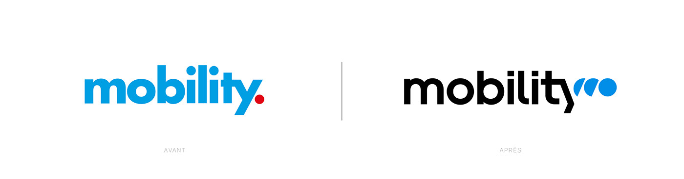

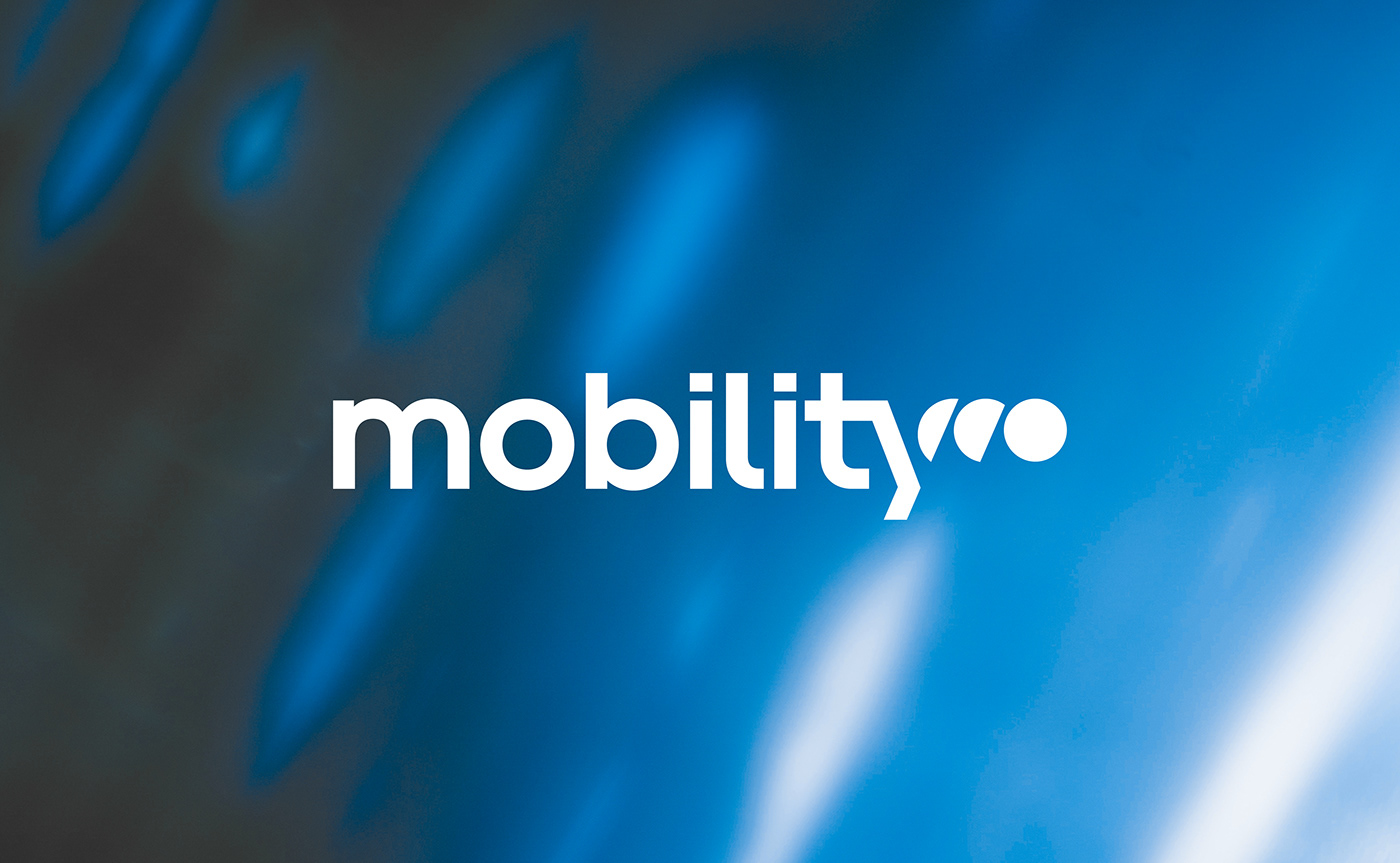
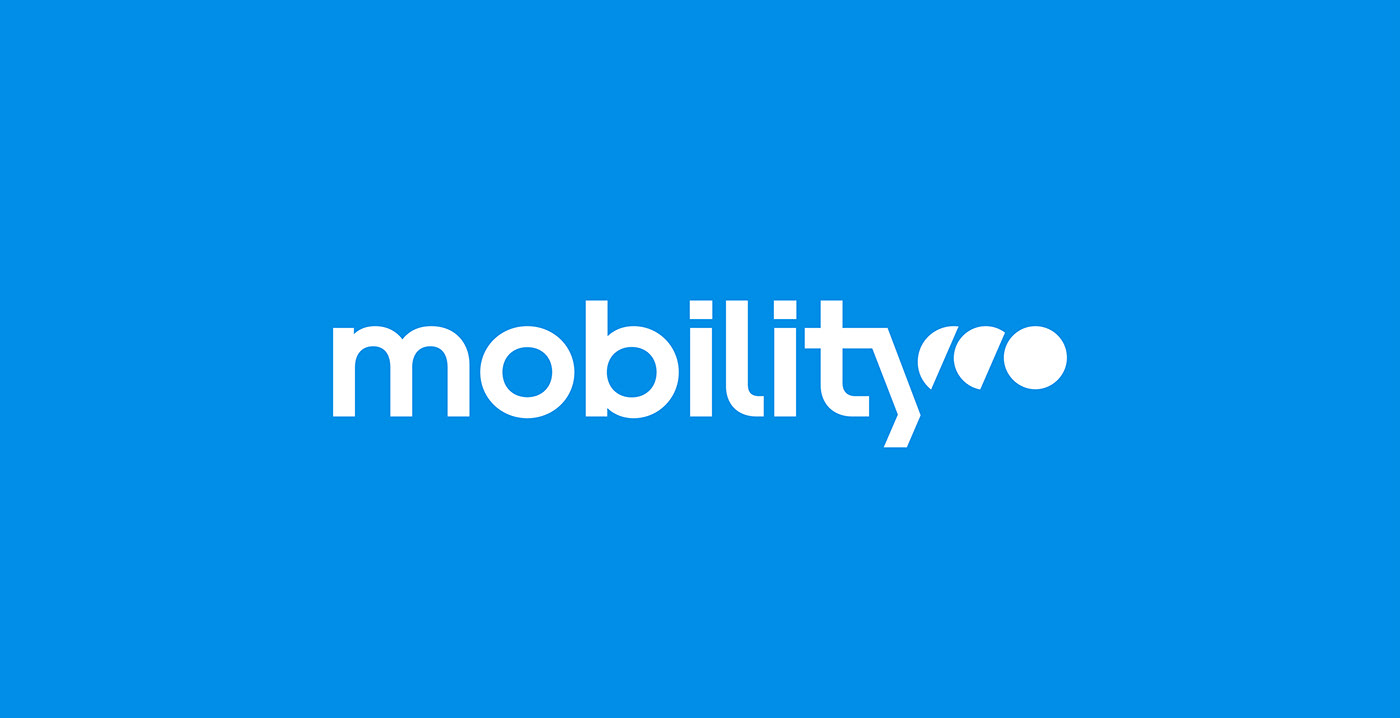
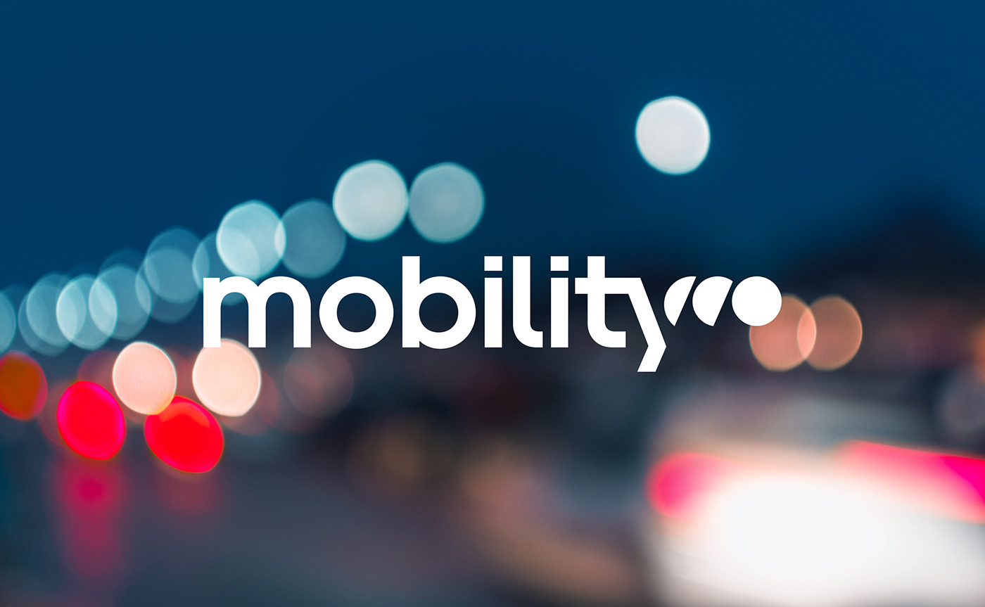
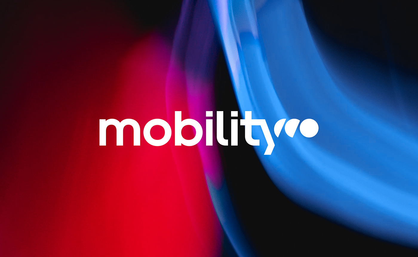
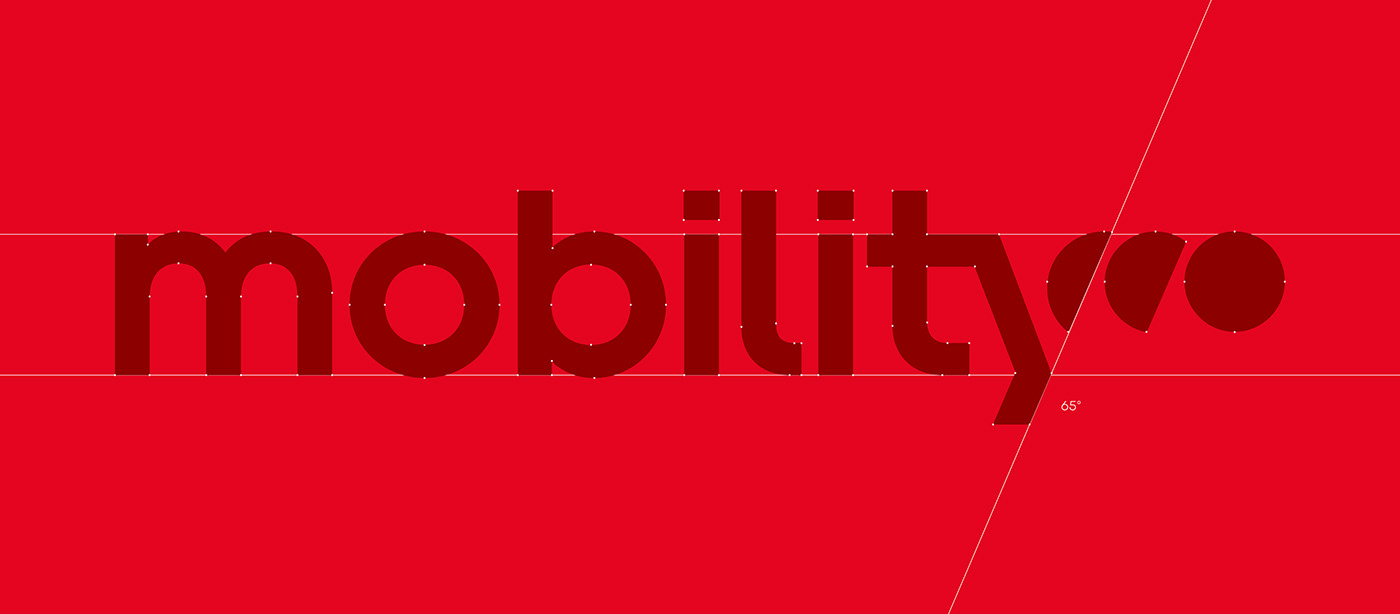
A new logo: from immobility to mobility
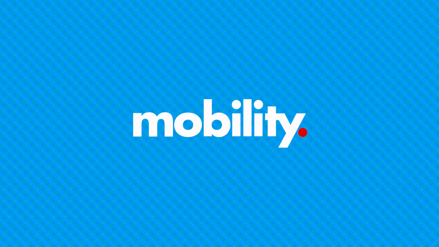
In the old version, the dot was used typographically, marking the end of a sentence, the end of a story, a red light or a stop sign... This new version does not pretend to erase everything, but to correct the symbolism of this logotype, which is not in line with the company's current values. A dot that leaves the base line, that moves and that uses history to build the future!
A new logo that fully preserves the Mobility DNA while completely changing the symbolism: a new starting point for the brand and the teams!
An emblem that, when taken on its own, perfectly fulfils its role as the MO monogram. It allows the brand to be identifiable even in very small spaces and allows it to break away from its typographic block whenever necessary.


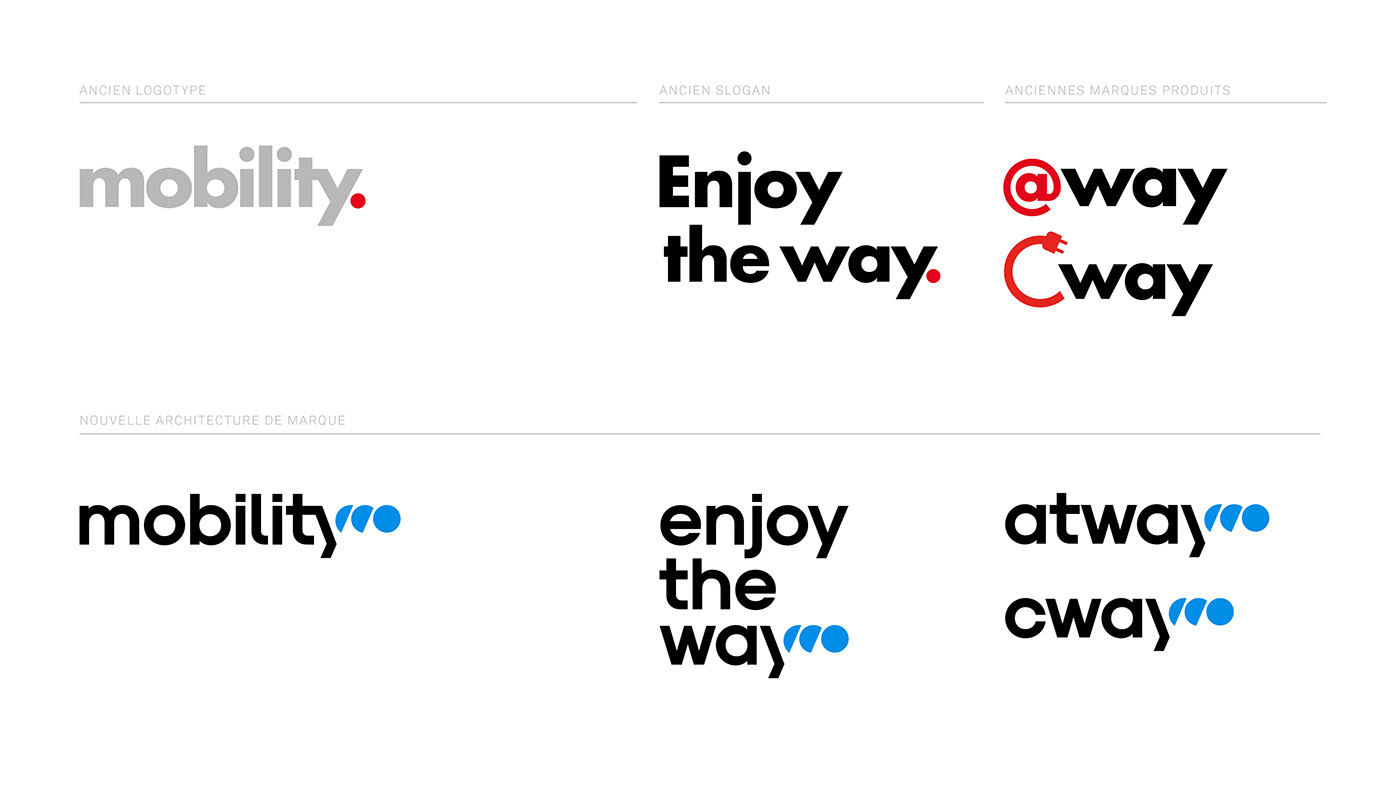
A brand architecture that extends the Mobility story
Mobility needed to reaffirm its history, to put its values back at the heart of its identity. That's why we created a special wordmark to make the slogan fit perfectly with the logotype. This trick will allow the slogan to stand out and reaffirm the brand's values.
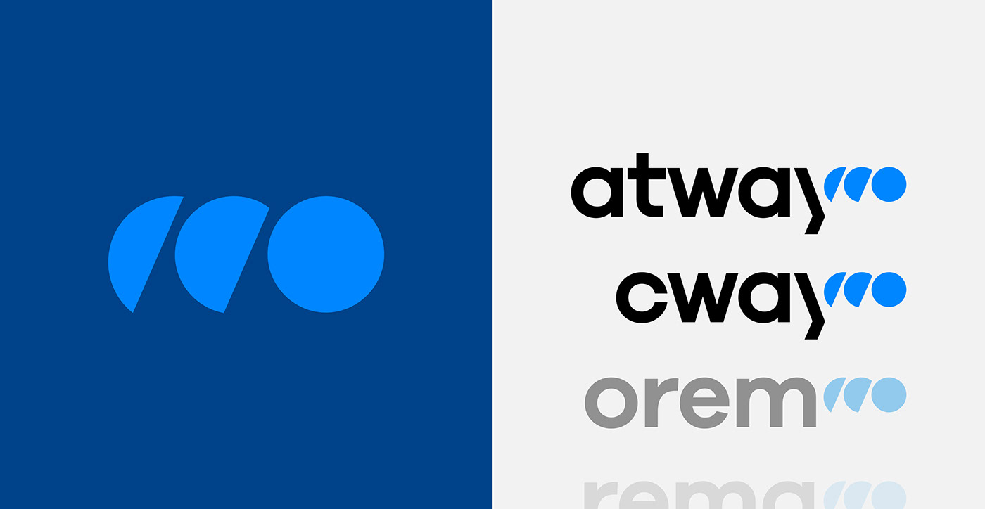
This new wordmark was also conceived and designed with the aim of creating a brand architecture consistent with Mobility's product brands, atway and cway. A system that not only branded the current product brands, but also the future product brands! Colours and typography that follow the codes of the old identity while modernising them.
This new wordmark was also conceived and designed with the aim of creating a brand architecture consistent with Mobility's product brands, atway and cway. A system that not only branded the current product brands, but also the future product brands! Colours and typography that follow the codes of the old identity while modernising them.
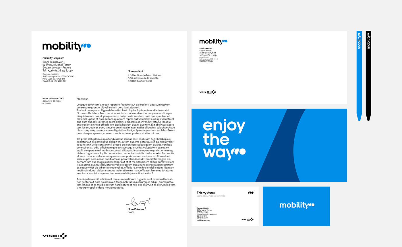

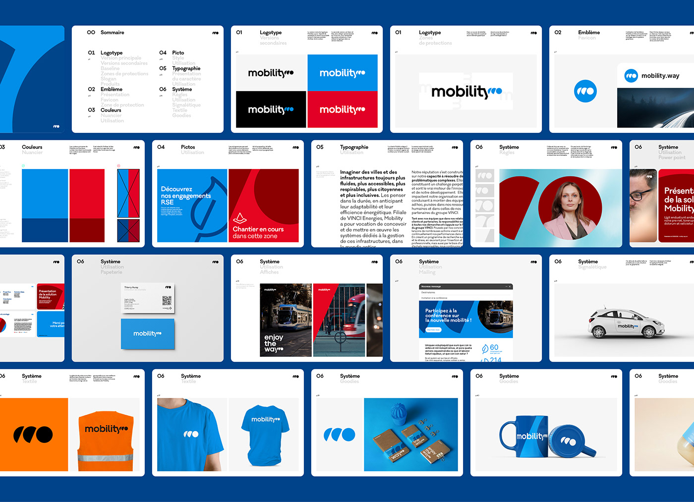
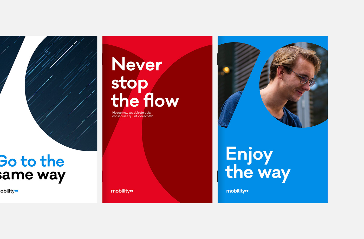
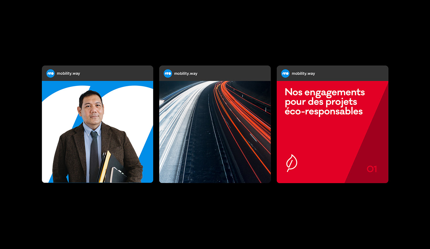
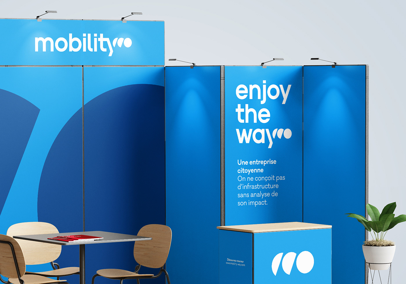
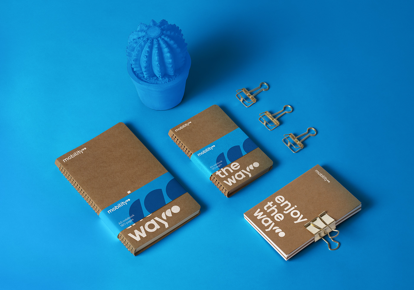
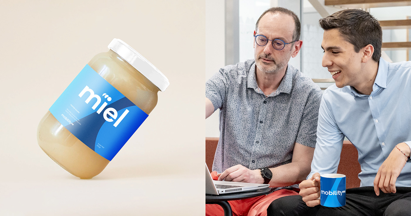
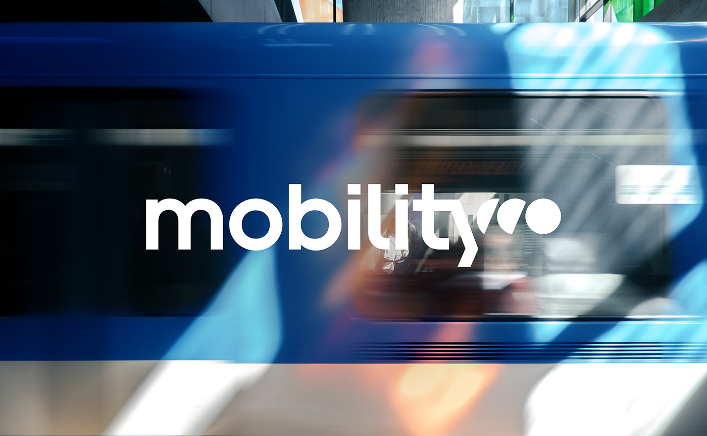
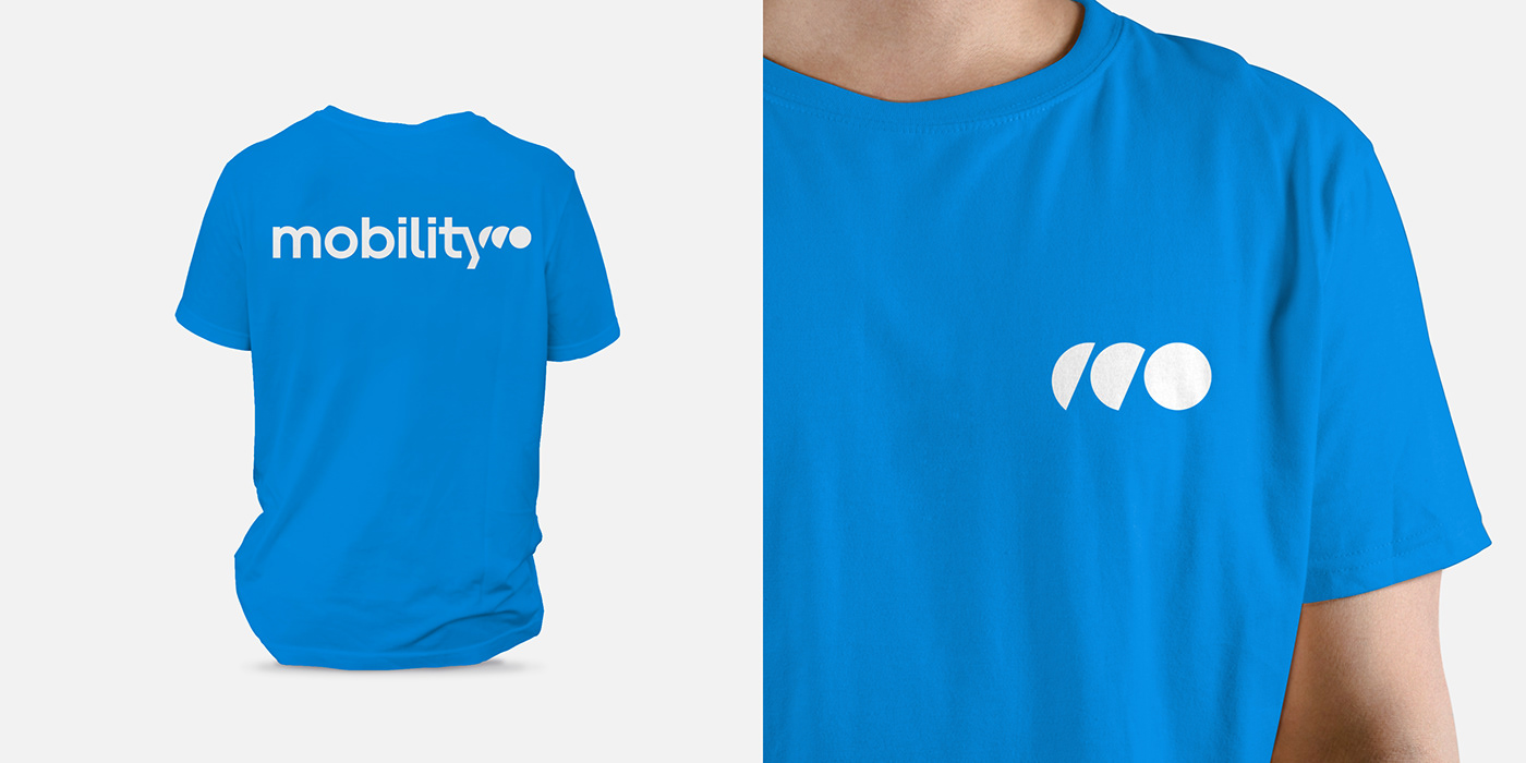
A graphic system that reinforces the Mobility brand
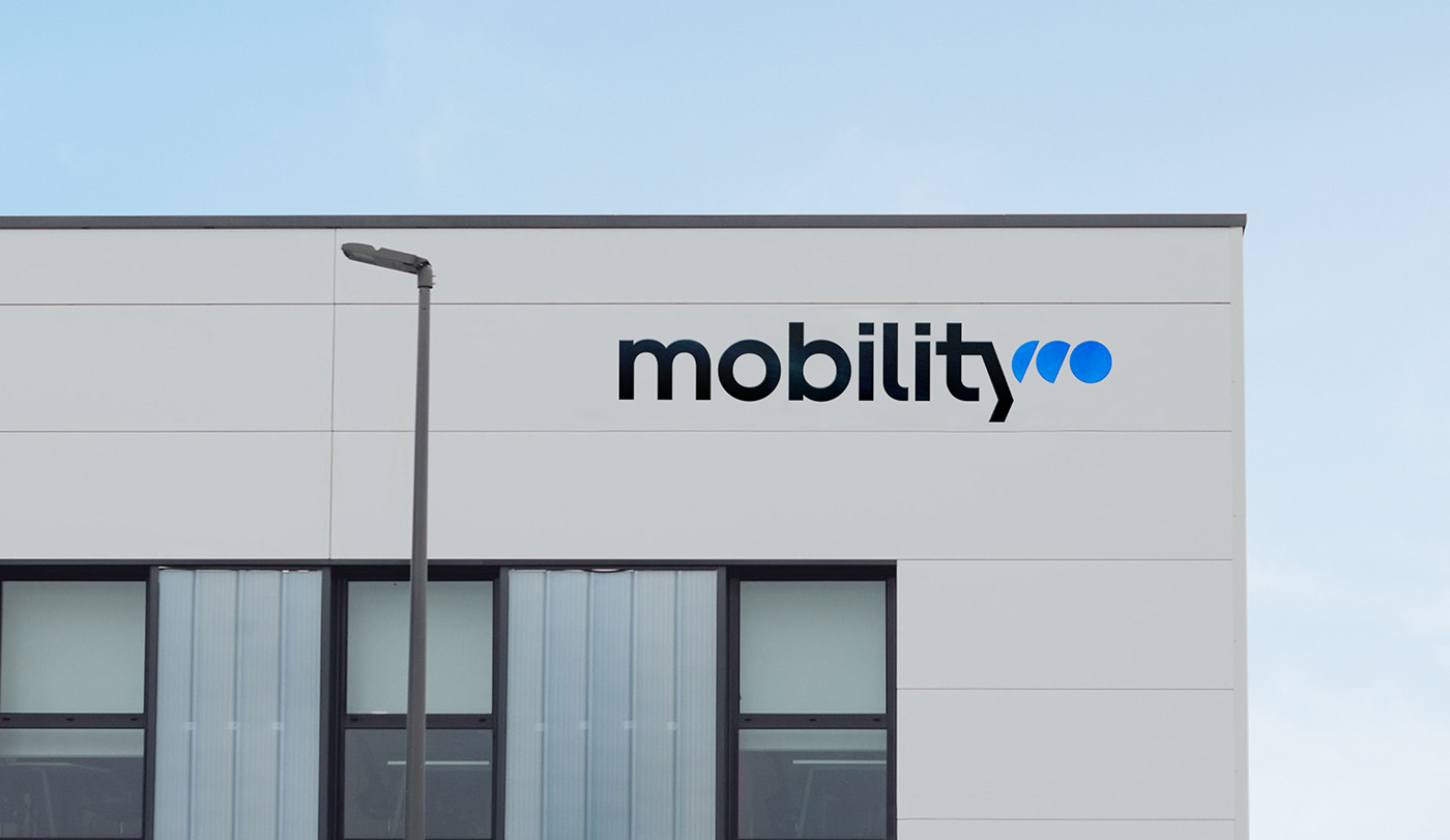
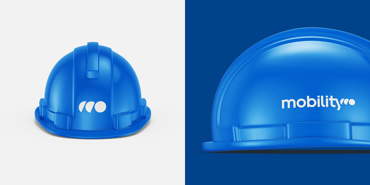
Mobility's new graphic system has been designed to fit all formats, all available colours and to be very easy to use. With the emblem at the heart of the system, it will allow the brand to extend the awareness of its new emblem and establish itself as a strong brand.
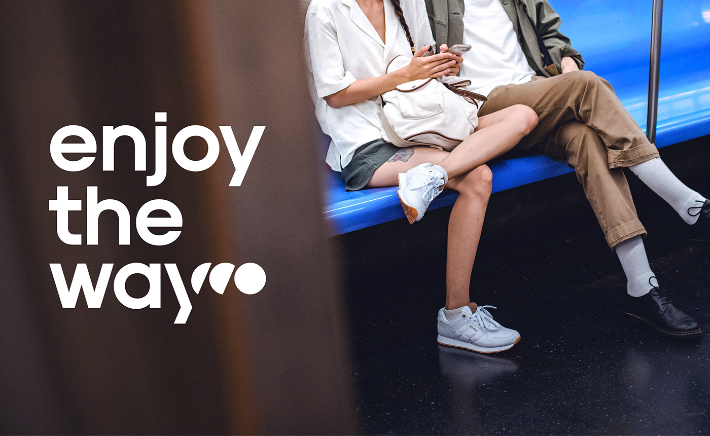
The system can be used for both print and digital, making it very easy to use.
The system can be used for both print and digital, making it very easy to use.