


Final Project for GIT Program: Design a One Page Website

For our final project for a class in Web Content Design, we were asked to choose from 2 options to create a one page website. I chose to do the children's author option and it was a treat to open up the images folder and find some amazing cover art. I loved reading my daughter Eric Carle's books when she was a toddler so this project was a lot of fun!


I began the process of matching the provided wireframes with some possible layouts using CSS Grid and Flexbox to arrange the elements into different layouts for each breakpoint.
Some sections of the page moved from a single column layout to a two column layout and there were parts that were real mindtwisters. But, once you get the hang of nesting flexbox grids inside of grids and rows it's sort like playing with one of these.

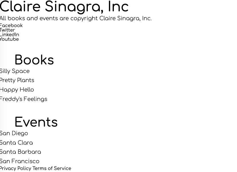
Here's what the site looked like after I put all the content into its various containers.

And here's the hero section starting to take shape. I've learned the hard way over the years that no matter how good you think you are at typing out HTML, there's always something there to remind you...

So, I found it much more efficient to use a checker like NUHtml right after I finish the intial pass at writing the markup before getting into any styling!

YAY! Now it's time for the fun part.

Twitter Card graphic for the header

The top of the page with the mobile menu closed. We did a lot of work with coding hamburger buttons this session and it was fun to learn how that little piece of CSS/HTML actually happens.
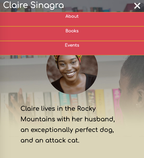
Mobile Nav opened
As the site development progressed, the dev tools console was a sanity-saver.


Without a ton of practice under my belt, it's tricky to translate mockups into grid-speak and there's usually a moment when what you think is gonna happen...ain't gonna happen.

Exhibit A: Here's the book section which was supposed to go from a Flexbox column layout on mobile to a Flexbox row on medium screens. EASY I thought, I'll just go from "flex-direction-column" to "flex-direction-row"! What could go wrong? Well, a lot, when you forget that you set all your child sections to display "justify-content-center" and they end up going higgledy-piggledy across your layout!

The newsletter form at mobile screen size

Here's the same form, but it's laid out using CSS Grid, so it was a matter of re-directing the form labels and inputs to their new homes in the 3 column grid.
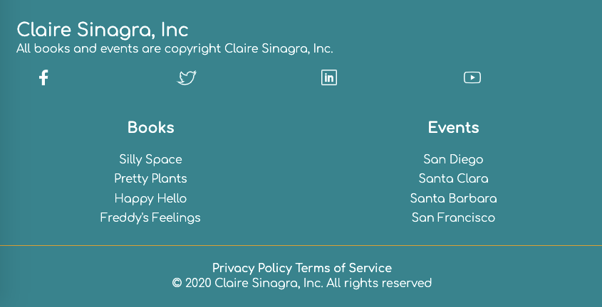
Almost there! But, at this point I needed to try and get the social media links to appear as icons. After a little trial and error, I managed to combine inline styling on the paths along with some sizing attributes to the stylesheet and voila! Little SVG icons all in a row.