


One of the main problems of the current visual identity is that it does not correspond to the current goals and visions of "DUSEL". For this reason, we have developed an identification suitable for him.
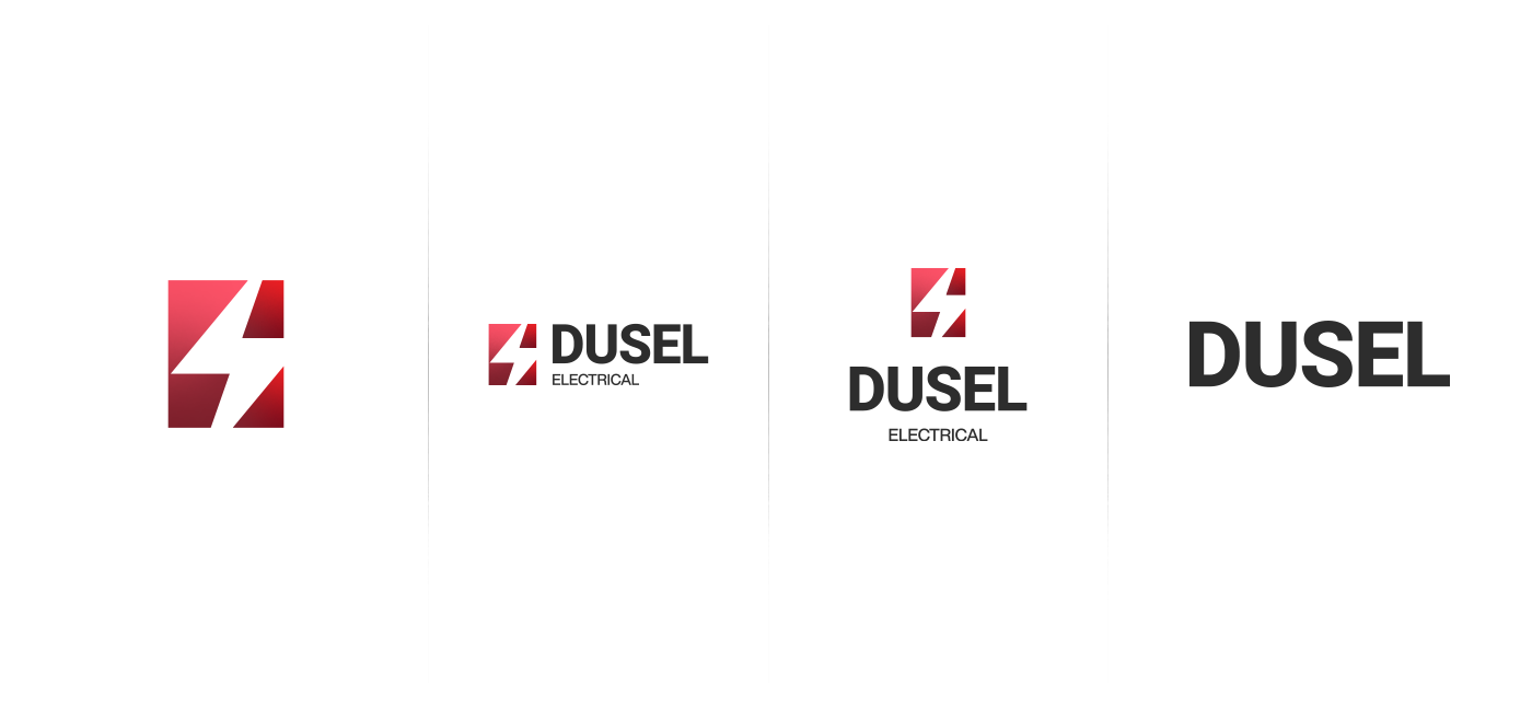
The logo featured lightning and used a gradient with the aim of adding a little volume. The red color at the strongest point of the Lightning was chosen, and it did not go out of the color of the"DUSEL" itself.
You can see the current identification of" DUSEL " through its site.

This drawing logo is much more adaptive. It does not lose its meaning in any case, as shown below.

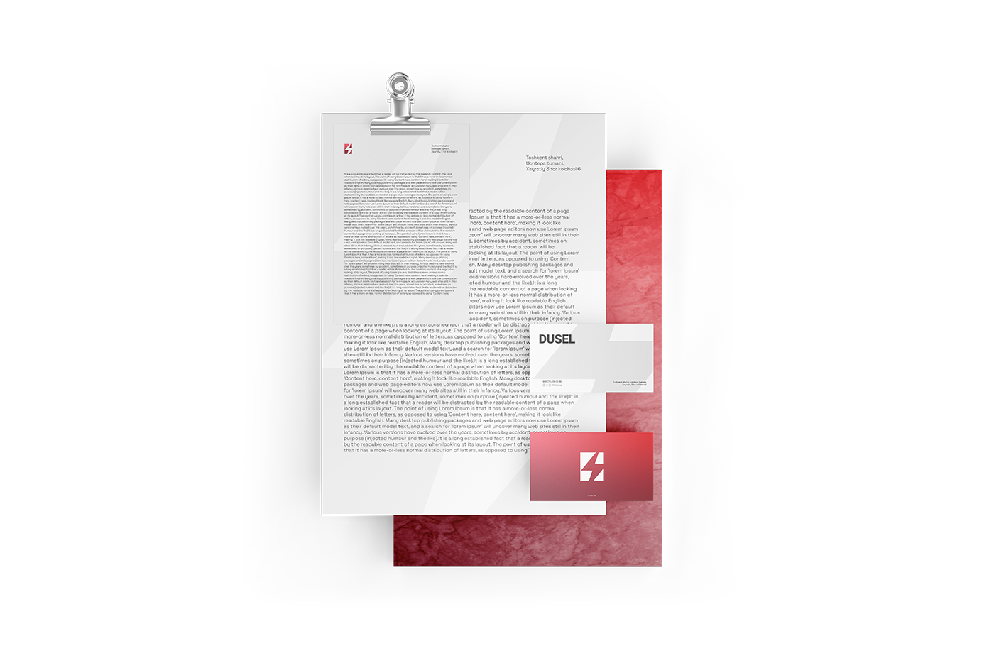
The documents indicate in what case the identification will be below.


The main color of"DUSEL" is red, and it was chosen green and yellow as an assistant to red.

Bebas was chosen as the main font as the firm's fonts. SPACEGROTESK font was selected while making an additional font. Their licenses are free and there is no problem using them.

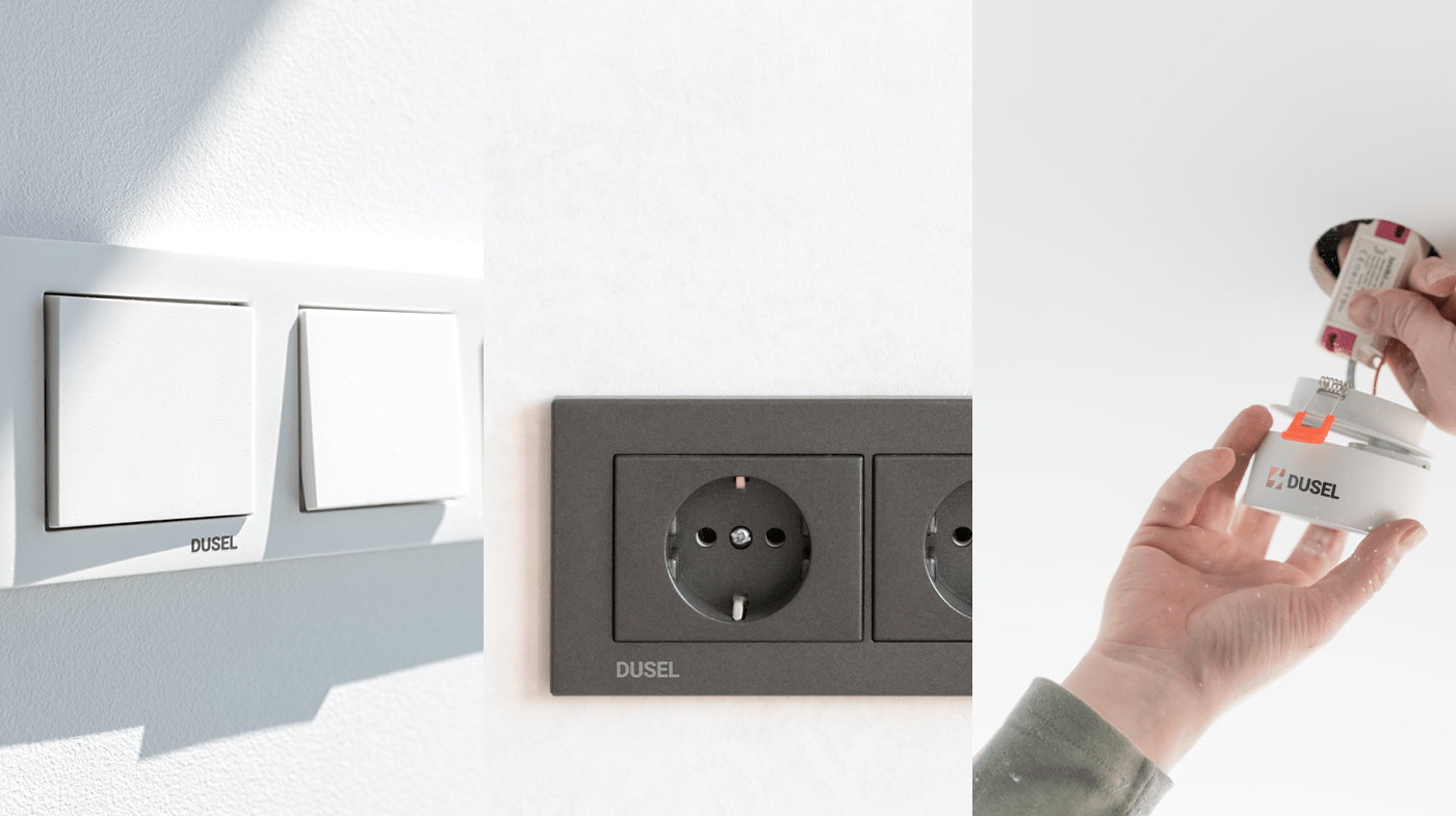
In its products, the logo itself is clearly visible in the main form.

On the packaging was a large picture of the product and additional information is written.


In our version of the concept, it is recommended to use the word "Radiant", based on its capabilities, in order to grow brand communications.

2023 will present a collection of designs called"3650kun soldier "in connection with the 10 years since the founding of DUSEL.


