Avyun
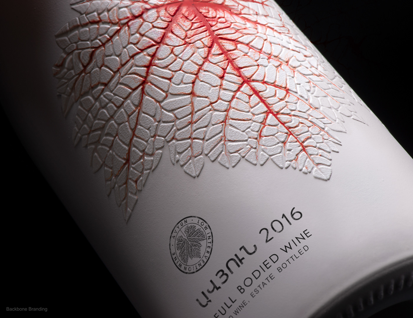
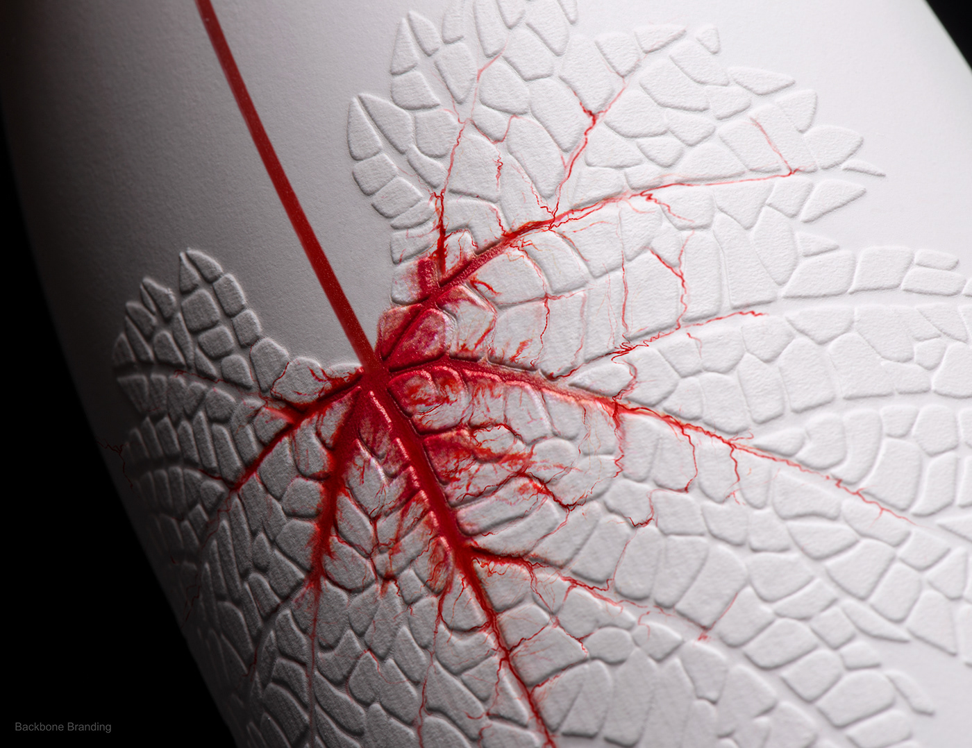
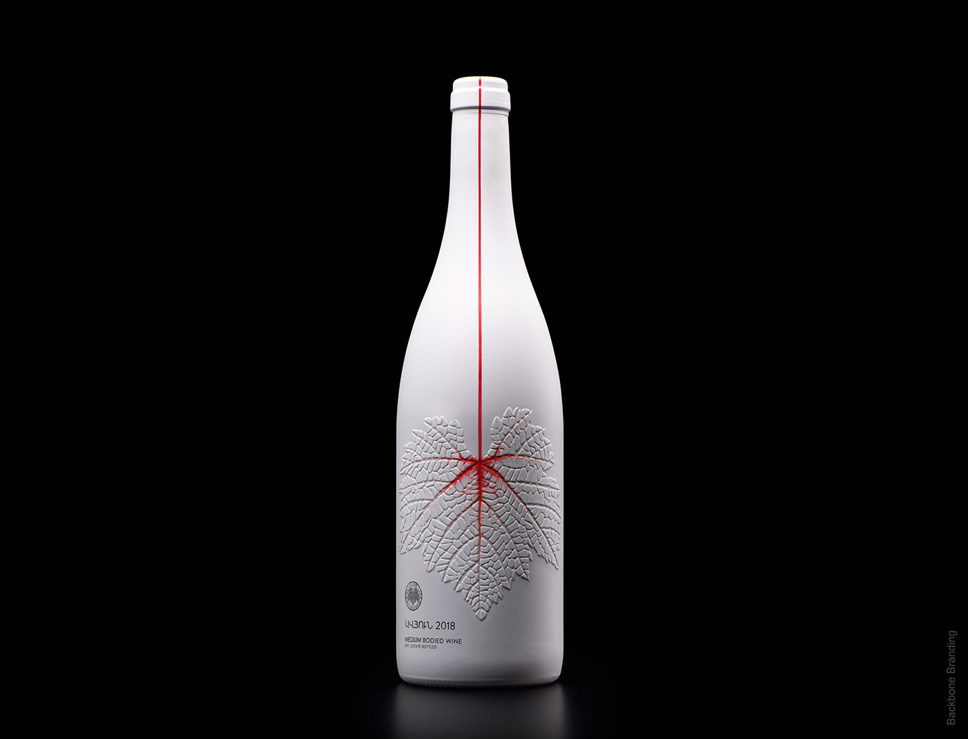
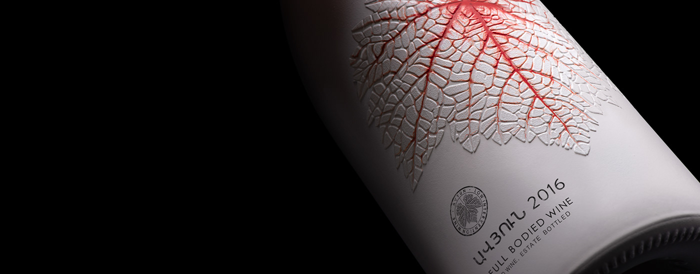
We reflected on the wine process and envisioned the veins of a grape leaf filling up with red wine.
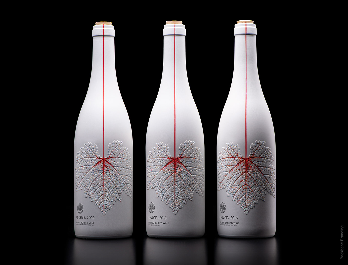
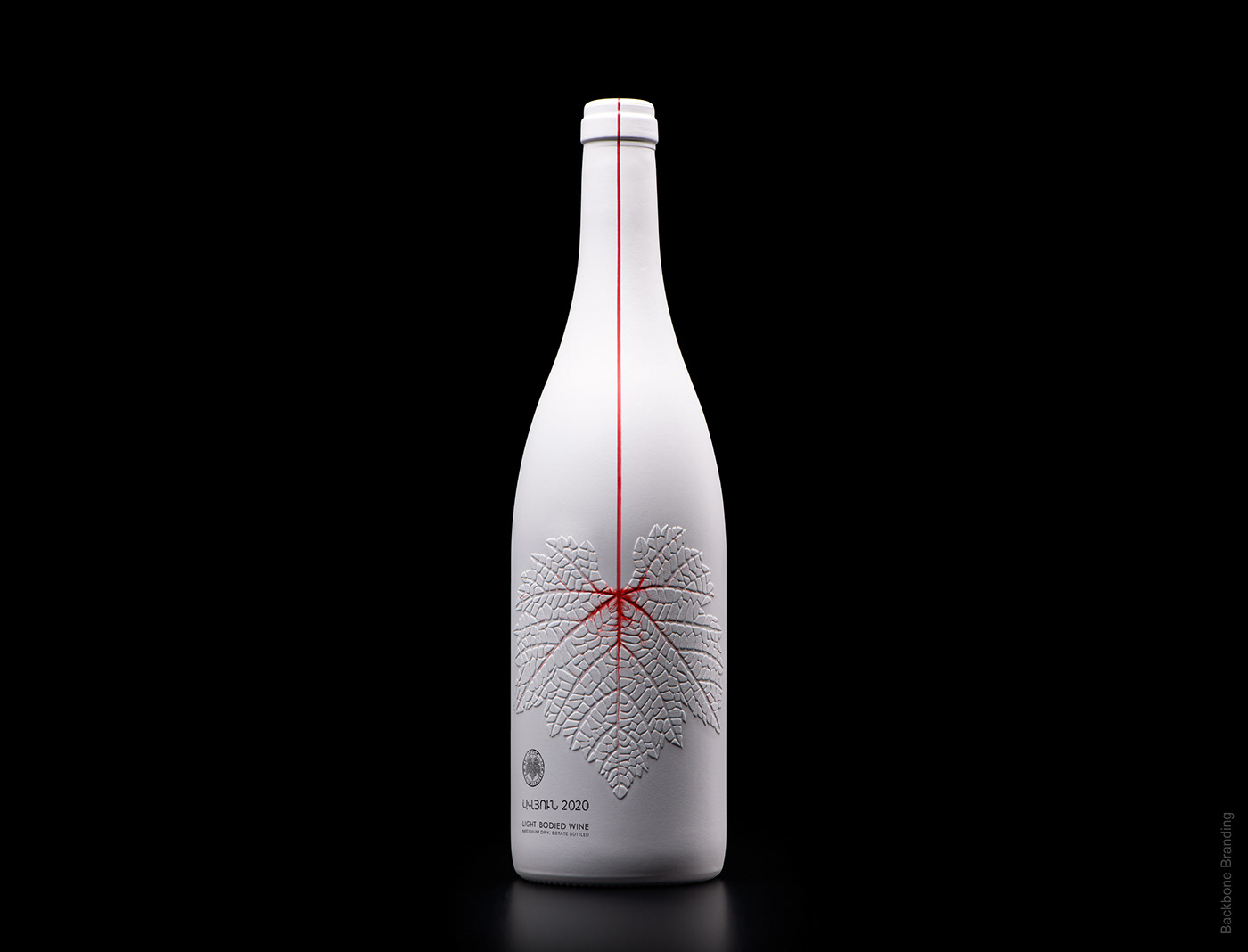
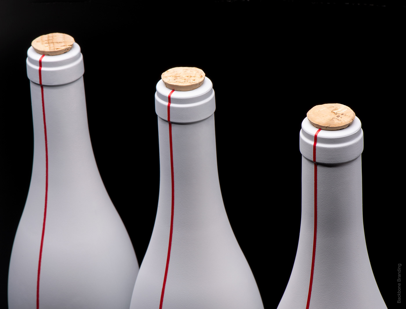
Our challenge was to portray the three stages of wine maturation which were to be depicted on three separate wine bottles. We looked at the source to a successful wine – the grape itself, which also determines the distinct taste of the wine.
As wine ages, the grapes share their unique flavors handed down through generations, disclosing their age-old secrets.
This metamorphosis of grapes into wine inspired us to create a design which is minimalistic, yet bold and lucid. The central element is an embossed grape leaf and through it we exhibit the storyline of the grapes moving down, permeating into the vessel of wine. The distinct vigor and energy of the grape, flowing through the veins of the leaf and turning them red, parallels with the blood that flows through our veins. The word for energy and vigor is "Avyun" which is the name suited and chosen specifically for this wine.
This design of the flowing wine is also for buyers to determine the degrees of strength of the wine. We can easily gauge the strength by the amount of wine that has flowed into the leaf.
Credits:
Brand Strategist: Lusie Grigoryan
Creative Director & Designer: Stepan Azaryan
Illustrator: Marieta Arzumanyan
Creative Director & Designer: Stepan Azaryan
Illustrator: Marieta Arzumanyan
Animation: Sahak Zarbabyan
Photos by: Backbone Branding & Suren Manvelyan