
Cliente: Rodopes Transportadora | Serviço: Identidade Visual | Ano: 2022 | Motion: checkdsgn | Responsável: checkdsgn

🇧🇷
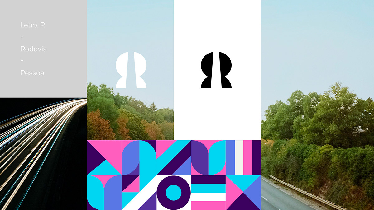
Uma empresa de transporte de carga que vem para dar continuidade à uma bela história que já acontece há muito tempo na Família Pessoa. Unindo a paixão que tem pelo trabalho e o sobrenome da família, criou-se a RODOPES, onde 'rodo' vem de 'rodovia' e 'pes' vem de 'pessoa'. Uma união entre o que há de melhor no profissional e no pessoal.
🇺🇸
A cargo transport company that comes to continue the a beautiful history that has been going on for a long time in the Pessoa Family. Combining the passion he has for work and the family's last name, RODOPES was created, where 'rodo' comes from 'highway' and 'pes' comes from 'person'. A union between the best in the professional and in the personal.
🇧🇷
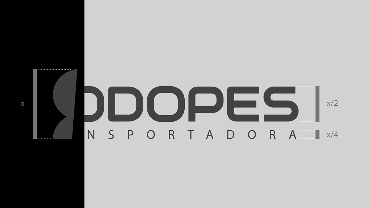
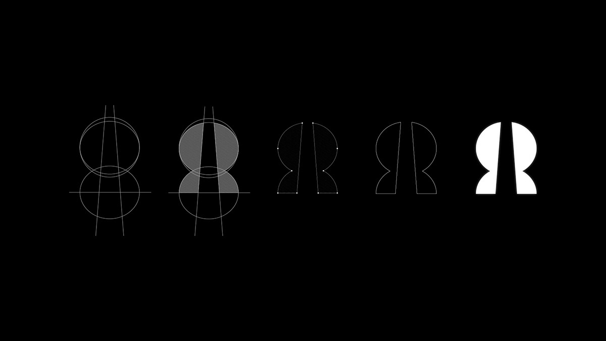
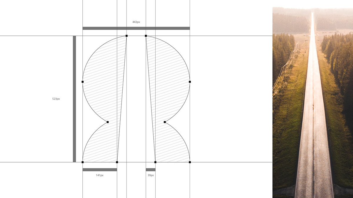
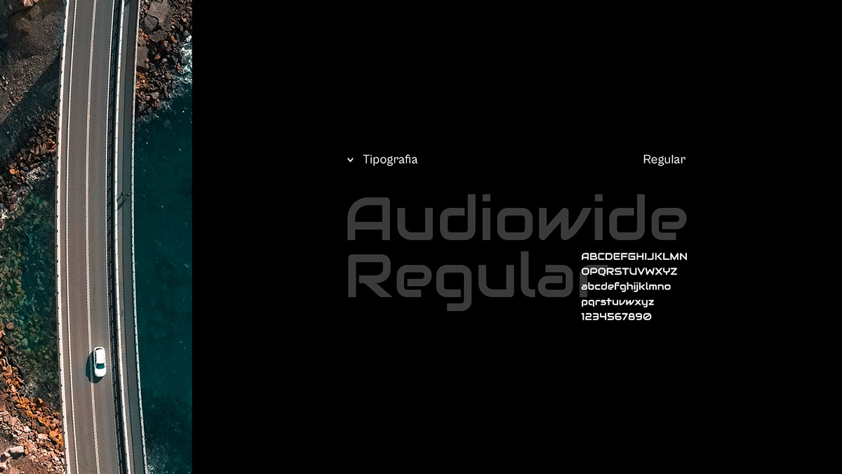
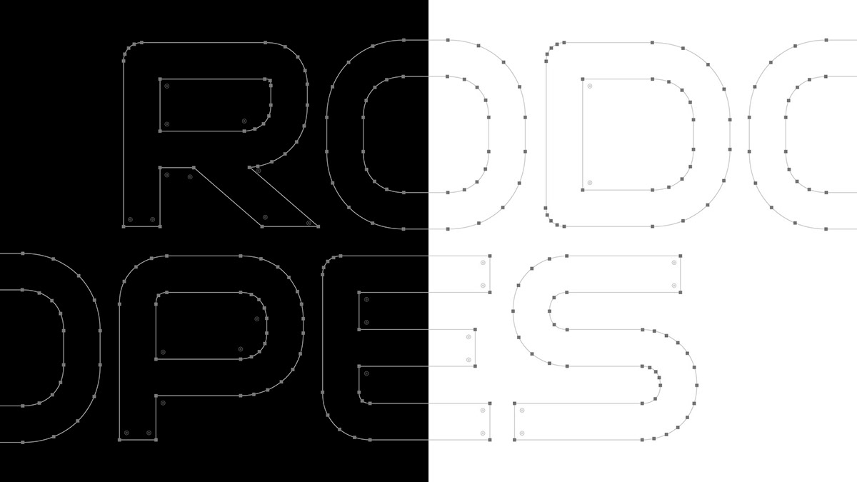
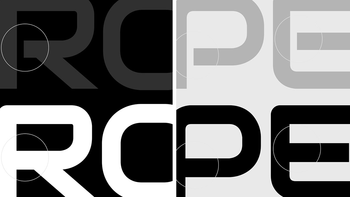
A tipografia escolhida para o logo foi a Audiowide na sua versão regular.
Ela representa movimento, modernidade e, ao mesmo tempo, força.
Para a tagline e corpo de textos, selecionamos a Myriad Pro, uma tipografia com uma grande variedade de pesos e que se comporta muito bem em ambientes digitais e off-lines, servindo para títulos ou textos corridos.
🇺🇸
The typography chosen for the logo was Audiowide in its regular version.
It represents movement, modernity and, at the same time, strength.
It represents movement, modernity and, at the same time, strength.
For the tagline and body texts, we selected Myriad Pro, a typography with a wide range of weights and that behaves very well in digital and offline environments, serving for titles or running texts.


🇧🇷
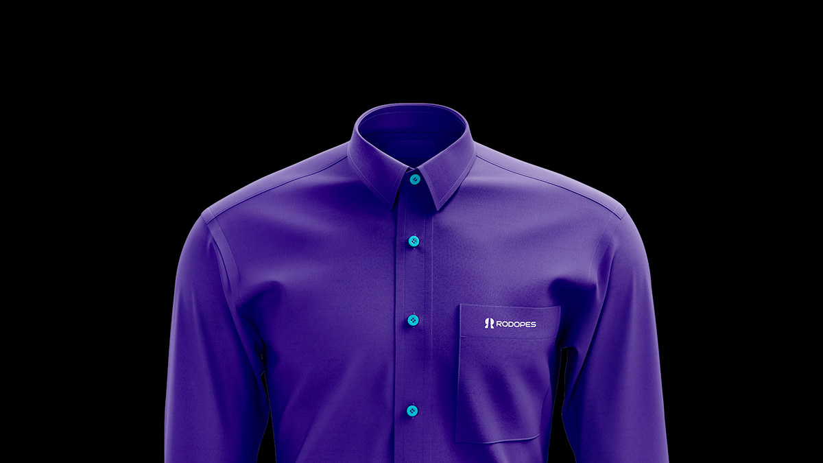
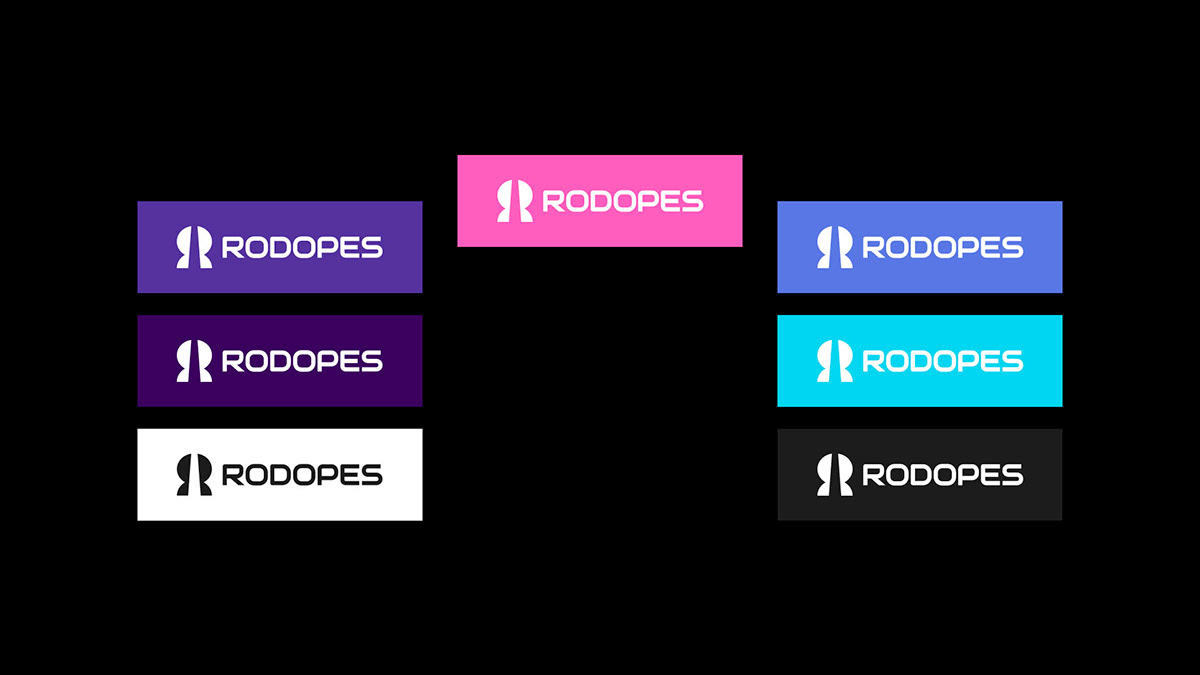
Para as cores, buscamos (junto com o cliente) sair do tradicional de empresas de transporte.
O azul-tradicional, o vermelho/laranja e o cinza já está saturado no segmento, então trouxemos para o projeto uma paleta bem diversificada que transmite, de certa forma, a inovação, exclusividade e modernidade.
O resultado foi uma variação de tons, incluindo o rosa, o lilás e o roxo.
Além disso, também tem o azul mais digital, o branco e o preto, com suas respectivas luzes e sombras.
Uma paleta bem completa para conseguir transmitir o que a Rodopes é: inovadora e moderna.
🇺🇸
For the colors, we seek (together with the client) to leave the traditional way of transport companies.
The traditional blue, red/orange and gray are already saturated in the segment, so we brought a very diverse palette to the project that conveys, in a way, innovation, exclusivity and modernity.
The traditional blue, red/orange and gray are already saturated in the segment, so we brought a very diverse palette to the project that conveys, in a way, innovation, exclusivity and modernity.
The result was a variation of tones, including pink, lilac and purple.
In addition, it also has the most digital blue, white and black, with their respective lights and shadows.
In addition, it also has the most digital blue, white and black, with their respective lights and shadows.
A very complete palette to convey what Rodopes is: innovative and modern.

🇧🇷
Por fim, cuidamos de toda a direção criativa do projeto, tal como fotografia, elementos, texturas e afins.
Dessa forma, conseguimos ter um projeto mais coerente, equilibrado e fazendo jus aos seus atributos.
Rodopes está no mercado de uma maneira única e isso é o que nos deixa mais feliz e realizado com esse projeto!
🇺🇸
Finally, we take care of all the creative direction of the project, such as photography, elements, textures and the like.
In this way, we managed to have a more coherent, balanced project that lived up to its attributes.
Rodopes is on the market in a unique way and this is what makes us the happiest and most fulfilled with this project!