

Morish Malt
Morish Malt was developed to focus on the idea of families and friends making memories together while enjoying a delicious cup of Morish Malt. From the warm colours, to the sense of adventure and nostalgia, the packaging was lovingly and carefully illustrated and designed to appeal to the families as well as children.

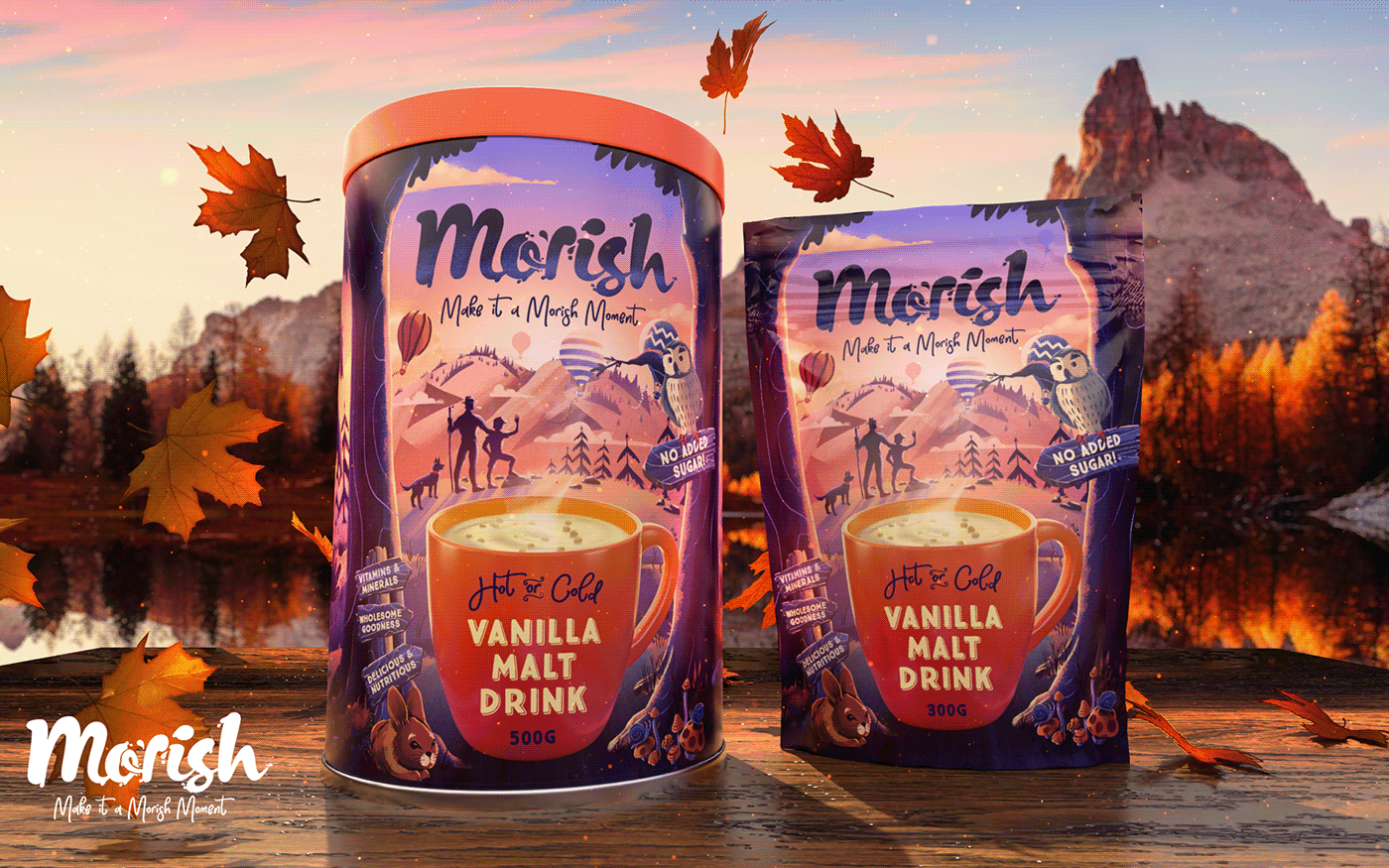
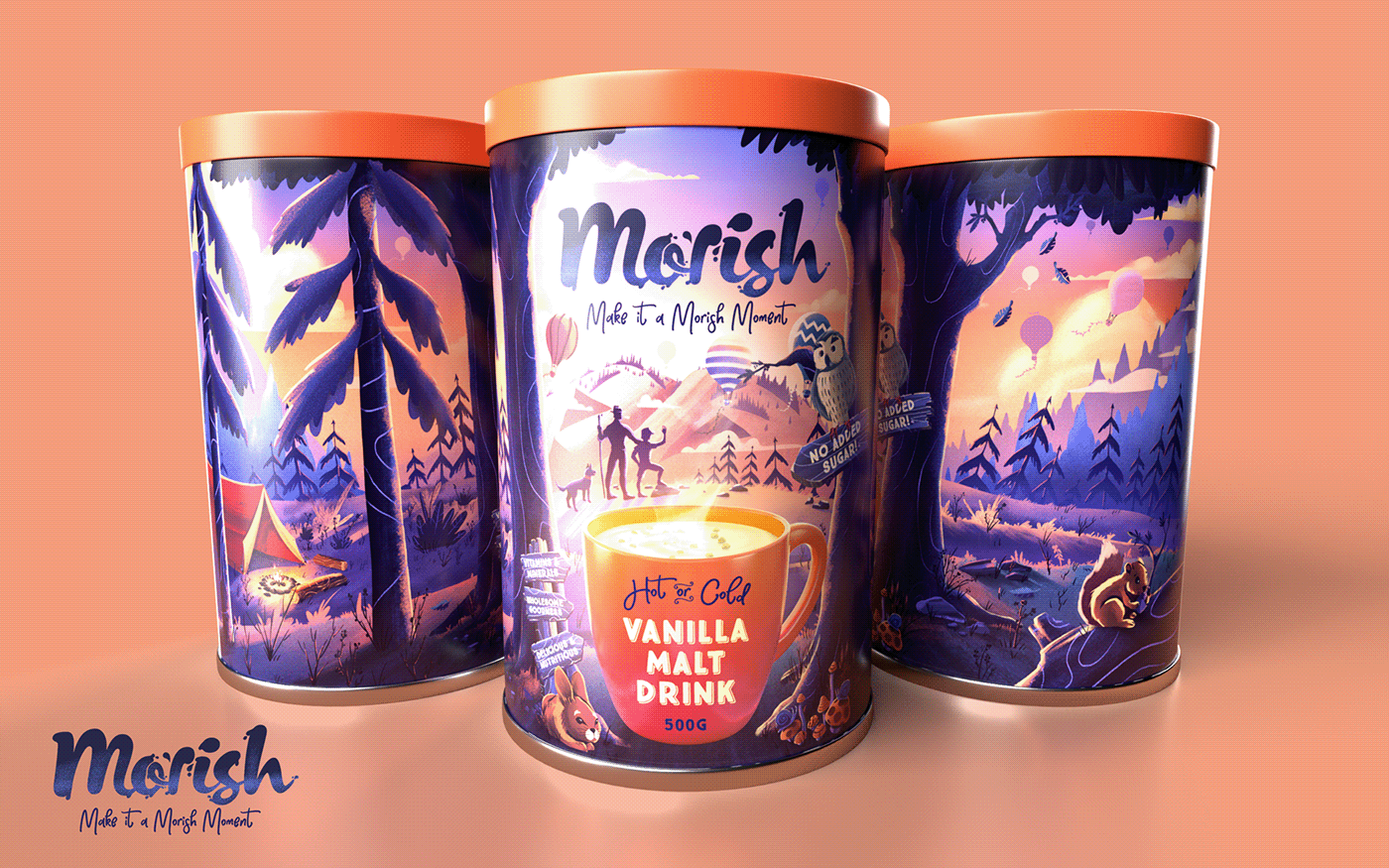

Illustration Process
We created the illustration in tones of black and white first, ensuring all the different aspects read well and could be distinguished. It was important to get this step right as a foundation before we experimented with colour. It also allowed us to have complete control over the colour and we were able to make adjustment to any aspect of the artwork. We created a style that was cute, nostalgic and adventurous. Painterly but also graphic with texture, appealing to children as well as their parents and families.


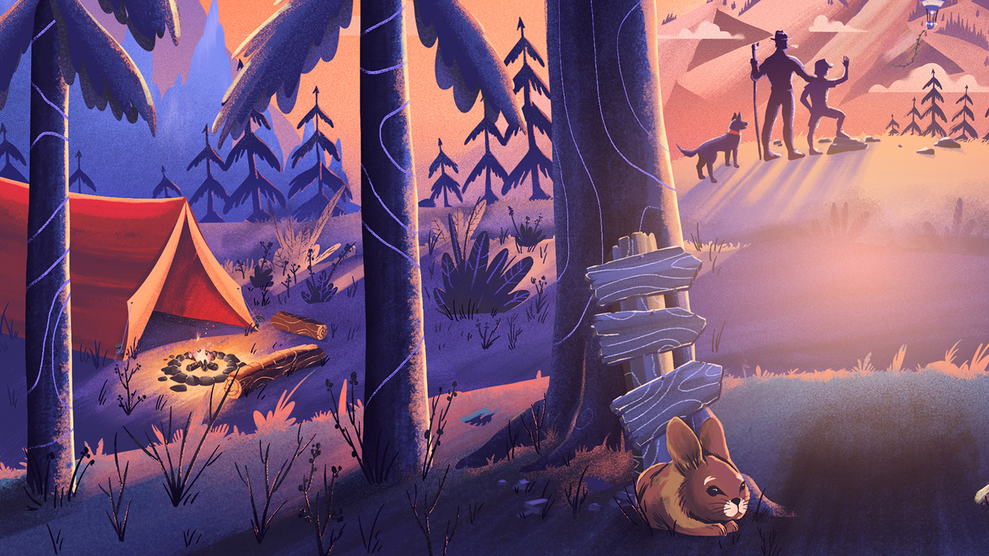
Full Colour Illustration
Here is the final result of the full colour artwork used in the packaging design. Contrasting colours of oranges and purples that are complimentary to each other give a sense of warmth and coziness, perfect for a drink that brings the same feeling when drinking it.


CREDITS:
Client: Morish
Art Direction & Illustration: Chris Savides
Colour and 3D packaging: Waldo Buchner