


The first project we had to do in the FdA Graphic Design course in Camberwell College of Art was to rebrand the current exhibition of African culture in the British Museum. The goal of the project was to make it clear for us what an actual identity system is and how it's applied to a brand. We had to design a visual language and apply it to a gallery context.
Research
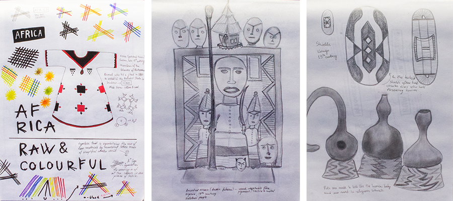
Our first job was to go to the Africa room in the British Museum and draw quick sketches of all the objects that grab our eyes. This is a very efficient way of studying them and noticing all of their details. It was interesting because the African exhibition was the only one in the museum which included contemporary objects, not only historical ones.

After studying the exhibits and the gallery space, we were supposed to summarize our findings in a mind map. Mine includes several keywords which describe the African culture, with details for each one — things like similar keywords and processes which can be used in the final design of either the identity system or the gallery space.
First concept
My first concept was based on hand-weaving, which is the main way textiles are produced in rural Africa. Also, if you oversimplify the shape of the continent, it becomes just a triangle, the shape the letter A is based on. I wanted to use it together with the weaving idea for the logo, along with contrasting bold/light, small/big Futura type, to reflect the contemporary exhibits.

Second idea
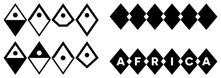
When I was getting my feedback on my pitch, I quickly realized that the identity isn't as good as I imagined. I decided to use the diamond shape which was so common for the African culture and use it as a bulding block to develop an identity further.

Sketches from different stages of the diamond grid concept
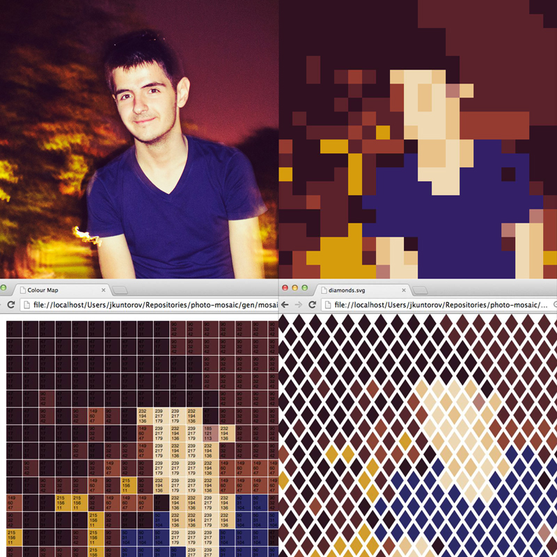
The first thing I tried was to use my programming skills and make a script which takes an image file as input and outputs a vector (SVG) diamond grid with coloured diamonds.
The final identity
I quickly realized that it's not really going to help me to generate SVG diamond grids, even though it was working sick. I got back on track with a more conceptual, instead of practical, approach. I started playing with the diamond shape and making it resemble the letter A, but after seeing them aligned together I knew that just 6 empty overlapping diamonds will be a great form to represent the exhibition inside the gallery space. For spaces outside the British Museum type is added to the diamonds.
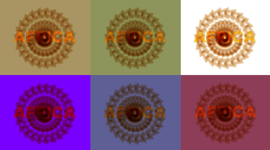
Typography & colour experiments — the typeface used is Novecento Wide.
The other thing that help me form my identity was layering. After creating a poster using a plain diamond grid I didn't find it as interesting as I would wanted it to be. That's when I tried puting things out on layers and in different sizes, which made the identity really exciting and memorable.


After creating the main two posters, it was just a matter of applying the identity using the same visual language on all other kinds of media and materials.


In order to make the exhibition more interesting, I designed a simple interactive display which reacted to movement in front of it. When the room is calm, the display starts showing stories about the so called 'blood diamonds', the ones funding conflicts around the African continent.


