
ZAFFER - Serralheria Inteligente
PT
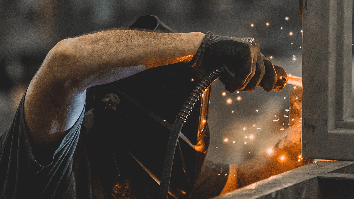
ZAFFER serralheria inteligente, tem a missão de oferecer um atendimento humanizado e personalizado de acordo com a necessidade de cada cliente. O projeto teve seu início desde o processo de Naming até o desenvolvimento da identidade visual. Todas as etapas de criação tiveram um enorme cuidado para transmitir exatamente o que a marca deve ser: Industrial, Criativa, Profissional.
__
EN
ZAFFER intelligent sawmill, has the mission of offering a humanized and personalized service according to the needs of each client. The project started from the Naming process to the development of the visual identity. All stages of creation took great care to convey exactly what the brand should be: Industrial, Creative, Professional.
Client: Maicon Balassa | Service: Visual Identity | Country: Maringá, Paraná | Year: 2022 | Art Director: Jonatan Pinheiro

PT
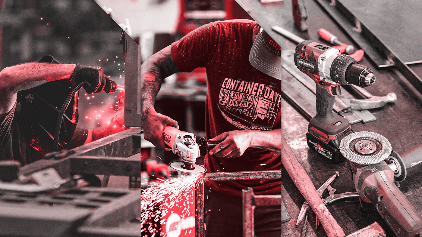
O símbolo/logo foi desenvolvido com base, em algumas características que representam seus fundadores e o processo de fabricação dos produtos. Como a ZAFFER, tem o foco em fabricação de móveis no estilo industrial e itens para amantes de churrasco, foram utilizadas na simbologia, elementos que estão ligados diretamente ao dia a dia da empresa.
__
EN
The symbol/logo was developed based on some features that represent its founders and the product manufacturing process. Like ZAFFER, which focuses on manufacturing industrial-style furniture and items for barbecue lovers, elements that are directly linked to the company's day-to-day were used in the symbology.
PT
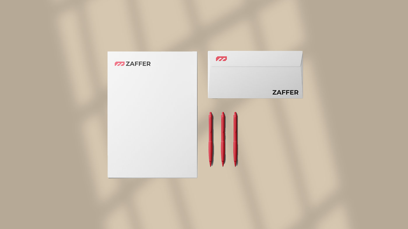
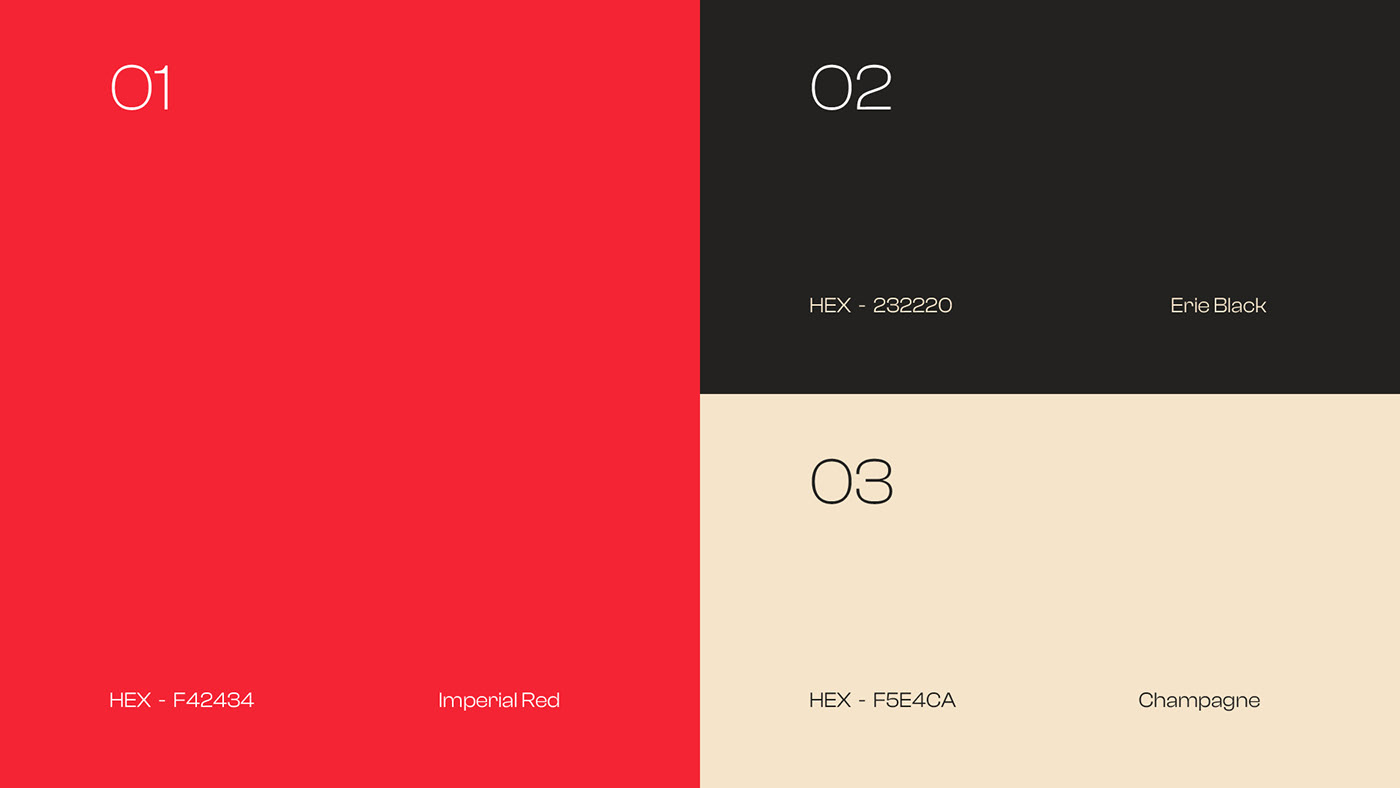
A escolha da paleta cromática surgiu com base nas cores presentes em todo o processo de criação do produtos. Gerando dessa maneira uma consistência visual que se estende desde o chão de fábrica até a comunicação offline e online.
__
EN
The choice of the chromatic palette came about based on the colors present throughout the product creation process. Thus generating a visual consistency that extends from the factory floor to offline and online communication.

PT
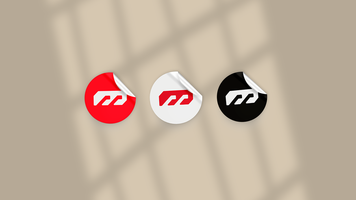
Para a construção do símbolo foi utilizado um grid modular tornando assim a marca mais harmônica e simétrica. Por se tratar do segmento metalmecânica, a escolha por um grid geométrico faz todo sentido estratégico.
__
EN
For the construction of the symbol, a modular grid was used, thus making the brand more harmonic and symmetrical. As this is the metalworking segment, choosing a geometric grid makes perfect strategic sense.