

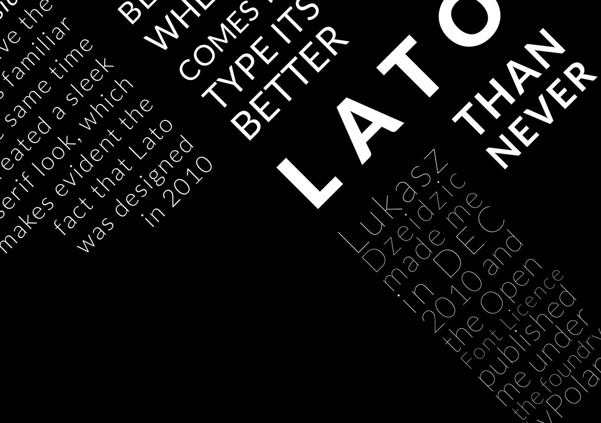
For this project we had to do a type brochure, where we showcase a Font Flag and a Type Specimen Sheet. I chose the font Lato, which was voted one of the best free fonts designed. It has a variety of weights and worked well in larger scales. I also liked how well the type transitioned onto black background which is one of the reasons I kept my colour scheme the classic black and white.

Front of Brochure: I made use of a Bauhaus sort of grid. I felt it gave it an energetic atmosphere, and it was an easier way to showcase the different type of font styles that Lato has. I feel that the black background gives the brochure such a slick feel, and if this was to be used as a poster it would still look good.

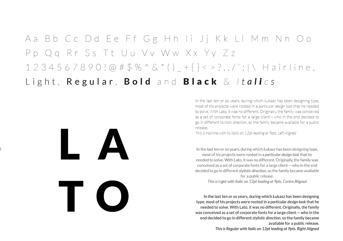
Back of Brochure: For this layout I made use of 2/3rds of the frame taking up with the most information, and the last third quite plain. I wanted maximum white space, so I found ways to condense the information as not to take up too much space.
____________________________________________________________________________________________________

Brochure in 3D

Thank you!


