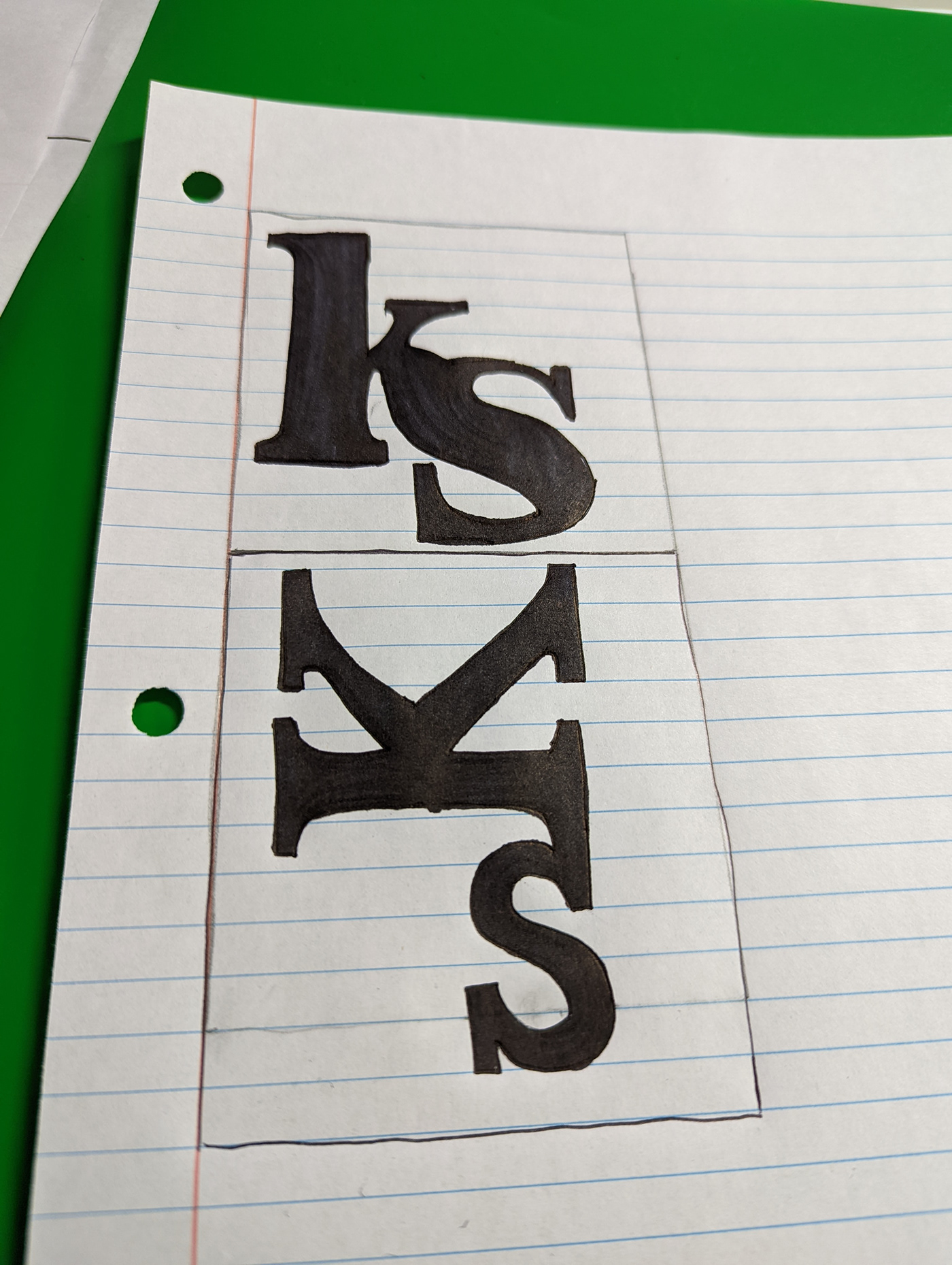
Monograms

For my typography class, our very first assignment was to make a monogram. A symbol that is unique to us and is able to effortlessly flow despite the challenge of making it all cohesive. I chose these monograms because they are simple but also complex and easy to associate with me.


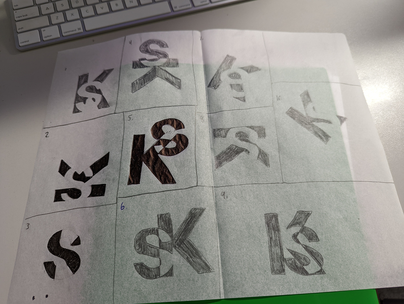
My biggest struggle was attempting to make ten remakes of my personal top three sample drafts out of thirty. Another setback was the fact that my hands are more steady when drawing in comparison to using a mouse. There were a few ways in which feedback influenced my completion of the project. For example, for one of my choices, one classmate suggested that I rearrange the letters so that one letter is on the other side. For one of the sketches that did not make the cut, my professor stated that I could bend the rules by adding my middle initial in a way that is subtle.