The challenge
SIMS Metal Management are a global waste recycling company. They were creating a mobile app for their customers to help them find the most appropriate recycling location.
I was brought in to style their existing wireframes that they had developed themselves - it needed to follow their existing style guide.
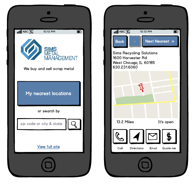
Here are their original wireframes (not my work):


The process
Once I started digging into the wireframes, certain things didn't quite make sense. For example, on the home screen of the app, the user had a "Click to call" option, but who would they be calling if they hadn't chosen a location?
So what started as a reskinning became a deeper rethink about how the app should work, or even if the app itself made any sense at all.
My inital wireframes sought to fix the workflow so that a user was very clear which recycling centre they were dealing with.
Here, I worked through a couple of alternative designs for the location page, where the user could explore the services, deals and opening hours at that site:

The outcome
I delivered a set of high-fidelity designs with the new user journey along with my reasoning as to why the changes had been made:

Usability testing highlighted an issue I should have picked up myself, the way the selected tab looked more like a button than an indication of where you are. The same went for the buttons along the bottom:

The final designs matched the branding they were after with a much clearer workflow.
The client went on to hire me for some further website design work.


