Rebranding of the visual identity
Oslo S Utvikling (OSU)
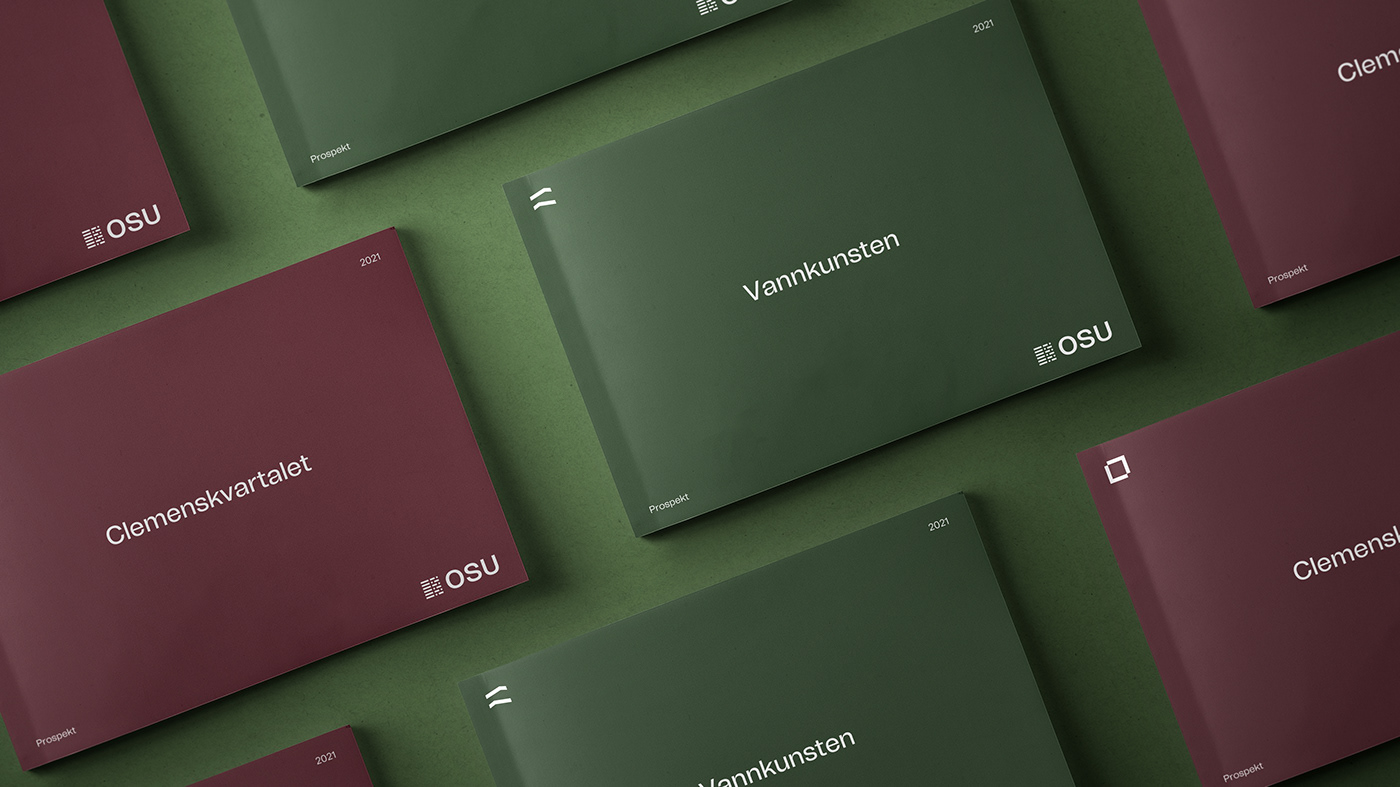
OSU has during 20 years developed homes, commercial premises, office buildings and public spaces in Oslo's newest and most attractive neighborhood, Bjørvika. From the very beginning OSU has worked to ensure quality in all stages by working long-term and holistically and together with other developers in the capital region OSU has delivered beloved projects such as Barcode, Vannkunsten and Operastranda.
From having a strategy of "laying low" and creating awareness of Bjørvika as an attractive area, they have now reached the point where they wanted to strengthen the brand and getting ready for new tasks.
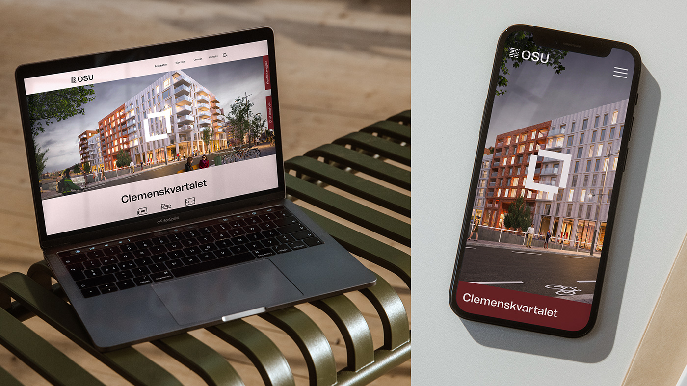
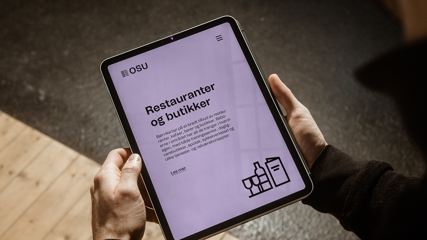
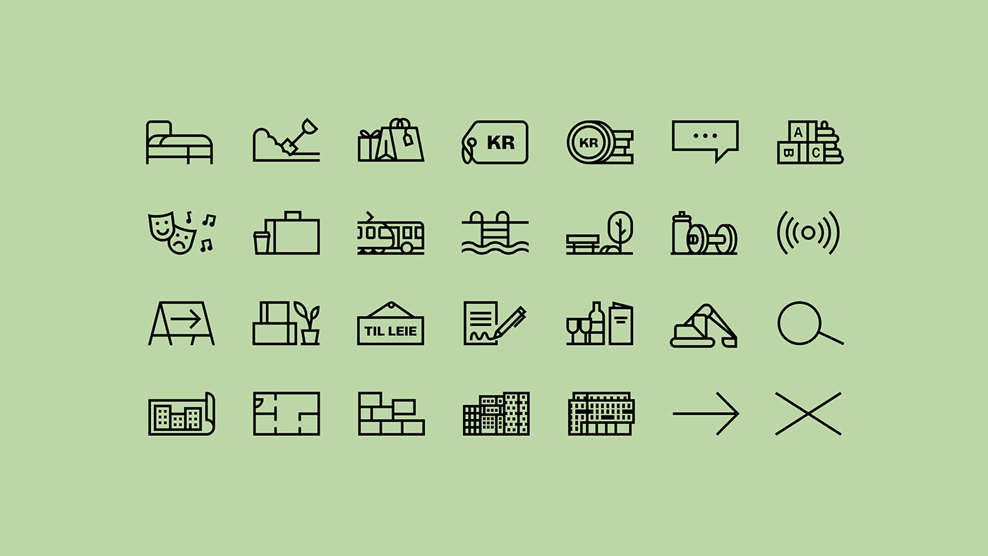
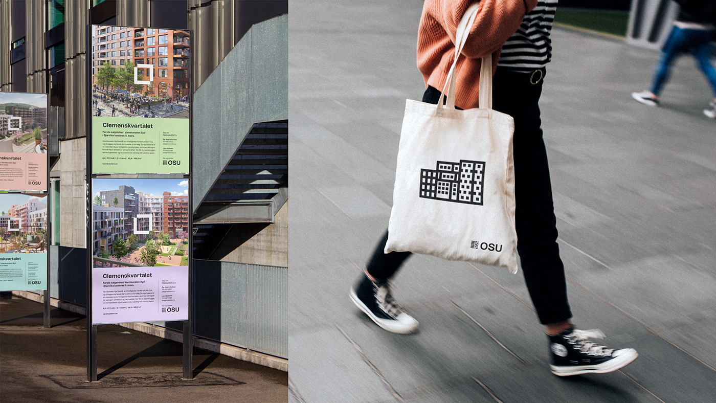
Tank has done the rebranding where the symbol is kept as it was, but everything else in the visual identity is redesigned with the vision of creating a living brand with a human touch. OSU has now a more recognisable brand, and a visual toolbox ready for what may come in the future.


OSU has been developing Bjørvika into Norway's most attractive residential and business area.


"When you plan, design, develop the brand and the web, it's all about creating a visual system that's easy to understand and makes sense both for the client and for the people of Oslo. "