

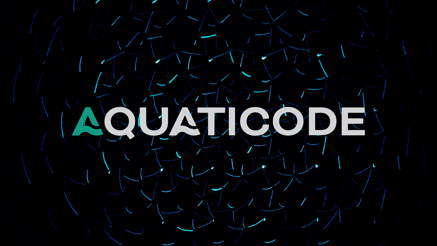
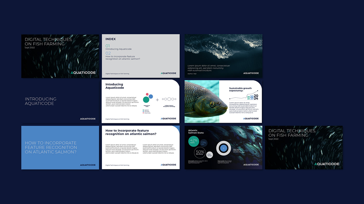
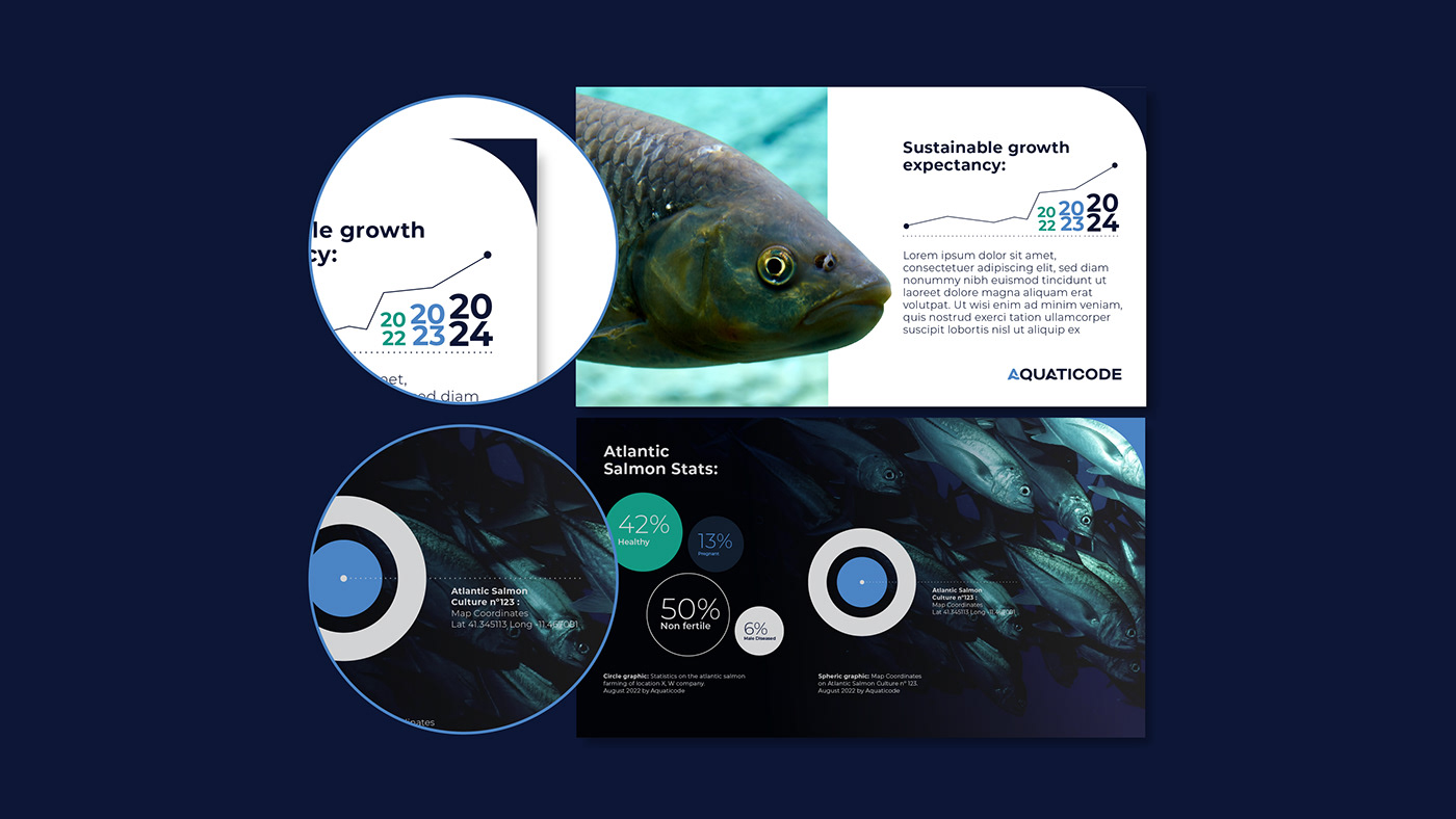
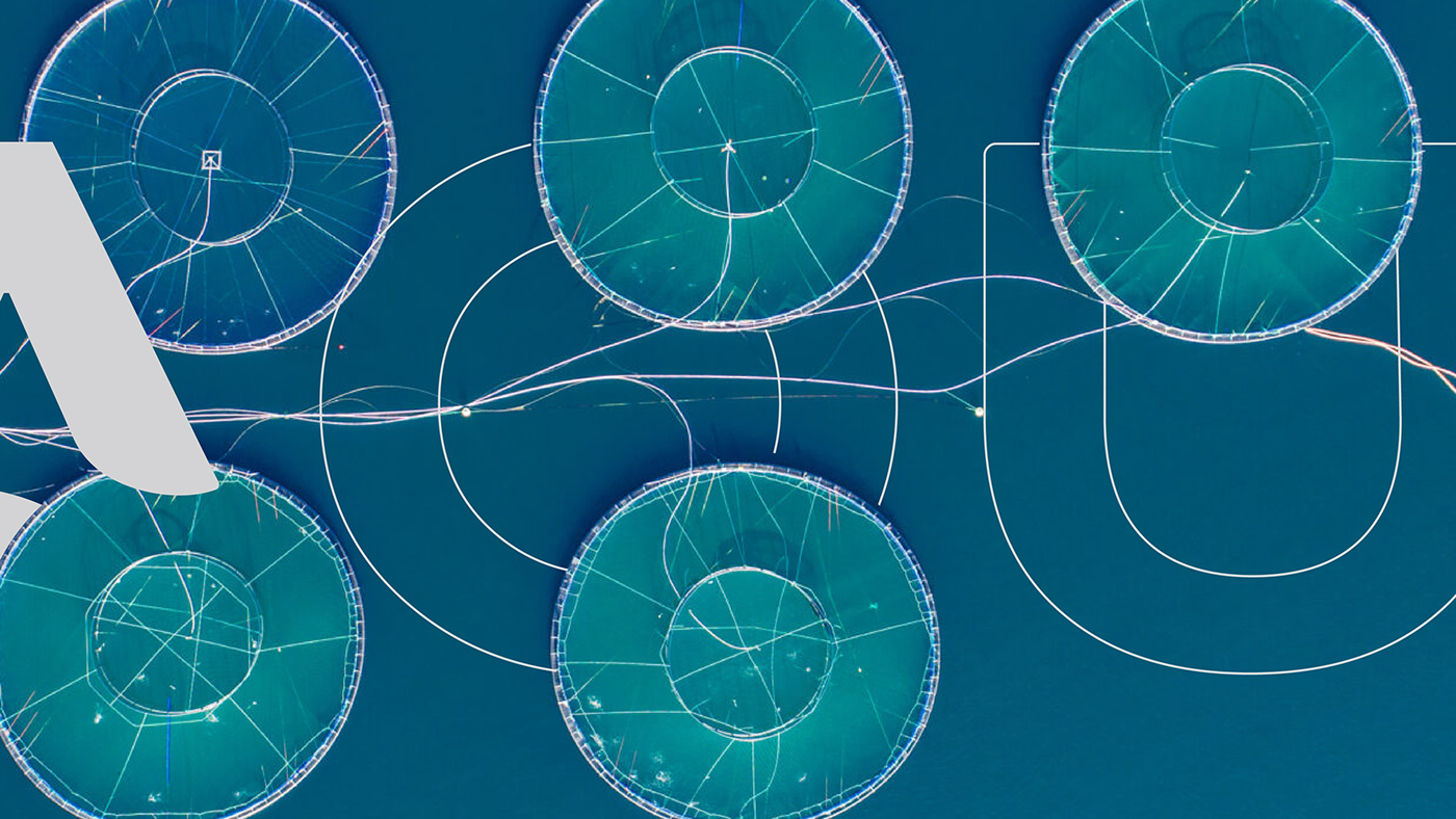
Aquaticode is a company that stands on sustainable values and technological innovation.
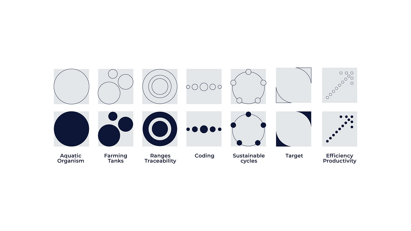
It merges both the aquaculture universe and the ultimate technology on feature recognition
and traceability.
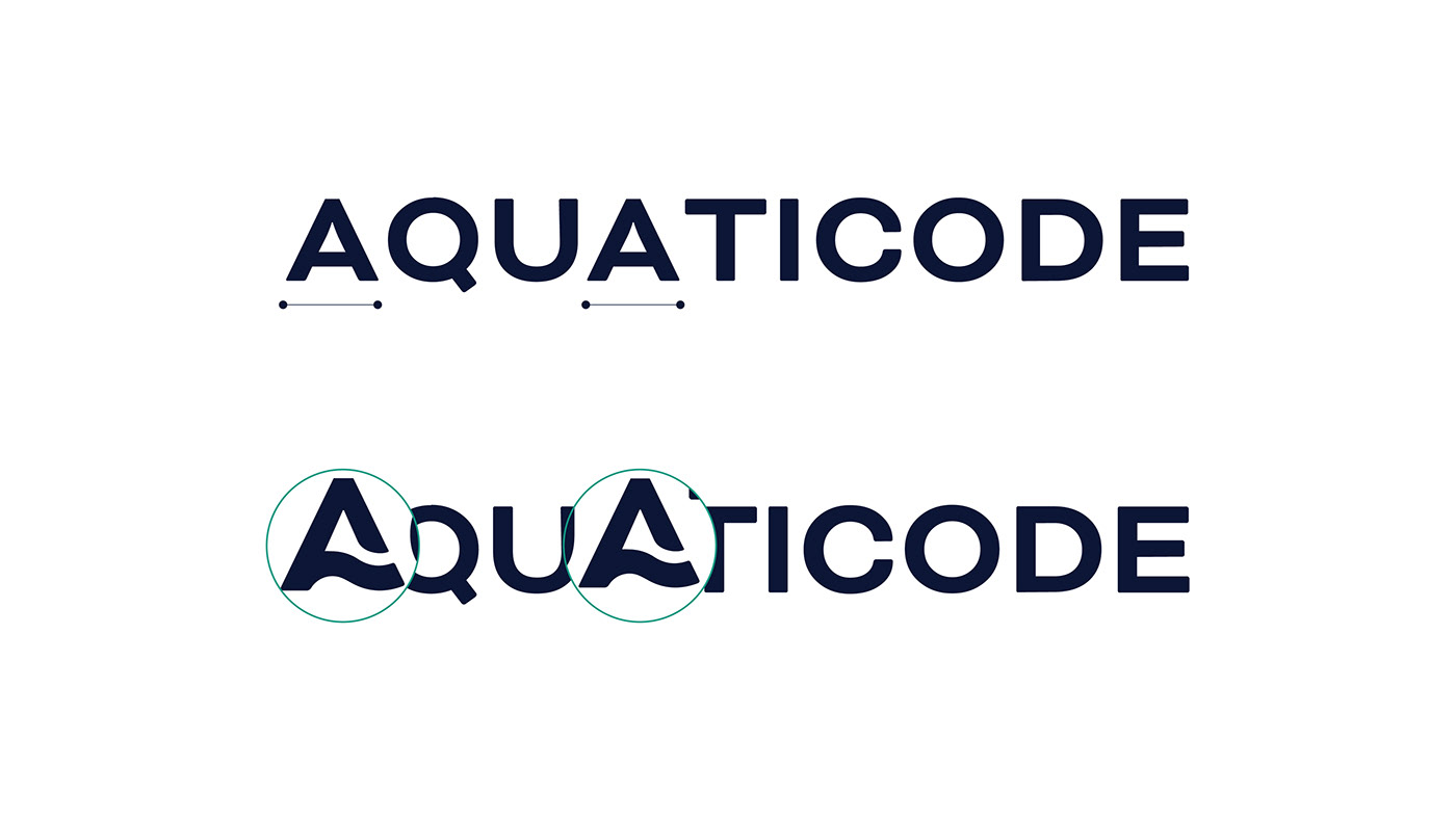
The identity reflects the values of the company and the balance between the aquatic world,
in its macro and micro dimensions, and both the technology/innovation and the stability/credibility
of the business.
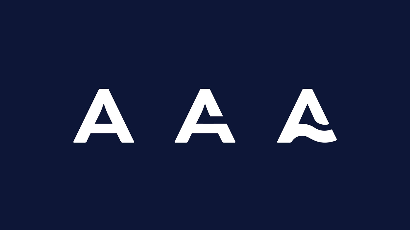
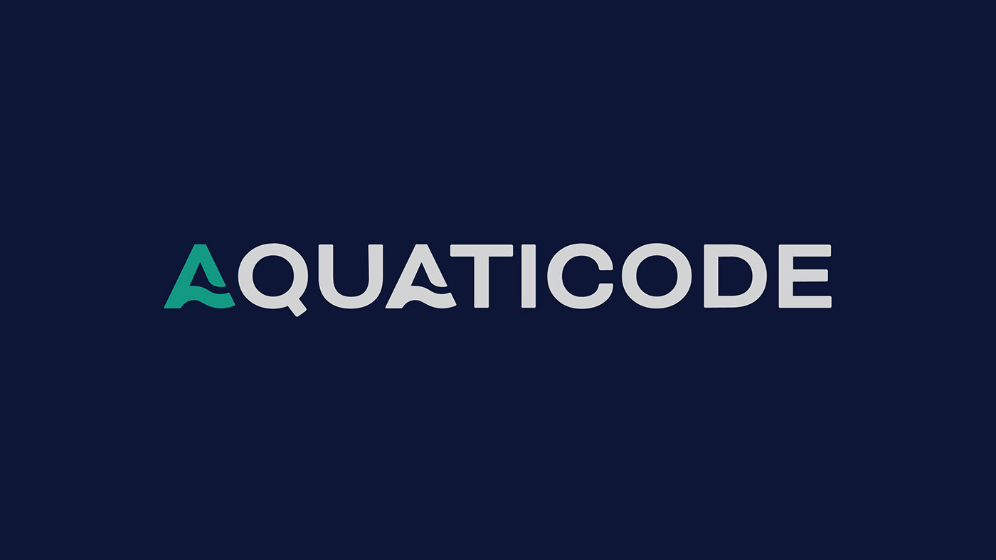
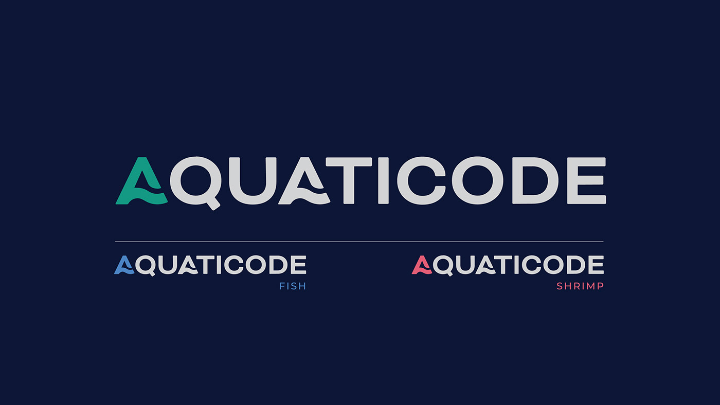
The typography conveys the idea of trust, loyalty, impact and timelessness, in its simple and strong lines, in its bold and effective visual statement and in its technological and sustainable look.
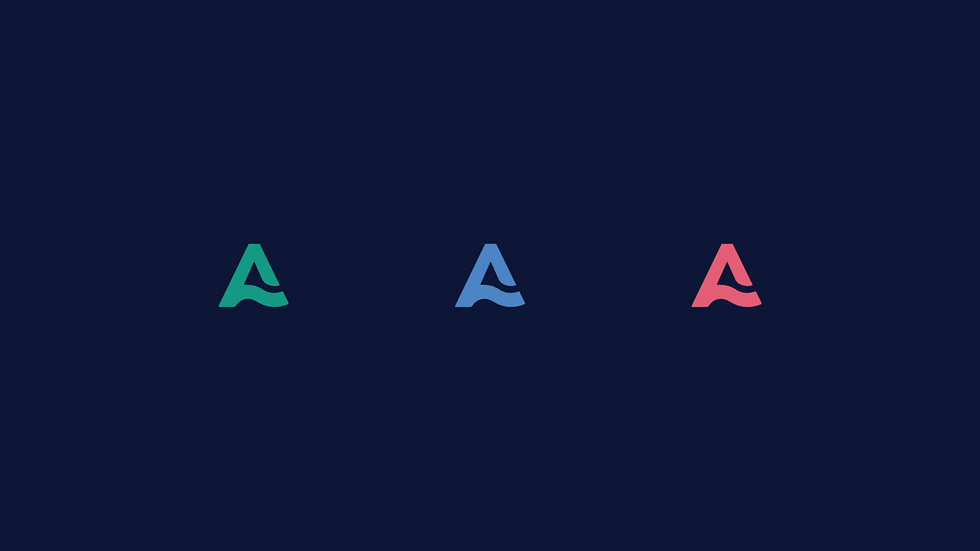
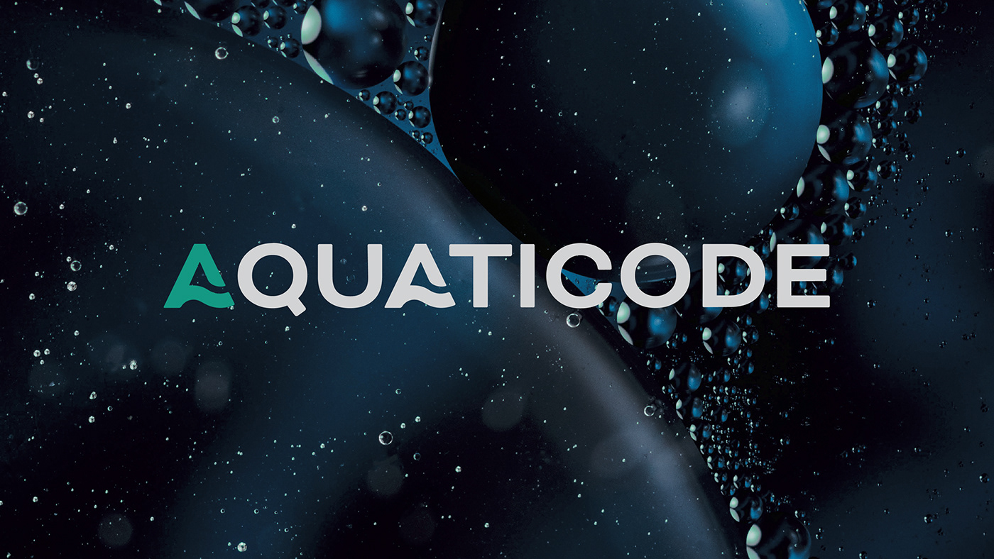
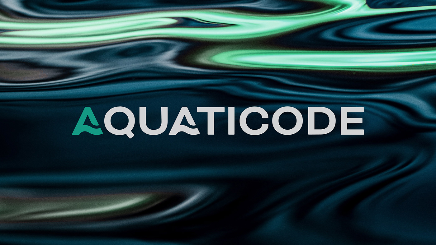
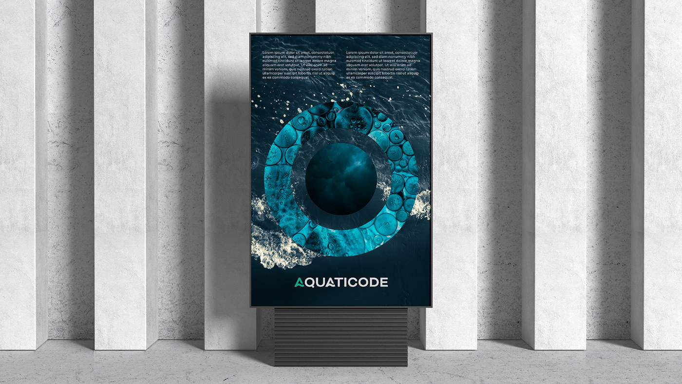
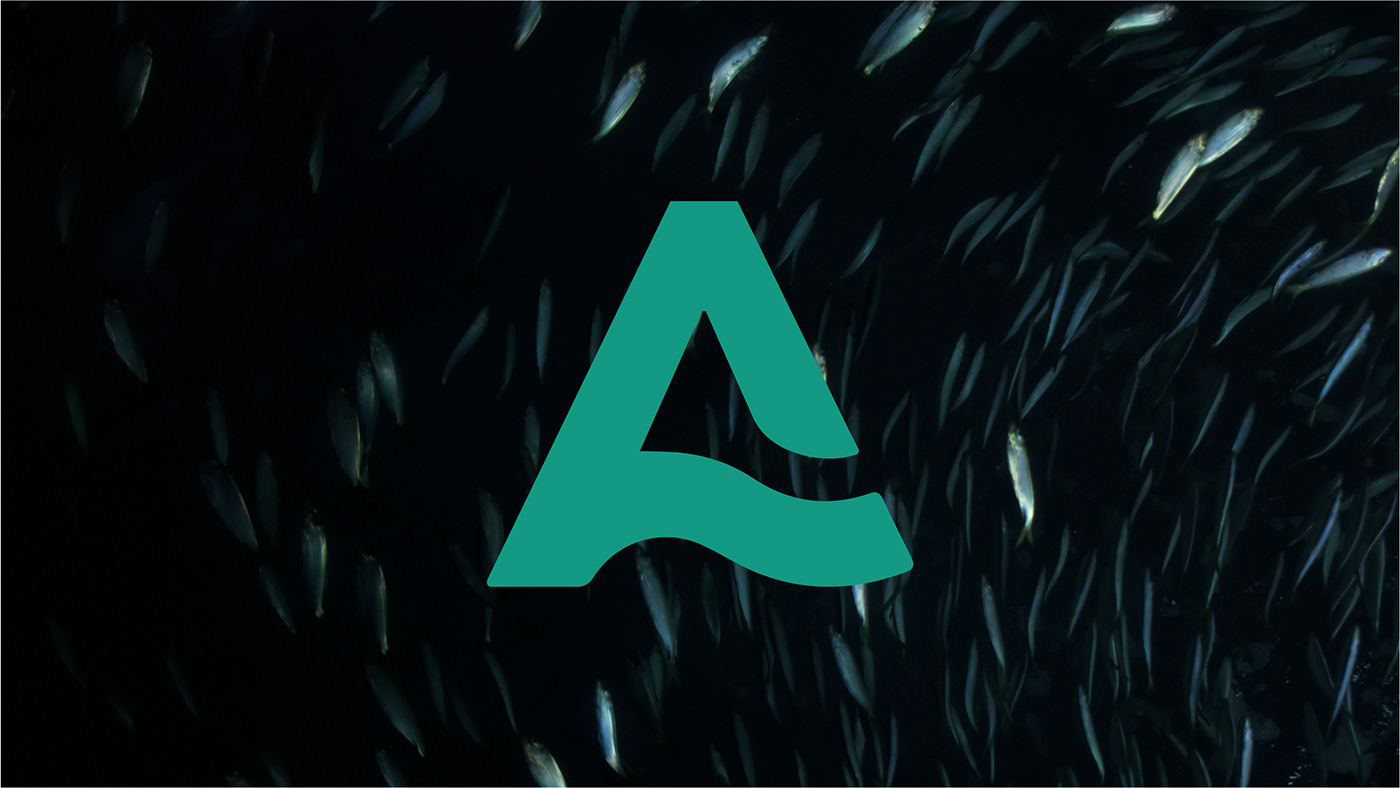
The letter "A" serves as an symbol to represent the area of intervention.
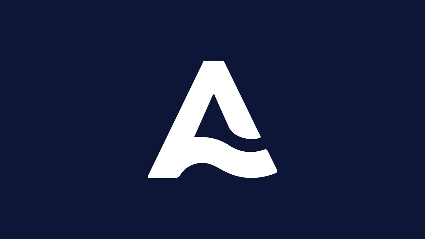
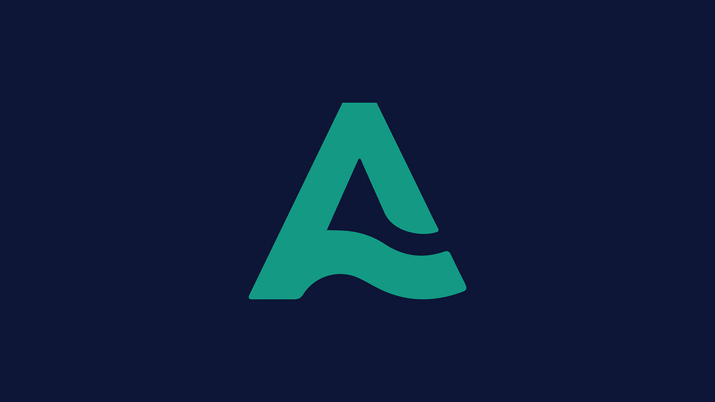
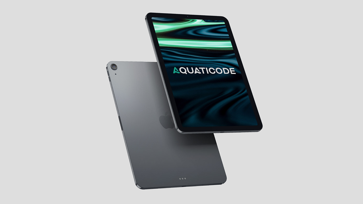
The green color represents the aquatic universe and serves as a differentiating factor.
The curvy lines on the letter A illustrate the sea movement, the will to go forward,
to be flexible and to stimulate dinamism, just like the values of the company.


Find out more here
Client: AQUATICODE
Creative Director: Anne-Laure Chauvin
Brand Designer: Carmo Cunha e Sá
Head of Digital: João Fernandes
Creative Digital Director: Dinis Deuchande
Project manager: Ana Dantas, João Prateiro
Art-worker: Estela Pereira
All rights reserved to NOSSA™


