TRABALHO ACADÊMICO / ACADEMIC WORK / 2022
SOBRE / Esse é um projeto de design de interfaces feito no âmbito acadêmico da Universidade do Estado do Pará. Como proposta avaliativa, escolheu-se como caso a ser analisado, e assim transformado, do Bosque Rodrigues Alves – Jardim Zoobotânico da Amazônia, patrimônio secular de Belém do Pará, cujo possui como função a preservação da fauna e flora amazônica, a partir de atividades as quais envolvem educação ambiental, lazer, turismo e cultura. Sob essa perspectiva, o presente trabalho objetiva desenvolver a interface gráfica de um website voltado ao espaço público do Bosque Rodrigues Alves, para viabilizar o acesso à informações acerca do local, visando a valorização do patrimônio. Como dito anteriormente, esse é apenas um trabalho fictício e acadêmico, o qual não faz parte da comunicação oficial do Bosque Rodrigues Alves.
ENG This is an website design project carried out within the academic scope of the Universidade do Estado do Pará. As a proposal, it was chosen as a case to be analyzed, and then transformed, from the "Bosque Rodrigues Alves - Jardim Zoobotânico da Amazônia", in Belém do Pará, which function is to preserve the fauna and flora, from activities which involve environmental education, tourism and culture. From this perspective, the present work goal is to develop the graphical interface of a website aimed at the space of "Bosque Rodrigues Alves", to enable access to information about the place.
Again, this is just an ficticional and academic work, not being part of the official communication from "Bosque Rodrigues Alves".

ENG O "Bosque Rodrigues Alves” is one of the main laboratories in the world and guardian of a collection of plants from the Amazonia Rain Florest flora, which contributes to the recovery of areas that have lost their vegetation by any action. It also aims to commit to research, conservation and environmental education, preparing present and future generations for a better world, ecologically more balanced and more just economically and socially.

ARQUITETURA DA INFORMAÇÃO / Foi imprescindível a construção de uma Arquitetura da Informação (Sitemap) para o desenvolvimento de um software interativo, sendo este um grupo de componentes que farão parte da interface, bem como a organização da informação, etiquetas, navegação e mecanismos de busca. Logo, isso possibilitou a visualização da estrutura geral da interface, assim permitindo aos pesquisadores-projetistas seguirem com as etapas seguintes do projeto.
ENG It was essential to build an Information Architecture (Sitemap) for the development of an interactive software, which is a group of components that will be part of the interface, as well as the organization of information, labels, navigation and search engines. Therefore, this allowed the visualization of the general structure of the interface, thus allowing the researchers-designers to proceed with the next stages of the project.


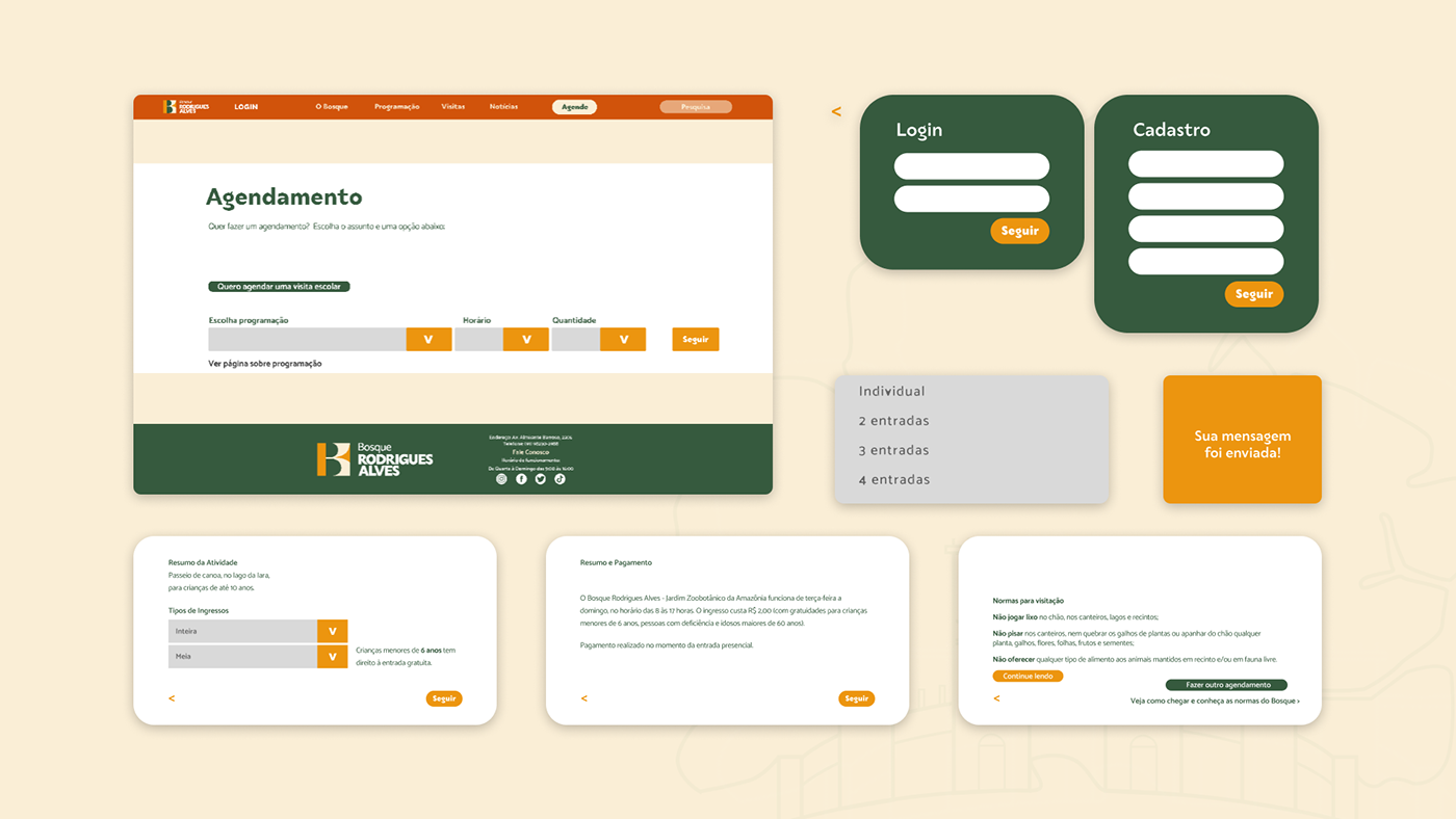
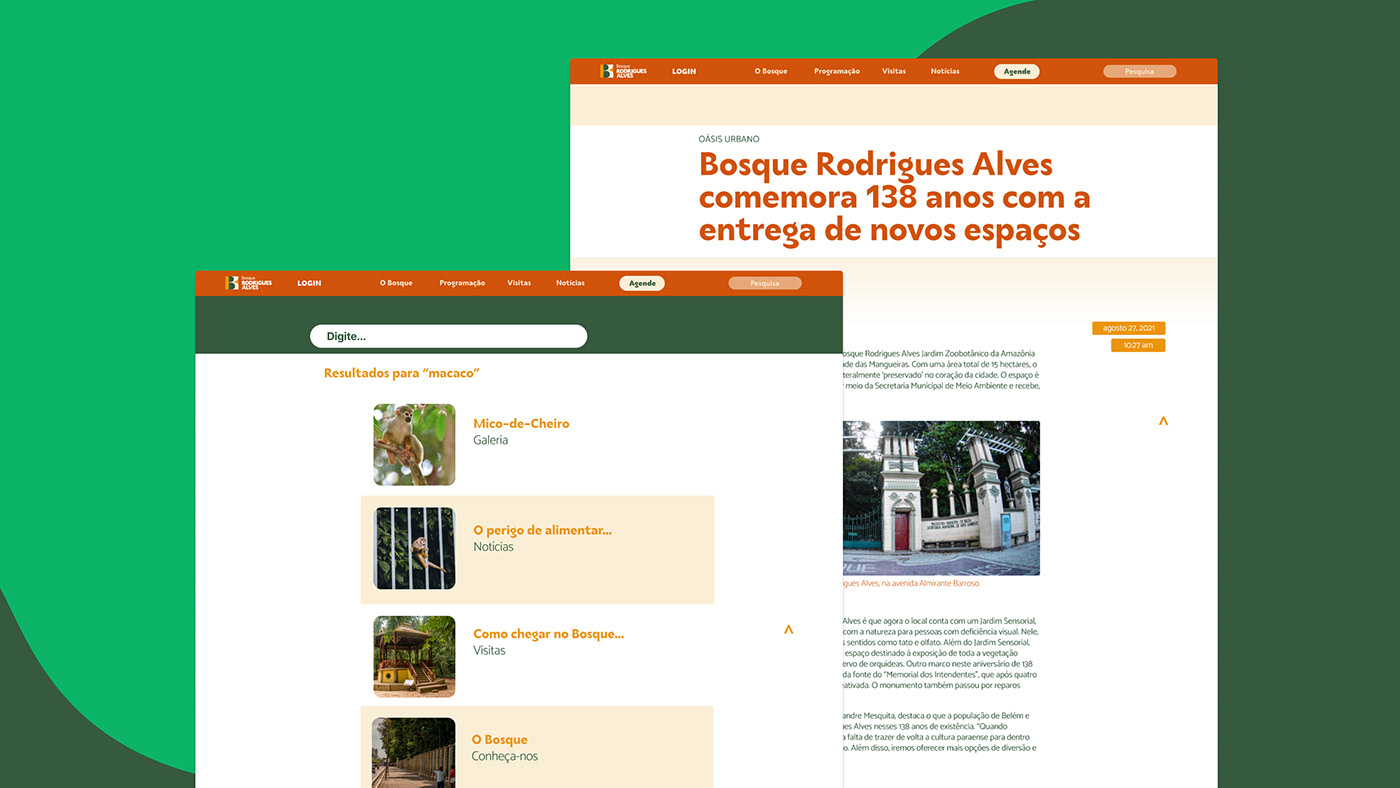
WIREFRAMES / Os Wireframes desenvolvidos nesta pesquisa são de baixa fidelidade, sem aplicação de identidade visual, limitando-se aos aspectos funcionais do site, formatação de texto e imagens e dentre outros. Essa etapa possibilita que os projetistas recebam feedbacks mais fidedignos por parte de possíveis usuários, uma vez que visualiza-se o que foi idealizado ao longo do desenvolvimento em uma interface gráfica, sendo mais simples também identificar seus problemas e vantagens.
ENG The Wireframes developed in this research are of low fidelity, without the application of visual identity, being limited to the functional aspects of the site, text and image formatting, among others. This step enables designers to receive more reliable feedback from potential users, since what was conceived during development is visualized in a graphical interface, making it simpler to identify its problems and advantages.

ABORDAGEM / Para começar o projeto, foi necessário determinar qual a a missão do Bosque Rodrigues Alves, sendo esse "Promover o compromisso com a pesquisa, conservação e a educação ambiental, preparando as gerações presentes e futuras para um mundo melhor, ecologicamente mais equilibrado e mais justo econômica e socialmente". Após isso, viu-se que sua visão seria de "Ser referência como ponto de lazer sustentável no contexto urbano da cidade de Belém e estimular a valorização da história e cultura amazônica". Dessa maneira, definiu-se como valores da marca: Sustentabilidade, Ética, Lazer e Educação Ambiental.
ENG To start the project, it was necessary to determine the mission of Bosque Rodrigues Alves, which is "To promote the commitment to research, conservation and environmental education, preparing present and future generations for a better, ecologically more balanced and fairer world and socially". After that, it was seen that his vision would be "To be a reference as a point of sustainable leisure in the urban context of the city of Belém and to stimulate the appreciation of the Amazonian history and culture". In this way, the brand's values were defined as: Sustainability, Ethics, Leisure and Environmental Education.

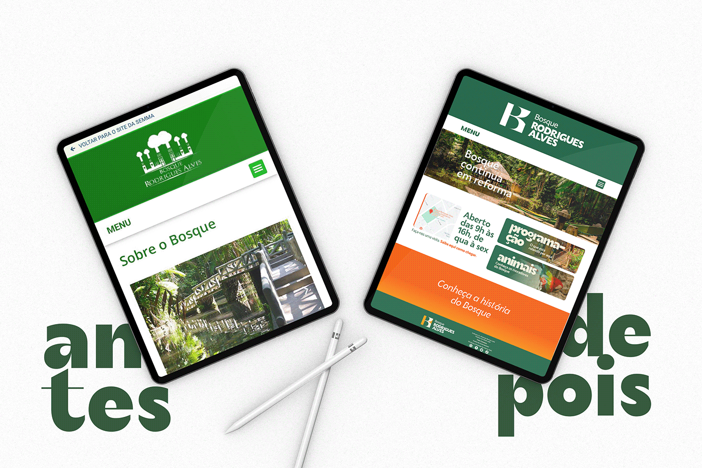
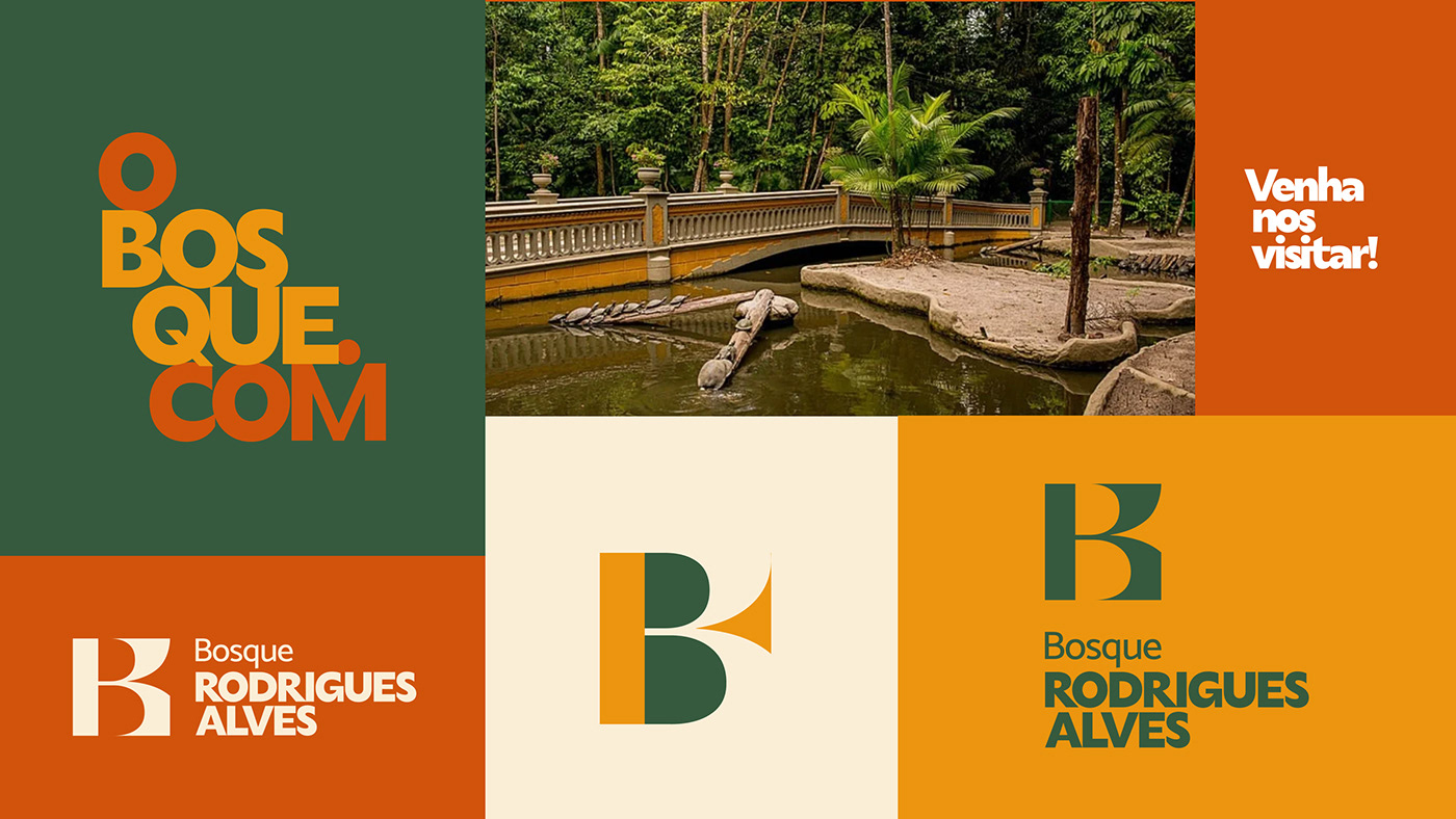
REBRANDING / Como etapa avaliativa do projeto, desenvolveu-se uma nova identidade visual para o Bosque Rodrigues Alves, a fim de ser aplicado no protótipo final do website, isso com a proposta de tornar o seu visual mais moderno e se aproximar do público mais jovem. Assim, seguiu-se por uma linha mais tradicional por ser um espaço público, ainda assim, a partir das fontes escolhidas para a identidade visual, a logo expressa modernidade com seus elementos tipográficos.
ENG As an evaluative stage of the project, a new visual identity was developed for Bosque Rodrigues Alves, with the proposal of being more modern and approaching the younger audience. Thus, it was followed by a more traditional line for being a public space, even so, from the chosen fonts for the visual identity, the logo expresses modernity with its typographic elements.

⠀
⠀
⠀

PALETA DE CORES / A escolha predominante do verde, estando presente em dois tons diferentes, é devido ao seu forte significado relacionado à natureza e à sustentabilidade. O amarelo, uma das cores que origina o verde, sugere a alegria e espontaneidade, seu nome vem do latim amaryllis, o qual simboliza a cor da luz irradiante em todas as direções. Por fim, o tom de vermelho foi definido para compor a paleta de cores principais por possuir um alto contraste com a cor verde, ademais, a combinação entre verde e amarelo resulta um tanto fraca, mas, se acrescentamos o vermelho, revigora.
ENG The predominant choice of green, being present in two different shades, is due to its strong meaning related to nature and sustainability. Yellow, one of the colors that originates green, suggests joy and spontaneity, its name comes from the Latin amaryllis, which symbolizes the color of light radiating in all directions. Finally, the shade of red was defined to compose the main color palette because it has a high contrast with the color green, in addition, the combination between green and yellow is a little weak, but if we add red, it invigorates.
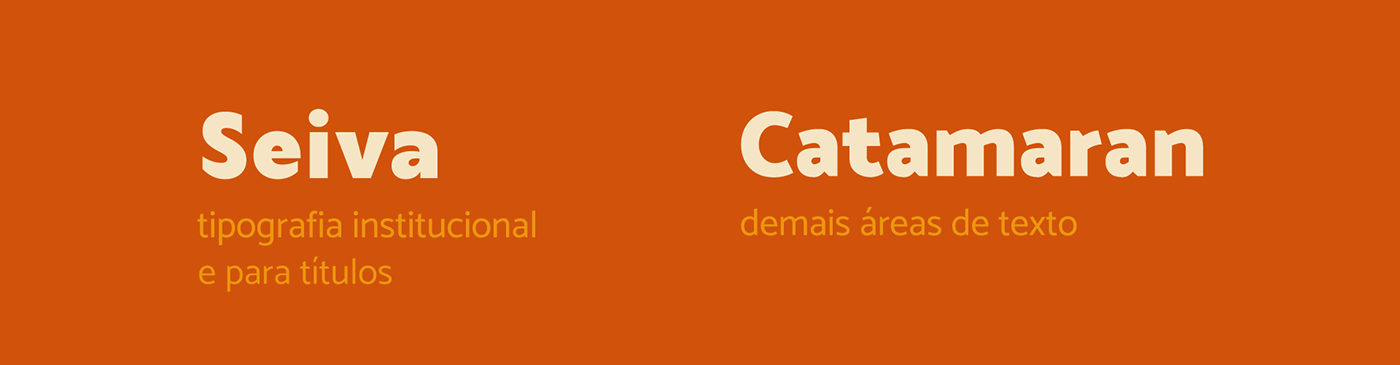
TIPOGRAFIA / Para a tipografia, admitiram-se duas fontes diferentes, uma para títulos e outra para corpo de texto: a Seiva e a Catamaran, por Fabio Haag Type e Pria Ravichamaran, respectivamente. Assim, possibilitou transmitir nos títulos modernidade, usando de uma tipografia mais “irregular”, porém sem perder a sua legibilidade. Por conseguinte, a fonte escolhida para o corpo de texto se relaciona com a de título que, apesar de ser uma fonte tradicional, necessário por ser um espaço público, mas com seus elementos básicos dão um estilo sutil às letras.
ENG For typography, two different fonts were admitted, one for titles and another for body text: Seiva and Catamaran, by Fabio Haag Type and Pria Ravichamaran, respectively. Thus, it made it possible to convey modernity in the titles, using a more “irregular” typography, but without losing its legibility. Therefore, the font chosen for the body text is related to the title that, despite being a traditional font, necessary for being a public space, but with its basic elements give a subtle style to the letters.
Use o nosso protótipo no Figma, vai valer a pena nós prometemos!
ENG Use this Figma prototype to see the project in action, will worth it we promise!
EQUIPE / TEAM
Designers: Beatriz Melém, Lincoln Nazario; Anna Julia Pinheiro
Professores Orientadores: Brena Renata (UX/UI Design); Sávio Fernandes (Branding)