蔓蔓享品牌设计
MANMANXIANG BRAND DESIGN
MANMANXIANG BRAND DESIGN
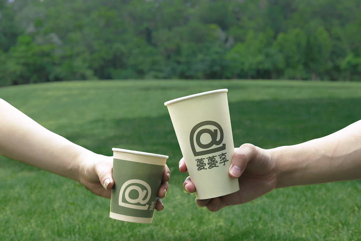
蔓蔓享是位于广州的西点品牌,区别于其他西点和烘焙店,蔓蔓享店主和来光顾的客人更像是朋友,客人来到蔓蔓享就像是回到家一样,能够放松的享受休闲时光,非常自然的自助式选购和用餐,甚至可以自己动手制作咖啡。所以我们提取了网络社交中的“@”作为识别符号,并与店内特色蛋糕卷产品进行了结合,体现品牌的烘培属性和人与人之间的情感交流。图形及文字采用具有轻松感的线段式表达,传达“社交、情感、轻松、欢乐”,同时符号也可以根据不同场景及物料按照比例放大缩小、平铺或裁剪,适应不同需求。
Manmanxiang is a western pastry brand located in Guangzhou. It is different from other pastries and bakeries the owner of Manmanxiang is more like friends with the guests who come to visit. When guests come to Manmanxiang, it is like returning home. They can relax and enjoy leisure time, buy and dine in a very natural self-service way, and even make their own coffee.Therefore, we extracted the "@" in the social network as an identification symbol, and combined it with the special cake roll products in the store to reflect the baking attributes of the brand and the emotional communication between people. Graphics and texts are expressed in line segments with a sense of ease, conveying "social, emotional, relaxed, joyful", and symbols can also be scaled up, down, tiled or cut according to different scenes and materials to suit different needs.
DA:XXD DESIGN| AD:肖琪媛、徐育青 | D:徐育青、肖琪媛、谭佳、肖德金| C:广州云岩餐饮有限公司