

This was a personal design project I came up with so I could explore doing more reserved packaging. I envisioned a fictional pharmeceutical company so I could create businesscards and letterhead and a small sample of the kinds of drugs they would develop. I came up with product names that would sound like a real drug that could be used for its intended purpose (for example: the prefix "pro" for a depression medication to suggest that it would improve symptoms). Colors were selected to match eiher the intended result of the medication or the consumers reaction to symptoms of their illness.

Digital rendering of box and bottle for antidepressant medication

Pacakge design for antidepressant medication

Digital rendering of box and bottle for muscle relaxant medication

Pacakge design for muscle relaxant medication

Digital rendering of box and bottle for migraine relief medication
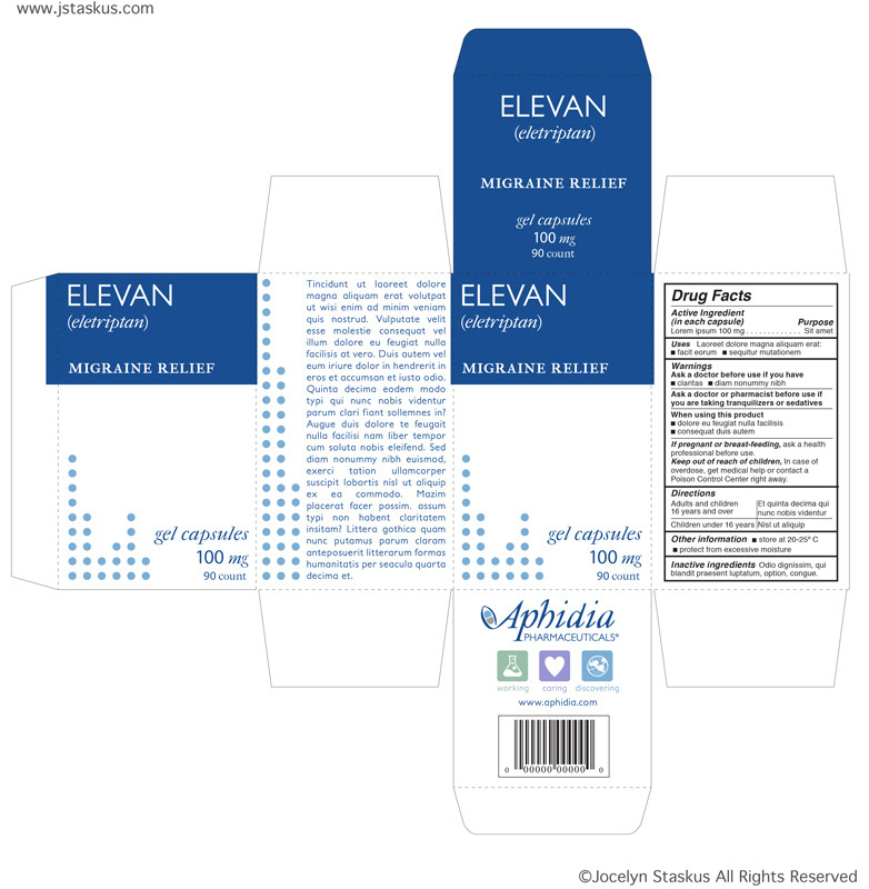
Pacakge design for migraine relief medication

Letterhead and business card

Logo


