


BOUD has developed the identity and packaging
design system for Oroot, a new hair styling brand.
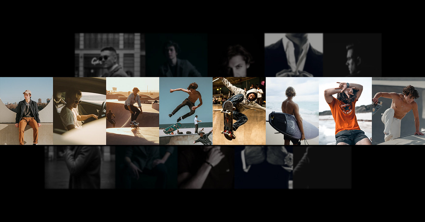
Oroot breaks away from the standardized masculinity of a standard
hairstyle brand: it introduces new masculinity that represents a healthy
and mindful lifestyle. That is Oroot's unique value.
The slashed logotype shows a new masculinity concept, the layering, and stacking of our everyday choices and routines. Oroot's brand and logo express the manliness that doesn't follow the mold.
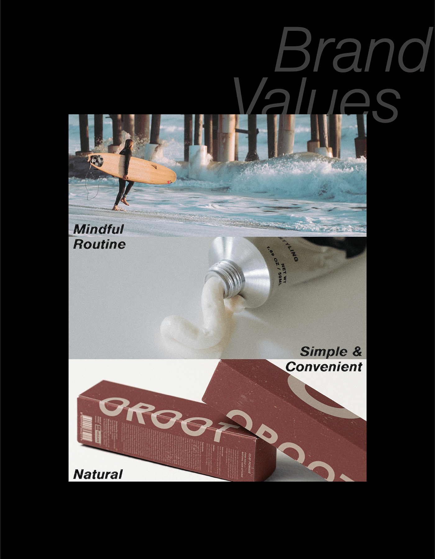
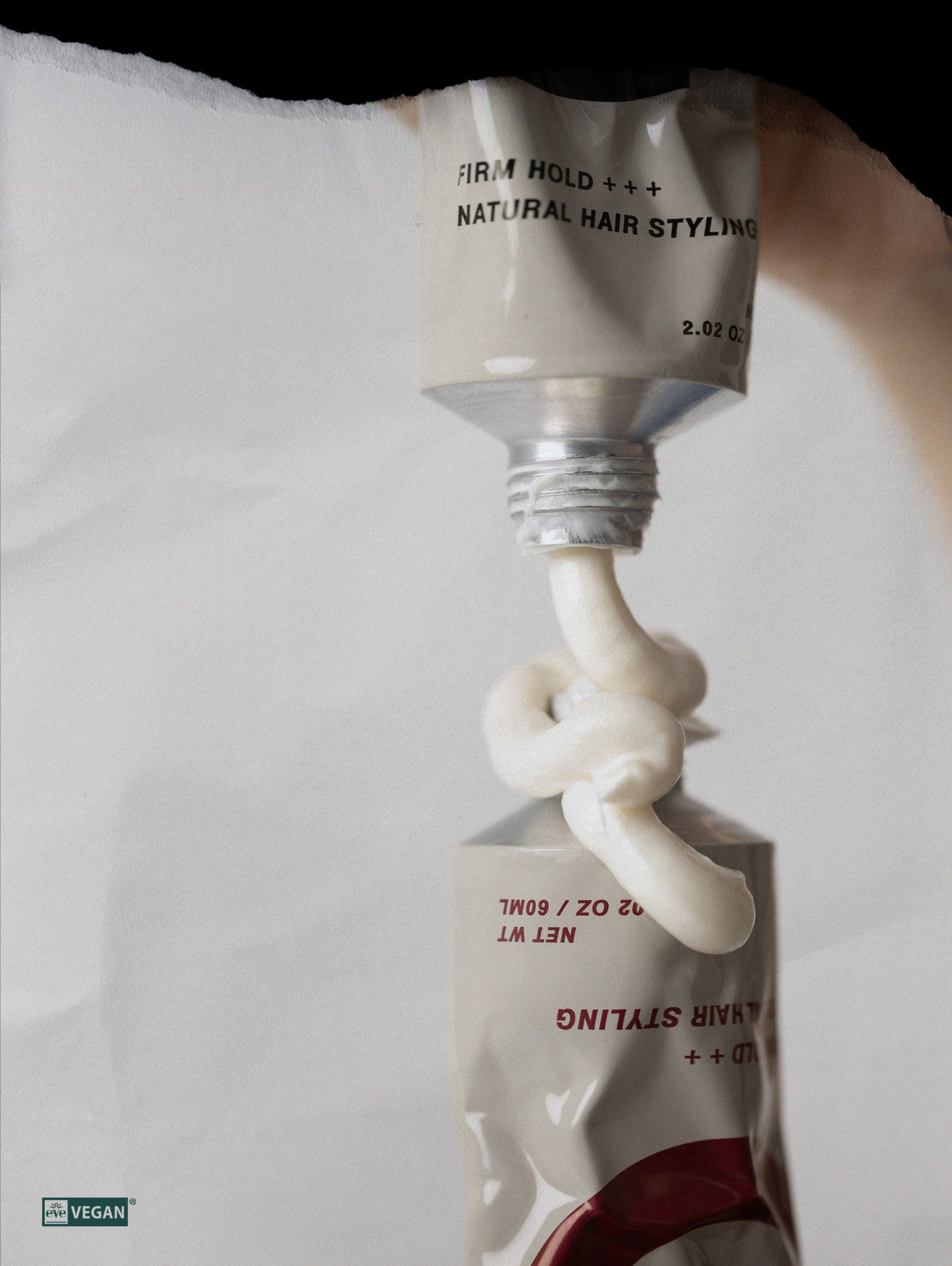
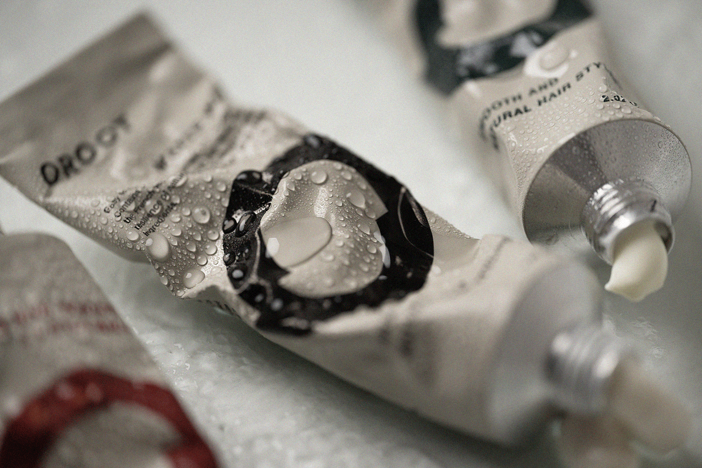


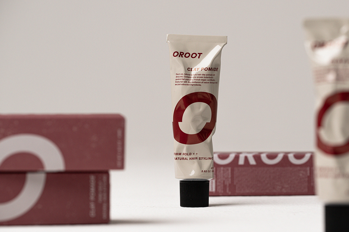
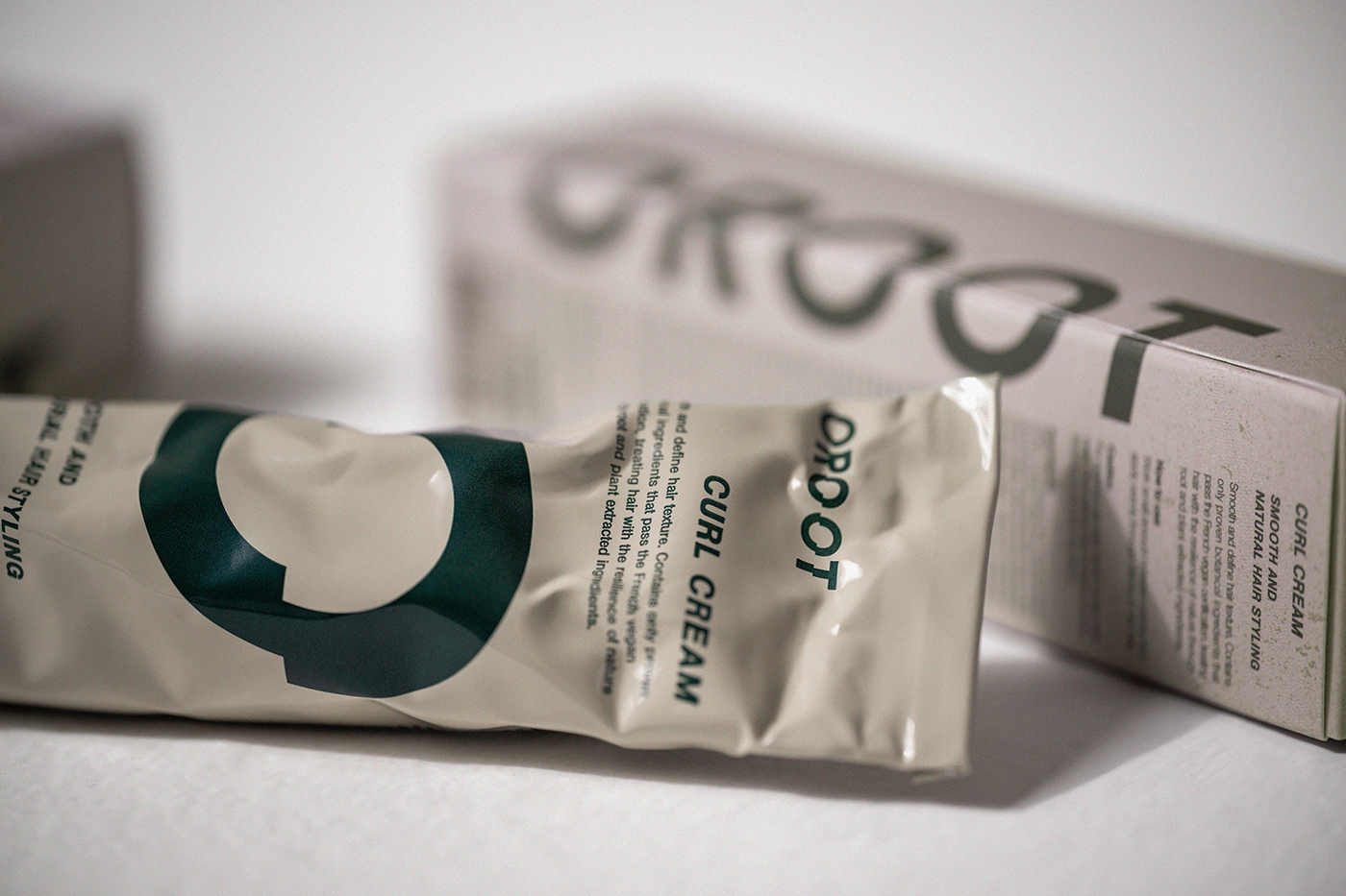
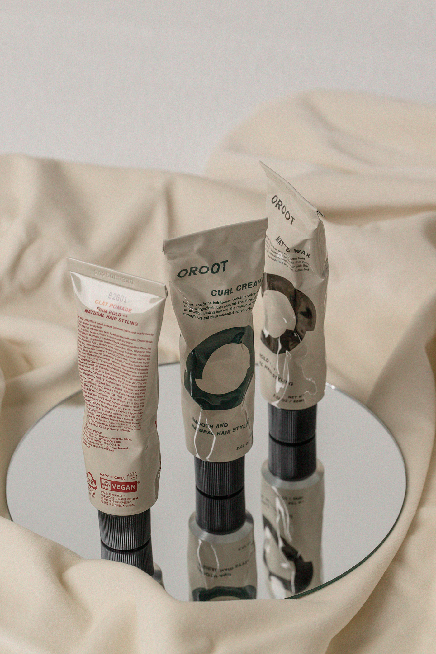
We designed a 100% recyclable aluminum tube package instead of the typical jar to increase usability for customers who use styling products.
This way, we have improved portability, easiness of use, waste of product, and hygiene that customers who used traditional wax were uncomfortable with.
This way, we have improved portability, easiness of use, waste of product, and hygiene that customers who used traditional wax were uncomfortable with.
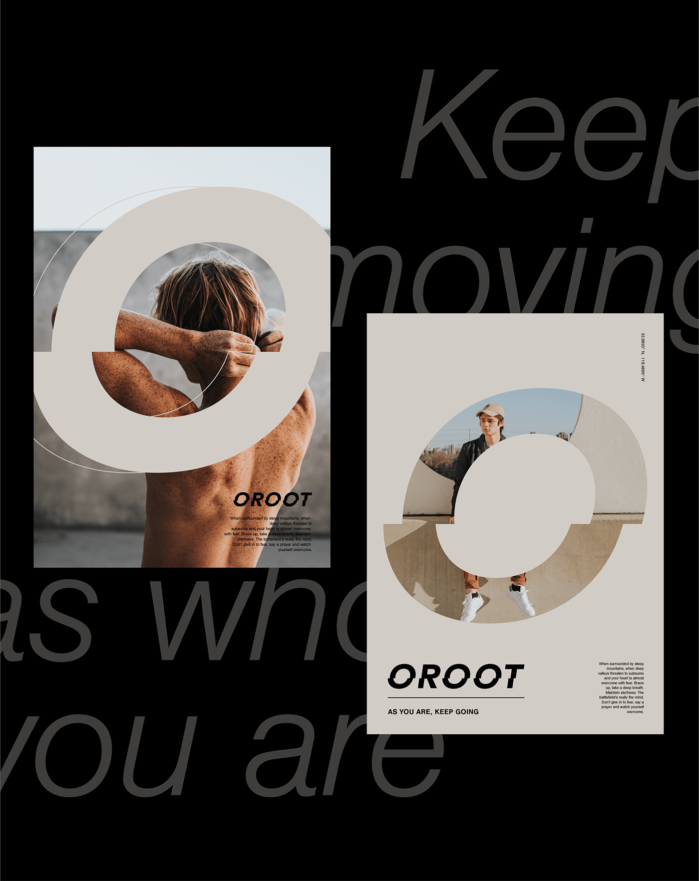
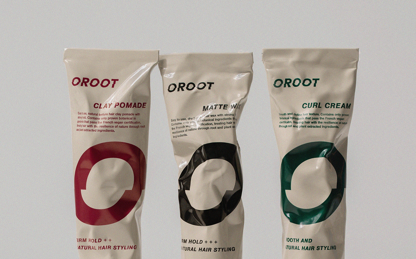
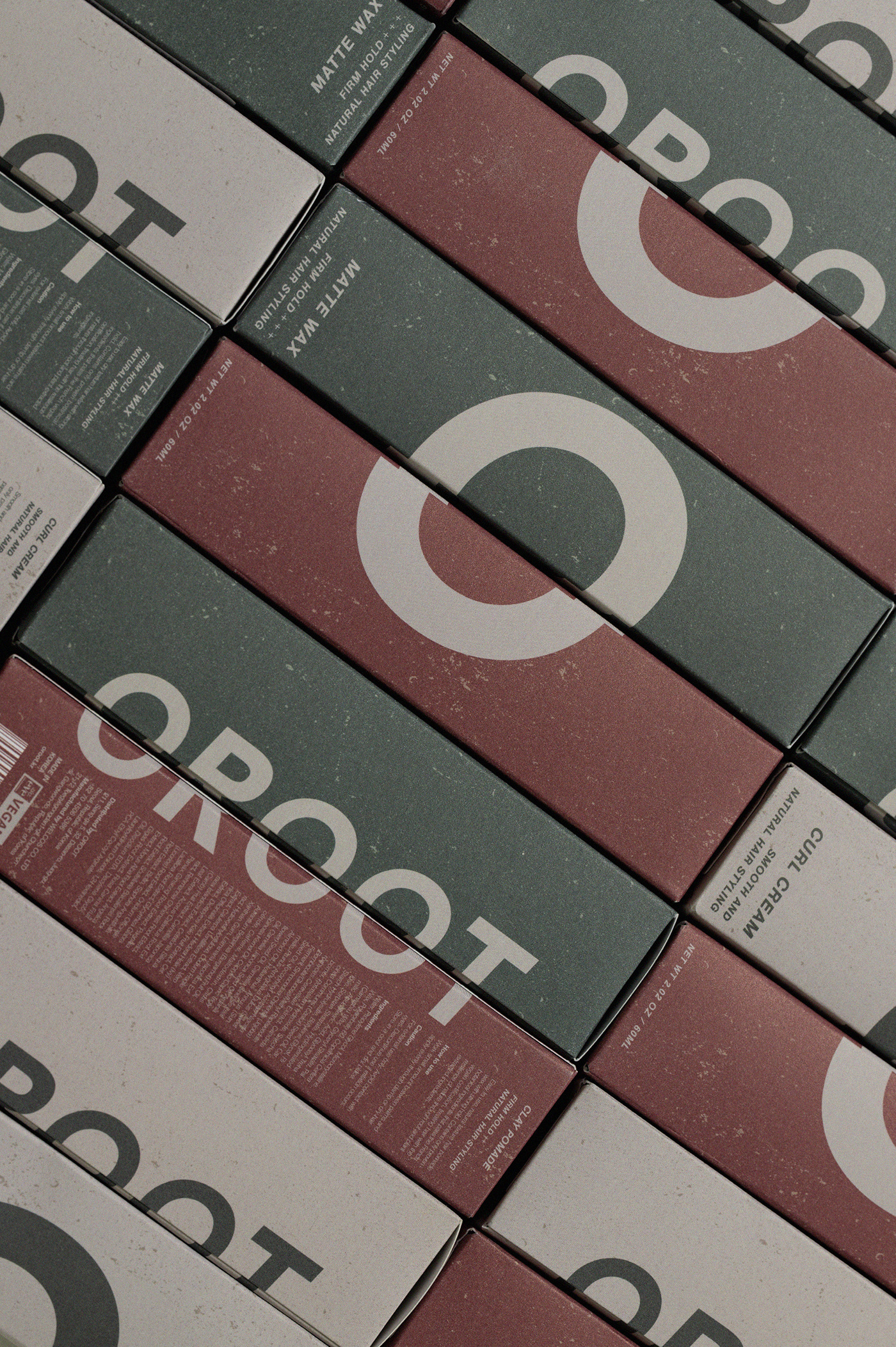
The slashed 'O' can be used alone as a stamp or iconic mark
to widen brand application.
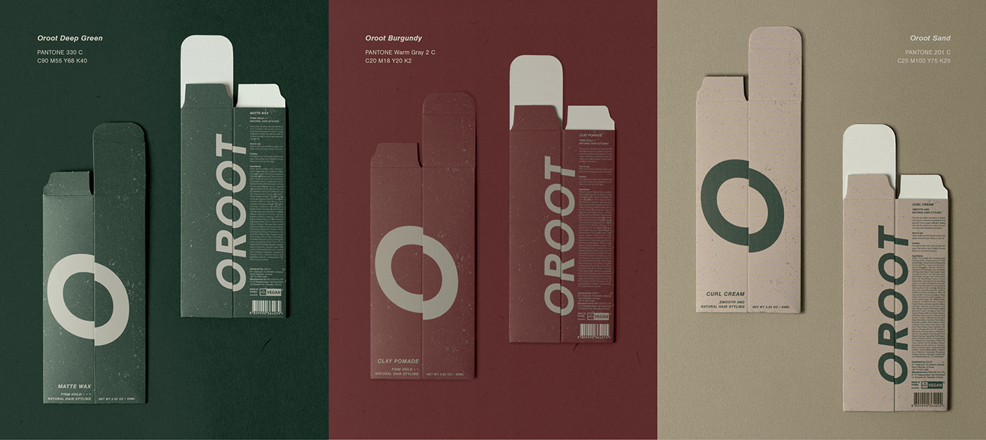
The Oroot box packaging uses eco-friendly material, Curious Matter paper.
It has a unique, gritty surface that allows vintage color to show.
Using vegetable-sourced ingredients that are non-toxic, the Natural and Organic brand value is also delivered through touch.
Using vegetable-sourced ingredients that are non-toxic, the Natural and Organic brand value is also delivered through touch.
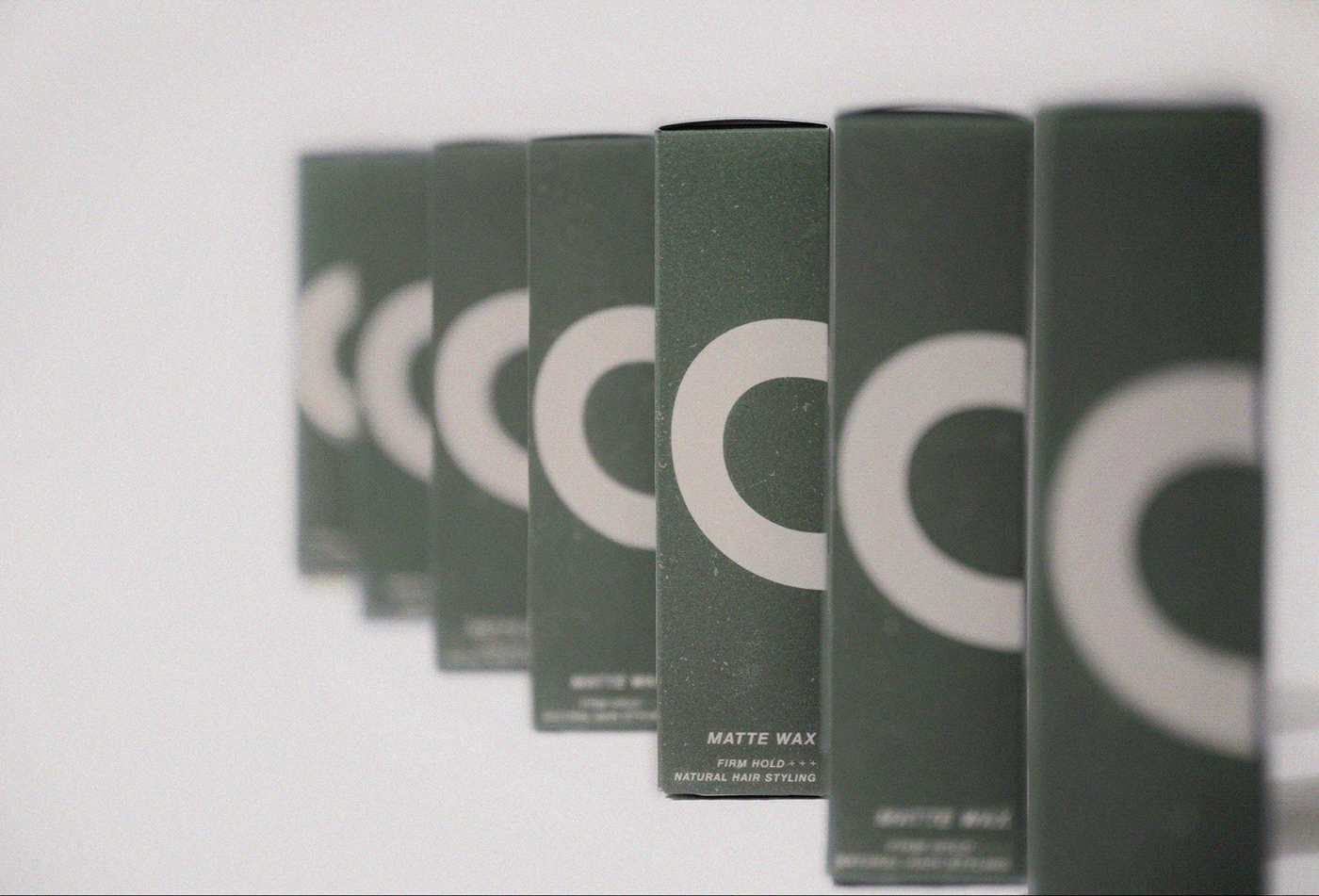
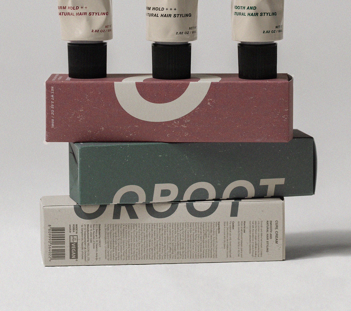
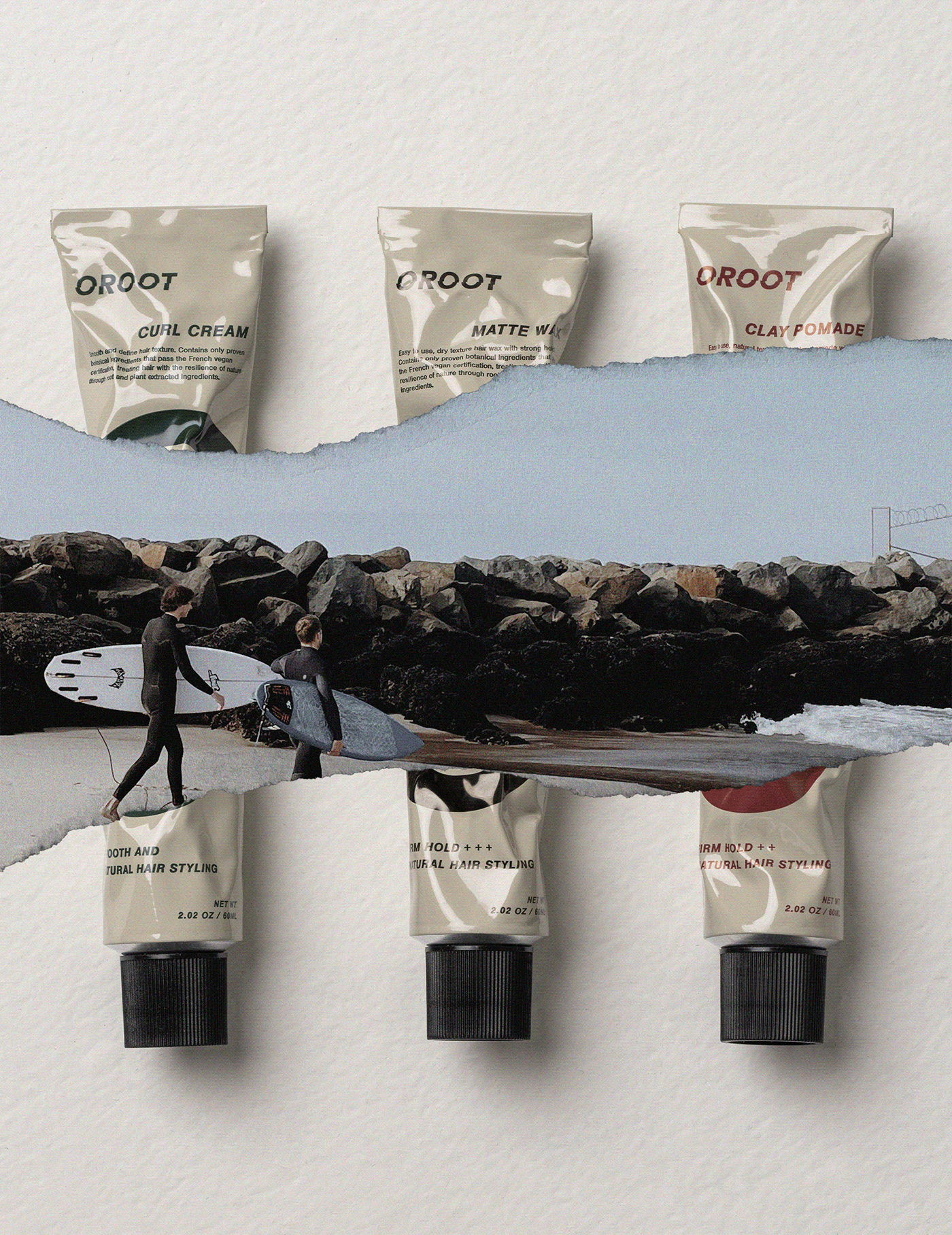
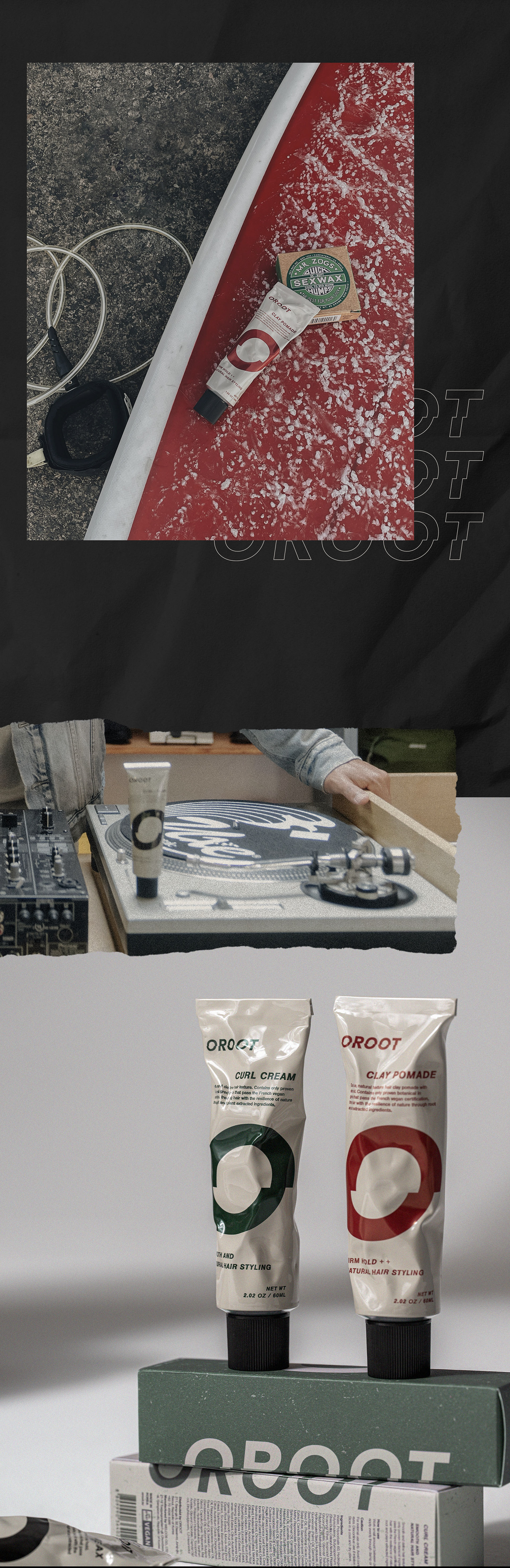
The color of the Oroot is impactful but cozy.
In addition, you can intuitively distinguish features by looking
In addition, you can intuitively distinguish features by looking
at product-specific colors.
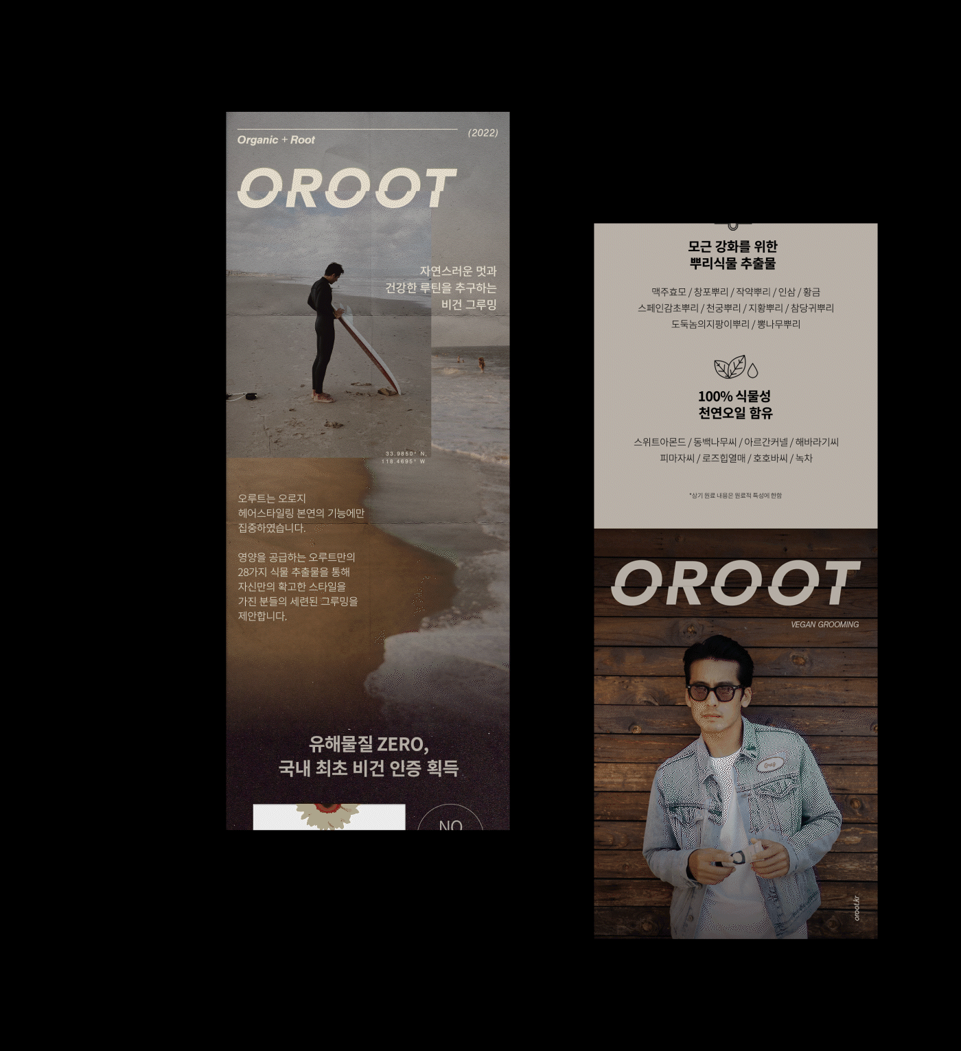
The brand value, new usability, and iconic logo and color of Oroot are ideal
for men who seek natural styling.
BOUD
-
Creative Directing : Jiyeon Ma
Project Manager : Youngmin Hwang
-
Creative Directing : Jiyeon Ma
Project Manager : Youngmin Hwang
Lead Designer : Giulia Giugno
production Designer : Youngmin Hwang
Brand Design : Youngmin Hwang, Giulia Giugno
Photographer : Jinsu Du, Zino Grapher
Brand Design : Youngmin Hwang, Giulia Giugno
Photographer : Jinsu Du, Zino Grapher
CMF Manager : Sewon Kim
Clients : Oroot
More Projects
https://www.theboud.com/
https://www.theboud.com/


